
Company Website
http://www.klandk.com/
Company Introduction
KL&K DESIGN is an internationally renowned design consultancy jointly operated by its two founders, Dr Kan Tai-keung and Mr Freeman Lau, together with Mr Hong Ko. KL&K Design’s predecessor, Kan & Lau Design was established in 1976. Within almost forty years, the company has grown and expanded with offices in Hong Kong, Shenzhen as well as business interests in various parts of the PRC. We serve more than 200 clients from both China and overseas, and have received numerous awards in the industry. As trend-setters in brand design in China, we lead with international perspective and local experience, as well as an adept hand of amalgamating culture and business. In 2013, KAN & LAU DESIGN was officially renamed KL&K DESIGN to mark the co-operation of the three generations of partnership, which with a dedication to innovate world-class China design, keeping us abreast of the times.
Product concept, highlights and added value
Nowadays, the health-preserving trend is gaining popularity among the younger generation. Fancy beverages soothe young people's minds, yet the excessive intake of sugar inadvertently leads to weight gain. As young people's attention to health continues to grow, returning to a sustainable and healthier way of drinking water has become one of their daily life choices.
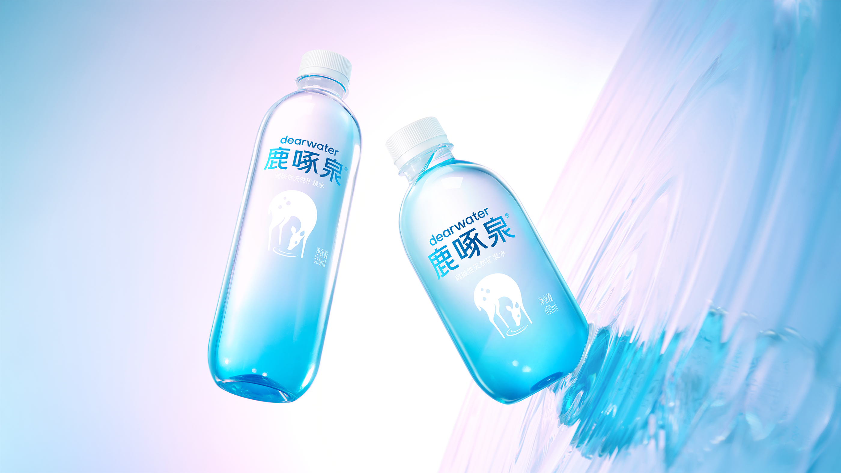
In the newly developed bottled water packaging, the blue color used is different from the brand's previous color. This mainly stems from the characteristics of the deep-rock mineral water category. In the general public's perception, it is easier to associate with environments like snow mountain mineral water and mountain spring water, while there is actually a lack of imagination about water from deep rocks. To highlight the depth and scarcity of the water source, a profound and layered blue hue is adopted, and the term "Deep-Rock Blue" is used to arouse consumers' visual association with the deep underground environment where the water is sourced.
Product Images
Please briefly describe how your product communicates with consumers
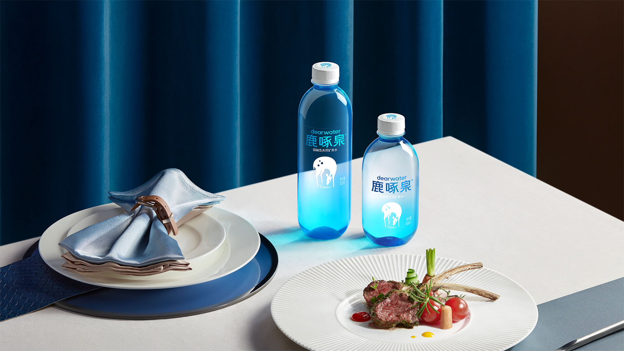
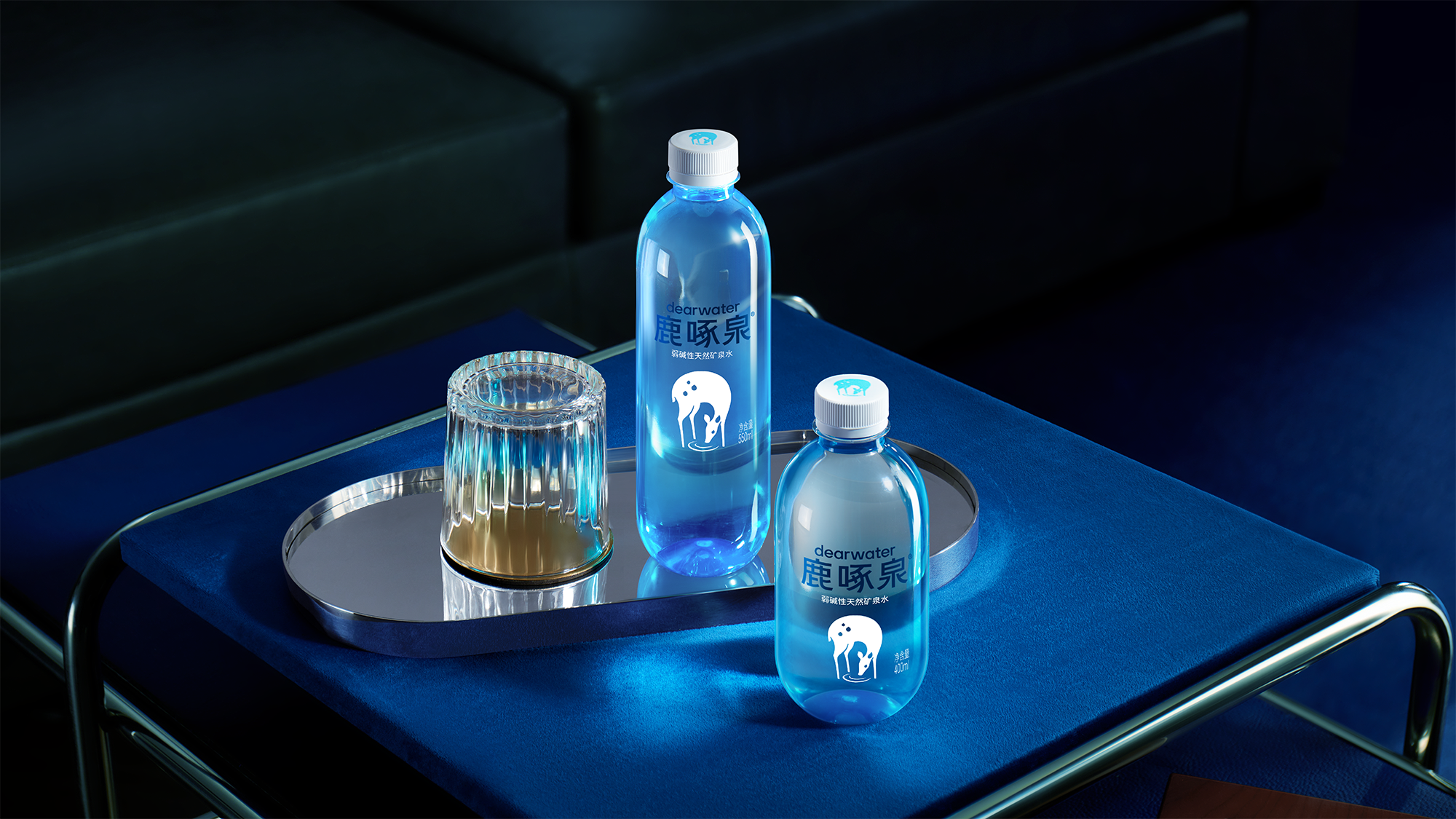
We have integrated a gradient blue hue into our original crystal-clear bottle to create the all-new Deer Peck Spring Gradient "Little Blue Bottle". Under light, the water inside looks clear and translucent, further enhancing the product’s texture. The adoption of the gradient design on the bottle is mainly based on two considerations: first, it aligns with the product’s inherent attribute—being deep-rock mineral water, and the gradient color can better convey the category information of the product; second, from the perspective of display visuals, we aim to attract consumers’ attention through the unique gradient blue color, which also helps differentiate the product from other similar brands in the market. With an overall minimalist texture, the bottle meets the current consumer demand for high aesthetic appeal.
The realization of the gradient blue bottle craftsmanship relies on relatively advanced technologies in the bottled water industry. The gradient color itself is applied during the preform stage. Combined with food-grade color oils and high-quality, eco-friendly PET materials, this process imposes relatively high technical requirements on preform manufacturing and also leads to higher costs. The advantage of this approach is that the unique packaging highlights the product’s sense of value; the downside is a slightly lower yield rate. However, production capacity can be accelerated through subsequent improvements in production technology.
Product Images
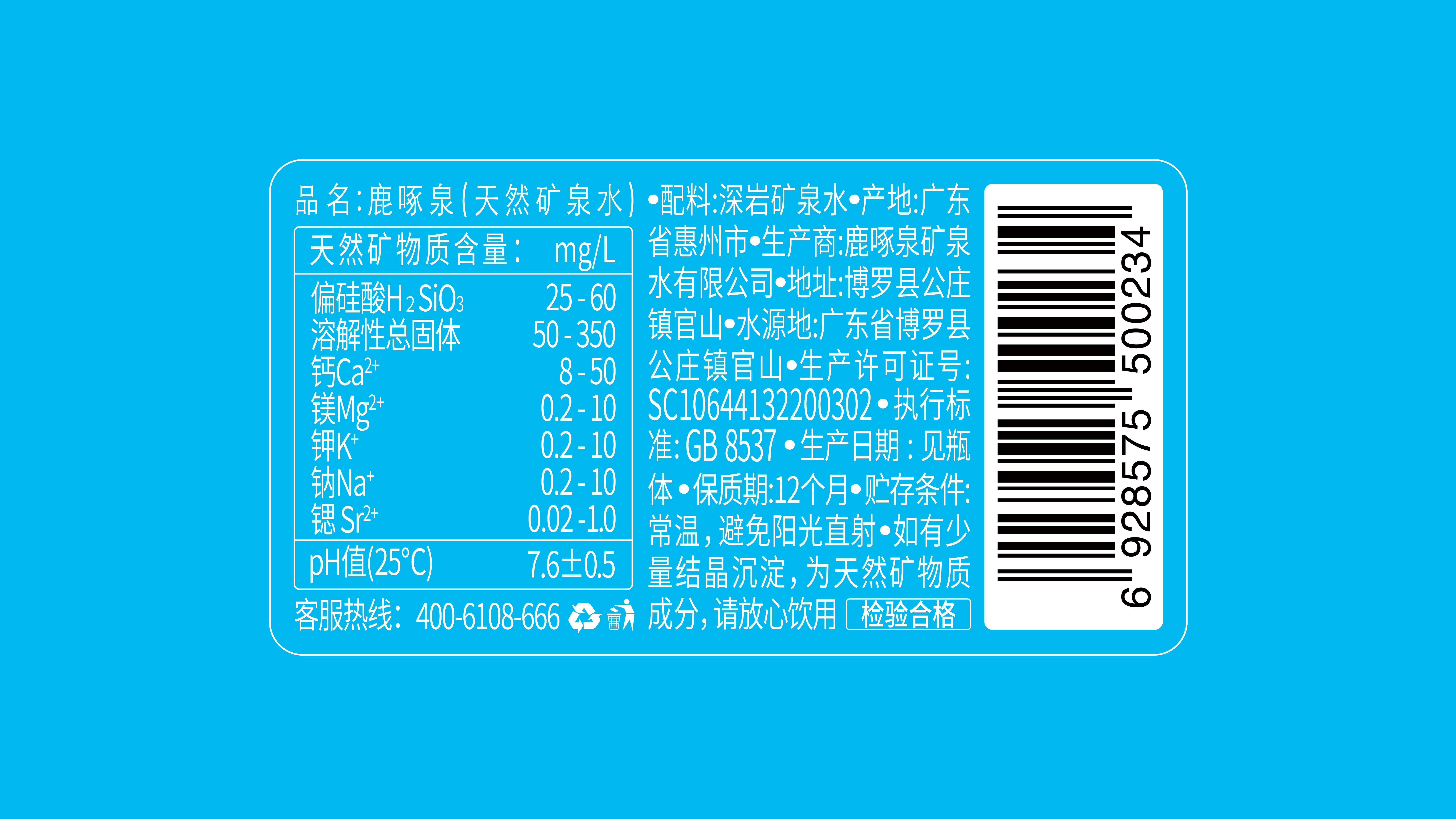
Ingredients List Photograph
Launch Date
2022-10
Target Consumer
For high-end groups pursuing material comfort and spiritual enjoyment
Weight/Volume per Pack
400ml
Price per Item
6元/瓶
Storage requirements
常温储存(Normal Temperature Preservation)
Marketing Area
East China
Distribution Channels
其他销售渠道 高端场所
Market Performance
无