


Background
"Inikin " is a natural and rare low-temperature active spring mineral water of volcano, which originates from the vast forest hinterland of Daxinganling Mountains and the high-quality water source belt of 47 ° n - Arshan. The rare source of volcanic rock makes it a metasilicic acid type, natural weak alkaline mineral water which contains major elements such as calcium, magnesium, and many kinds of trace elements such as silicon, strontium, lithium, selenium, etc. And also with an appropriate mineralization degree.
"Inikin" is the language of Oroqen, which means "Living Spring". It is not only the highly refined flowing and active water attribute of "volcano low temperature active spring", but also conveys the brand tone of natural vitality. The collision between the name of rare culture and the rarity of water resources brings a sense of thickness and value to a start-up brand.
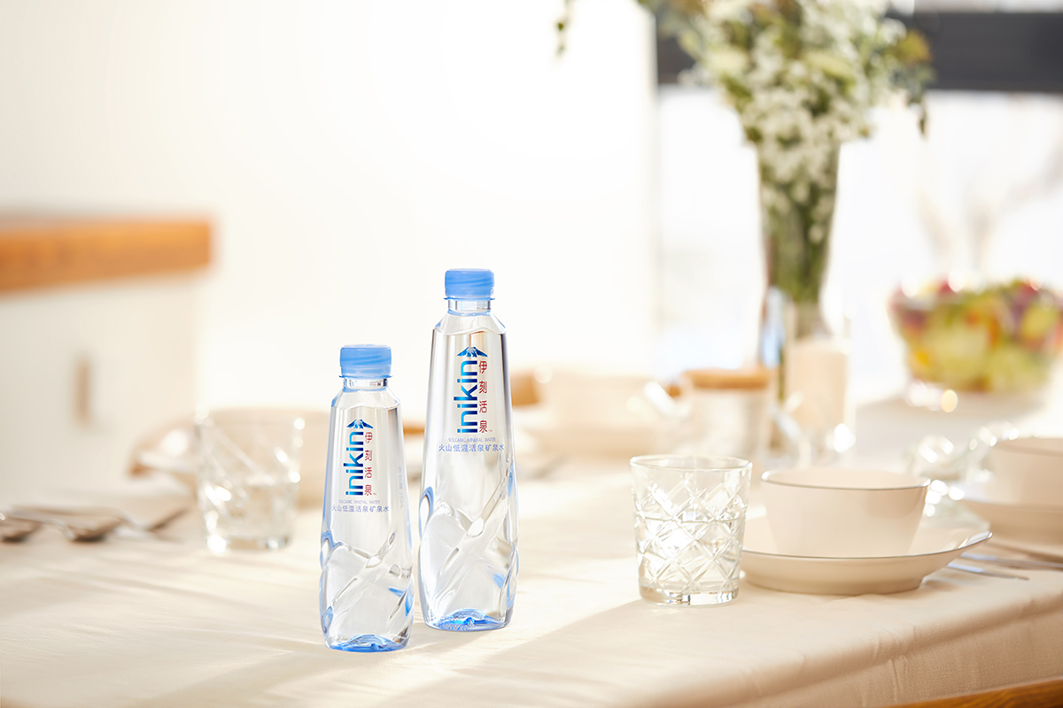
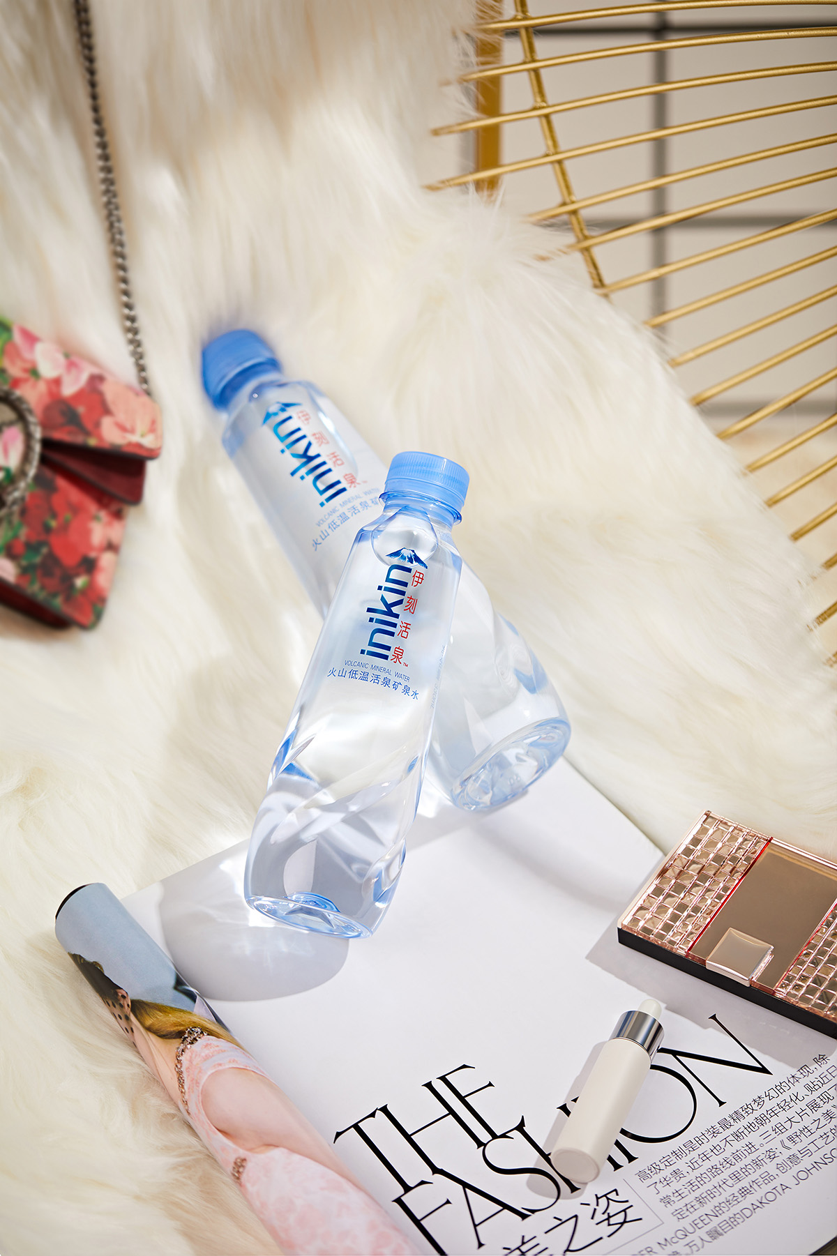
The core target group of the brand is the consumers who are 24-35 years old and pursue a healthy and quality life. The high-quality packaging design and visual presentation meet the dual needs of the target population for quality and appearance; the natural rare and living spring brings every moment of "extraordinary life" , which is the source of vitality for health.
Inikin is a natural and rare water. The living water source gives the body more healthy vitality and a higher quality of life experience.
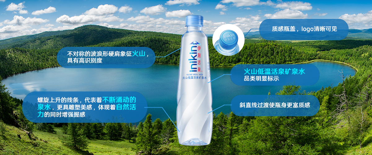
The packaging of the product is designed with the volcano low temperature active spring as the prototype. The bottle body presents the flowing curve of the active spring, which is flexible and vigorous; the bottle shoulder presents the rolling ups and downs of the volcano; the lower part of the bottle body has four spiraling upward flowing surfaces, which are like the spring gurgling when rotating the bottle body, giving consideration to the beauty and practicality of grasping. It reflects the vitality and endless growth of inikin.
The design of the logo is based on the minimalist style. The blue "inikin" English logo echoes the blue color of the packaging, and the Chinese logo in red color is matched with the vertical version, which echoes the surging water pattern on the bottle body, making the visual sense of upward extension, so as to conform to the brand concept - extraordinary vitality from nature.
Inikin, living for extraordinary.
In terms of the bottle design, the bottle shoulder shows the continuous ups and downs of the volcano, conveying that the products come from the rare volcanic rock water source. The bottle body presents the flowing curved surface of the active spring, which is flexible and dynamic. It has the aesthetic feeling of sculpture and enhances the product a good holding feeling, fully reflecting the concept of the volcano's low temperature self-flowing spring water. The design of the logo also highlights the rare attributes that the product wants to convey, and the simple and distinctive logo attracts the attention of consumers.
As soon as the product was launched, various media and KOL reported one after another. The large-scale public social media "The Food Industry" said that "the bottle design of inikin combines the images of volcano and active spring, which is very fashionable and beautiful. High-end water quality and stylized packaging design, effectively convey the full vitality of product attributes. " The professional water industry public number "drinking water world" said that the packaging of inikin is based on the volcanic low temperature living spring, which gives the world a glimpse of this hidden microcosm in the forest. "