
Country
中国(China)
Official website
https://www.jmlfood.com/
Company Introduction
Established in 1994, Malang Group is a modern large-scale comprehensive food enterprise group integrating research and development, production and sales. Jinmailang business covers convenience food, noodles, drinks and other three sectors, products are sold all over the country, and exported to more than 50 countries and regions. Jinmailang was awarded top 500 Private Enterprises in China and Top 500 Private Manufacturing Enterprises in China.
Images
Brand Name
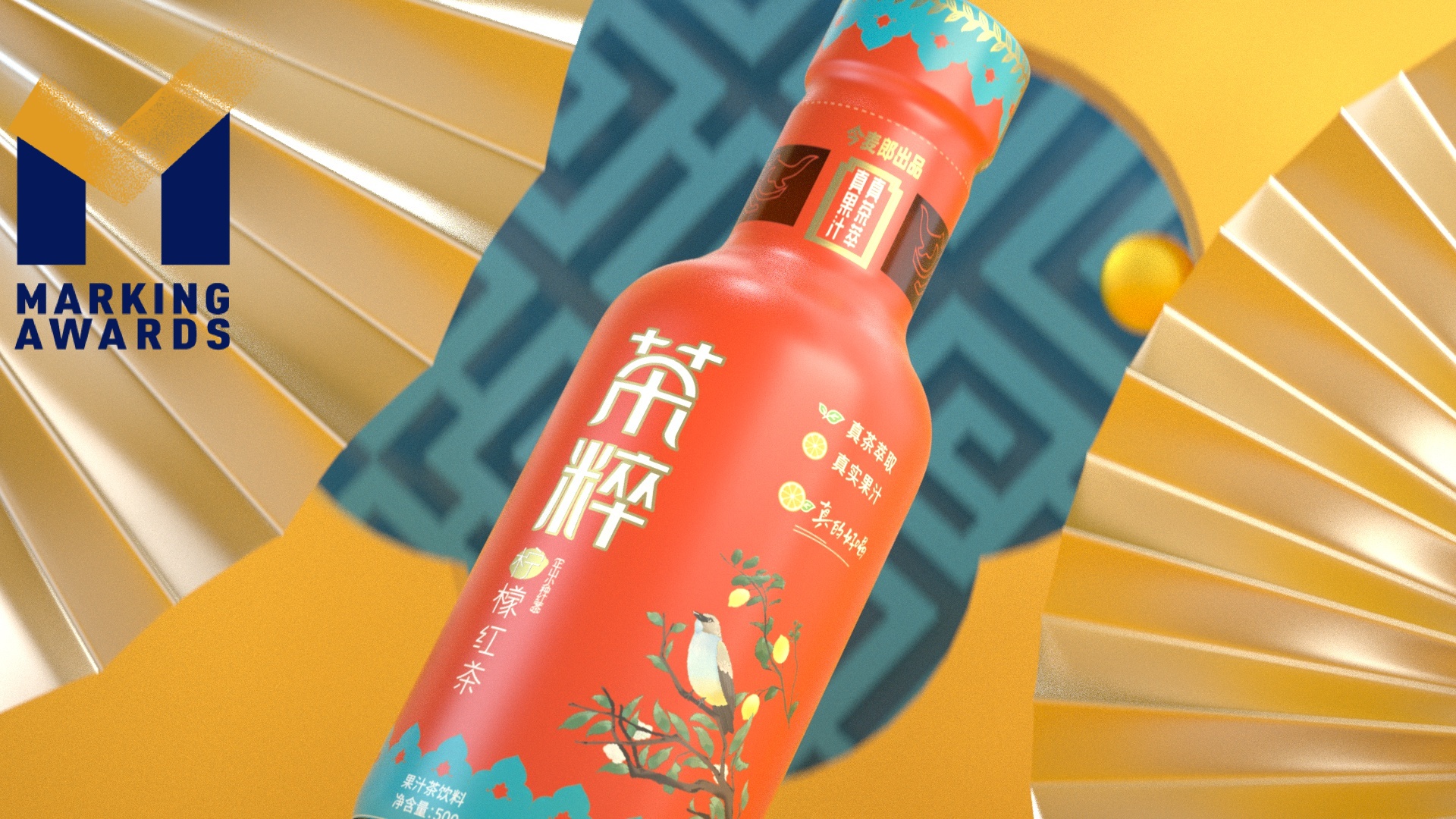
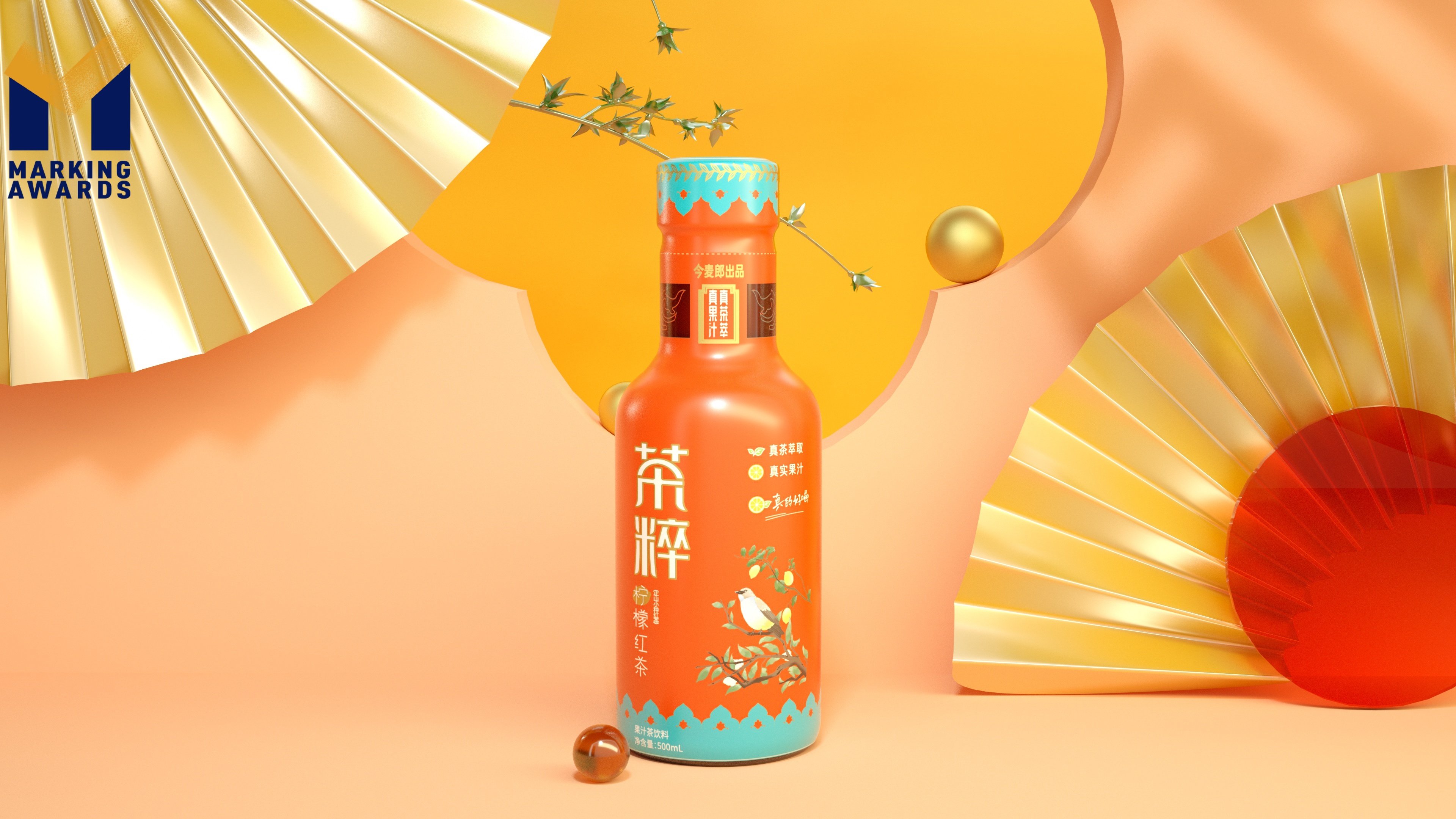
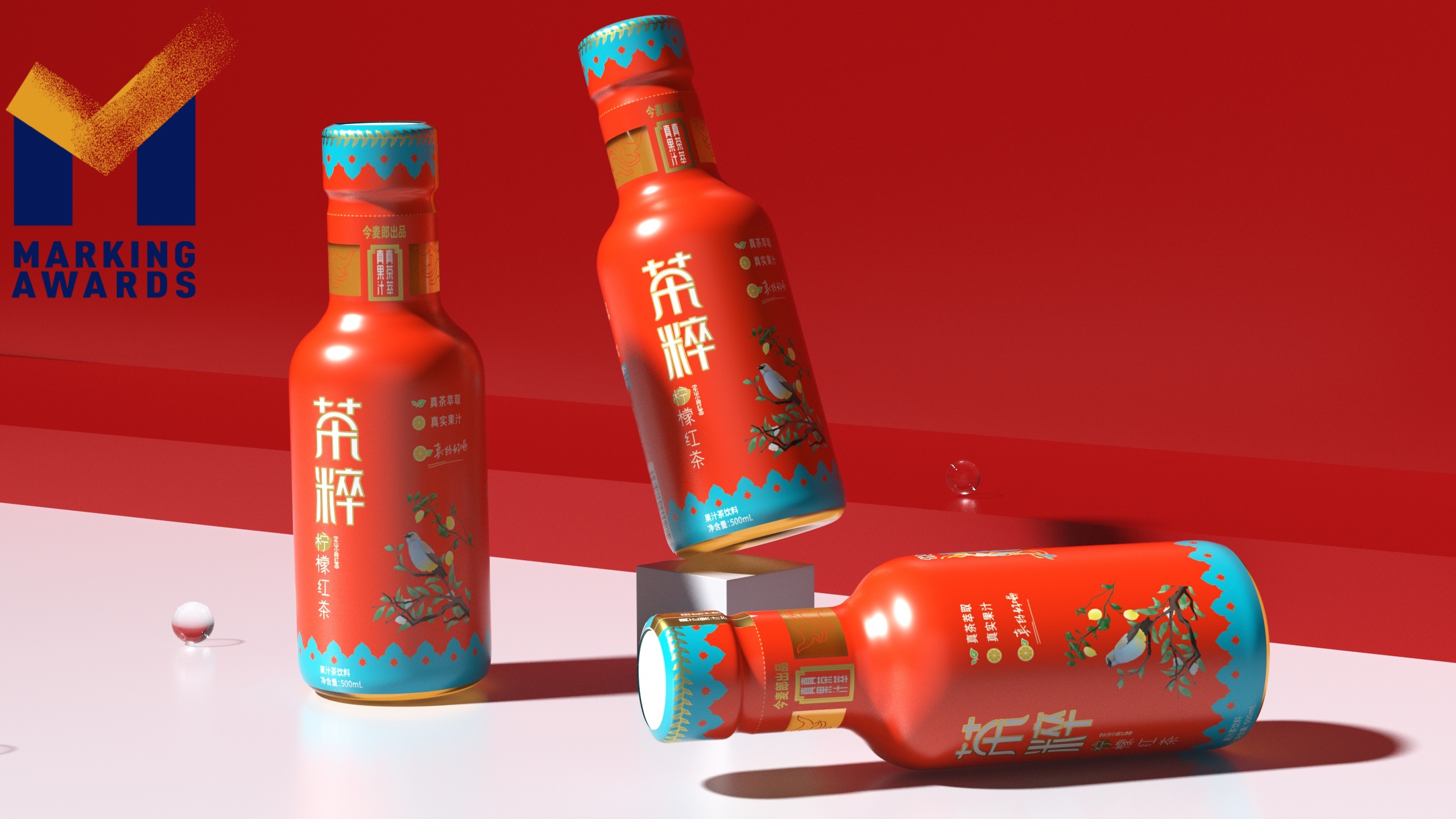
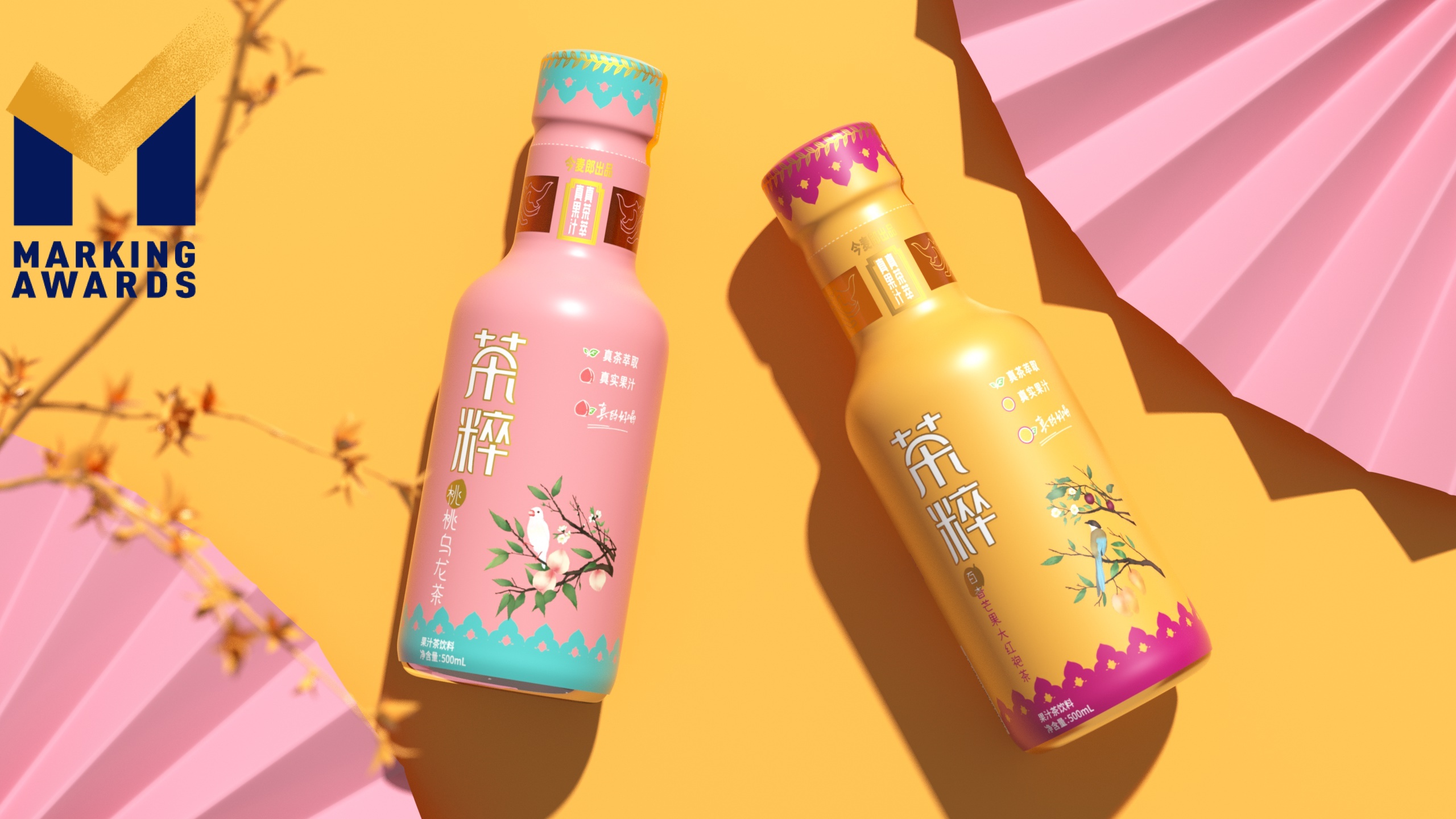
ChaCui
Designer Name
Chen He
Position of Designer
Design director of Shanghai MICCO culture media Co., Ltd
Client
Shanghai Mick culture media Co., Ltd
Target Group
Young consumers in first and second tier cities
Major sales
电商 E-commerce; 大型商场 Shopping Mall; 小型商超和便利店 Supermarket & CVS; 杂货店 Grocery; 餐饮&酒店 Restaurants & Hotel
Positioning
大货 Mass Production
Design Story
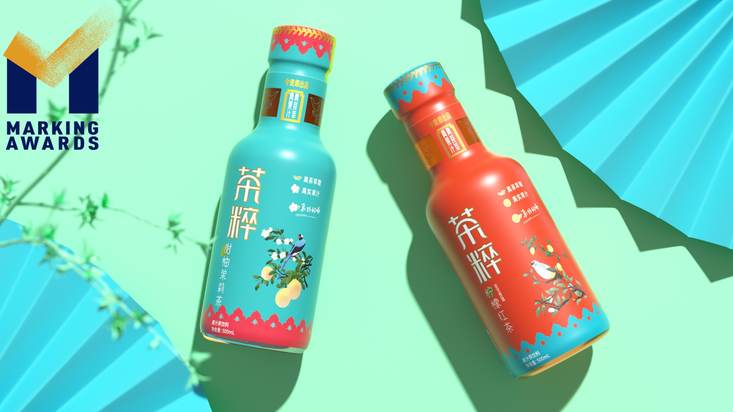
Tea essence is a new concept tea drink for first-line and second-line young people. The word "tea" can be associated with Chinese culture for the first time. The combination of the two means the essence of Chinese national style, which is a new tea for a new generation of young people. In terms of packaging, our design lies in the following points: 1. Color: tea juice is inspired by the palace wall of the Forbidden City. The traditional but bold blue and red color contrast highlights the national style attribute of the product. In view of the red walls and glazed tiles in the Forbidden City, the calm and atmospheric red and the clear and wanton green collide with each other, and the charm of the land of China flows on the bottle. 2. Pattern: the painting draws on the expression techniques of fine brushwork sketches of the Song Dynasty, which is delicate and beautiful, slender and elegant, and reflects the exquisite and high quality of the product with the picture 3. Sense of quality: the product uses high-quality extracted tea and real fruit juice in raw materials. High quality raw materials are combined with modern technology to distinguish it from tea drinks on the market.
Highlights
1. Brand name is the first banner of products facing consumers. The word "tea essence" is full of strong Chinese meaning. The essence of tea, the essence of tea, the "essence" of tea, clearly shows the positioning of the product and implies the high quality of the product itself. 2. Brand recognition is the lifelong property of a brand. Good design is the key to make products jump out of the same type of products. National style is an important way to distinguish "tea essence" from other fruit juice tea drinks with the same positioning. Under the current trend of "Northern Europe Minimalism" and "Japanese Minimalism", Chinese elements are used to distinguish products with other brands.
Market Performance
无
Material
PET塑料 PET material
Craft
1. Color The color and big feeling of the product are the most important first impression left by the product to consumers. In order to improve the product texture, the packaging adopts spot color printing to ensure the purity of color, and makes multiple proofing adjustments to ensure the color accuracy and color temperature of the product. 2. Bronzing Details are always hidden in inconspicuous places, but the overall texture is inseparable from the embellishment of these details. This product adopts high-quality bronzing. The choice of bronzing color and texture set off each other with the temperament of the product itself. While decorating the picture, bronzing brings people a sense of foot texture and high quality.
Does the design solve the problems that are common across the product category?
Through Guofeng design and other products with the same positioning, the brand division of the products is carried out. High contrast colors are used to distinguish from other products. After multiple color correction, the product has a more sufficient sense of quality. The combination of design and technology makes the product jump out of the same type of products.
What functional designs of the work have enhanced the user experience?
The design of large bottle mouth is adopted, which is convenient for consumers to drink. The bottleneck size is suitable for consumers to grasp.
Did the design help increase the sales performance of the product?
无
Does the work consider sustainability (environmentally or commercially, or both)?
The design of large bottle mouth is adopted, which is convenient for consumers to drink. The bottleneck size is suitable for consumers to grasp. The outer packaging is made of plastic material, which can be recycled. The packaging and printing part is an environment-friendly enterprise, which reduces environmental pollution.