
Country
中国(China)
Official website
https://www.brighticecream.com/
Images
Brand Name
Bright Ice Cream
Designer Name
Yvonne Dai
Position of Designer
Creative Director
Target Group
Young generations that is interested in health.
Major sales
电商 E-commerce; 小型商超和便利店 Supermarket & CVS; 杂货店 Grocery
Positioning
大货 Mass Production
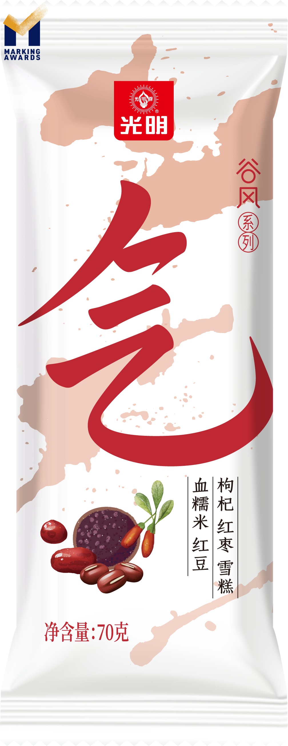
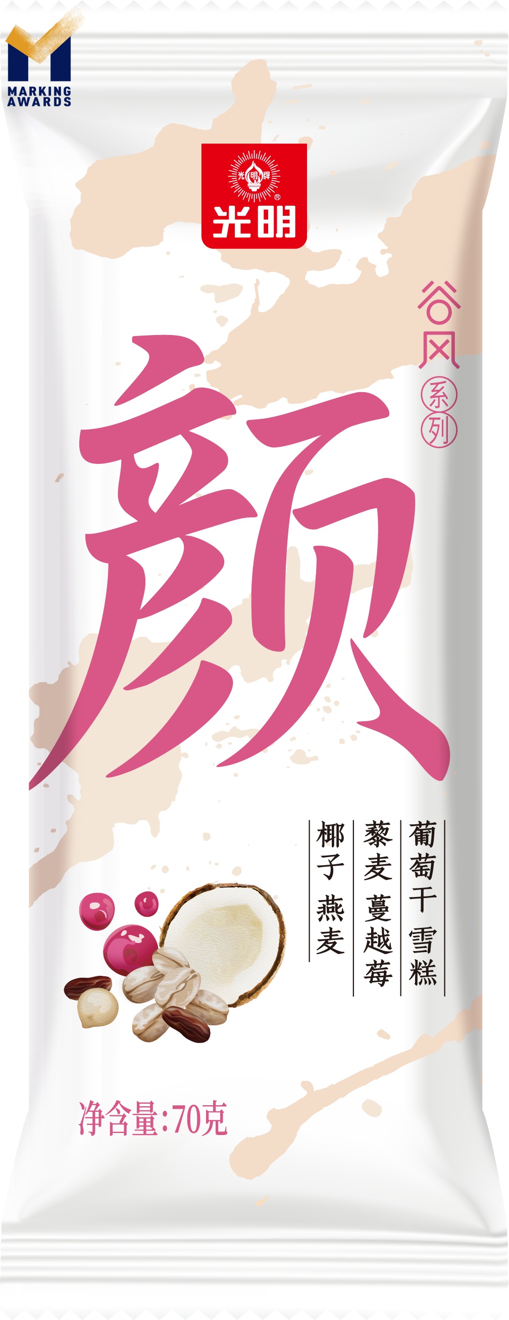
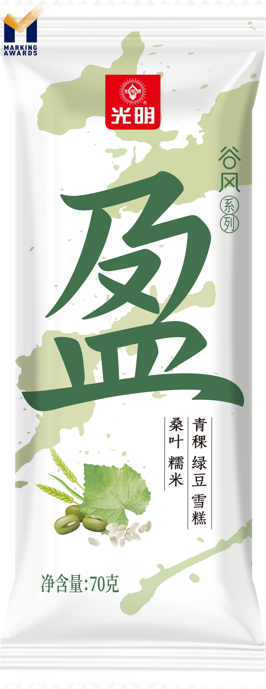
Design Story
The concept of designing the Gu Feng Series is inspired by the ancient Chinese ink painting as it could emphasise our core product values - Chi, Ying and Yan, as the Gu Feng Series is regarded as relatively healthy and those are ancient Chinese words stands for wellness and a healthier lifestyle.
Highlights
To meet the needs of young generations interest in healthy food, the ice cream adds various fibre and healthy grains, as well as an ink splash design in package.
Market Performance
无
Material
其他
Craft
It is decorative and healthy, and is widely used in food packaging.