
Type of applicant company
Design organization
Country
Armenia
Company Website
https://backbonebranding.com/
Images
Brand of the Work
Tak Flour
Designer Name
Creative Direction: Stepan Azaryan, Illustration: Elina Barseghyan, Design Team Leading: Gevorg Abrahamyan, Design: Ashot Hayrapetyan, Sculpture: Edgar Grigoryan, Design Idea : Abdolreza Kashani
Position of Designer
none
Target Consumer
The redesign appeals to those who prioritize quality and creativity in their cooking and baking, and seek ingredients that align with their passion for homemade and artisanal food.
Distribution Channels
Supermarket & CVS
Positioning
Mass Production
Design Story
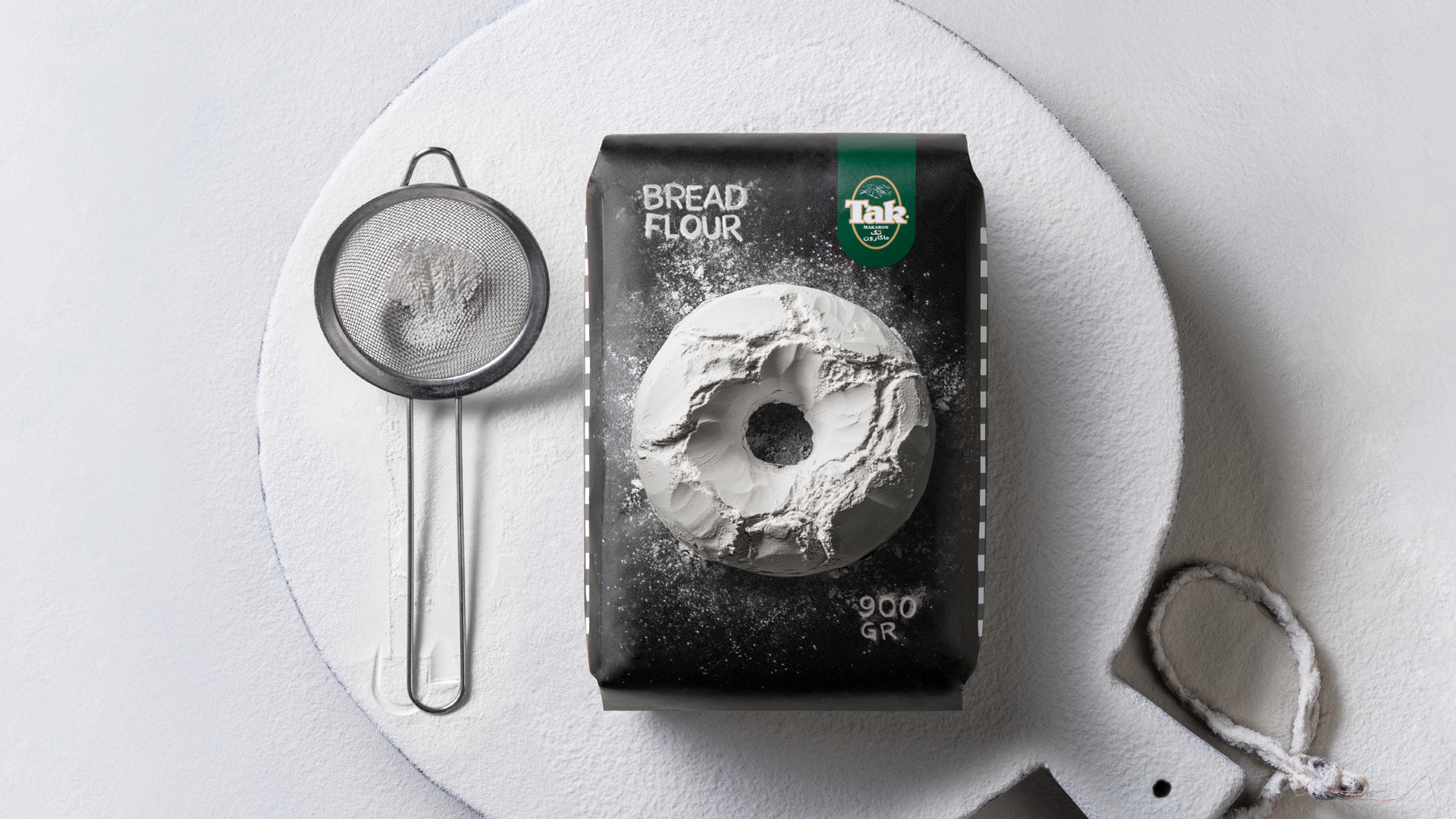
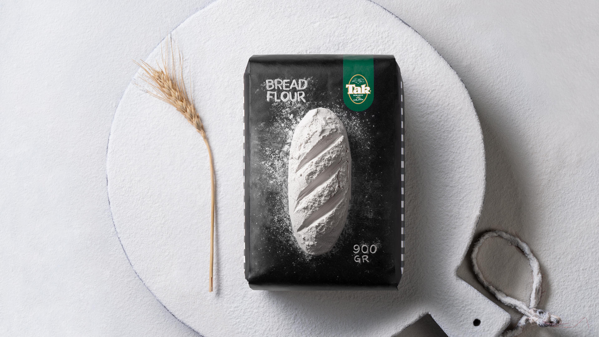
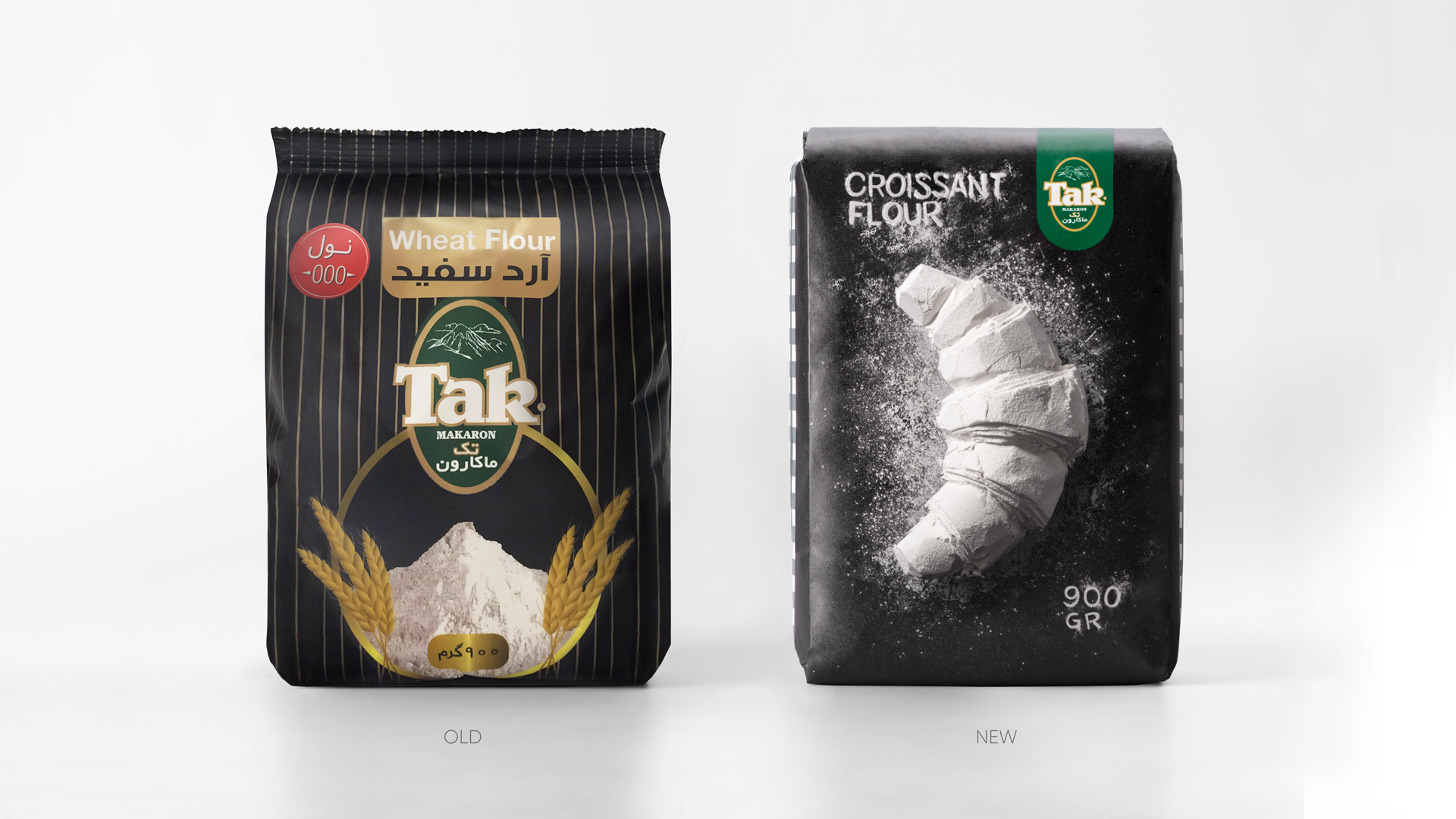
Our mission for "Tak" flour was to enhance its on-shelf appeal while preserving its distinctive brand identity and ensuring easy recognition. Flour, with its singular flavor and limited packaging options, called for a clever marketing strategy that included a variety of designs, each featuring unique illustrations of the product.
The design is centered around bold black packaging, serving as a canvas for the flour's artistic expression. Flour is sculpted into intricate masterpieces of beloved bakery products like bread and croissants, symbolizing craftsmanship and artisanal quality. The "Tak" logo is prominently displayed, ensuring brand recognition, while the brand’s signature pattern on the sides reinforces a cohesive visual identity. This combination of artistry and brand consistency allows "Tak" flour to stand out on the shelf, captivating consumers and solidifying its presence.
Highlights
The redesign of "Tak" flour focuses on enhancing its on-shelf appeal with bold black packaging that showcases intricate flour sculptures of bakery products, symbolizing craftsmanship. This artistic design, combined with the prominent display of the "Tak" logo and signature pattern, ensures strong brand recognition and makes the product stand out on the shelf.
Market Performance
The updated design has helped differentiate "Tak" flour from competitors, driving increased consumer interest and boosting its visibility on store shelves.
Material(For concept works, please choose the material you plan to use)
PET material
Craft
The design of "Tak" flour packaging required the artistry of sculpting flour into intricate bakery forms and the craftsmanship to translate these into detailed visual elements. Advanced printing technology was utilized to achieve the bold black packaging and precise illustrations, ensuring both aesthetic appeal and wide applicability in modern production processes.