
Type of applicant company
品牌方
Country
日本
Company Website
http://joshundo.co.jp/
Images
Brand of the Product
Joshundo
Designer Name
Joshundo
Position of Designer
Design Director
Target Consumer
Sea buckthorn, a superfood rich in natural iron and over 200 nutrients, is specially designed for students and professionals. The portable 100ml bottle is perfect for busy lifestyles, allowing you to easily replenish nutrients during classes or work breaks, keeping you healthy and energized.
Distribution Channels
电商 E-commerce; 大型商场 Shopping Mall; 小型商超和便利店 Supermarket & CVS; 杂货店 Grocery; 餐饮&酒店 Restaurants & Hotel
Positioning
其他 健康饮品 Healthy drink
Design Story
The background of this design stems from our desire to make sea-buckthorn, a superfood, more widely accepted and to help customers experience health and vitality from it. Therefore, we adopted "impact" and "vibrant energy" as the core design concepts, aiming to convey a positive and energetic force. Through this design, we hope to showcase the natural power and health benefits of sea- buckthorn, sparking interest and trust in this precious plant. Every detail of the design has been carefully considered to ignite curiosity and inspire a longing for a healthy lifestyle, making sea-buckthorn not just a nutritional choice, but a symbol of vitality and a quality life.
Highlights
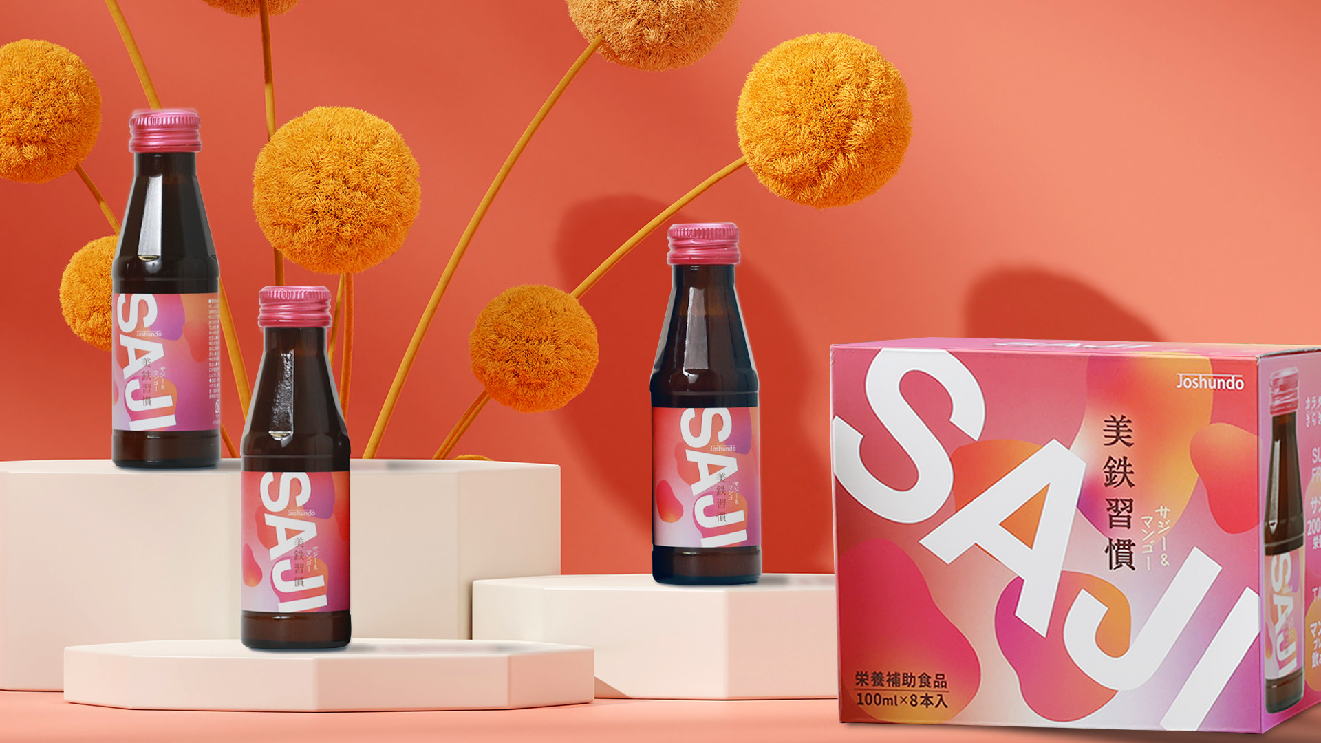
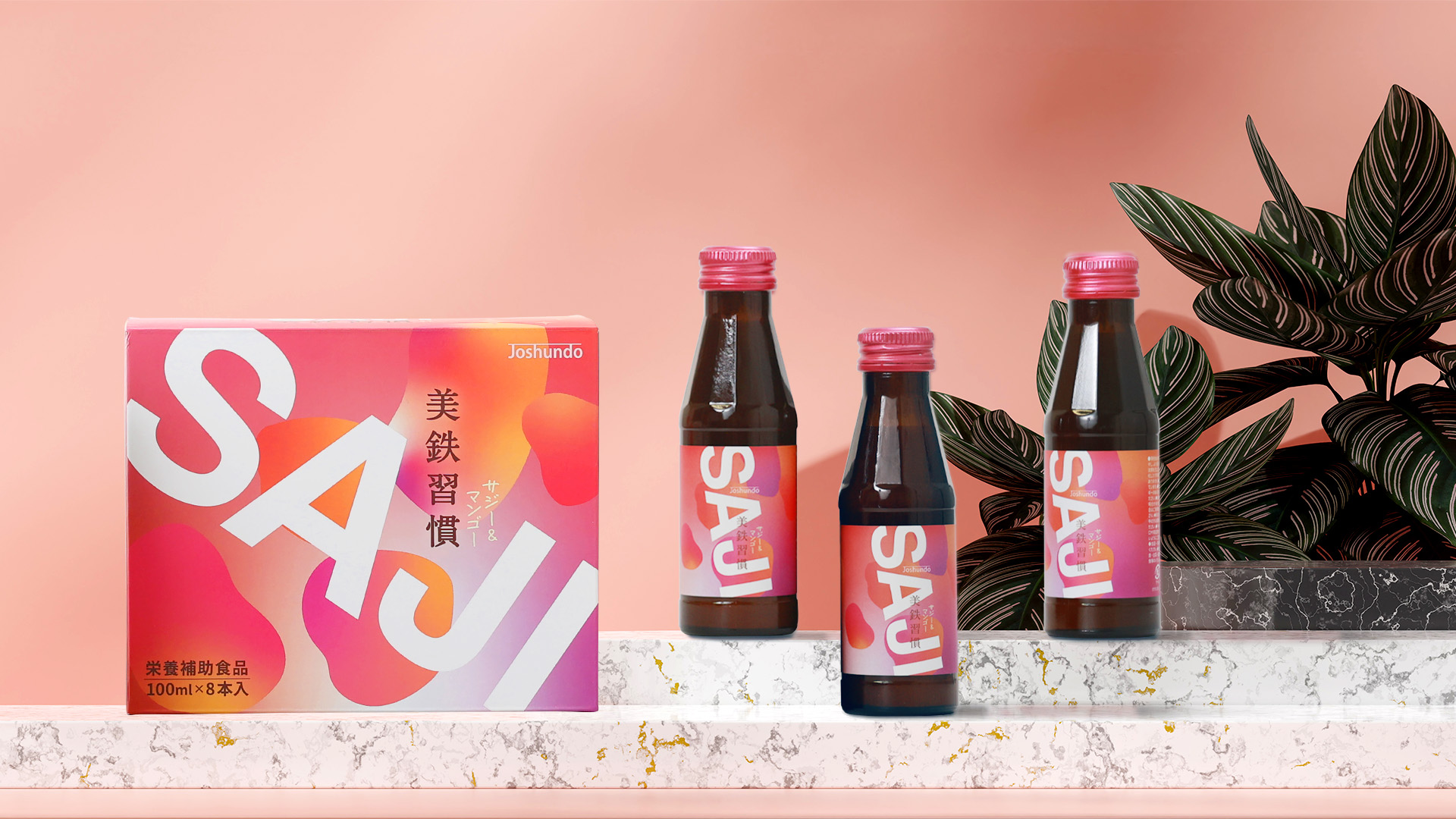
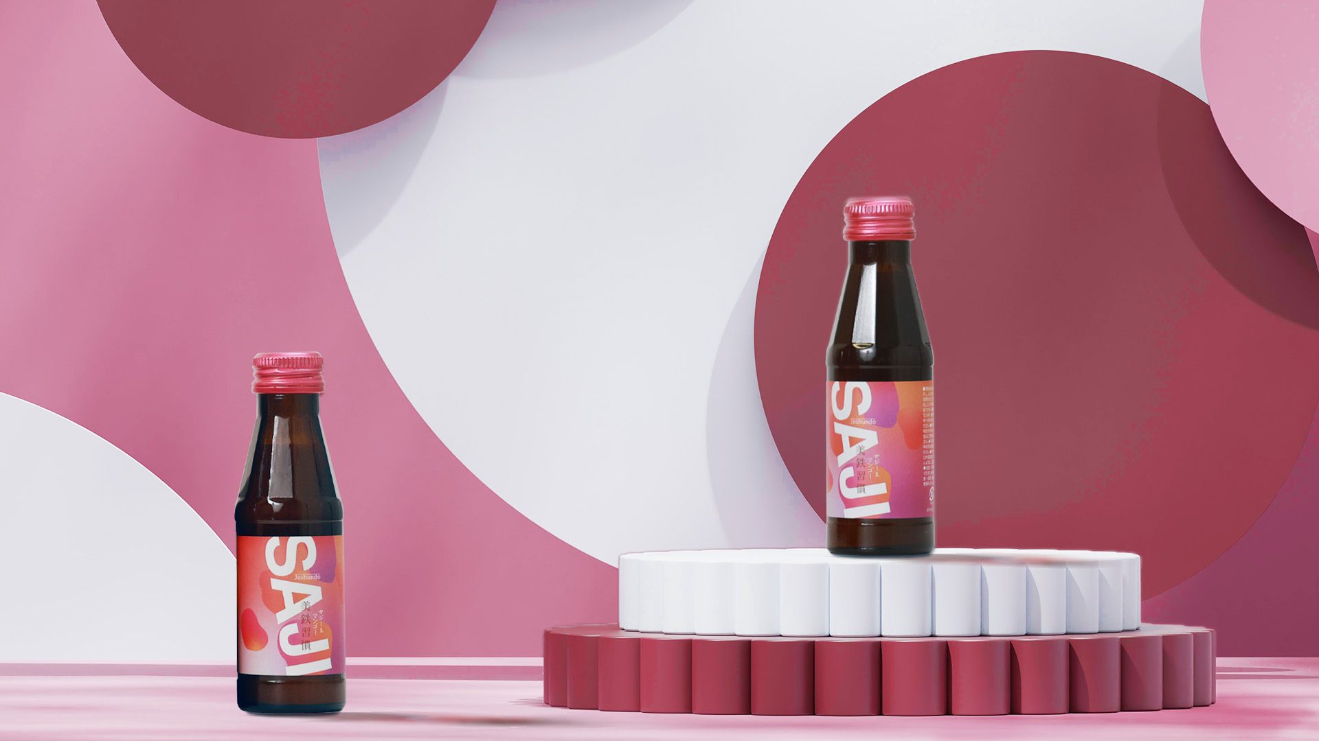
In the early stages of the design process, we had an in-depth discussion about whether to use "sea-buckthorn fruit" as the main visual element to enhance the product's recognition and impact. However, as the design evolved, we realized that the word "SAJI" itself, with its simplicity and strong sense of purpose, could adequately convey the core message of the product. It not only adds unique value to the design but also reflects the confidence and resilience that the brand seeks to express.
Furthermore, to highlight the design's uniqueness and innovation, we intentionally placed the "SAJI" text outside the box's frame, as if it were overflowing. This design approach aims to convey an "overflowing vitality and impact," allowing viewers to immediately feel the energy the product brings. This boundary-pushing design strategy allows our product to stand out among many similar products, showcasing unprecedented visual impact and innovative thinking.
Market Performance
Since its launch, the product has performed exceptionally well on major e-commerce platforms in Japan, with steadily increasing sales, making it a favorite among consumers. At the same time, in offline channels, the product has also gained a strong reputation in Japanese supermarkets and drugstores, receiving widespread acclaim from customers. Despite its outstanding performance in the Japanese market, the product has not yet entered the Chinese domestic market.
Material(For concept works, please choose the material you plan to use)
纸质 Paper
Craft
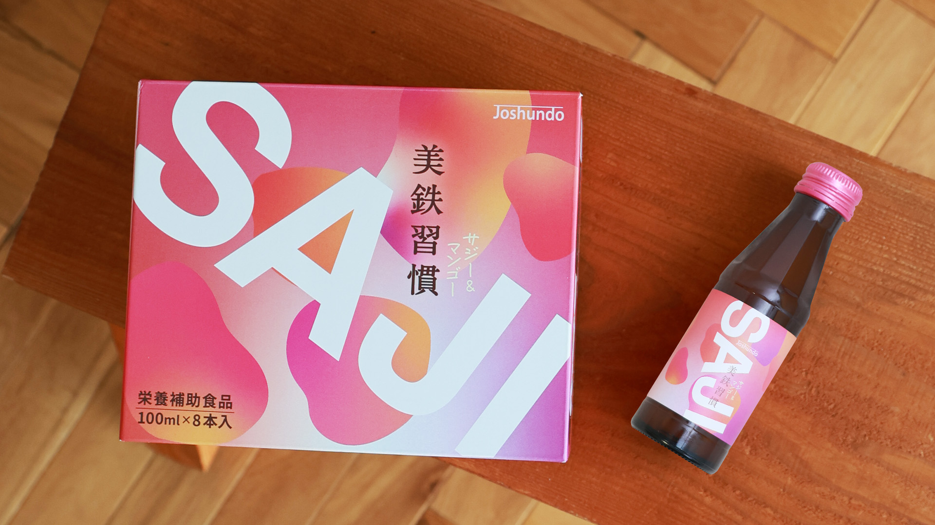
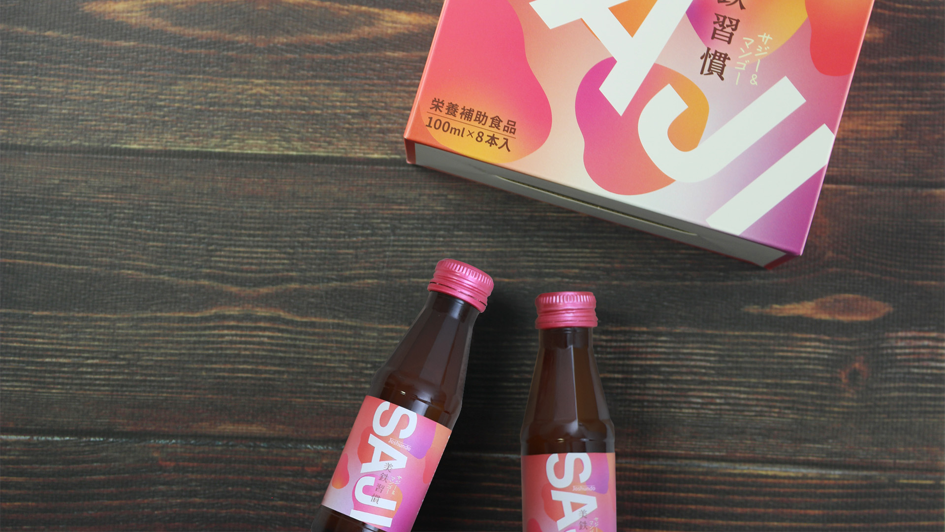
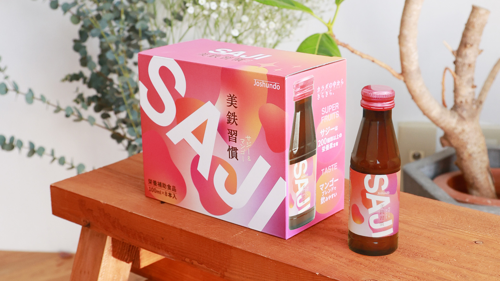
The white cardboard corrugated box is made of high-quality materials and features four-color printing, with a matte film applied to the surface. This printing technology ensures vibrant and detailed colors while enhancing the overall texture of the packaging, making the product visually appealing. Additionally, the use of a matte film improves the packaging's abrasion and water resistance, ensuring the product's safety during transportation and storage. The internal small bottle packaging design is convenient for carrying, catering to fast-paced lifestyles. Overall, the packaging highlights the superiority of the materials and the precision of the printing technology, significantly enhancing the product's market competitiveness.
Does the design solve the problems that are common across the product category? If so, please explain.
In the Japanese market, while people are somewhat familiar with sea-buckthorn, they don’t have a strong impression of the sea-buckthorn fruit itself. As a result, incorporating the fruit into the packaging design often fails to make customers immediately associate it with sea-buckthorn products. With this in mind, we aimed to create a product that is instantly recognizable. In the design of this product, we boldly adopted the English letters "SAJI" as a prominent and iconic element. This significantly enhances the packaging’s recognizability, ensuring that customers can immediately identify it as a sea-buckthorn-related product at first glance.
What functional designs of the work have enhanced the user experience?
Currently, similar sea buckthorn juice products on the Japanese market are predominantly packaged in large volumes, which present certain limitations: they are inconvenient to carry and require refrigeration after opening, adding to the hassle of use.
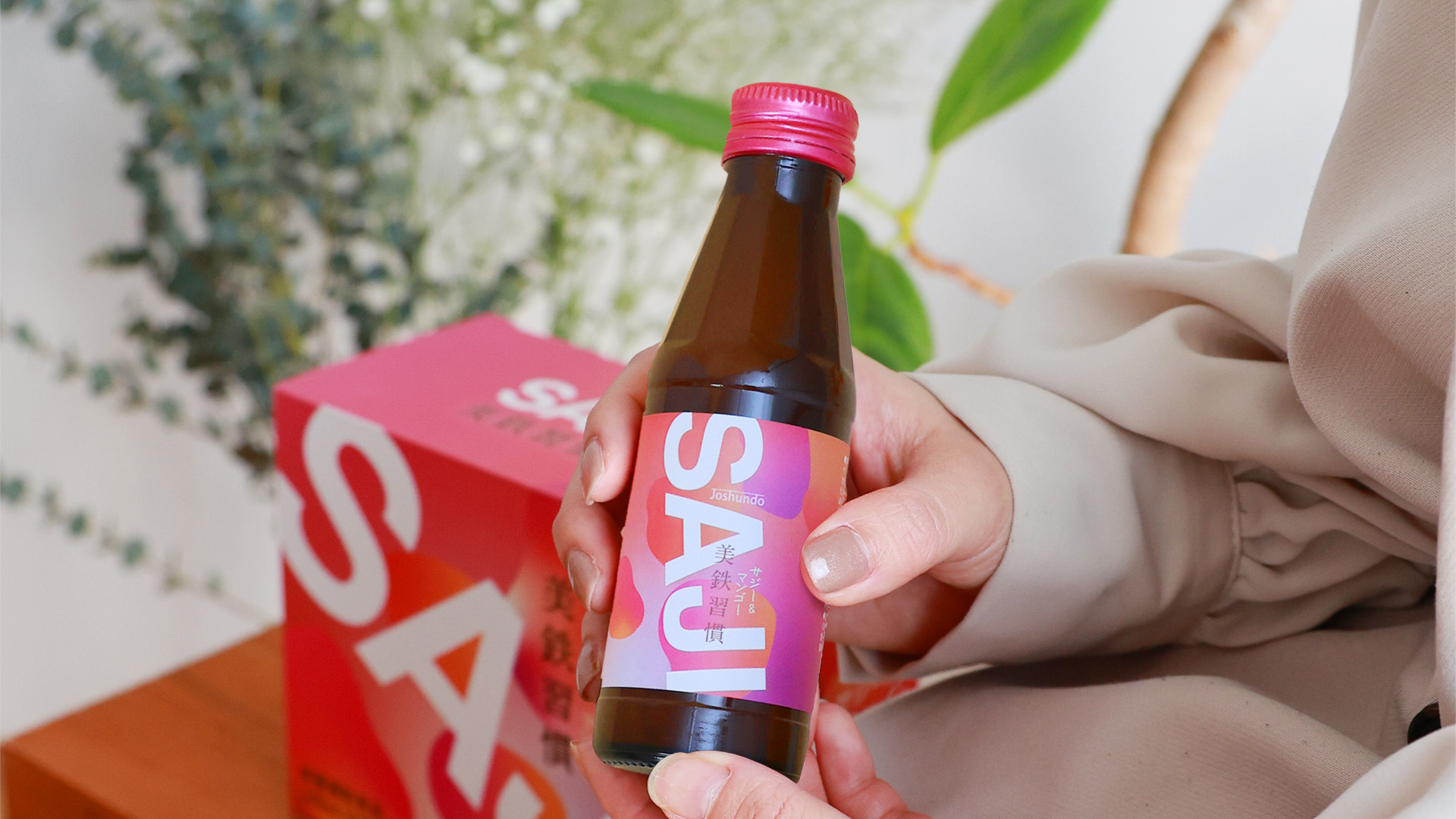
To address these issues, we have adopted a design featuring paper boxes and small bottles. The single-serving bottle design not only significantly enhances portability but also eliminates the risks associated with improper storage after opening. Moreover, as sea buckthorn products are still in the market development stage, the small bottle packaging is undoubtedly the ideal choice to attract potential consumers and allow them to experience the charm of sea buckthorn.
Does the work consider sustainability (environmentally or commercially, or both)? If so, please explain.
From a commercial perspective, we aim to create a product that will be favored by consumers worldwide over the long term by prominently displaying the word "SAJI" in bold English lettering on the packaging. The promotion of sea-buckthorn in Japan holds significant health benefits, as it provides consumers with abundant nutrients while also enhancing awareness of the plant’s value.
Additionally, the cultivation of sea-buckthorn has an ecological role in preventing desertification, contributing positively to environmental protection and sustainable development. More importantly, the harvesting of sea-buckthorn provides local farmers with a stable source of income during the winter season, helping to improve their economic conditions. This reflects the company’s commitment to environmental sustainability and social responsibility.