
Type of applicant company
设计机构
Country
中国
Company Website
http://www.zg-ad.com.cn
Images

Brand of the Product
GraceFlow
Designer Name
Perfect Point Design Team
Position of Designer
Perfect Point Design Team
Target Consumer
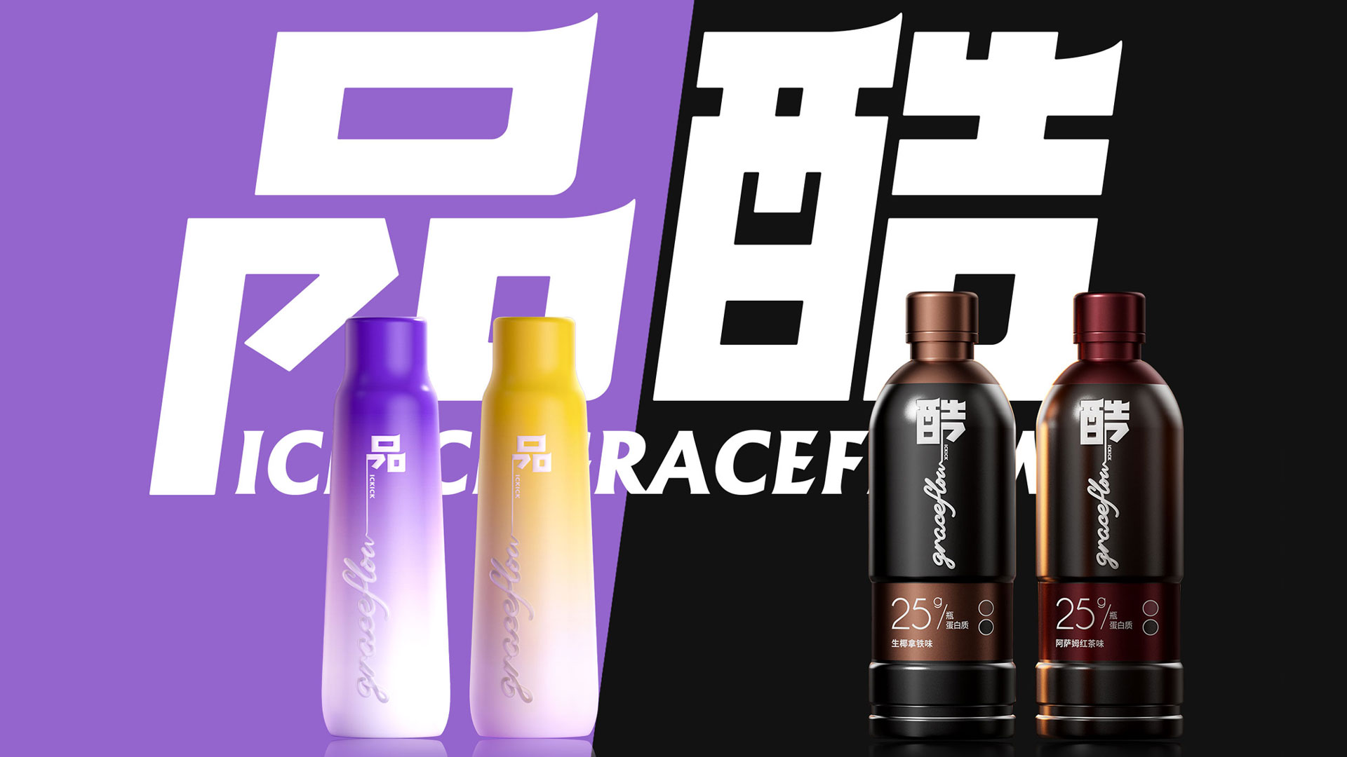
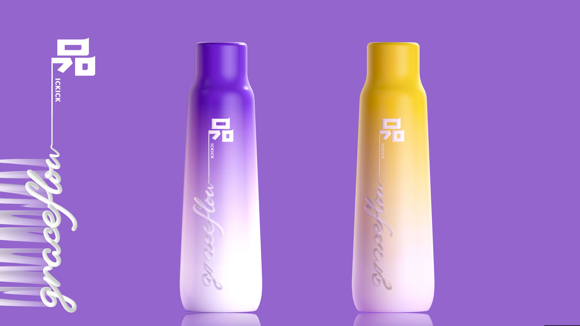
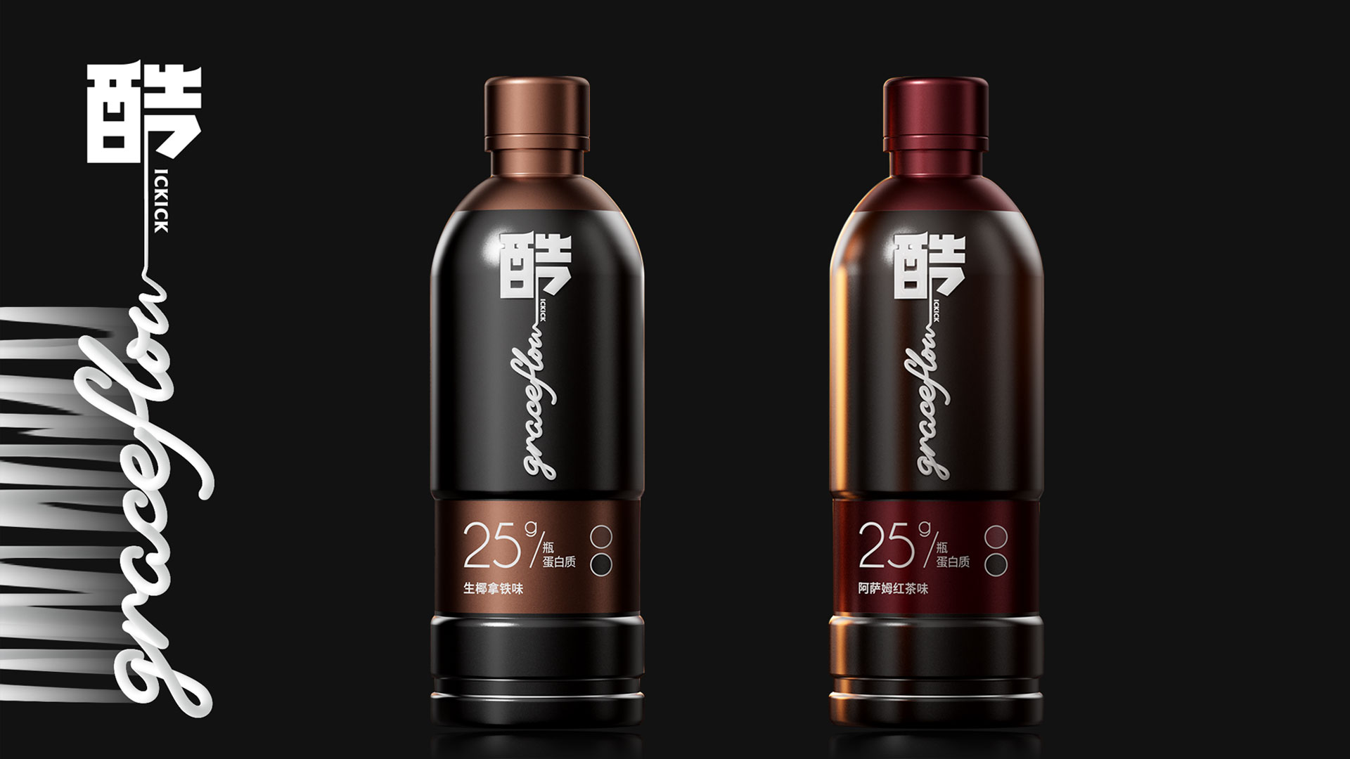
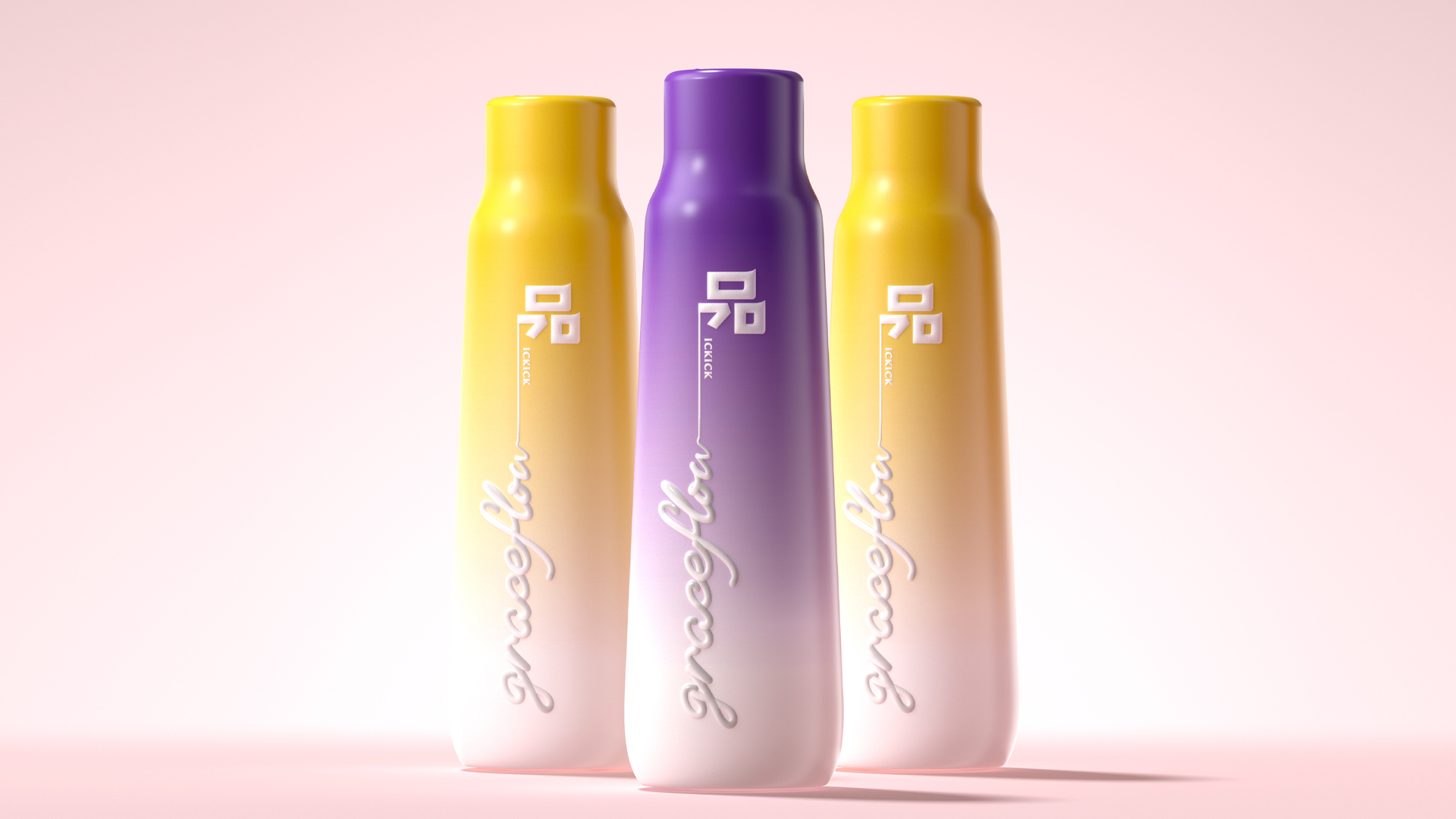
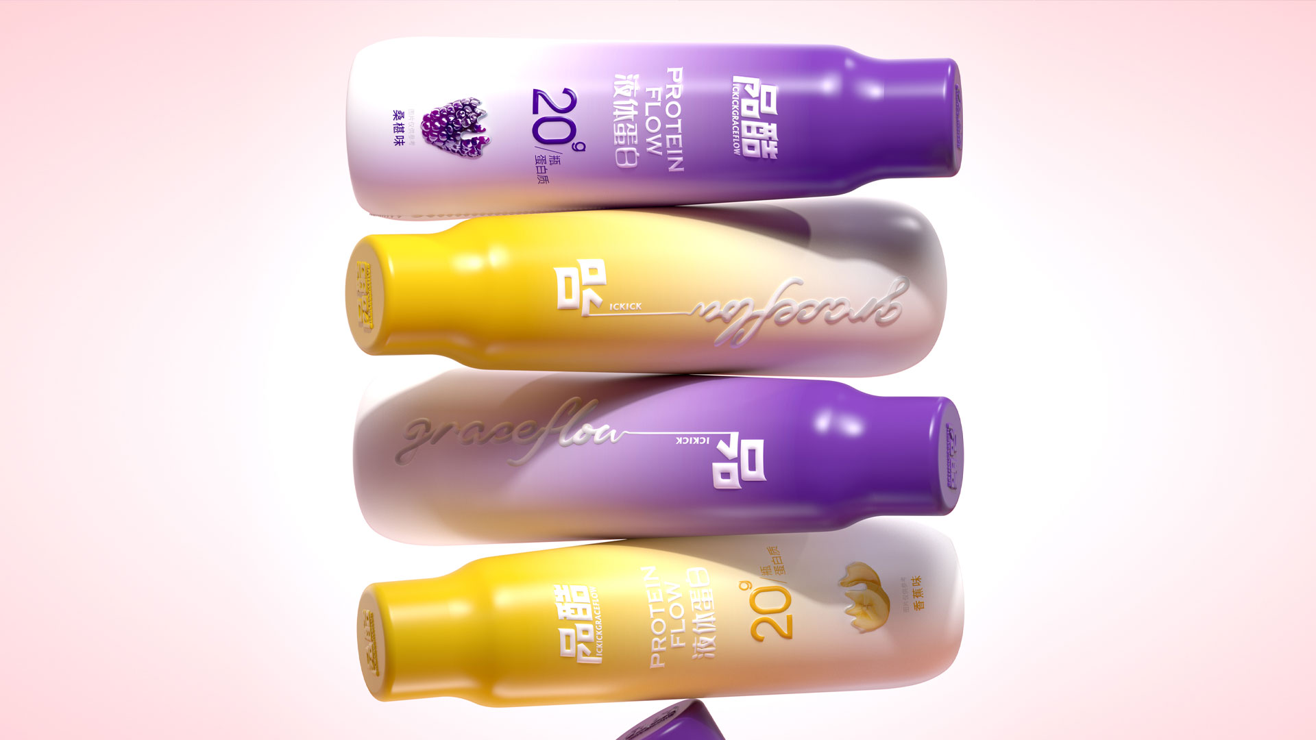
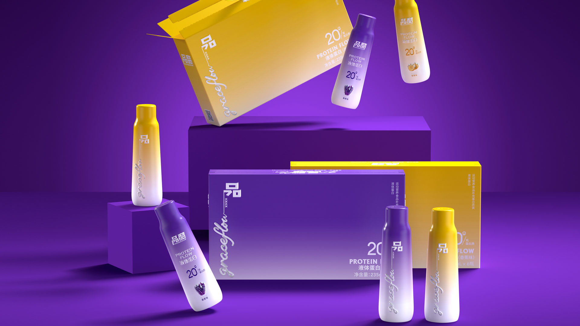
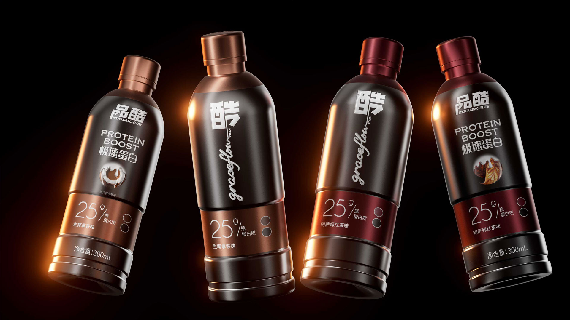
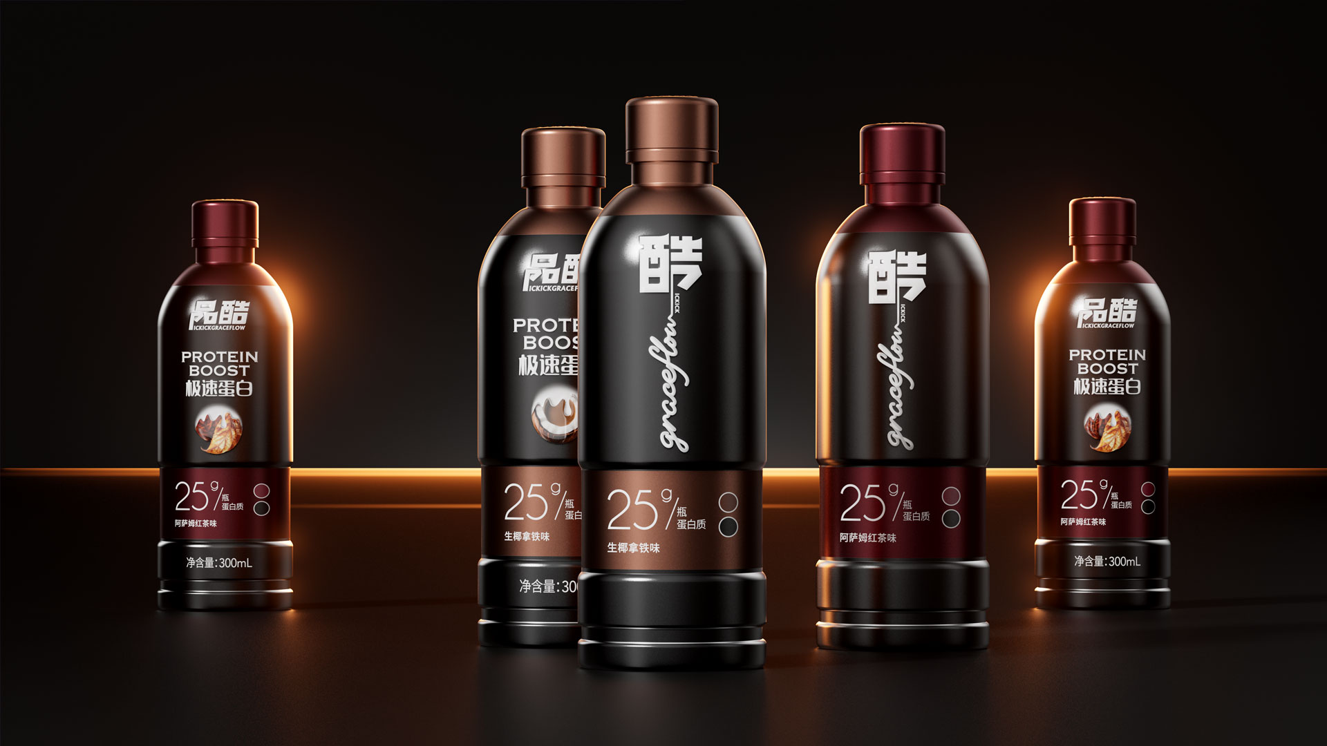
品酷 GraceFlow PROTEIN BOOST 健身蛋白产品,精准定位两大核心人群,包装设计独具匠心。“品”系液体蛋白,聚焦休闲塑身人群,尤其是女性消费者,瓶身线条优雅瘦长,尽显轻盈之态;“酷”系极速蛋白,全力服务专业健身男士,瓶型刚健有力,勒口设计贴合手掌,抓握稳固,不同色彩巧妙区分口味。
Distribution Channels
电商 E-commerce
Positioning
大货消费品 Mass Production
Design Story
Pickick GraceFlow PROTEIN BOOST is targeted at fitness enthusiasts and is divided into two series. The "Pin" series features liquid protein, which is suitable for those who do casual body shaping, especially female consumers. The bottle body is slender. The "Ku" series offers rapid protein, which is designed for professional male fitness enthusiasts. The bottle shape is powerful with a neck design for easy gripping, and different colors are used to distinguish flavors.
In terms of design, the brand logo is disassembled, and Chinese characters and English are integrated. The unique visual symbols are formed by the shared strokes of "Pin", "Ku" and the letter "P", fully demonstrating a young and fashionable style and conforming to the brand concept. Pickick GraceFlow PROTEIN BOOST is targeted at fitness enthusiasts and is divided into two series. The "Pin" series features liquid protein, which is suitable for those who do casual body shaping, especially female consumers. The bottle body is slender. The "Ku" series offers rapid protein, which is designed for professional male fitness enthusiasts. The bottle shape is powerful with a neck design for easy gripping, and different colors are used to distinguish flavors.
In terms of design, the brand logo is disassembled, and Chinese characters and English are integrated. The unique visual symbols are formed by the shared strokes of "Pin", "Ku" and the letter "P", fully demonstrating a young and fashionable style and conforming to the brand concept.
Highlights
During the product packaging design process, we delved deep into the core value of the brand name "PinKu" and carefully extracted highly representative product symbols, which were skillfully incorporated into every detail of the packaging. From the overall packaging vision to every display of the product, these symbols continuously appeared, maximizing the exposure and dissemination times of the "PinKu" brand and truly achieving a deep integration of the brand and the product.
In every aspect of the packaging design, we always focused on the preferences and needs of the target audience. From the shape and color selection of the brand logo to the line design and material texture of the bottle shape, everything was meticulously crafted to ensure a perfect match with the aesthetics and usage habits of the target consumer group, leaving a deep and unique impression of the "PinKu" brand in the minds of consumers.
Market Performance
Tiktok and Tmall average 5-6 RMB a month
Material(For concept works, please choose the material you plan to use)
PET塑料 PET material; 纸质 Paper
Craft
Bottle body: PET bottle sticker fully wrapped, partially oiled, outer box: silver card
Does the design solve the problems that are common across the product category? If so, please explain.
1. How can a new brand double its exposure? We disassembled the brand name and created product lines for two core consumer groups accordingly. We skillfully incorporated brand elements into the packaging. Whether it's the label or the bottle body, the brand characteristics are shown everywhere, greatly increasing the exposure probability.
2. How to differentiate from competing products? We started with the packaging shape and used a minimalist design language, focusing on highlighting the brand symbol. We conducted in-depth research on the shape and color matching to ensure a significant distinction from competing products.
Finally, the presented design is simple, fashionable and distinctive, precisely meeting young people's pursuit of high-appearance products and helping the brand stand out in the market.
What functional designs of the work have enhanced the user experience?
The "Product" series - liquid protein, focuses on the casual body shaping crowd, especially female consumers, with elegant and slender bottle lines, showing a light and agile state; The bottle sticker uses a very textured touch film.
Cool "series - Speed Protein, fully serving professional fitness men. The bottle shape is sturdy and powerful, with a clasp design that fits the palm for a stable grip. Different colors cleverly distinguish flavors.
Did the design help increase the sales performance of the product? If so, please give related evidence.
From the beginning of product design, the founder's proposition was to prioritize appearance, as the main sales channel is e-commerce. We have achieved the goal of encouraging fans to take photos, check in, and publish on their own initiative. Make the product more social. After the product was launched in July 2024, it ranked third on Weibo's local search list, with a total reading of 11.216 million and a listing time of 24 hours. It was also included in Baidu's hot search list
Does the work consider sustainability (environmentally or commercially, or both)? If so, please explain.
We use environmentally friendly paper for the outer box packaging