
Type of applicant company
设计机构
Country
中国
Company Website
https://www.modern-c.cn/
Images
Brand of the Product
Bowmore
Designer Name
Steven.Tam(Creative)\ Sharon.Ouyang(Account)\ Carl.Wang(Creative)\ Linya.Shen(Design)\Yiping.Shen(Illustrator)\ Bruce.Shen(Account)
Position of Designer
Steven.Tam(Creative Director)\ Sharon.Ouyang(Account Director)\ Carl.Wang(Creative Director)\ Linya.Shen(Design Director)\Yiping.Shen(Illustrator)\ Bruce.Shen(Account Manager)
Target Consumer
35years old+, High - net - worth individuals(HNWIs)
Distribution Channels
电商 E-commerce; 其他销售渠道 烟酒行
Positioning
限量款/联名款/区域限定 Limited Edition/IP Collaboration/Located Edition
Design Story
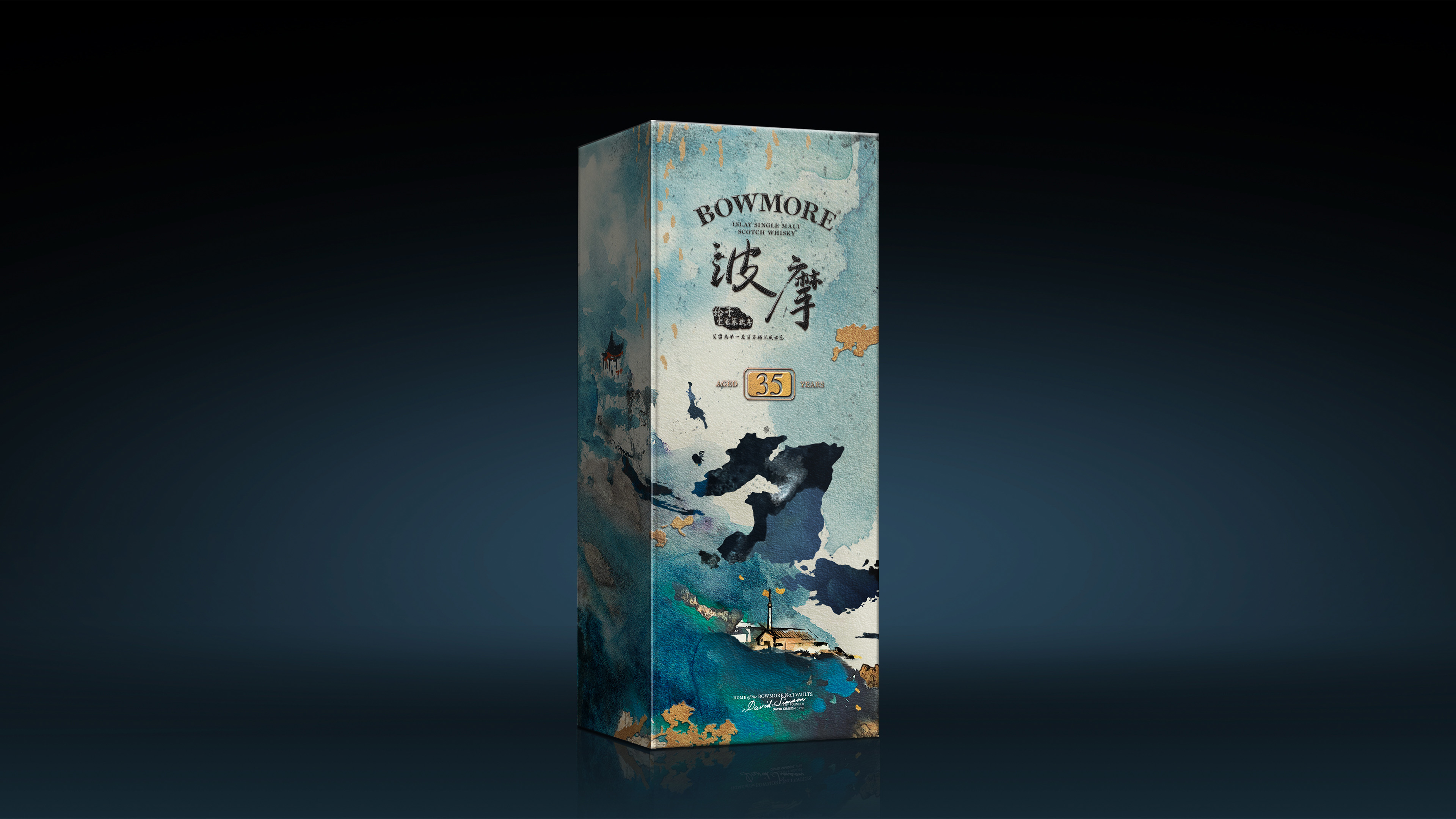
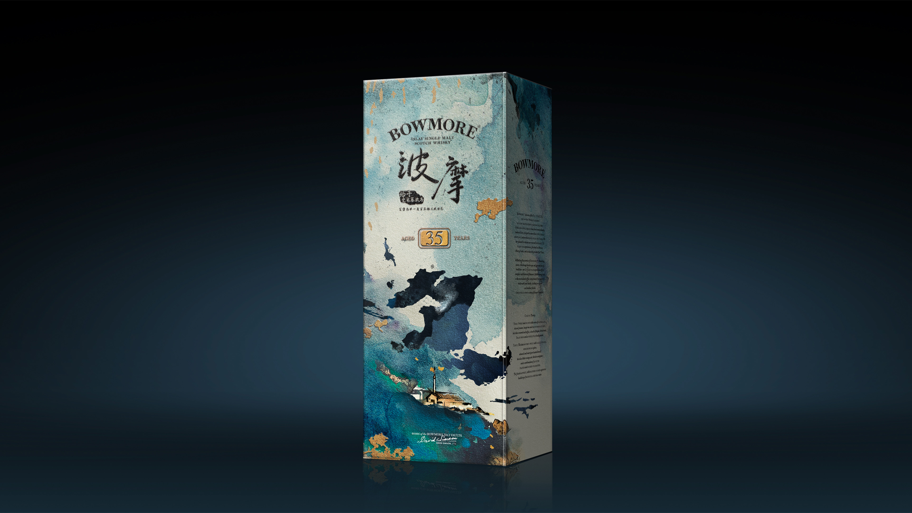
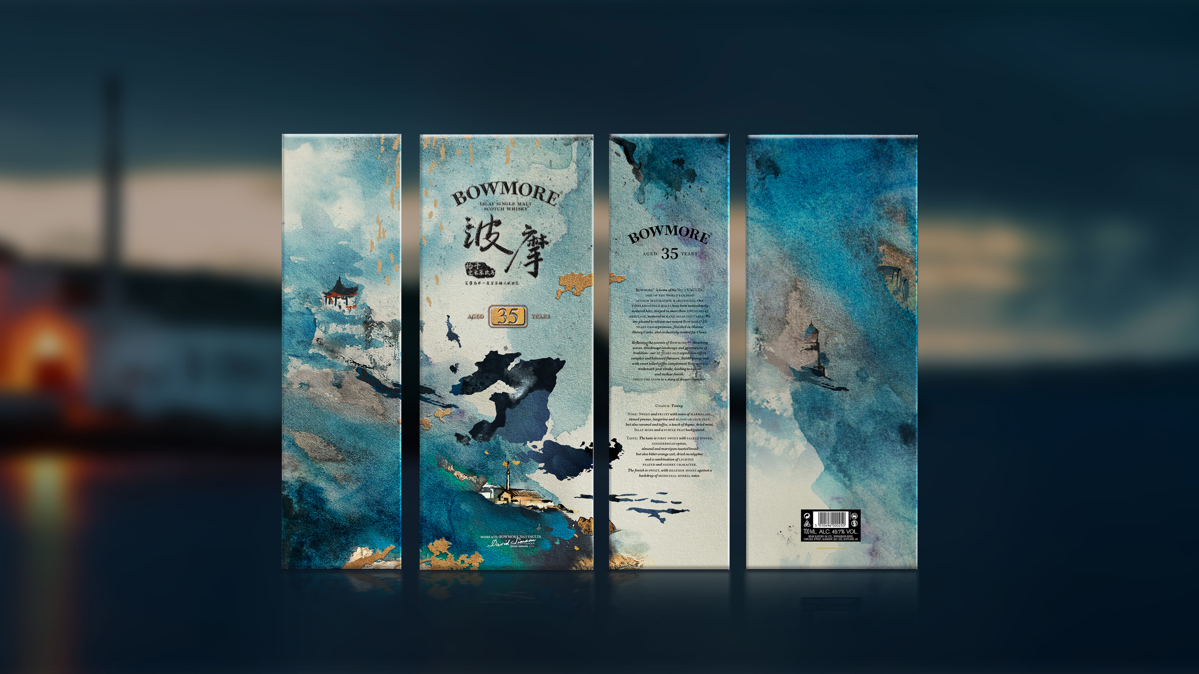
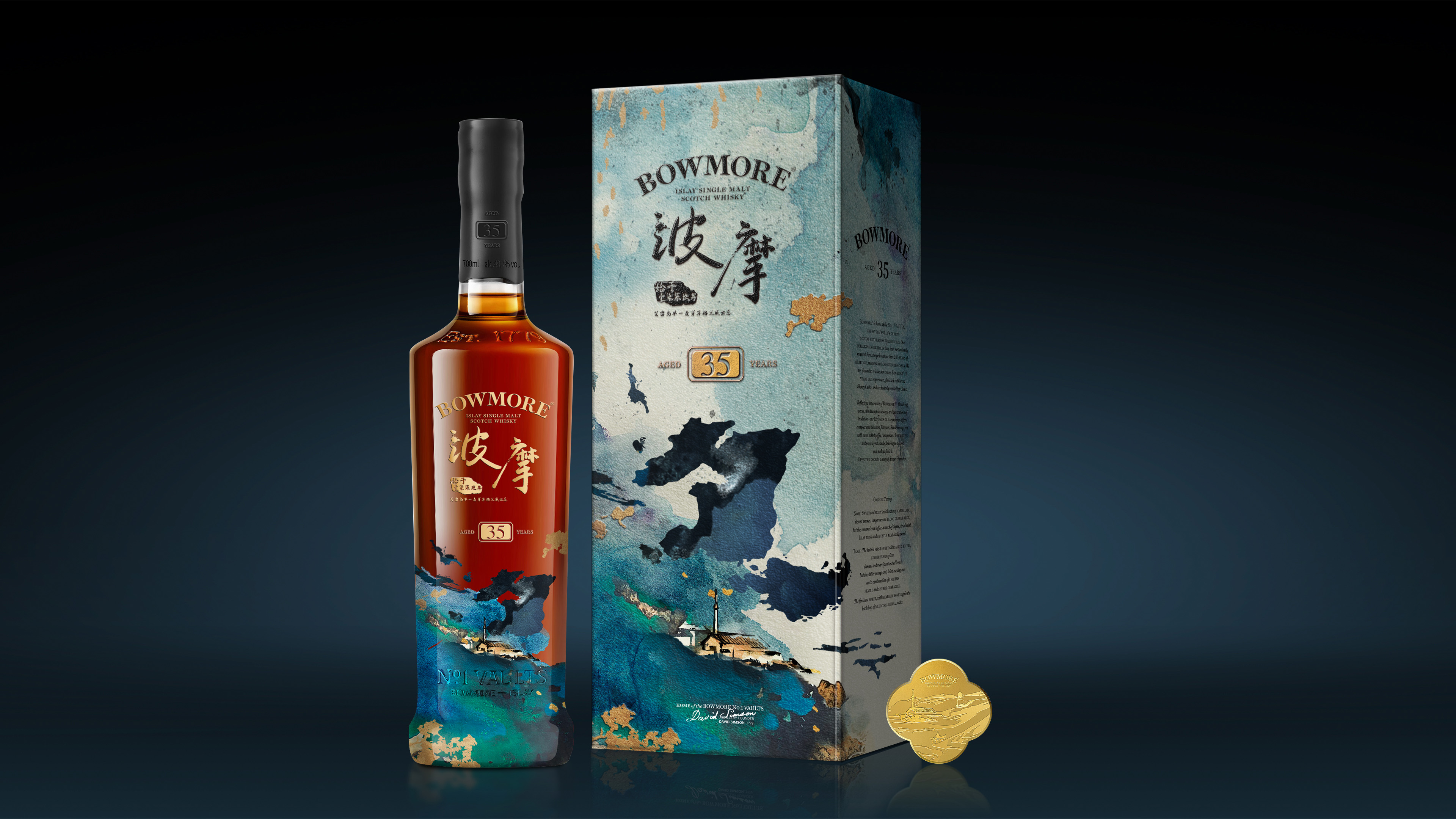
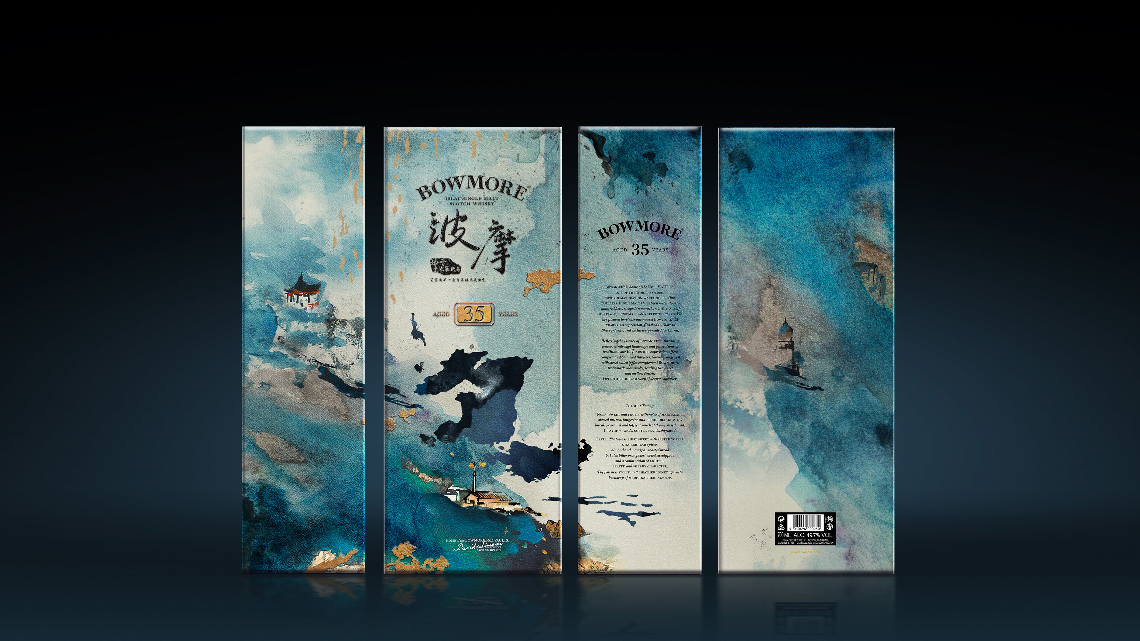
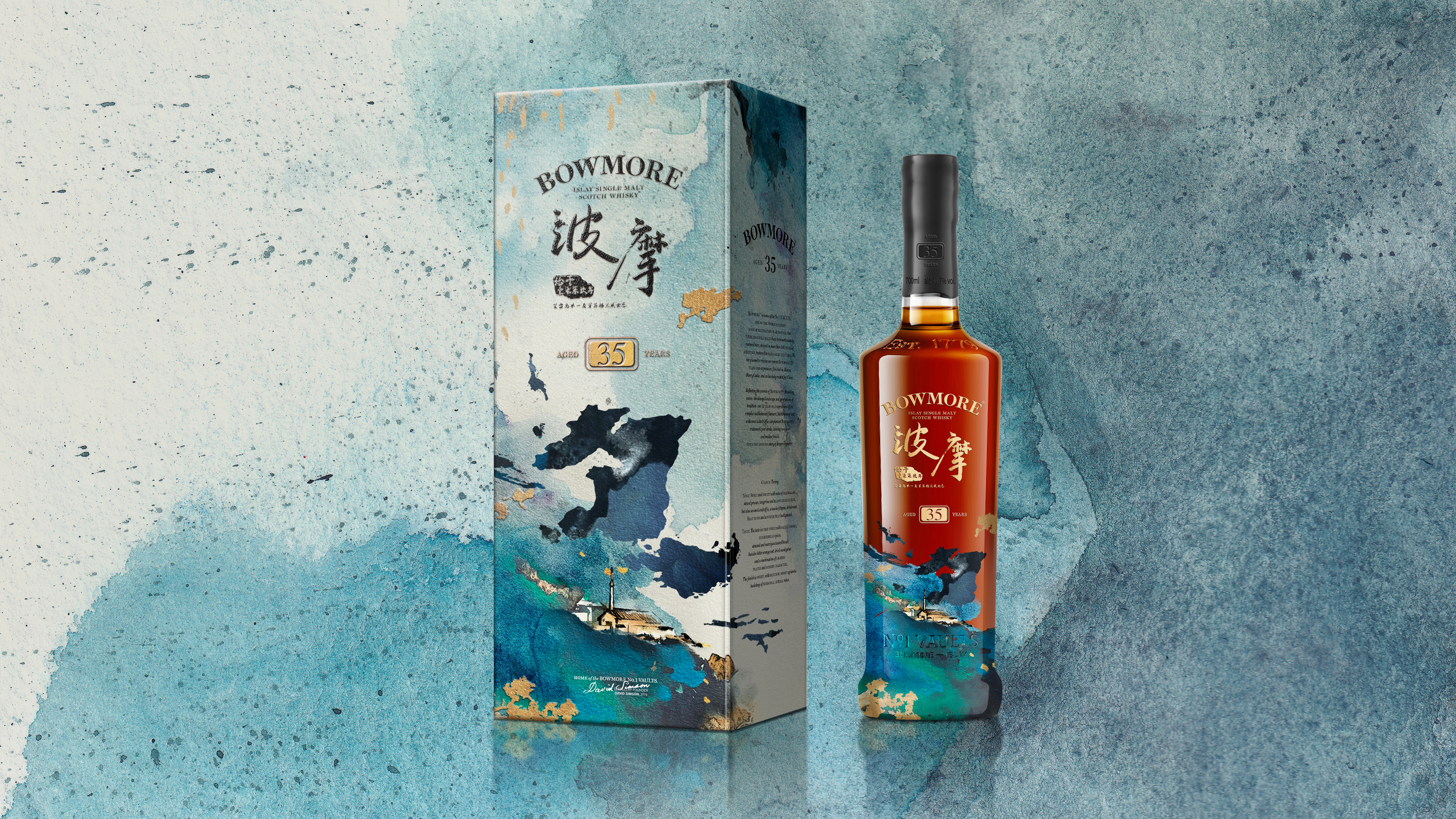
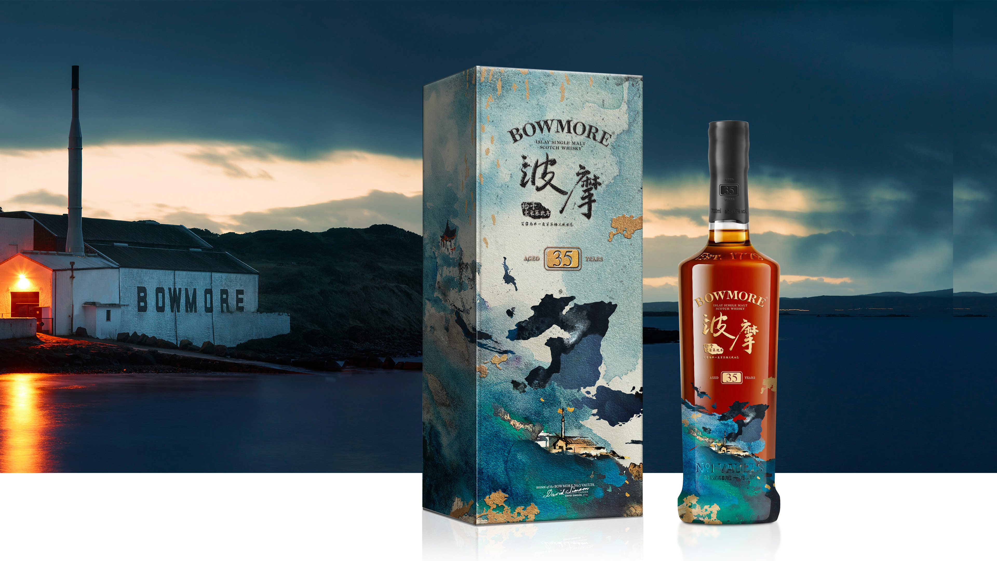
The Encounter of Traditional Chinese Gardens and Western Whisky Craft
Bowmore 35Y.O. Limited Edition whisky packaging design is inspired by the classical Chinese concept of the “aroma garden,” a space symbolizing both tranquility and reflection, while also representing an essential aspect of life itself.
Drawing on montage techniques, the design blends elements of a classical Chinses garden such as plants, flowers, rocks, water, and architecture with the natural beauty of Bowmore’s home on Scotland’s Islay island. This fusion of Eastern and Western cultural symbols creates a poetic and deeply symbolic visual experience.
The theme, REFLECTION OF THE AROMA GARDEN uses the imagery of water reflections to evoke the Eastern philosophy of balance between reality and illusion. At the same time, it symbolizes the whisky’s 35 years of ageing, encapsulating its depth of flavor and rich aromas, inviting the connoisseur on a journey of sensory discovery.
Highlights
The design adopts a soft, watercolor-inspired aesthetic, seamlessly blending the rugged landscapes of Islay with the contemplative serenity of a classical Chinese garden. The imagery of reflections in water subtly mirrors the whisky’s maturation process, where time and patience create depth and complexity. This melding of cultural symbolism from both East and West underscores the global appreciation for Bowmore’s craftsmanship.
The color scheme combines serene blue-greens with accents of gold, evoking the maritime environment of Islay while symbolizing the luxury and refinement of a 35-year-aged whisky. The fluid, organic composition reflects the multi-layered complexity of Bowmore's whisky, blending history, heritage, and innovation into a visual narrative that mirrors the whisky’s evolving flavors.
Market Performance
none
Material(For concept works, please choose the material you plan to use)
纸质 Paper
Craft
The packaging is enhanced by innovative techniques, such as embossing and reverse UV printing, which add rich layers of texture and depth. The embossing lends a sculptural quality to the surface, creating a raised, tactile effect, while the reverse UV printing introduces a subtle play of light and shadow, reflecting the fluidity and complexity of the whisky itself.