
Type of applicant company
设计机构
Country
中国
Company Website
http://hybsj.cn/
Images
Brand of the Product
Daijian
Designer Name
Qixuan jing、Jian zhang
Position of Designer
Creative director
Target Consumer
Sea buckthorn pulp suitable for people: 1. Women with poor skin tone, dullness and melasma; 2. Often eat oil fried, pickled products, canned, barbecue and other food; 3. People who use computers and mobile phones for a long time; 4. People with sub-healthy bodies who need conditioning.
Distribution Channels
电商 E-commerce
Positioning
大货消费品 Mass Production
Design Story
Background of the Work: Design a packaging for a Shahe juice concentrate product primarily targeting e-commerce channels.
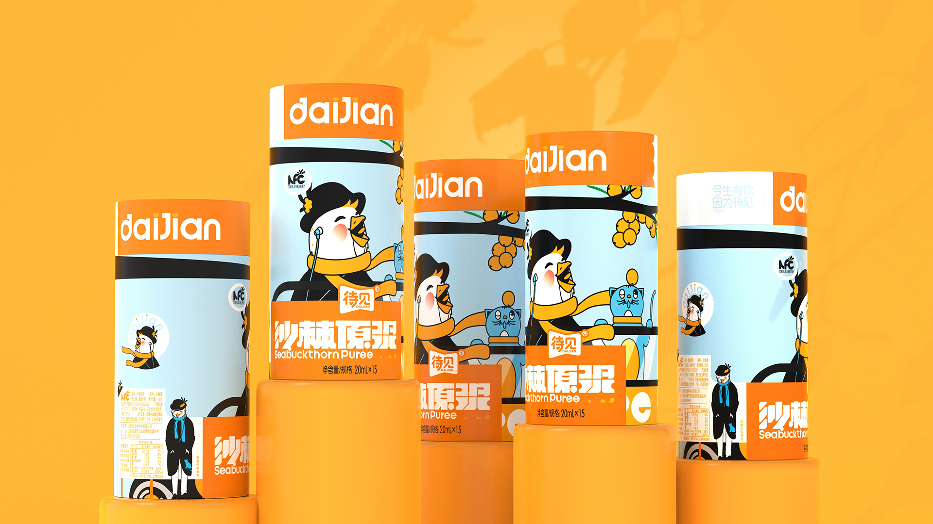
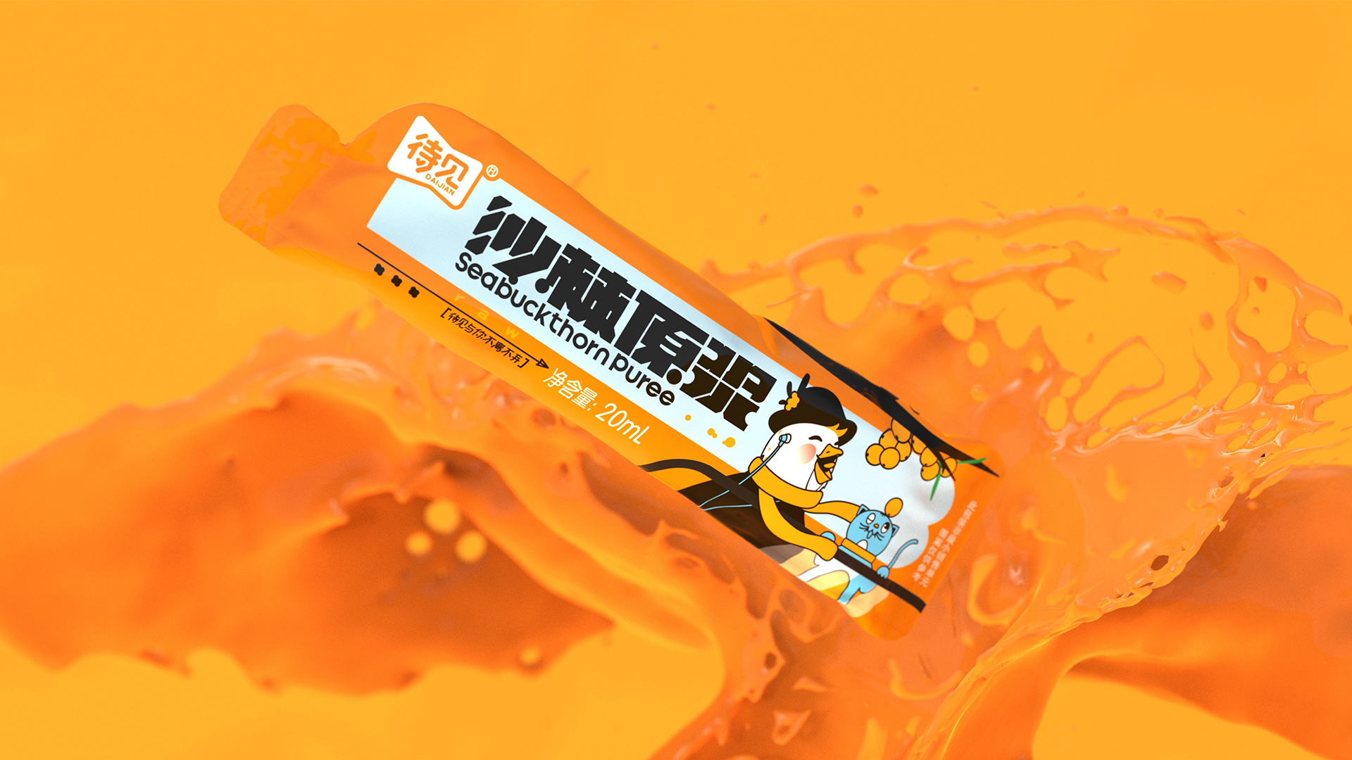
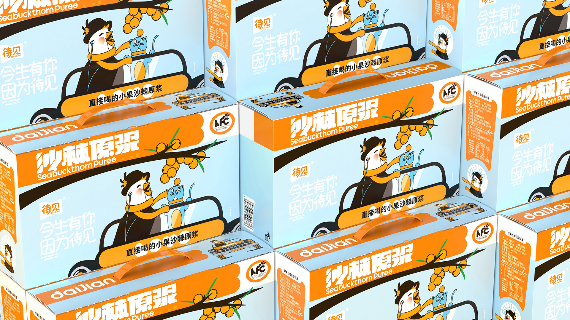
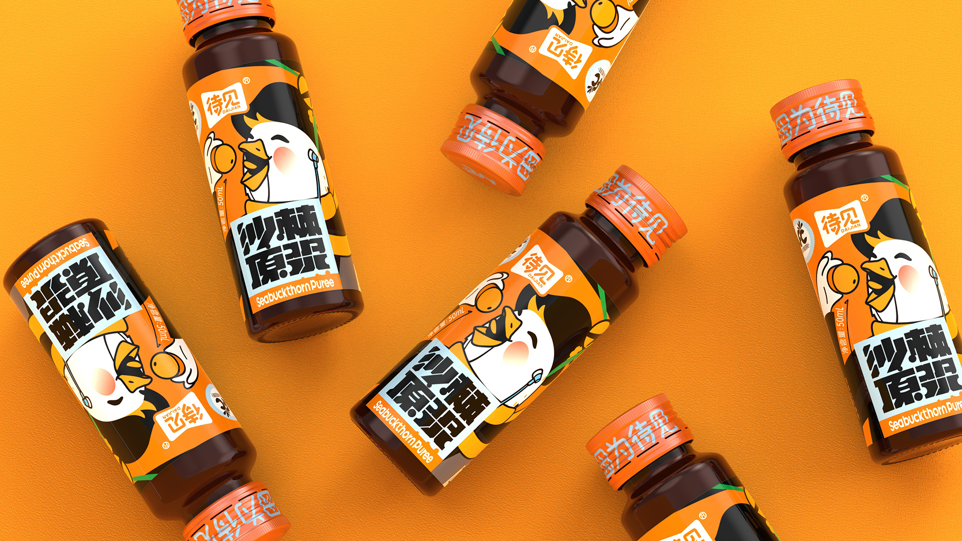
Design Concept: The Shahe juice concentrate packaging design features bright orange and blue as the main colors. Orange represents the fruit color of Shahe, symbolizing nature and health; blue gives a fresh and cool feeling. The packaging uses cartoon IP character images holding Shahe fruit, making it lively and interesting, which can attract consumers' attention and make the product look more approachable, suitable for young consumer groups. The typography is simple and straightforward, with the core product attribute "Shahe juice concentrate" highlighted for easy consumer identification. The brand logo is placed prominently on the packaging to reinforce the brand image and enhance brand recognition. All elements in the packaging maintain a consistent brand style, reinforcing the brand image and helping to establish brand awareness and loyalty.
Highlights
The highlight of the product is the packaging, which features the brand's IP creation, adding fun and affinity, suitable for e-commerce promotion and appealing to young consumers and family users. The cartoon IP holds a sea buckthorn fruit, conveying the main ingredient and health benefits of the product. Meanwhile, the product comes in various packaging forms, including bottles, cans, and boxes, to meet the needs and usage scenarios of different consumers. The diversified packaging design not only enhances the aesthetics of the product but also increases its practicality and market competitiveness.
Market Performance
No
Material(For concept works, please choose the material you plan to use)
PET塑料 PET material; 纸质 Paper
Craft
1. The packaging box is made of paper material that matches the UV effect, reducing packaging costs. It also considers environmental factors as much as possible and uses recyclable materials, which aligns with modern consumers' emphasis on environmental protection.
2. The inner packaging of the product includes various packaging forms, including bottles, bags, and cans, to meet the needs and usage scenarios of different consumers, and also makes it convenient to carry and enjoy the product.
Does the design solve the problems that are common across the product category? If so, please explain.
1. Unclear target audience - Solution: Conduct market research to clarify the needs, preferences and consumption habits of the target audience, and adjust the design plan accordingly.
2. Unclear information delivery - Solution: Simplify design elements, make sure that the main information (such as brand name, product name, IP, etc.) stands out and is easy to understand, use clear and easy to read fonts and high-contrast colors.
3. Lack of uniqueness - Solution: Create a distinctive packaging style through innovative design concepts and unique visual elements.
What functional designs of the work have enhanced the user experience?
1. Portability: The product is packaged in small bottles and strips, easy to carry and use, suitable for drinking anytime and anywhere.
2. Clear information: the product name, ingredients and use methods are clearly marked on the packaging to help consumers quickly understand the product information.
3. Visual appeal: the packaging design is colorful, the pattern is vivid and interesting, attracting consumers' attention and increasing their desire to buy.
Did the design help increase the sales performance of the product? If so, please give related evidence.
It has not yet been fully rolled out.
Does the work consider sustainability (environmentally or commercially, or both)? If so, please explain.
1. IP creation: Create a core visual IP image for the brand, which is easy to convey and remember.
2. Brand information: There are words of "sea buckthorn pulp" on the package. Sea buckthorn is a plant with high nutritional value, and its cultivation and utilization can promote ecological balance and environmental protection. The product itself is environmentally friendly, so the packaging also indirectly reflects sustainability.
3. Versatility: The packaging design is not only beautiful, but also has a variety of functions, such as easy recycling, reusable, etc., which also reflects sustainability.