
Type of applicant company
设计机构
Country
中国
Company Website
www.qinweidesign.com
Images
Brand of the Product
SUNTORY
Designer Name
Qinwei Design
Position of Designer
无
Target Consumer
People who attach importance to health and love drinking sugar - free tea.
Distribution Channels
电商 E-commerce; 大型商场 Shopping Mall; 小型商超和便利店 Supermarket & CVS; 杂货店 Grocery
Positioning
大货消费品 Mass Production
Design Story
With the improvement of health awareness, more and more people like to drink sugar - free tea.
Barley tea contains no caffeine, making it a good choice for people whose sleep is affected by drinking tea. Its unique wheat aroma and refreshing taste are deeply loved by consumers.
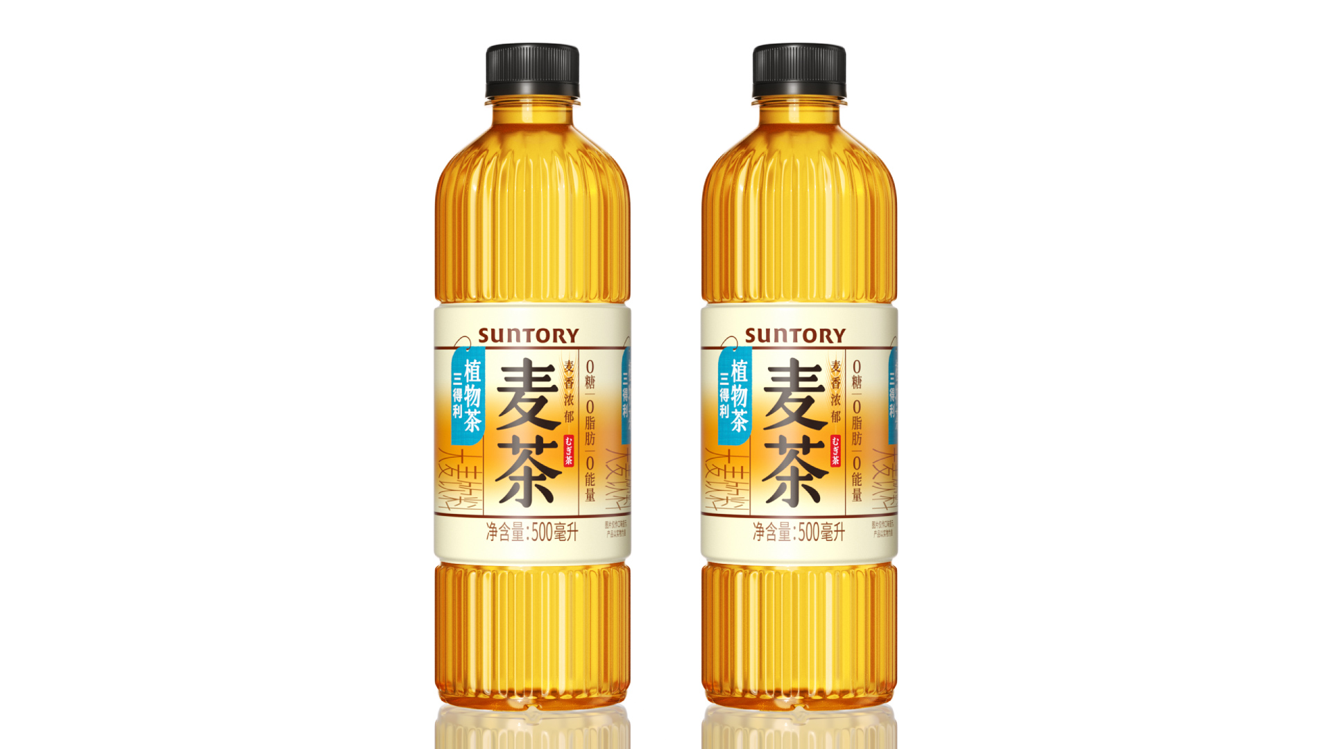
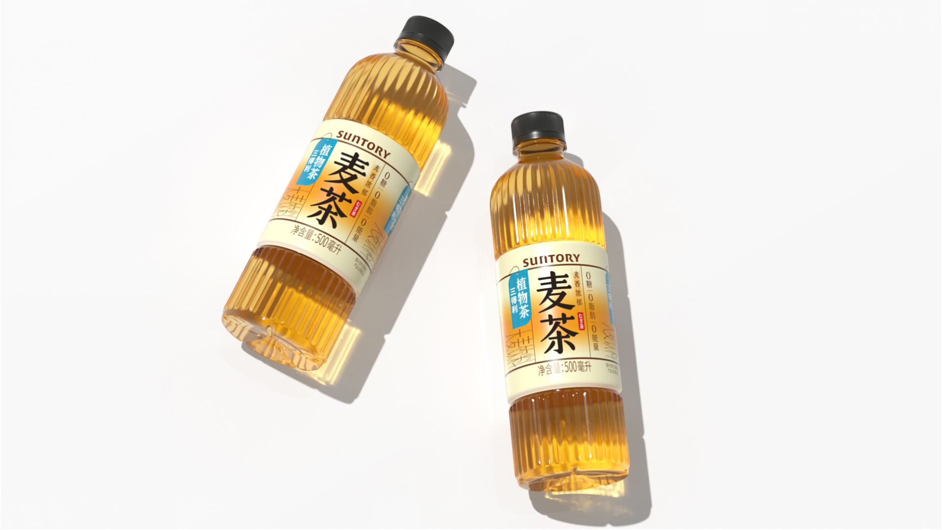
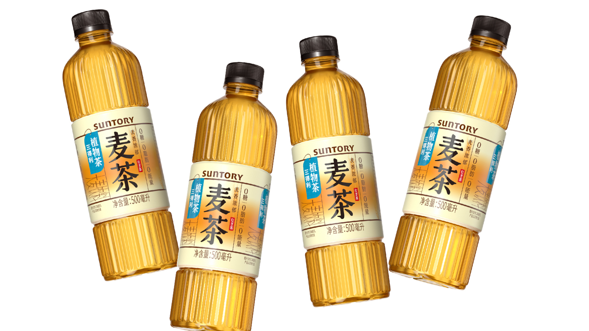
The packaging design of SUNTORY Barley Tea well showcases the product's flavor. The simple and distinctive appearance is eye - catching and memorable at the point of sale.
SUNTORY's barley tea better showcases the product flavor through packaging design and achieves sufficient visibility at the point of sale.
Highlights
The design of SUNTORY Barley Tea is simple and elegant. The eye - catching product name enables consumers to spot it at a glance on the shelf.
By using bright orange and a gradient effect, it recreates the moment when the color of barley tea spreads during brewing. For consumers who love barley tea, this is indeed a unique, familiar and endearing visual memory. Moreover, when the products are displayed together on the shelf, this design can create a highly continuous visual effect.
The stripe design on the bottle adds details to the product's appearance, making the whole product look of excellent quality. The short - label design allows the eyes to quickly focus on the product information and also exposes more of the tea color, creating a more appetizing effect.
Market Performance
The sales volume of the product after its launch has far exceeded the brand owner's expectations.
Material(For concept works, please choose the material you plan to use)
PET塑料 PET material
Craft
PET bottle + PVC shrink film
Does the design solve the problems that are common across the product category? If so, please explain.
无
What functional designs of the work have enhanced the user experience?
The striped bottle design endows the product with a more high - quality appearance. The segmented labels enable consumers to see more of the brown color, enhancing their sense of appetite.
Did the design help increase the sales performance of the product? If so, please give related evidence.
The sales volume of the product after its launch has far exceeded the brand owner's expectations.
Does the work consider sustainability (environmentally or commercially, or both)? If so, please explain.
The short label design reduces the consumption of wrapping film, making it more environmentally friendly.