
Type of applicant company
设计机构
Country
中国
Company Website
www.qinweidesign.com
Images
Brand of the Product
SUNTORY
Designer Name
Qinwei Design
Position of Designer
无
Target Consumer
It can be consumed by all people, and is especially suitable for consumers who enjoy the light and thirst - quenching nature of water while also desiring a fruity flavor.
Distribution Channels
电商 E-commerce; 大型商场 Shopping Mall; 小型商超和便利店 Supermarket & CVS; 杂货店 Grocery
Positioning
大货消费品 Mass Production
Design Story
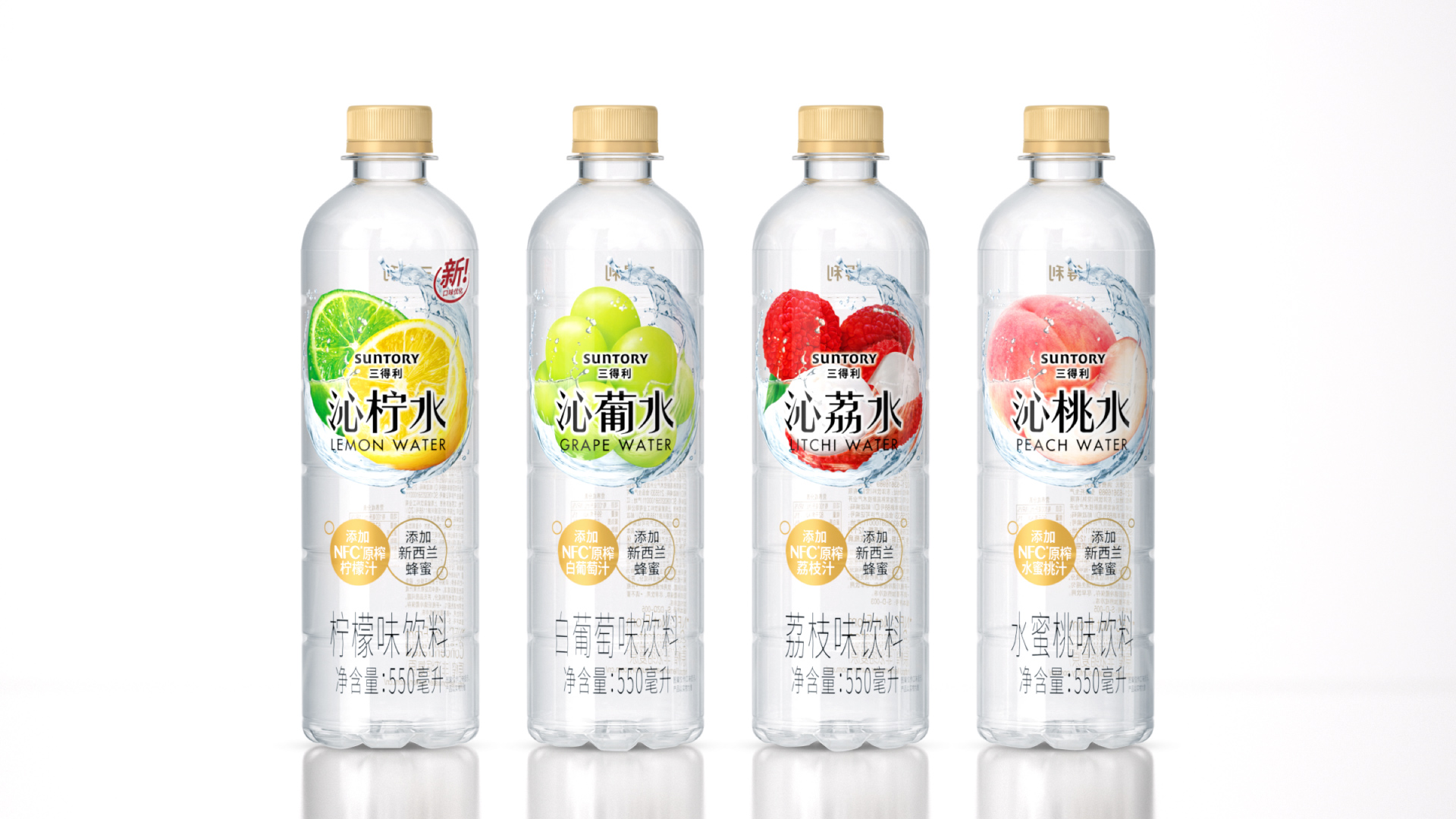
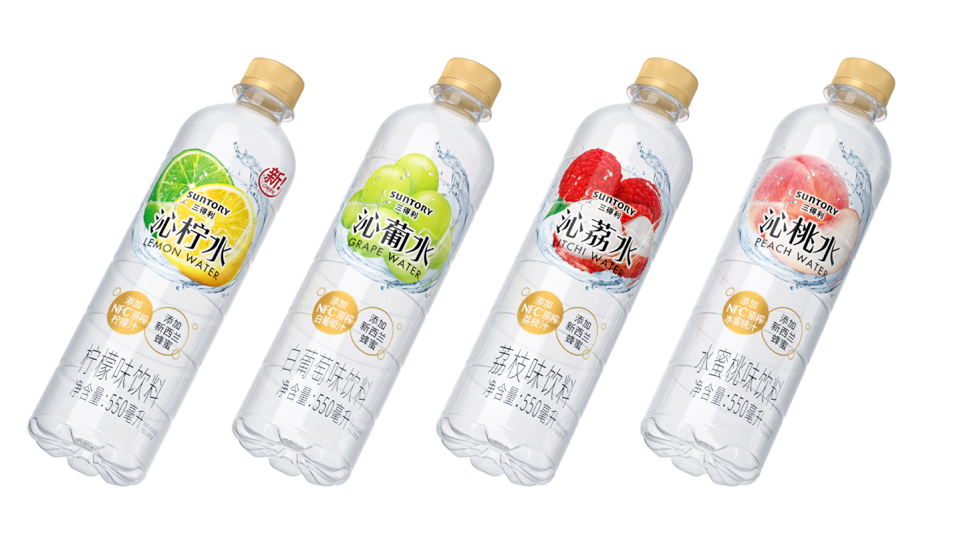
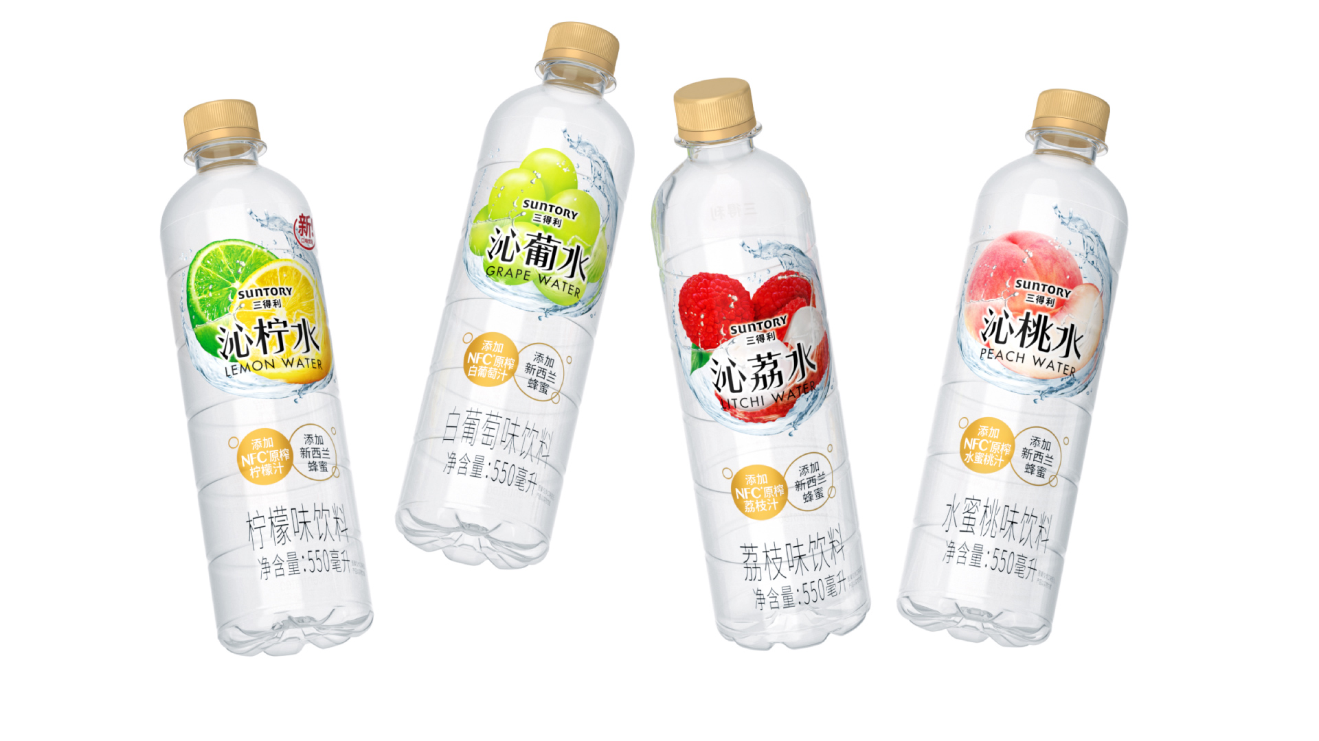
Suntory's "Qin" series of near - water beverages incorporates NFC (Not From Concentrate) freshly squeezed fruit juice and premium New Zealand honey. This carefully selected ingredient combination imparts a natural, refreshing flavor profile, enabling consumers to enjoy a pure and revitalizing taste experience. Beyond simple hydration, the series offers a diverse range of flavors, catering to the distinct taste preferences of consumers.
Having been available in the market for multiple years, the product now debuts with a new packaging, injecting fresh vitality into the long - standing product line and further enhancing its market competitiveness.
Highlights
The exquisitely crafted high - transparency label design offers consumers an unobstructed view, enabling them to directly visualize the beverage's natural, water - like texture, as clear and pure as a mountain stream.
At the heart of the packaging design lies a captivating visual element: a harmonious blend of vivid, mouth - watering fruits and dynamic water waves. This eye - catching combination not only creates a visually stunning aesthetic but also serves as a powerful and immediate cue for consumers who have a craving for delightful fruit - flavored beverages. It effortlessly draws their attention, awakening their taste buds and stirring their desire to experience the unique flavor within the bottle.
Market Performance
The new packaging design features a more refreshing and translucent appearance, fully expressing the product's watery texture and fruit flavors. This has effectively boosted sales.
Material(For concept works, please choose the material you plan to use)
PET塑料 PET material
Craft
PET bottle + PVC shrink film
Does the design solve the problems that are common across the product category? If so, please explain.
无
What functional designs of the work have enhanced the user experience?
The high - transparency label design allows consumers to directly observe the natural and pure texture of the beverage's water. The combination of fruits and water waves can vividly showcase the product's flavor.
Did the design help increase the sales performance of the product? If so, please give related evidence.
The new packaging design features a more refreshing and translucent appearance, fully expressing the product's watery texture and fruit flavors. This has effectively boosted sales.
Does the work consider sustainability (environmentally or commercially, or both)? If so, please explain.
无