
Type of applicant company
设计机构
Country
中国
Company Website
https://www.lkker.com/
Images
Brand of the Product
D-Cal
Designer Name
GAOQING QIUYANSONG LILIANSHIHUI
Position of Designer
Design director
Target Consumer
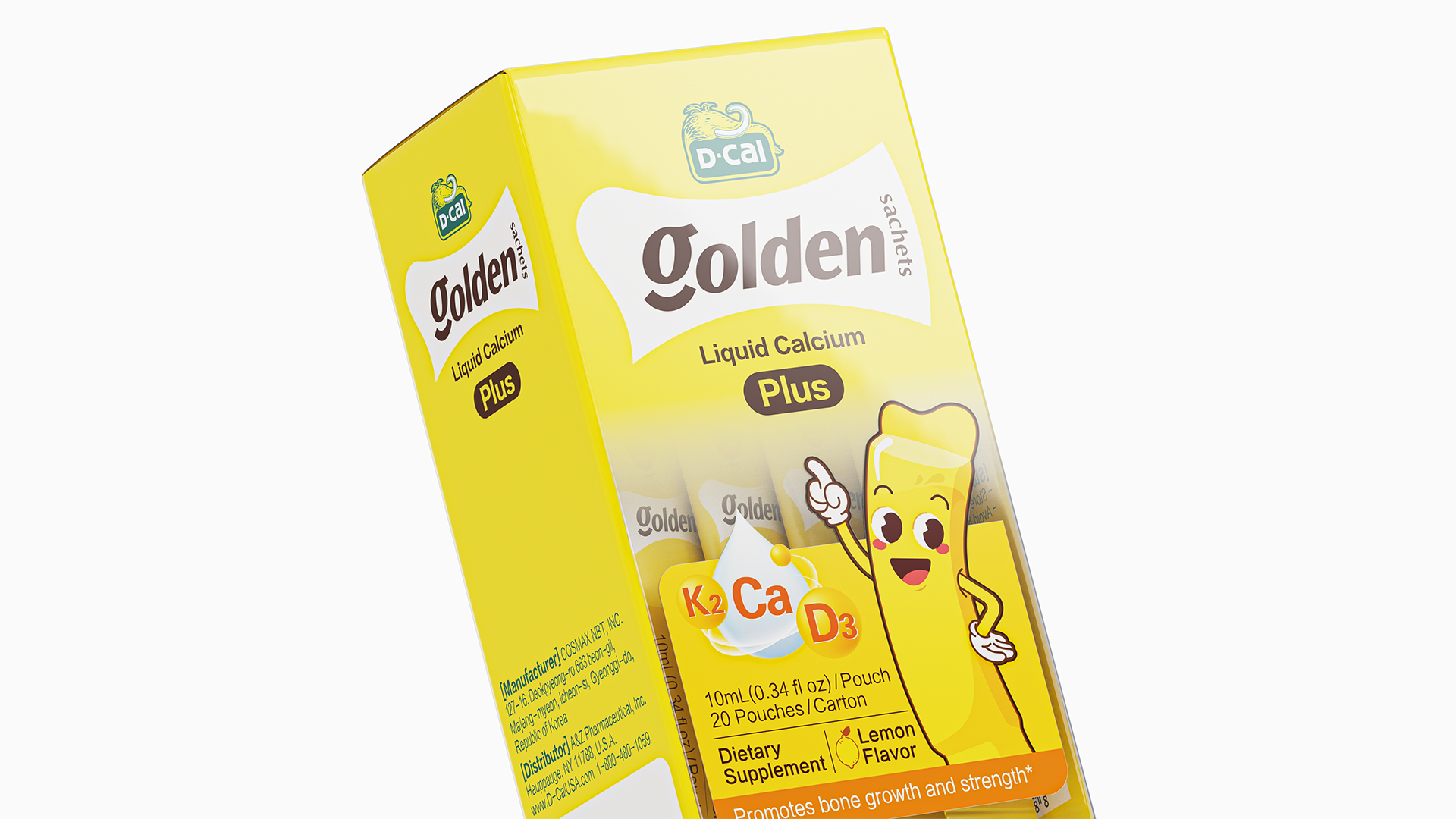
D-Cal Yellow Bar liquid calcium is designed for children with calcium needs, the core competitiveness of the product is "liquid", and the market similar to the pill of calcium tablets in stark contrast.
Distribution Channels
电商 E-commerce; 大型商场 Shopping Mall; 其他销售渠道 抖音等直播平台
Positioning
大货消费品 Mass Production
Design Story
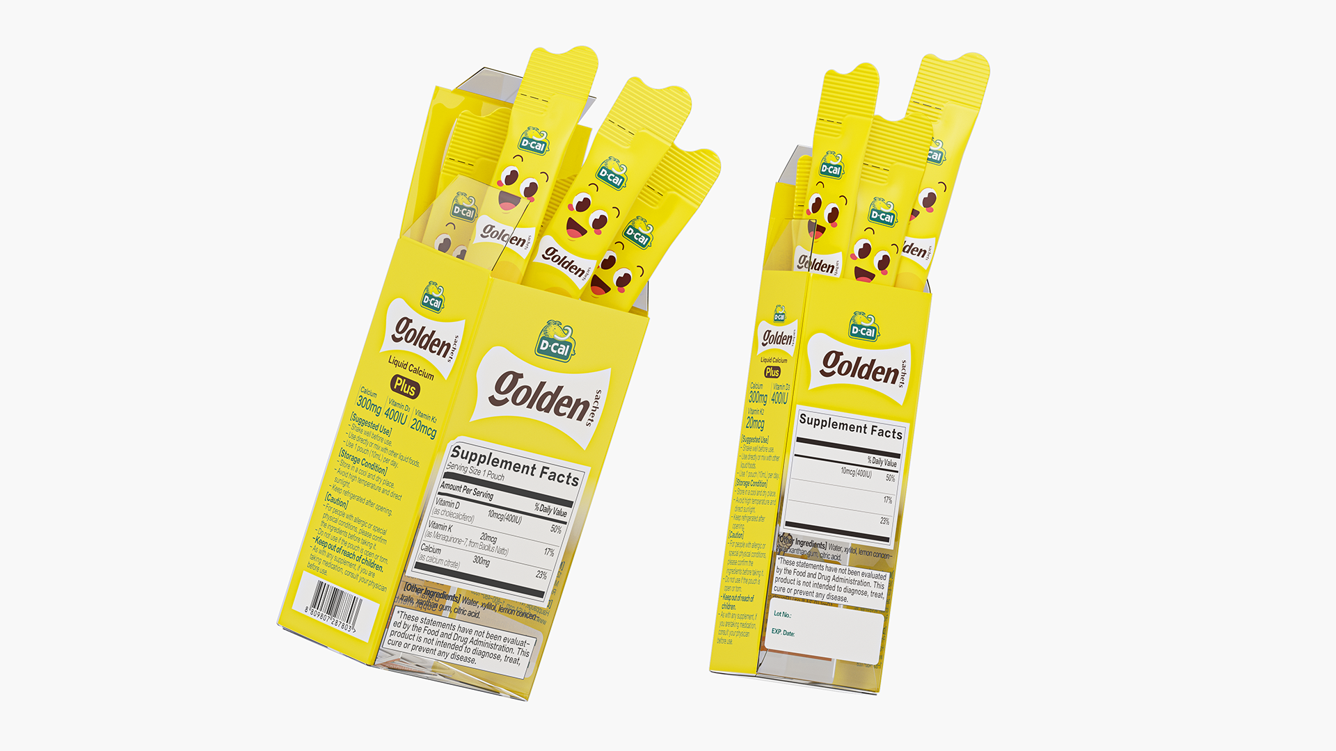
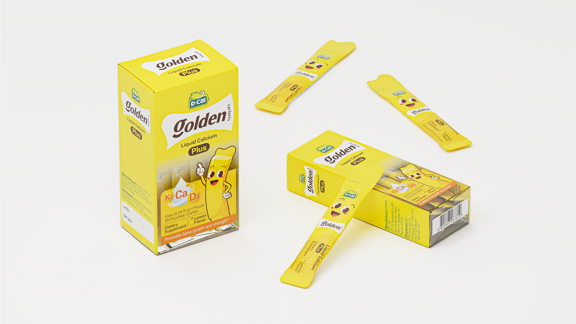
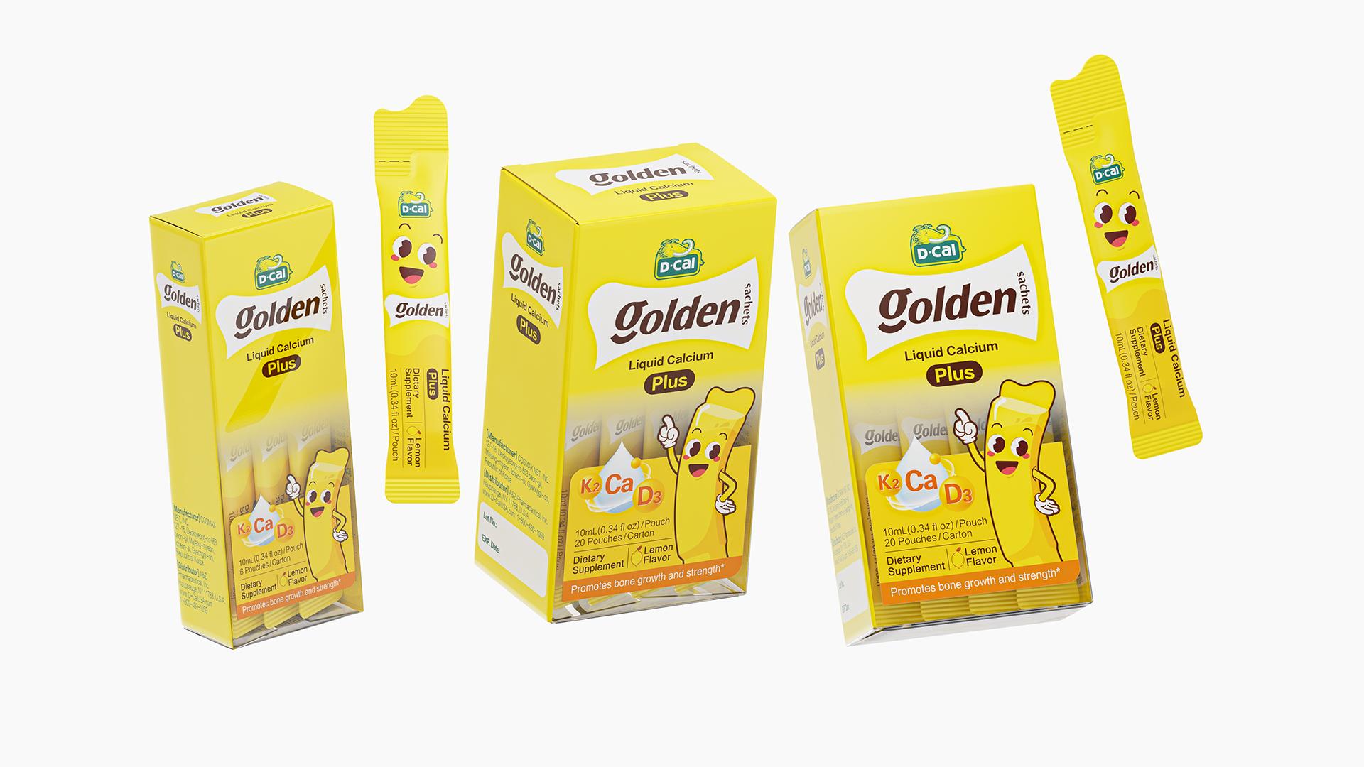
The core competitiveness of the product is "liquid", which is in sharp contrast to the calcium tablets similar to pills on the market. Therefore, the packaging design of the product expands the concept of liquid calcium, forms a very expressive visual hammer symbol, and the product name is combined to show the properties of liquid calcium in small yellow strips. And standardize the brand area. The main color of the packaging is bright yellow, which conveys a vibrant and sunny atmosphere, echoing the healthy properties of the product, and the use of gradual effects enhances the visual dynamic. The central IP image of the packaging is cute and friendly, more attractive to children and family consumers, and establish emotional connections with them. The design highlights of the packaging are also reflected in the inner strip, considering that the liquid calcium is for children to eat, the inner strip is also made of liquid wavy opposite sex design at the opening, more convenient to open, combined with the cute expression of IP, more acceptable to children when eating.
Highlights
1. The packaging design refines the product attributes of the brand's core "liquid calcium", which is in sharp contrast to the calcium agent on the market; 2, pay attention to the user experience, the opposite head design of the small inner strip echoes the product attributes of liquid calcium, but also takes into account the convenience of opening when children eat; 3, the color of the packaging and product categories remain unified, and more competitive shelf.
Market Performance
3 months on the market has sold 100,000 plus
Material(For concept works, please choose the material you plan to use)
PET塑料 PET material
Craft
The outer packaging is made of PET material
Does the design solve the problems that are common across the product category? If so, please explain.
The advantage of liquid calcium itself is to get rid of the experience of calcium tablets like taking "pills", liquid calcium is better accepted for children, and the design magnifies the advantages of its products, reduces the cost of brand education, and makes "liquid calcium" more visually reflected in the packaging and communication.
What functional designs of the work have enhanced the user experience?
The small inner bar is designed with a wavy opposite head, one is to emphasize the product properties of liquid calcium, the second is to facilitate children to open on their own, and the second is to increase the IP cute expression on the design of the inner bar, fully considering the user experience of the children who really drink liquid calcium.
Did the design help increase the sales performance of the product? If so, please give related evidence.
Without evidence
Does the work consider sustainability (environmentally or commercially, or both)? If so, please explain.
The brand area and selling point area of the packaging are strictly regulated, and the category segmentation of the product in the future can continue the packaging specification, form a family presentation, and enhance brand recognition.