
Type of applicant company
设计机构
Country
中国
Company Website
https://www.shinybay.com/
Images
Brand of the Product
Extra
Designer Name
ShinyBay Design Team
Position of Designer
无
Target Consumer
The target audience is young consumers who are facing the pressures of modern life and seek pleasure and stress relief through leisurely and relaxing candy snacks. This group has a preference for cute and interesting designs, is sensitive to brand stories and emotional values, is active on social media, and looks forward to more interaction with brands and personalized experiences.
Distribution Channels
电商 E-commerce; 大型商场 Shopping Mall; 小型商超和便利店 Supermarket & CVS
Positioning
大货消费品 Mass Production
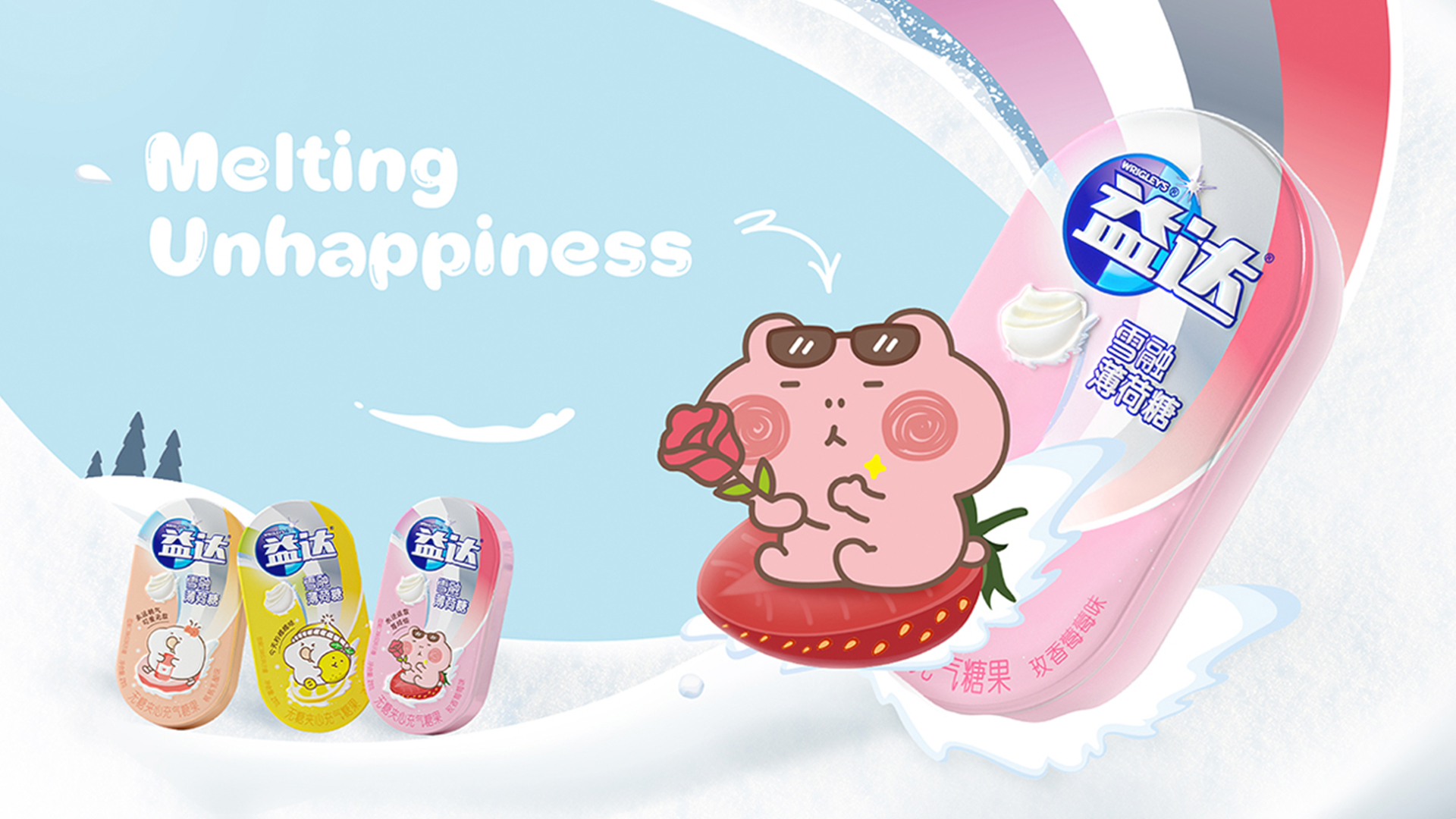
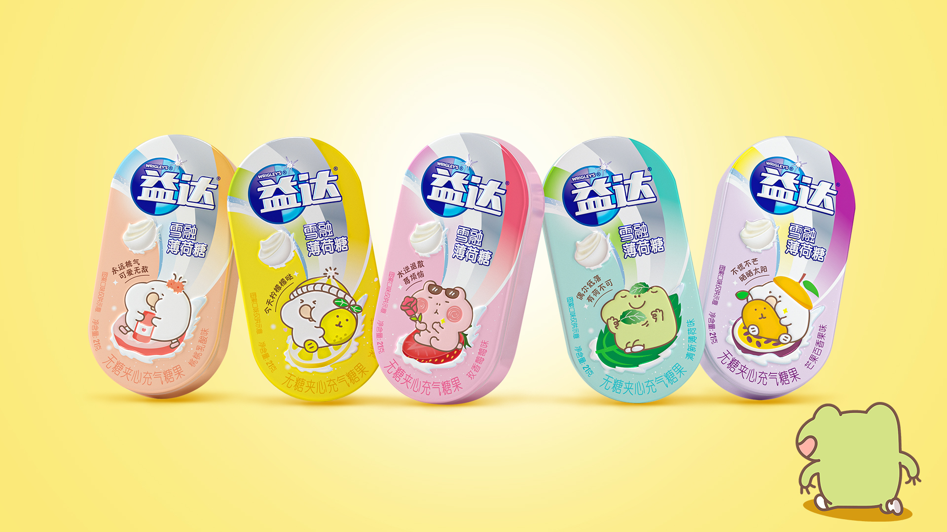
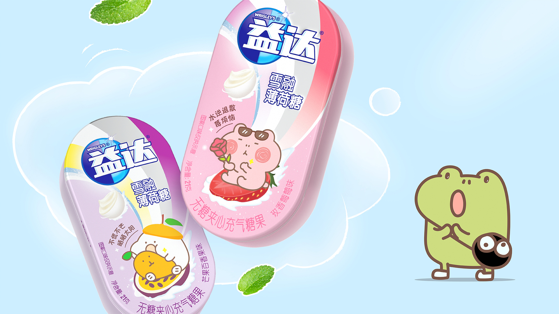
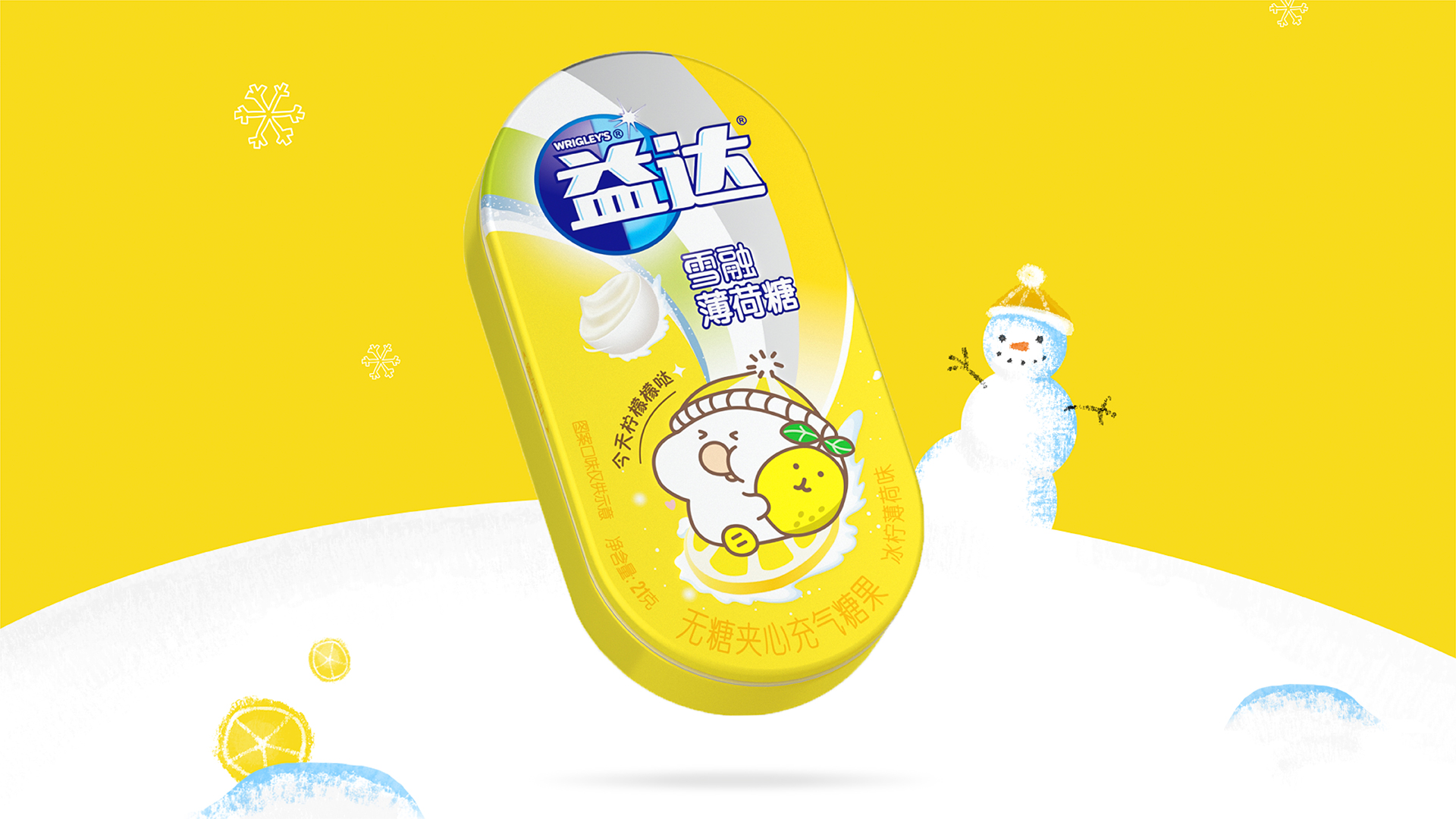
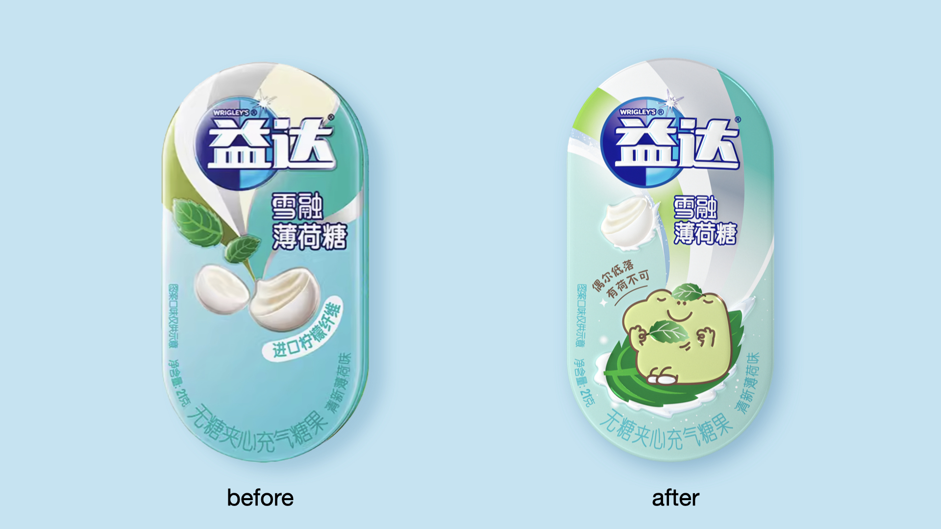
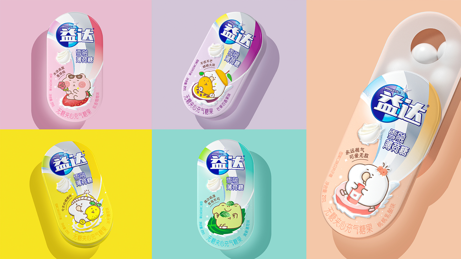
Design Story
The Extra brand plans to conduct a comprehensive upgrade of one of its mint products - the Snow Melting Mint. After careful consideration, we have chosen to start with the reconstruction of the brand name as the entry point. The concept of the brand name "Snow Melting" has been redesigned and reinterpreted, serving as a vivid symbol of "melting away the pressures of modern life". We have retained the iconic logo and unique curved design of the Extra brand, and ingeniously transformed it into a ski run pattern. With a light-hearted approach, we have constructed a journey of stress release. In addition, we have introduced lively and cute cartoon characters, further enriching the vivid skiing scene, thereby deepening the brand story and enhancing emotional resonance with consumers. Moreover, for each mint flavor, we have carefully assigned a cheerful mood slogan, further elevating the consumers' pleasant experience during tasting.
Highlights
The core highlight lies in the ingenious use of emotional metaphor, linking the concept of "snow melting" with the dissipation of modern life pressures, thereby creating a strong emotional resonance. At the same time, through the innovation of visual symbols, the brand logo's curved design is transformed into a ski run, which not only retains brand recognizability but also endows it with new symbolic significance. We believe that it is precisely by reconstructing a brand philosophy that resonates with consumer needs, thus creating emotional resonance, that enhances consumers' identification with the brand.
The new packaging has been meticulously designed to be more vibrant. It not only perfectly preserves the brand's original visual assets but also optimizes and innovates upon them, thereby enhancing the interaction between consumers and the brand.
Market Performance
In this project, we were not involved in the sales activities and are not aware of the sales data.
Material(For concept works, please choose the material you plan to use)
其他 铝罐
Craft
Aluminum tins, celebrated for their lightweight nature, superior sealing capabilities, and impermeable properties, have emerged as the quintessential choice for food packaging. They adeptly shield food items from the detrimental impacts of light, oxygen, and humidity, consequently prolonging their shelf life. In addition, the recyclability of aluminum cans positions them as a sustainable packaging solution, significantly mitigating the environmental footprint of packaging waste. Extensively utilized in the packaging of a variety of food products, including beverages, canned goods, and condiments, aluminum cans have earned their status as the preferred packaging medium for numerous food enterprises, owing to their durability, convenience in transportation, and ease of storage.