
Type of applicant company
设计机构
Country
中国
Company Website
http://www.reformbrand.com
Images
Brand of the Product
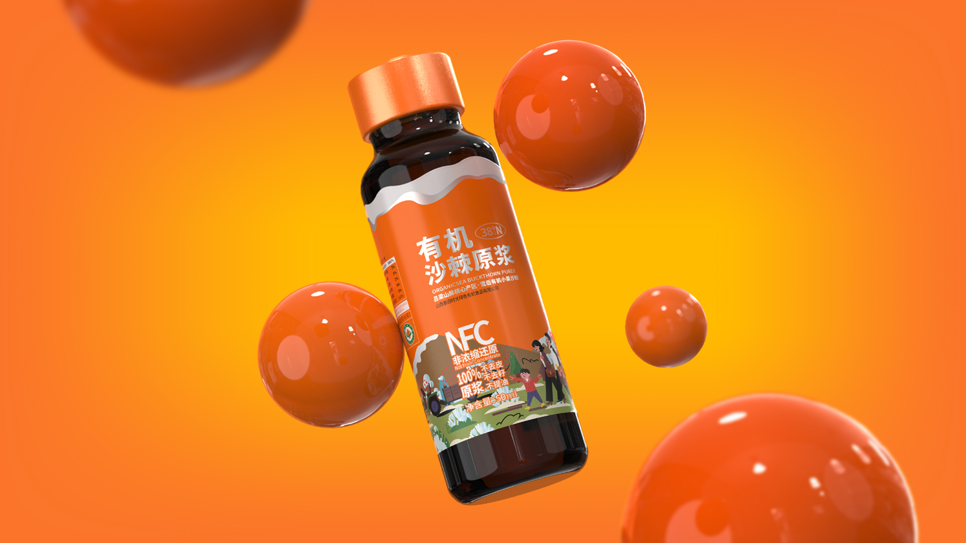
Taste of Springtime
Designer Name
Liu Xinhui、Li Wei
Position of Designer
Designer
Target Consumer
The target consumer group of this product is mainly modern families who value a healthy lifestyle. They will ensure the quality and safety of their beverage choices, pay attention to the taste and nutritional value of the product, have a certain understanding of the benefits of sea buckthorn, and share it with their families to provide more health benefits.
Distribution Channels
电商 E-commerce
Positioning
大货消费品 Mass Production
Design Story
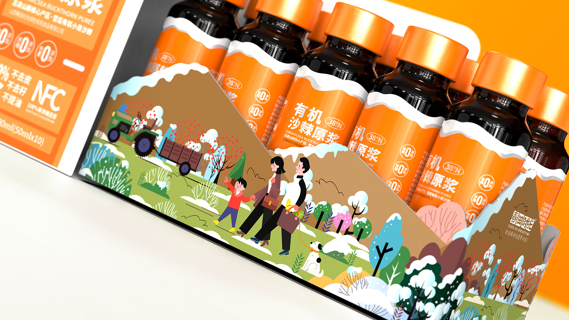
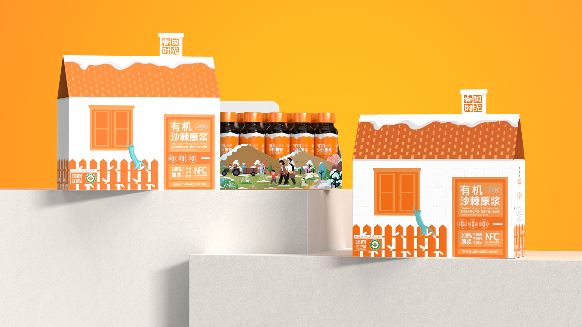
With the increasing emphasis of modern consumers on healthy eating, organic, natural, and additive free foods have become popular choices in the market. Sea buckthorn, as a fruit rich in vitamins and minerals, has gradually gained popularity in the market for its raw pulp. In order to meet the demand of consumers for high-quality, organic sea buckthorn puree, while conveying the healthy, natural, and warm attributes of this product. It aims to showcase its unique selling points to consumers through exquisite packaging design and clear product information, ensuring the purity and nutrition of the product. By incorporating elements such as houses, snow, and grass on the packaging, a sense of home is created, allowing consumers to enjoy delicious food while also feeling warmth and comfort.
Highlights
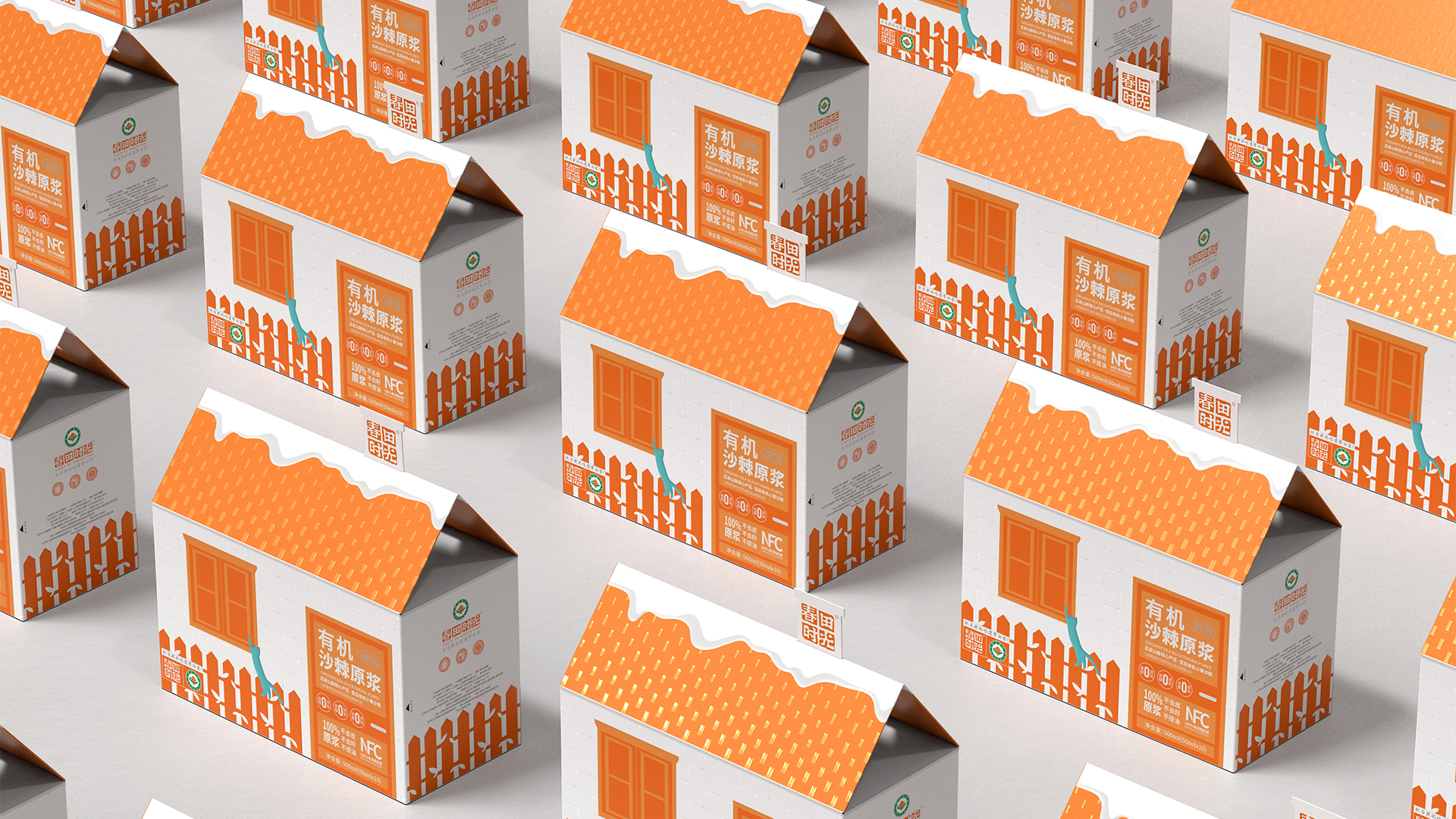
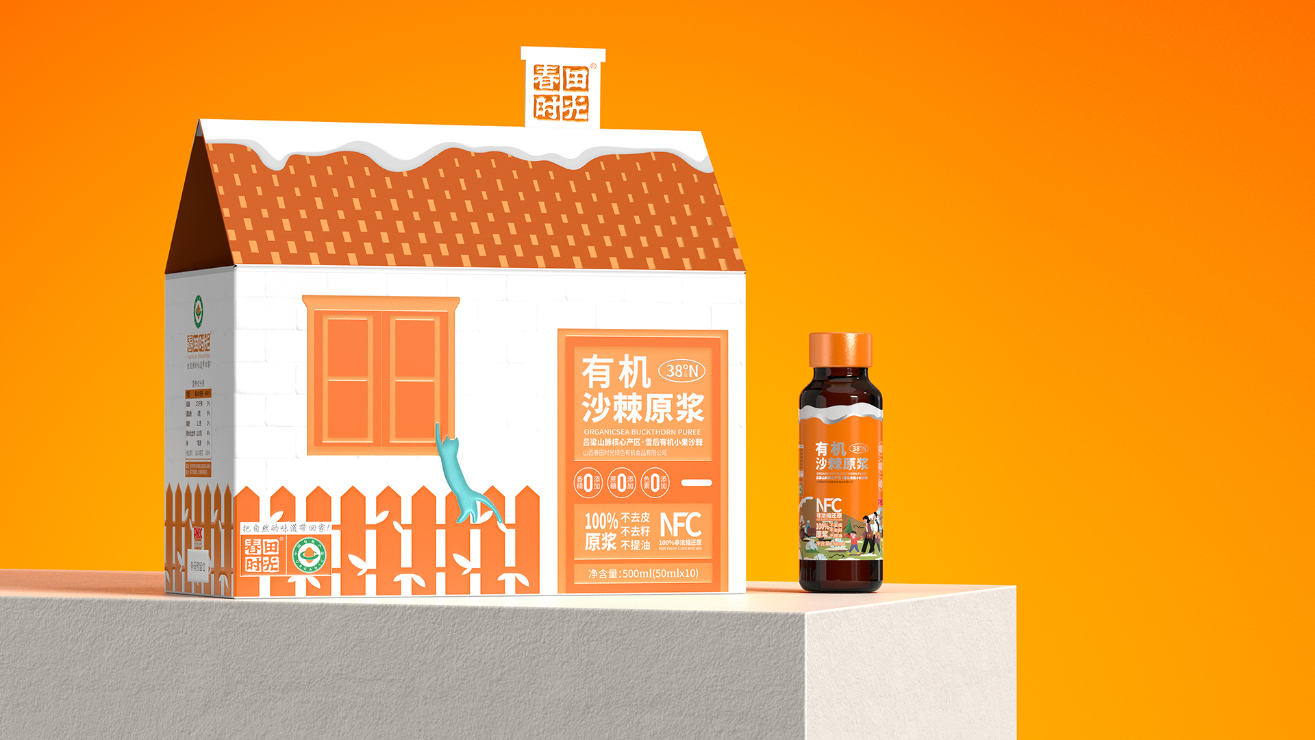
The packaging design of this product is its biggest highlight, with the outer box shaped like a house and filled with warm and natural elements. The overall use of orange and white highlights the true color of sea buckthorn fruit and creates a warm feeling of home. The raw materials of the product are wild small fruits grown after snow in Lvliang Mountain at 38 ° N. The design conveys the natural and healthy attributes of the product through the white snow on the roof and the grassland in front.
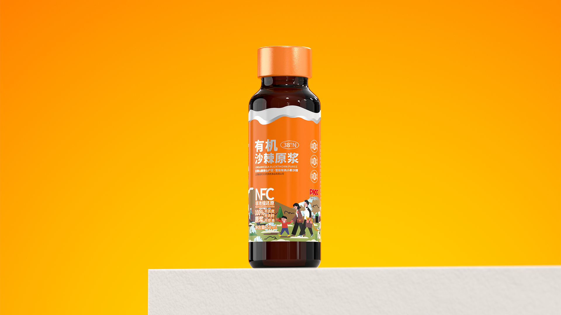
It is not just a beverage, but also a transmission of lifestyle and health concepts. By emphasizing concepts such as "organic" and "wild small fruits", the product conveys a healthy, natural, and environmentally friendly lifestyle to consumers. At the same time, through the production process of "no peeling NFC raw pulp, no oil extraction", the original flavor and maximum preservation of nutritional components of the product are ensured.
Market Performance
Product not on the market.
“None”
Material(For concept works, please choose the material you plan to use)
其他 玻璃瓶
Craft
This product utilizes the principles of origami art to creatively design unique building structures, integrating the beauty and practicality of origami. The doors, windows, cat holes, fences, and even simulated snow details of the house are all carved using embossing techniques, giving the product a more distinct three-dimensional sense and delicate touch, forming a unique brand image.
Does the design solve the problems that are common across the product category? If so, please explain.
Most oral liquid products on the market often leave a heavy impression of being "medicinal" in their presentation form, which creates certain psychological resistance in the process of consumer choice. To overcome this limitation, we have adopted the exterior design of a biomimetic house, which is not only novel and unique, but also cleverly incorporates fresh ecological planting scene illustrations, making the product's appearance full of nature and vitality. Simultaneously selecting the orange white dual color combination can not only stimulate people's appetite, but also perfectly fit the "healthy life" concept advocated by the product, thereby promoting the enthusiasm of consumer choice.
What functional designs of the work have enhanced the user experience?
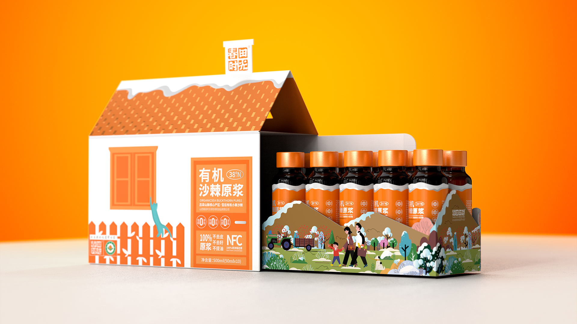
The packaging design of this product takes into account portability. The specification design with a net content of 500ML (50ML x 10 bottles) not only meets consumers' demand for single consumption, but also facilitates carrying and storage. This design not only enhances the practicality of the product, but also increases its market competitiveness. The design of the outer box resembles a "home" feeling, using a push-pull opening method and a natural pastoral illustration style, just like the product slogan "Bring the natural flavor home", enhancing consumers' experience of the healthy and natural taste of springtime.
Did the design help increase the sales performance of the product? If so, please give related evidence.
This product abandons the inherent appearance of traditional rectangular packaging and innovatively adopts a house shaped design. This unique design not only significantly enhances the product's recognition in sales scenarios, but also becomes an indelible brand memory point in consumers’ head, attracting more attention and winning more favor for the brand.
Does the work consider sustainability (environmentally or commercially, or both)? If so, please explain.
Under the dual consideration of environmental protection and business, this product fully demonstrates the concept of sustainability. Using environmentally friendly white cardboard as packaging material reduces the burden on the environment, and abandons processes such as film layers, UV printing, and screen printing that may cause pollution to the environment, instead pursuing a purer and more environmentally friendly printing method. In addition, the entire packaging design fully considers the subsequent degradation issues, ensuring that the entire packaging can be completely degraded, thereby achieving environmental protection throughout the entire lifecycle from production to disposal.