
Type of applicant company
品牌方
Country
中国
Company Website
无
Images
Brand of the Product
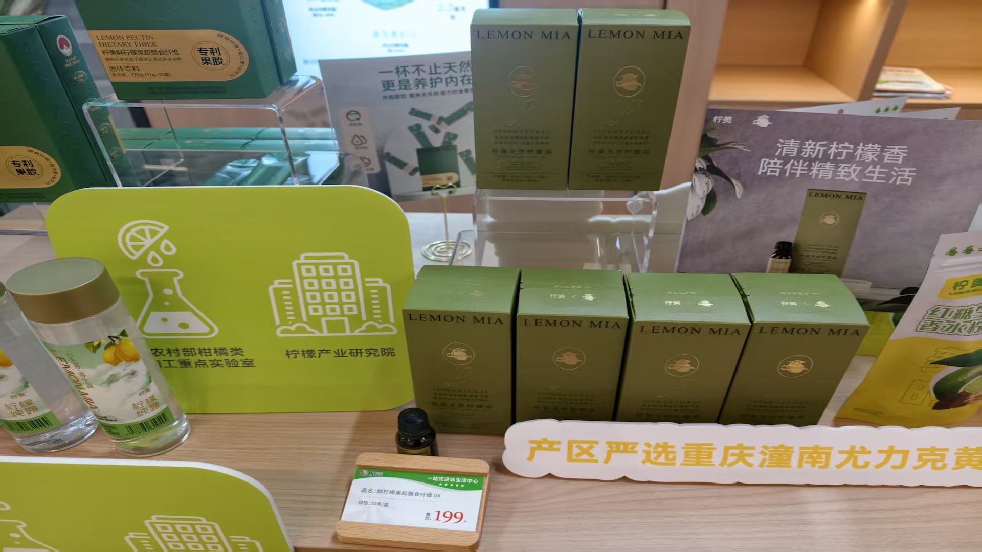
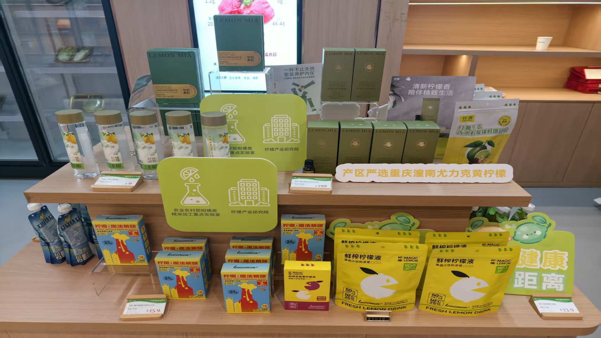
LEMON MIA
Designer Name
Neon
Position of Designer
Director of Product Design
Target Consumer
Refined Lifestyle Enthusiasts (Aged 20-45) They prioritize self-indulgence: eager to adorn their lives with products that boast high aesthetic appeal and strong experiential value, and willing to pay for items that cater to their emotional needs. They are discerning: attaching great importance to safety and health, and pursuing products with pure and natural ingredients. They are creative: valuing the combination of practicality and aesthetics in products.
Distribution Channels
电商 E-commerce; 大型商场 Shopping Mall; 小型商超和便利店 Supermarket & CVS; 餐饮&酒店 Restaurants & Hotel
Positioning
大货消费品 Mass Production
Design Story
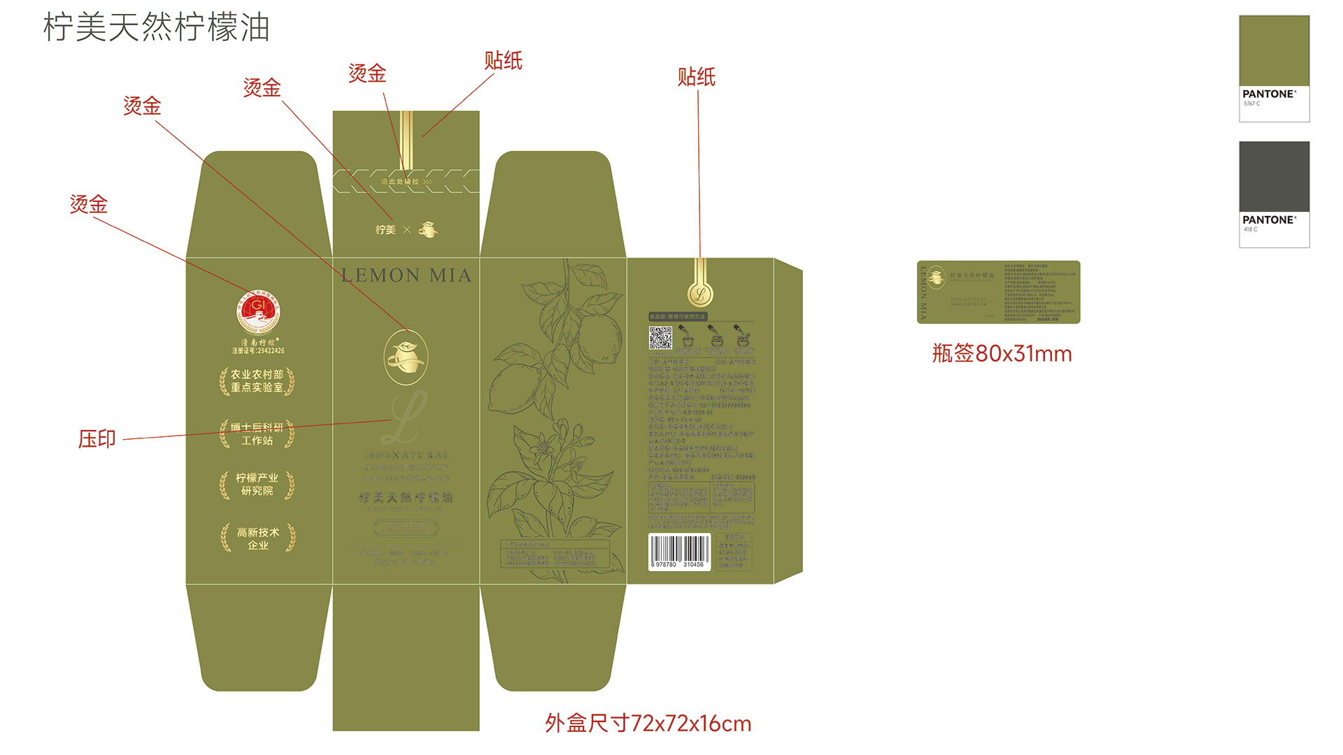
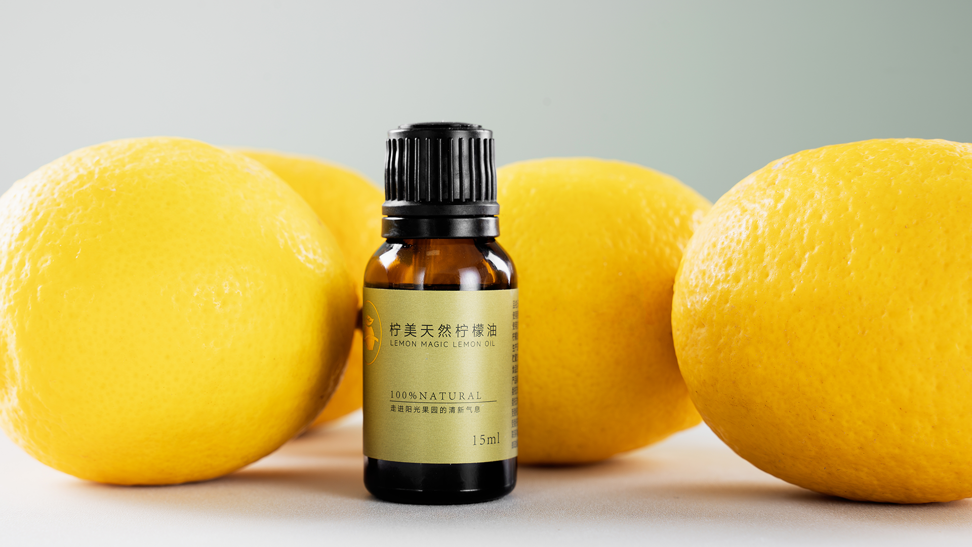
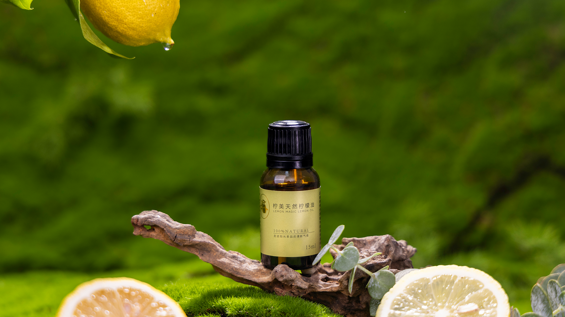
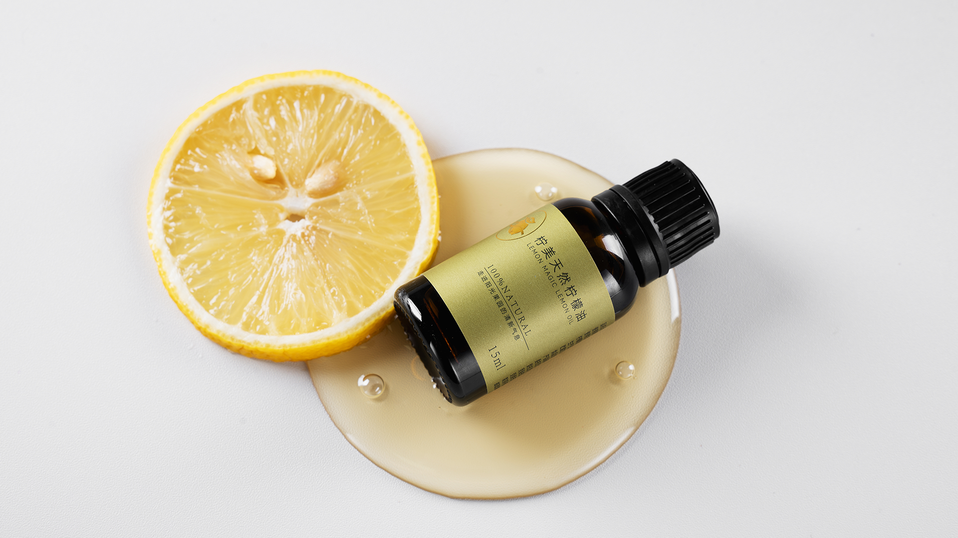
We break the inherent perception that "lemons = bright yellow" and move away from the common practices of essential oil packaging—such as telling orchard stories, overloading lemon elements, and using high-saturation warm colors. Instead, we draw inspiration from the natural texture of lemon leaves: taking lemon leaf green as the base color, replicating the natural touch with a delicate matte texture, adding accents of light gold lemon lines, and showcasing R&D strength on the side. The overall visual style is minimalist and premium.
The product design combines practicality with aesthetics. The essential oil features ultra-pure, food-grade ingredients, and its packaging also embodies a natural, healthy tone. It targets contemporary consumers who pursue clean ingredients and life aesthetics, establishing an emotional connection with them amid a fast-paced lifestyle, and making naturalness, purity and delicacy tangible.
Highlights
1.Break away from the homogeneous visual stereotype of "lemon = bright yellow", making the packaging stand out more on shelves and in social media shares.
2.Compared with ordinary smooth cartons, it offers a tangible "close-to-nature" feel—the delicate texture is like touching crushed lemon leaves, and the packaging echoes the "natural" attribute of the product.
3.The carton and bottle feature a completely unified style and color tone, eliminating the cheap feeling of "disconnection between carton and bottle". The lightweight design and light-proof bottle make it portable and avoid waste.
4.The minimalist and premium design automatically screens and attracts high-value customer groups in retail scenarios, reducing communication costs.
Market Performance
none
Material(For concept works, please choose the material you plan to use)
其他 纸质 Paper+玻璃瓶Glass bottle
Craft
The inner packaging uses a light-proof glass bottle, with the dropper part resistant to corrosion by essential oils. For the outer box, white cardboard is adopted, combined with gold stamping and embossing to simulate plant textures and recreate the tactile experience. It has a self-locking bottom and an easy-tear strip at the top—after opening, the strip can be inserted back to seal the box. The inner card features a self-developed die-cut structure, which balances convenience and structural stability.
Does the design solve the problems that are common across the product category? If so, please explain.
Due to the small size of the inner container holding the contents, which needs to match the outer box, the inner lining structure has undergone multiple calculations and adjustments. This has successfully addressed both the convenience of product production and the ease of use for users.
What functional designs of the work have enhanced the user experience?
1.The top opening adopts a tear strip structure, abandoning the conventional method of sealing with adhesive tapes or stickers. After the tear strip is opened, there is a tab structure that can be folded back to reseal the opening.
2.For the optimization of the inner lining structure, a two-piece design (upper and lower linings) is adopted, which enhances both convenience and stability.
Does the work consider sustainability (environmentally or commercially, or both)? If so, please explain.
1.Both the outer packaging and inner lining are made of white cardboard, which is recyclable. Additionally, embossing is applied to the white cardboard to simulate the effect of specialty paper, effectively reducing both commercial costs and environmental costs.
2.The essential oil bottle adopts a dropper spout design, which allows for better control of the flow rate and prevents waste during use.