
Type of applicant company
品牌方
Country
中国
Company Website
无
Images


Brand of the Product
Uniquebaby
Designer Name
Brand Design Department of Uniquebaby
Position of Designer
none
Target Consumer
Children aged 3 and above,Parents borned after 1995s
Distribution Channels
电商 E-commerce
Positioning
大货消费品 Mass Production
Design Story
This packaging design originated from the need to address the core contradiction in contemporary parenting and feeding: the conflict between parents' pursuit of high nutritional density in children's food and children's picky or poor eating behaviors. Market competitors' packaging often relies on homogeneous cartoon images, making it difficult to establish professional trust amidst information overload.
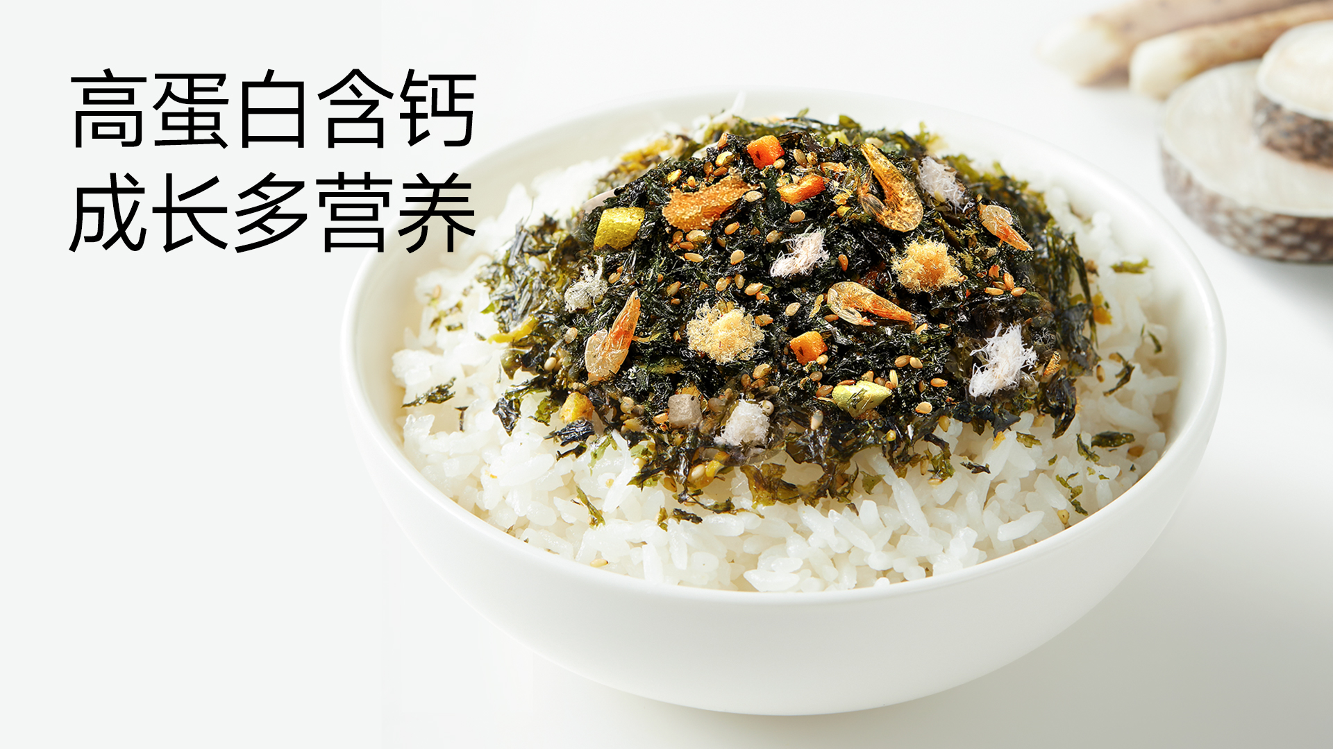
The design philosophy adheres to scientific visualization and scenario resonance. It abandons overly childish expressions, adopting a pure white base paired with high-saturation, large realistic product images to create a strong visual impact. This aims to clearly convey the core values of professionalism and effectiveness to parents. Iconified data on the front, such as "5 Nutrients" and "≥52% Land & Sea Ingredients," transform complex formula advantages into instantly understandable symbols of trust, directly addressing the deep concerns of ingredient-conscious parents for transparent formulations.
Highlights
Core Highlight: The packaging creates an instantly readable sense of value. Consumers can capture the three core selling points—"5 Nutrients," "0 Additives," and "≥52% Ingredient Content"—within one second through the visual focus. This highly efficient communication significantly reduces decision-making costs.
Differentiated Value: Compared to similar products, its added value lies in constructing a seamless experience loop from trust to action. It not only establishes professional trust through data but also seamlessly integrates the product value into users' actual lives via detailed scenario illustrations on the back (mixing with rice, porridge, making rice balls). The unique single-meal, single-packet quantitative design is not just a packaging form but a precise nutritional solution, endowing the product with practical value beyond the packaging itself.
Market Performance
The selling quantity on the entire network is over 1,000,000+
Top 1 sales volume on China tiktok
Material(For concept works, please choose the material you plan to use)
PET塑料 PET material
Craft
The main packaging body uses conventional metalized composite film to ensure barrier properties and shelf life.
The packaging employs a matte oil process, resulting in a matte finish that enhances the sense of high quality.
High-precision CMYK printing ensures true-to-life color reproduction of the product images and the texture of the land and sea ingredients, stimulating appetite.
A QR code is printed in a clear location on the back of the package, enabling one-item-one-code traceability. This allows consumers to easily scan and view the third-party inspection report for that production batch. This application of mature technology is key to building a chain of trust .
Does the design solve the problems that are common across the product category? If so, please explain.
This design successfully addresses two major problems common in children's food packaging: firstly, vague and non-transparent information, preventing parents from quickly judging the product's real value; secondly, ambiguous usage scenarios, where the product's value fails to connect with feeding behaviors. This packaging transparently communicates formula advantages through data-driven and iconic visual language, establishing immediate trust. Simultaneously, the clear usage guidance on the back redefines the product from a mere seasoning into a handy parenting tool, directly solving the pain point of "not knowing how to use it most effectively after purchase" .
What functional designs of the work have enhanced the user experience?
Portion Control: The 9g independent small-packet design helps parents accurately control single-serving portions, avoid waste, and enables more scientific feeding.
Scenario Adaptation: The "ready-to-eat" characteristic combined with multi-scenario usage guidelines (mixing with rice, porridge, making rice balls) greatly enhances convenience, making it particularly suitable for fast-paced scenarios like outings or snacks.
Trust Building: The "scan-to-check-quality" function transforms safety promises into an interactive experience, directly alleviating parents' food safety anxieties and enhancing post-purchase peace of mind.
Did the design help increase the sales performance of the product? If so, please give related evidence.
This packaging design significantly contributed to sales conversion through precise value communication. After launch, the product's keyword search conversion rate on major e-commerce platforms increased by approximately 50%, and it quickly ranked TOP 1 in its category sales. High-frequency keywords in consumer reviews, such as "clean ingredients," "visible nutrition," and "the independent packaging is so convenient," prove that the core selling points clearly communicated by the packaging effectively hit consumer pain points and directly drove purchasing decisions. Its differentiated professional image also helped the brand stand out in the fierce homogenized competition .
Does the work consider sustainability (environmentally or commercially, or both)? If so, please explain.
Commercial Sustainability: The packaging design enhances brand recognition and perceived value, increasing consumer loyalty and repurchase rates, laying a foundation for the brand's long-term growth.
Environmental Sustainability: Although the composite film material faces industry-wide challenges in recycling, the independent small-packet design itself avoids food waste at the source caused by large packages becoming damp or spoiled after opening. This represents a deeper-level environmental consideration of "reducing food waste." The brand can subsequently explore using more easily recyclable mono-material structures to further improve environmental performance.