
Type of applicant company
品牌方
Country
中国
Company Website
无
Images
Brand of the Product
Uniquebaby
Designer Name
Brand Design Department of Uniquebaby
Position of Designer
None
Target Consumer
Children aged 3 and above, Parents borned after 1995s
Distribution Channels
电商 E-commerce
Positioning
大货消费品 Mass Production
Design Story
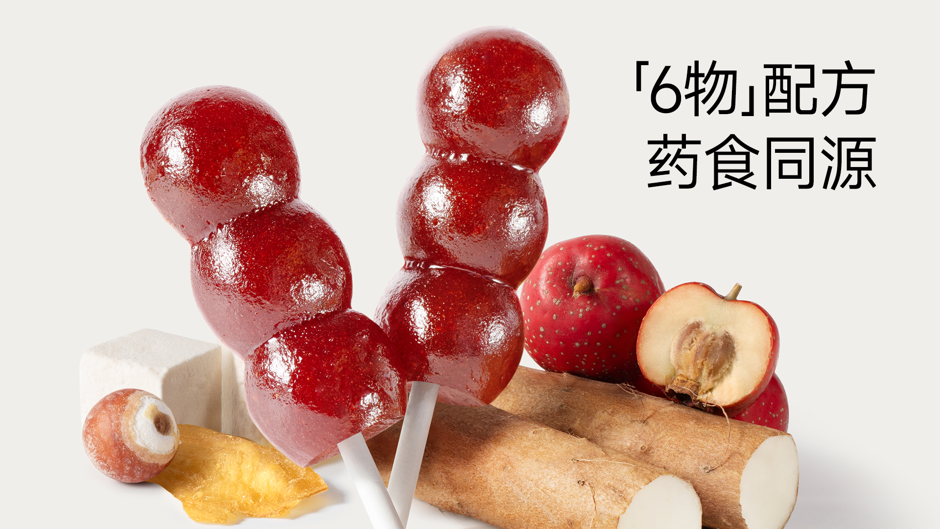
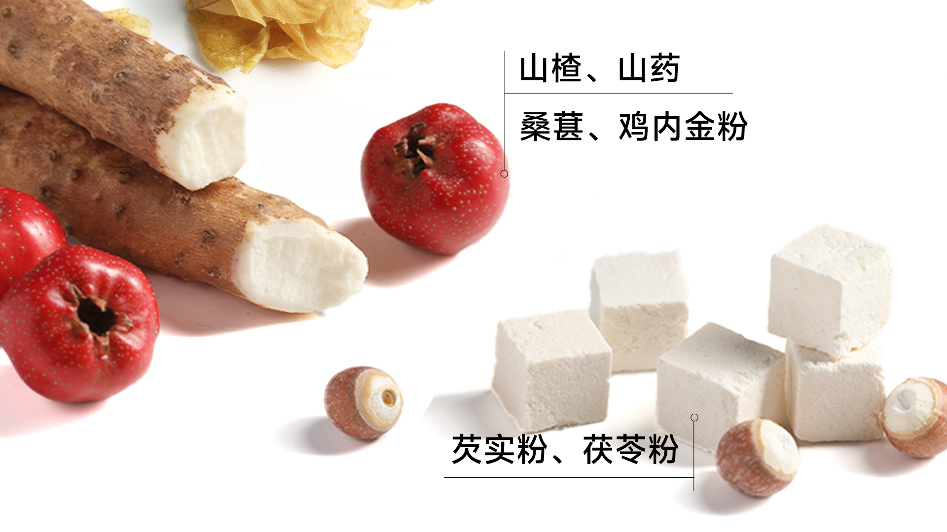
This packaging design stems from a profound insight into the core contradiction between contemporary parents' health anxieties and children's taste preferences, aiming to resolve the inherent conflict of "good medicine tasting bitter" associated with children's functional foods. It addresses the parental demand for products that strengthen the spleen and aid digestion alongside children's resistance to traditional herbal forms.
While many competing products in the market rely on overly childish cartoon styles, which can undermine professional trust, this design deliberately abandons that path. Instead, it employs a pure white background combined with high-saturation, high-precision photography of the actual product (the crystal-clear mini tanghulu shape), creating a strong visual impact and stimulating appetite. The aim is to clearly convey a first impression of "scientific, professional, pure, and natural" to parents. Its concept follows the visual expression of the original SNDC (Safe, Nutritious, Delicious, Convenient) R&D philosophy, integrating the core values of safety, nutrition, taste, and convenience into the design.
Highlights
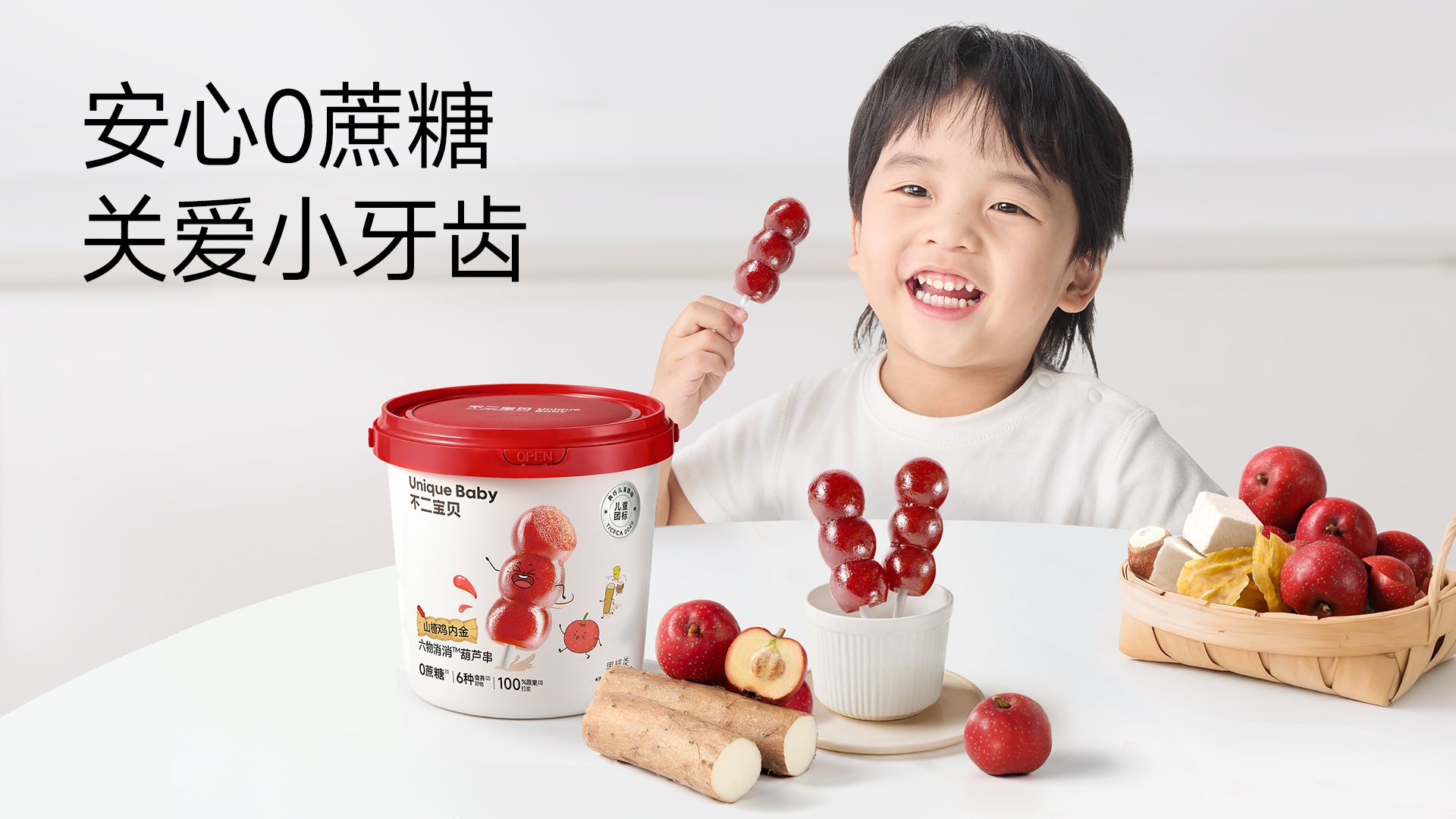
Core Highlight: The packaging achieves highly efficient communication, enabling instant communication across age groups. For children, the gourd-string shape and cartoon smiley face serve as natural attractants. For parents, the design allows immediate visual focus on three key selling points: "0 Added Sucrose," "6 Nourishing Ingredients," and "100% Whole Fruit Pulping"—effectively conveying professionalism and reassurance while reducing decision-making costs. This approach better reflects the brand's pure, playful proposition and its positioning as a children's food.
Differentiated Value: Its added value lies in successfully creating distinctive symbolic recognition. By prominently featuring enlarged product photographs, it combines the tanghulu shape with health and nutrition through personified imagery. This is not merely a formal innovation but also evokes deep emotional resonance, allowing the product to stand out among ordinary packaging and establishing unique brand symbol recognition.
Market Performance
The selling quantity on the entire network is over 300,000+
Material(For concept works, please choose the material you plan to use)
PET塑料 PET material
Craft
The packaging uses a matte oil process, resulting in a matte finish that enhances the sense of high quality.
It also uses high-precision CMYK printing, ensuring true color reproduction and rich detail in the product photographs.
A QR code is printed in a clear location on the back of the package, enabling one-item-one-code traceability. This allows consumers to easily scan and view the third-party inspection report for that production batch. This application of mature technology is key to building a chain of trust.
Does the design solve the problems that are common across the product category? If so, please explain.
This design addresses common issues in children's healthy snack packaging: harsh functional presentation that leads to child resistance, and vague value communication that fails to quickly build parental trust. The packaging softens the "medicinal" perception of functional products through the playful and culturally relatable Tanghulu form, eliminating children's reluctance to try it and increasing the product's playful appeal and affability. Simultaneously, the minimalist and direct layout of key information on the front allows ingredient-conscious parents to instantly grasp the core selling points, solving the pain point of inefficient information transmission.
What functional designs of the work have enhanced the user experience?
Individual Skewer Packaging: Each skewer is individually packaged, ensuring hygiene and portability. It makes the eating process ritualistic and fun, like enjoying a snack, significantly boosting children's acceptance.
Portion Control: The fixed skewer design helps parents easily control single-serving portions, preventing overconsumption and aligning with feeding needs for children's snacks.
Building Trust: The "scan-to-check-quality" function transforms safety promises into an interactive experience, directly alleviating parents' food safety concerns and enhancing post-purchase peace of mind.
Did the design help increase the sales performance of the product? If so, please give related evidence.
The packaging's highly distinctive gourd-string shape and clear value proposition give it strong communication power in online channels through images and videos. After launch, the product gained rapid organic spread on social media platforms due to its high aesthetic appeal and positioning as a "healthy little BingTangHuLu," becoming a star item. High-frequency keywords in consumer reviews, such as "my child loves it," "the shape is so cute," and "the ingredients are reassuring," demonstrate that the design successfully stimulates children's active desire and parents' purchase intention. It has significantly contributed to market education for this new category and driven sales for the new product. This new product has achieved sales exceeding 300,000 units since launching, becoming a hot-selling hit.
Does the work consider sustainability (environmentally or commercially, or both)? If so, please explain.
Commercial Sustainability: The packaging has successfully created a unique brand asset, the "Gourd String," with high recognizability and extensibility. This lays the foundation for developing a product series, ensuring long-term commercial viability and brand value.
Environmental Sustainability: The packaging materials face industry-common challenges regarding recyclability. However, the design tackles waste reduction at the source through "form innovation" – transforming functional foods that children might otherwise reject into delicious treats they enjoy, thereby avoiding waste due to poor taste acceptance. Exploring the use of biodegradable or mono-materials in the future could further enhance environmental performance.