
Type of applicant company
供应商
Country
中国
Company Website
www.ysprint.com
Images
Brand of the Product
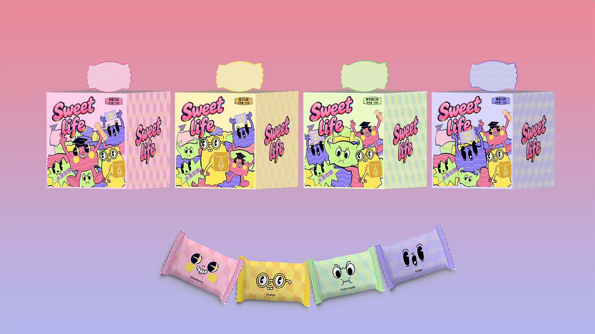
Sweet Life
Designer Name
Young Sun designers
Position of Designer
none
Target Consumer
Students in Primary and secondary school
Distribution Channels
电商 E-commerce; 大型商场 Shopping Mall; 小型商超和便利店 Supermarket & CVS; 杂货店 Grocery
Positioning
大货消费品 Mass Production
Design Story
Today's primary and secondary school students face unprecedented academic pressure and identity anxiety. Their worth is often reduced to scores and rankings, while talents and passions that defy simple metrics are quietly marginalized. We developed this product and its packaging to build a positive, equitable emotional support ecosystem. By cartoonizing and celebrating four exemplary strengths—"Academics, Music, Astronomy, and Sports"—we deliver a crucial message to children: success has more than one face, and your passion itself is a form of excellence.
Highlights
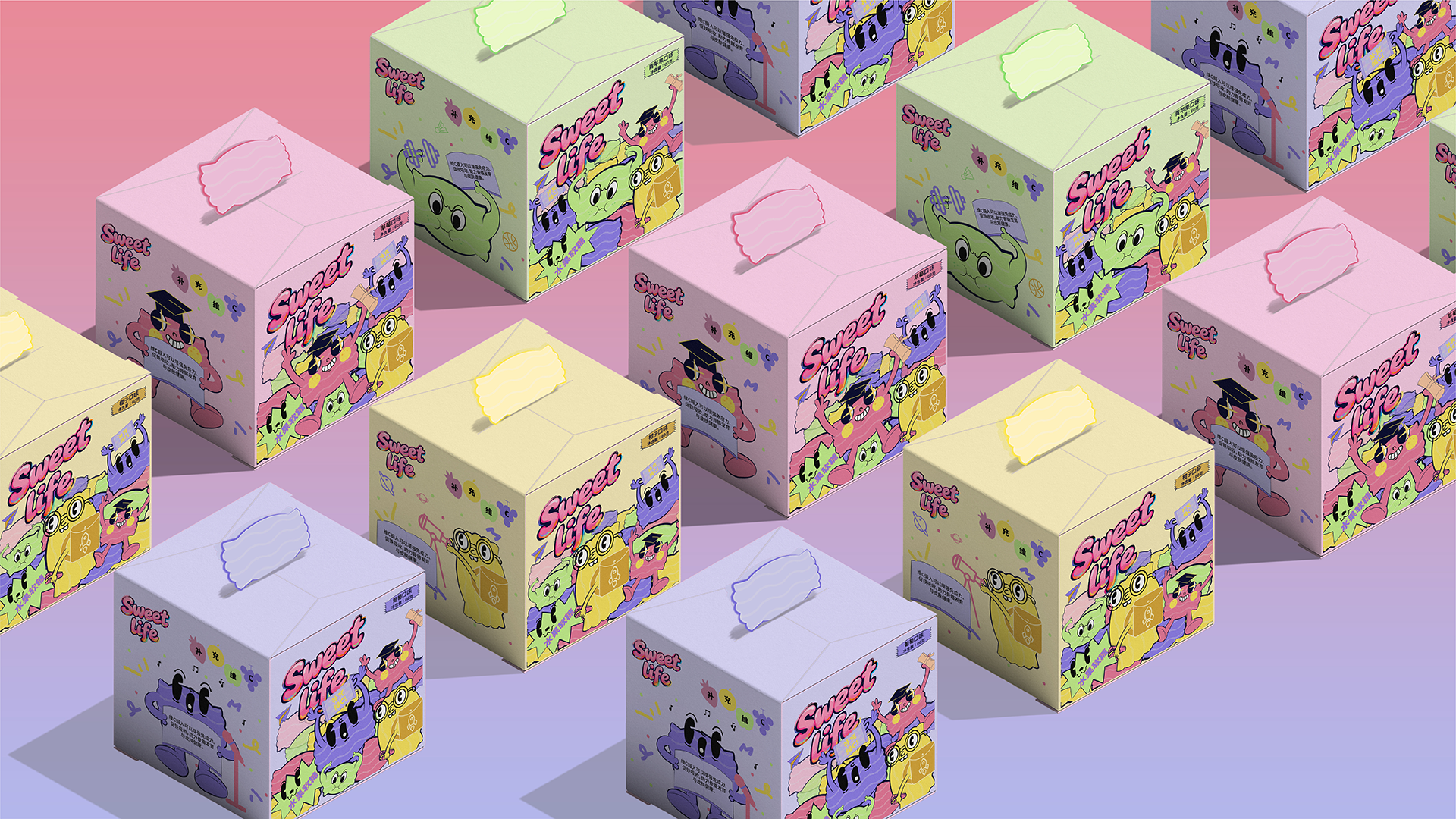
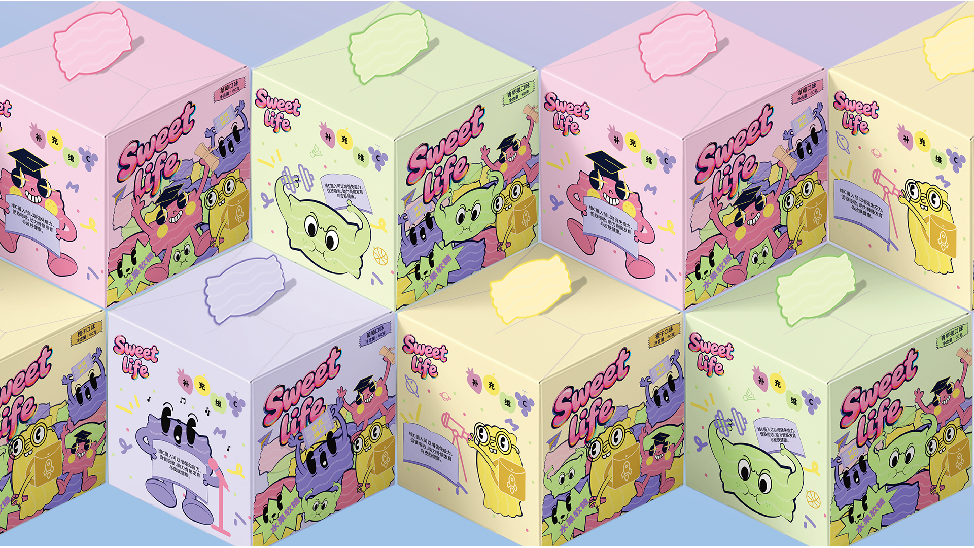
What will instantly captivate and remain etched in consumers' memory is the packaging's intuitive "Talent Spectrum Recognition System." Visual symbols equal identity: on the packaging, the four talents of "Academics, Music, Astronomy, and Sports" are transformed into comic characters featuring intense dopamine colors (Wisdom Pink, Rhythm Purple, Cosmic Yellow, and Vitality Green) and unique visual symbols. Children can almost instantly see themselves in a character—thinking "I'm that star explorer" or "I'm the sports star." This immediate sense of identity and belonging is the most powerful memory point created by the packaging.
Direct Emotional Trigger: The high-saturation, clashing color palette of dopamine aesthetics is not merely decorative. It is designed to function like "visual candy," directly stimulating feelings of joy and excitement. On a crowded store shelf, its colors alone serve as a declaration of joy, making it truly unforgettable.
Market Performance
none
Material(For concept works, please choose the material you plan to use)
纸质 Paper
Craft
1. The entire packaging utilizes carbon-neutral paper as its raw material, with a prominent label stating: "This packaging box is made from carbon-neutral paper," together with the logo of FSC and Soy ink, enhancing the sustainability of the packaging. 2. The four comic characters are highlighted using debossing combined with hot foil stamping in holographic foil, allowing them to stand out prominently on the shelf. Additionally, each of the four candy varieties features a distinct flavor. In the color blocks indicating the flavors—such as "grape" or "green apple"—scented ink is applied. Paired with playful reminder text, this design makes the packaging more engaging, enhances interaction with consumers, and ultimately boosts their affection and loyalty toward the product.
Does the work consider sustainability (environmentally or commercially, or both)? If so, please explain.
This packaging embodies a commitment to sustainability, carrying out environmental promises at every step. It is made from carbon-neutral paper and prominently features the label "This box is made from carbon-neutral paper," clearly communicating our carbon reduction efforts. The paper is FSC-certified, ensuring that the raw materials come from responsibly managed forests, protecting ecosystems from the source. Printing is done with low-VOC soybean ink, reducing chemical emissions and environmental pollution. Furthermore, the paper production process has achieved carbon neutrality, completing a green cycle from raw material to finished product.
We firmly believe that environmental awareness begins with daily actions. Through this product designed for children, we aim to weave the concept of green and low-carbon living into the details of the packaging, subtly planting the seeds of sustainability through interaction—making sustainability not just a choice, but a natural attitude that grows with them.