
Type of applicant company
设计机构
Country
中国
Company Website
www.the25s.com
Images
Brand of the Product
Duoweijihua
Designer Name
The 25s Creative Team
Position of Designer
无
Target Consumer
The target consumers are white-collar professionals with higher incomes. They possess foundational health knowledge, prioritize balanced nutrition, and have clear dietary goals. As pragmatic consumers, they reject premium pricing and seek tangible evidence of a product's efficacy and RTB. They require products to clearly articulate health benefits and value propositions.
Distribution Channels
电商 E-commerce; 大型商场 Shopping Mall; 小型商超和便利店 Supermarket & CVS
Positioning
大货消费品 Mass Production
Design Story
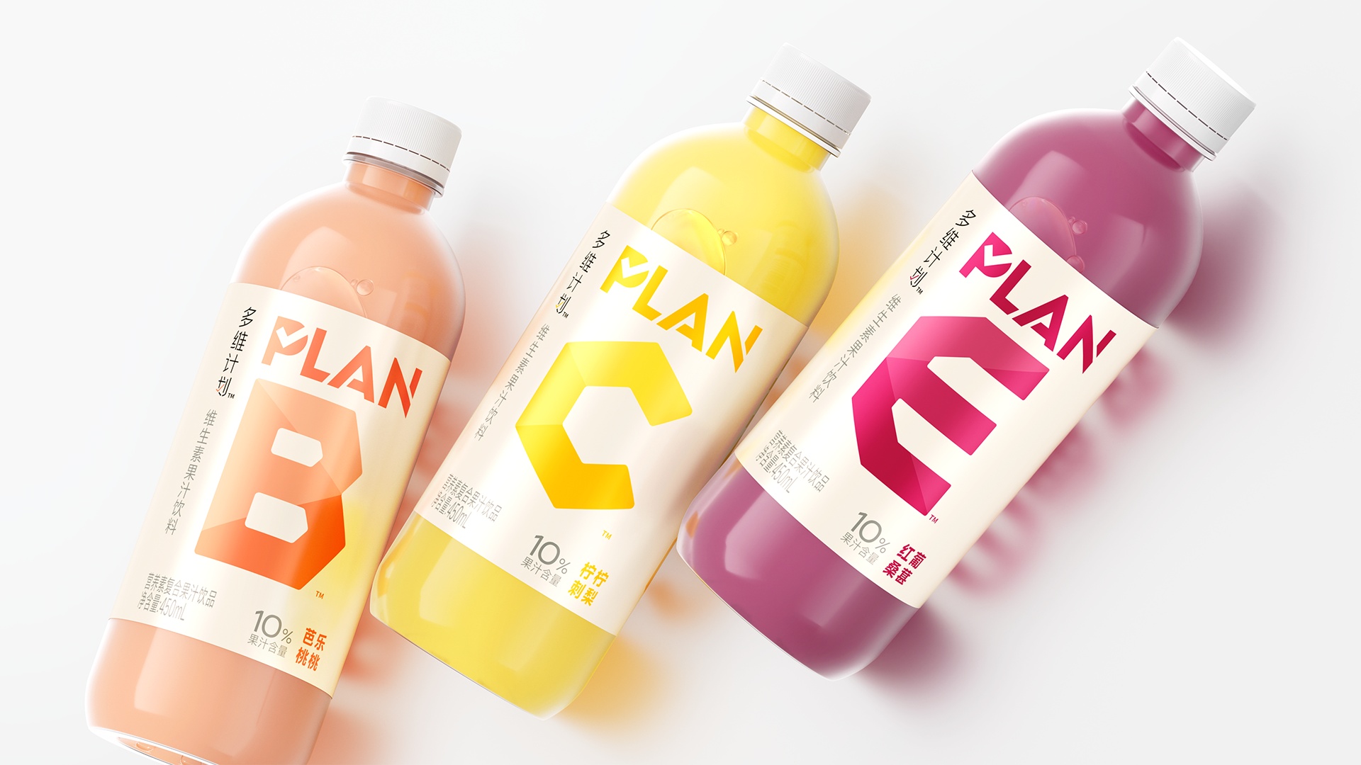
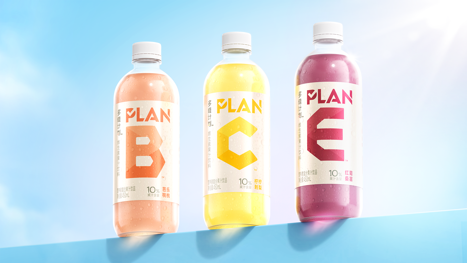
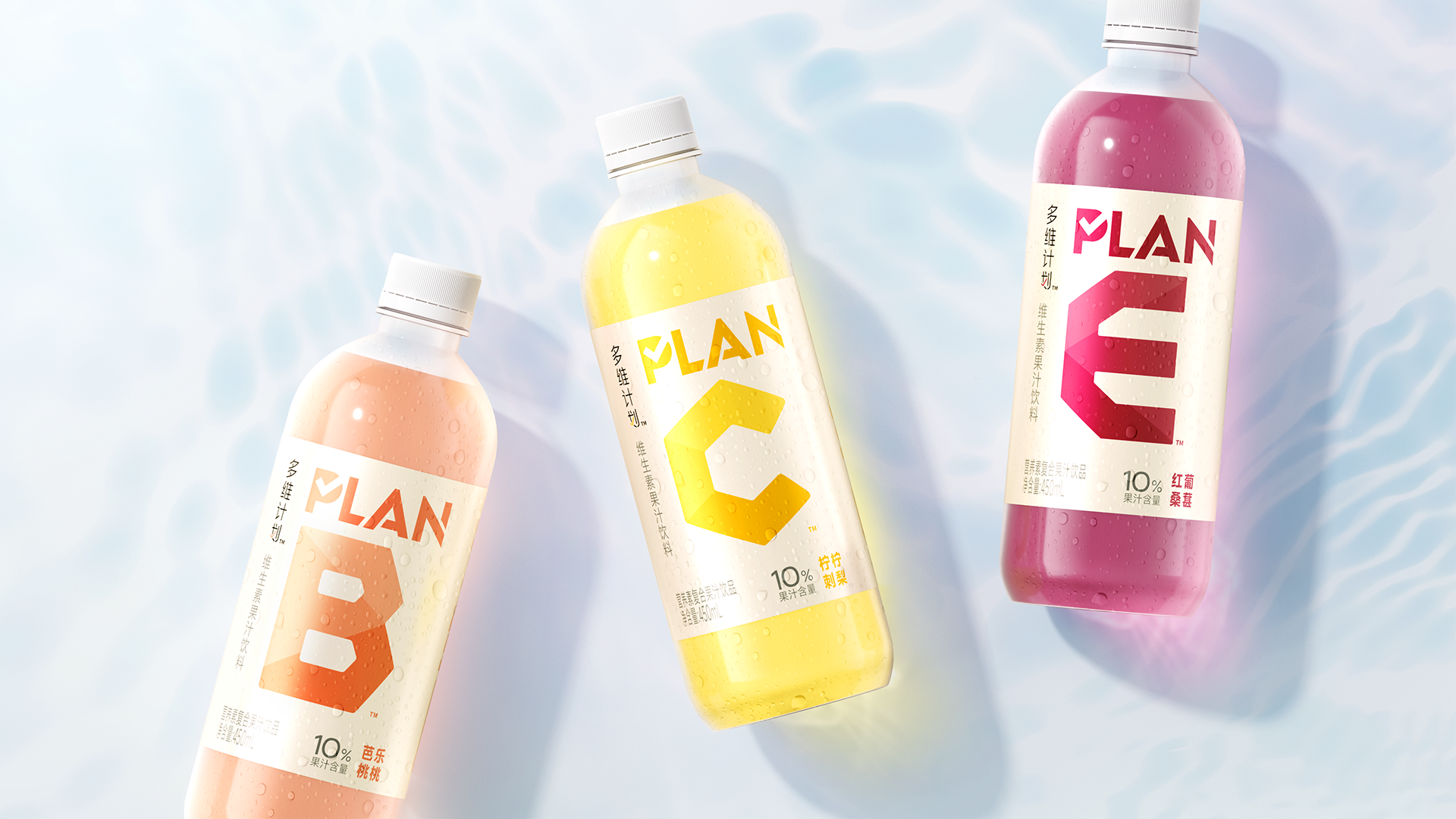
Today's consumers increasingly prioritize both health and taste in their beverage choices. Master Kong has launched a new vitamin-enriched juice drink series designed to provide consumers with a precise and convenient daily vitamin supplement solution. The product line embodies a rational, professional, and scientific core identity.
When displayed on shelves, the product line exhibits strong visual sequencing. Letters like B, C, and E serve as core visual symbols and selection guides, with each letter corresponding to specific vitamins like VB, VC, and VE. This approach creates distinct series recognition at the point of sale while deeply linking the letter symbols to the products' core benefits. Through intuitive visual guidance, it empowers consumers to quickly and accurately select products, supplementing their daily vitamin needs as required.
Highlights
With 多维/PLAN &字母 as the core visual, it intuitively conveys nutritional components, guiding consumers to quickly grasp product functionality. Flavors are differentiated through letters, colors, and RTB variations, creating a unified brand zone for multiple flavors on the shelf. The visual sequencing and expression logic remain consistent in both Chinese and English, presenting a unified brand tonality and visual order.
1.Bottle Design
The bottle features a minimalist, modern aesthetic with a lightweight body, clean lines, and a pure form that conveys rationality and health.
2. Signature Typography:
PLAN & 多维计划: Text details incorporate checkmark symbols to reinforce the sense of planning, further enhancing professionalism and shelf recognition.
Custom lettering for B/C/E: Based on the vitamin beverage category, the letterforms are clean, modern, and convey both functionality and deliciousness.
3. Category Identification:
The 多维/PLAN &字母 combination intuitively communicates nutritional content, guiding consumers to quickly grasp product functionality. Incorporating colorful capsule elements further reinforces the vitamin category identity.
4. Message Communication:
Flavor names are prominently displayed alongside concise RTB statements, establishing clear information hierarchy to facilitate rapid consumer selection.
Market Performance
无语
Material(For concept works, please choose the material you plan to use)
PET塑料 PET material
Craft
roller label + PET bottle