
Type of applicant company
品牌方
Country
中国
Company Website
http://www.jiurisp.com/
Images
Brand of the Product
JIUR
Designer Name
Bingzu
Position of Designer
无
Target Consumer
The target audience primarily consists of young consumers aged 18–35, while also extending to a broader health-conscious group that values product quality and a healthy lifestyle.
Distribution Channels
电商 E-commerce; 大型商场 Shopping Mall; 小型商超和便利店 Supermarket & CVS; 杂货店 Grocery; 餐饮&酒店 Restaurants & Hotel
Positioning
大货消费品 Mass Production
Design Story
The packaging design of JIUR Sparkling Juice was developed in response to intensified competition in the healthy beverage market, young consumers’ combined demands for “visual appeal + functionality + sustainability,” and the brand’s need for clear differentiation. The core design philosophy centers on visualized health, distinctive individuality, scenario-based functionality, and environmental responsibility, as outlined below:
Background and Design Drivers
1. Market Competition and Differentiation
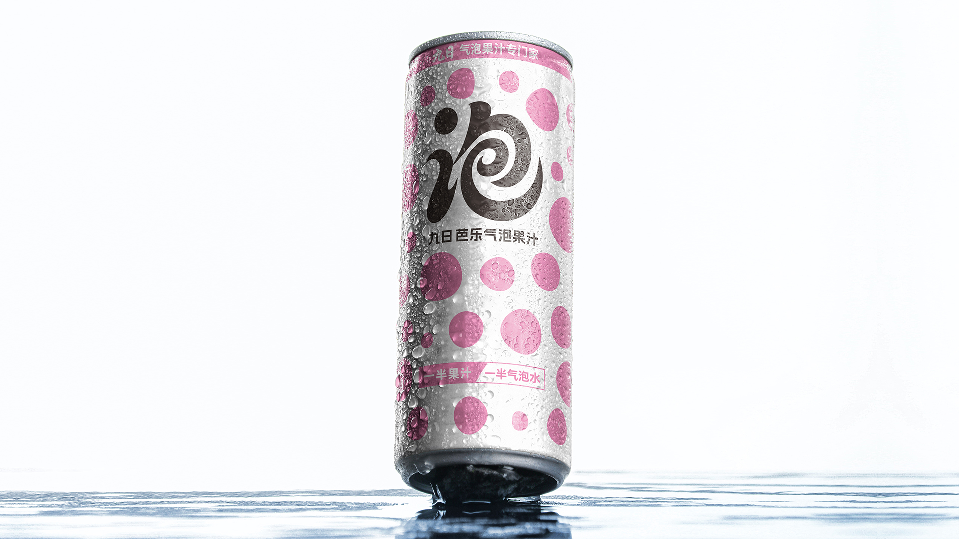
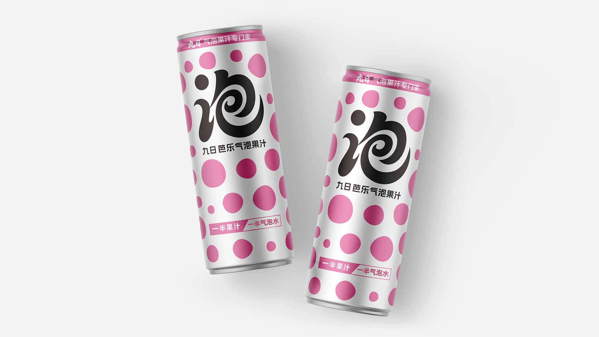
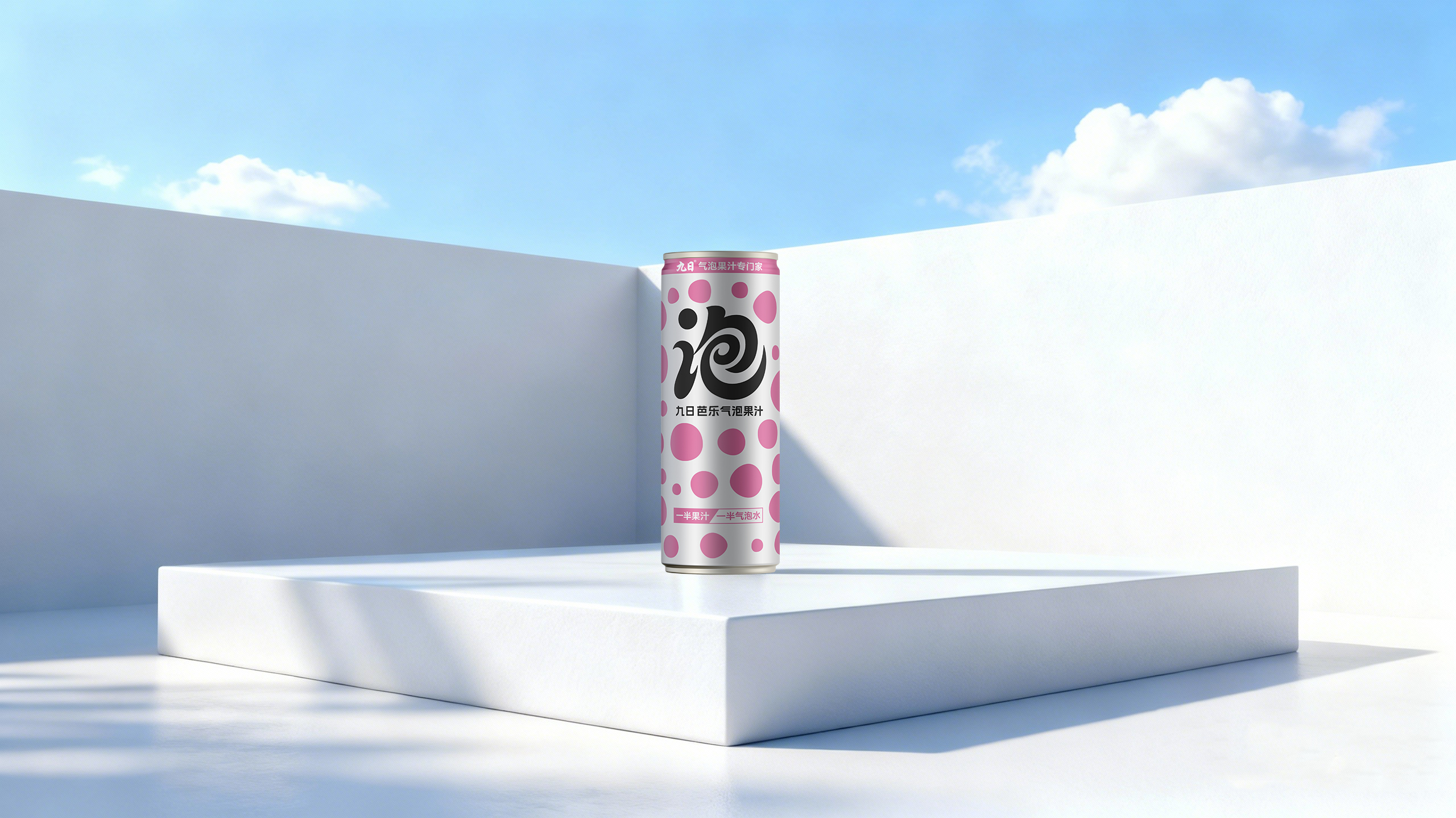
With numerous brands competing in the sparkling juice category, packaging has become a critical factor for shelf differentiation. The design clearly communicates the core selling point of “50% juice + 50% sparkling water,” preventing the product from being lost in category homogenization.
2. Consumer-Driven Multi-Dimensional Upgrades
Visual Appeal and Social Sharing:
Generation Z and young professionals place high value on packaging aesthetics, viewing it as a visual symbol for social sharing. The design emphasizes photogenic appeal and individuality.
Information Transparency for Healthy Consumption:
Consumers increasingly focus on ingredients and nutrition. The packaging visually highlights attributes such as clean formulation and high juice content, reducing decision-making barriers.
Functional Adaptation Across Scenarios:
Designed for dining, commuting, and leisure, the packaging balances portability and sealing performance, ensuring convenience and ease of use.
Sustainability in Practice:
By utilizing recyclable aluminum cans and minimalist printing with 2–3 ink colors, the packaging reduces environmental impact throughout its lifecycle while maintaining strong visual recognition and cost efficiency. Aluminum cans provide excellent barrier properties against light, oxygen, and moisture, preserving flavor and nutrition without additional preservatives or stabilizers. The food-grade inner coating prevents the release of harmful substances such as plasticizers or Bisphenol A, ensuring product safety.
3. Visual Expression of Brand Philosophy
Centered on “health + happiness,” the packaging translates product attributes such as refreshing taste and natural health into intuitive visual elements, reinforcing brand identity.
Highlights
Visualized Health and Clear Selling Points
Fruit-inspired color palettes paired with polka-dot graphics intuitively convey the natural attribute of 50% high juice content, strengthening consumer perception of clean ingredients.
· Youthful Personality and Social Appeal
High-saturation colors and pop-art-inspired polka dots align with young consumers’ aesthetics and social-sharing habits. The compact aluminum can enhances grip comfort, portability, and fashion appeal.
· Functional Practicality and Scenario Adaptability
Advanced laminated aluminum materials and eco-friendly dry-forming processes block light and oxygen, preserving flavor and nutrition. Lightweight cans support on-the-go consumption and portioned drinking, reducing waste.
· Brand Differentiation and Shelf Recognition
Through consistent design language combined with distinct color zoning for each flavor, the packaging achieves both brand unity and easy differentiation, creating strong visual impact on retail shelves.
Market Performance
无
Material(For concept works, please choose the material you plan to use)
其他 铝罐
Craft
Aluminum can printing primarily employs techniques such as through-aluminum printing, white coating printing, and curved surface printing. To ensure printing quality, it is necessary to go through steps such as surface processing and ink curing.
Does the design solve the problems that are common across the product category? If so, please explain.
无
What functional designs of the work have enhanced the user experience?
无
Did the design help increase the sales performance of the product? If so, please give related evidence.
无
Does the work consider sustainability (environmentally or commercially, or both)? If so, please explain.
The packaging features polka-dots and oversized font highlighting the word "泡" as a visual symbol, increasing the uniformity of the product series and creating strong visual impact. When displayed on shelves, it will be clearly distinguished from other similar products.