
Type of applicant company
品牌方
Country
中国
Company Website
无
Images
Brand of the Product
OYee
Designer Name
Interoction Times
Position of Designer
无
Target Consumer
The Gen Z and young Millennials aged 18-28 place great emphasis on the health aspects of beverages, while also being susceptible to the emotional value and trends of popular culture.
Distribution Channels
电商 E-commerce; 大型商场 Shopping Mall; 小型商超和便利店 Supermarket & CVS; 餐饮&酒店 Restaurants & Hotel
Positioning
大货消费品 Mass Production
Design Story
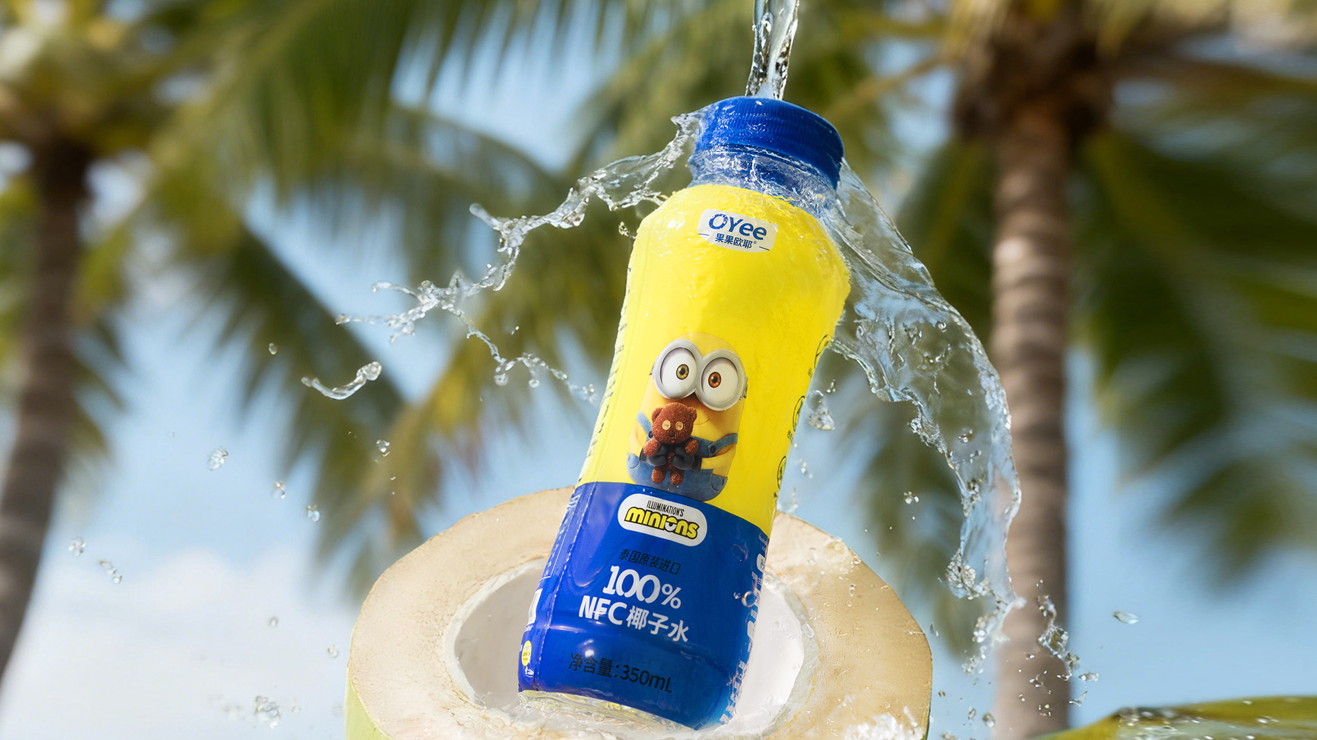
In the fast-paced, high-pressure urban lifestyle, the younger generation places increasing emphasis on emotional value and instant happiness. Beverages are no longer simply meant to quench thirst; they have become a means of companionship and emotional regulation. The packaging of the Minions Coconut Water features happiness as its core theme, utilizing the popular and highly emotive Minions character as a “emotional connector” between the brand and young consumers. Their innocent, playful, and optimistic traits align perfectly with the brand’s desire to convey a sense of lightness, good mood, and natural sustenance.
The overall main color scheme features a high-saturation yellow-blue palette. Yellow symbolizes happiness, vitality, and sunny emotions, while blue conveys freshness, purity, and a sense of natural hydration. Through strong but uncluttered visual contrasts, this design quickly grabs attention on shelves and in consumer settings, while reinforcing the psychological association of “happy drinking.”
(1) Prioritize emotions: Let happiness be the primary visual language.
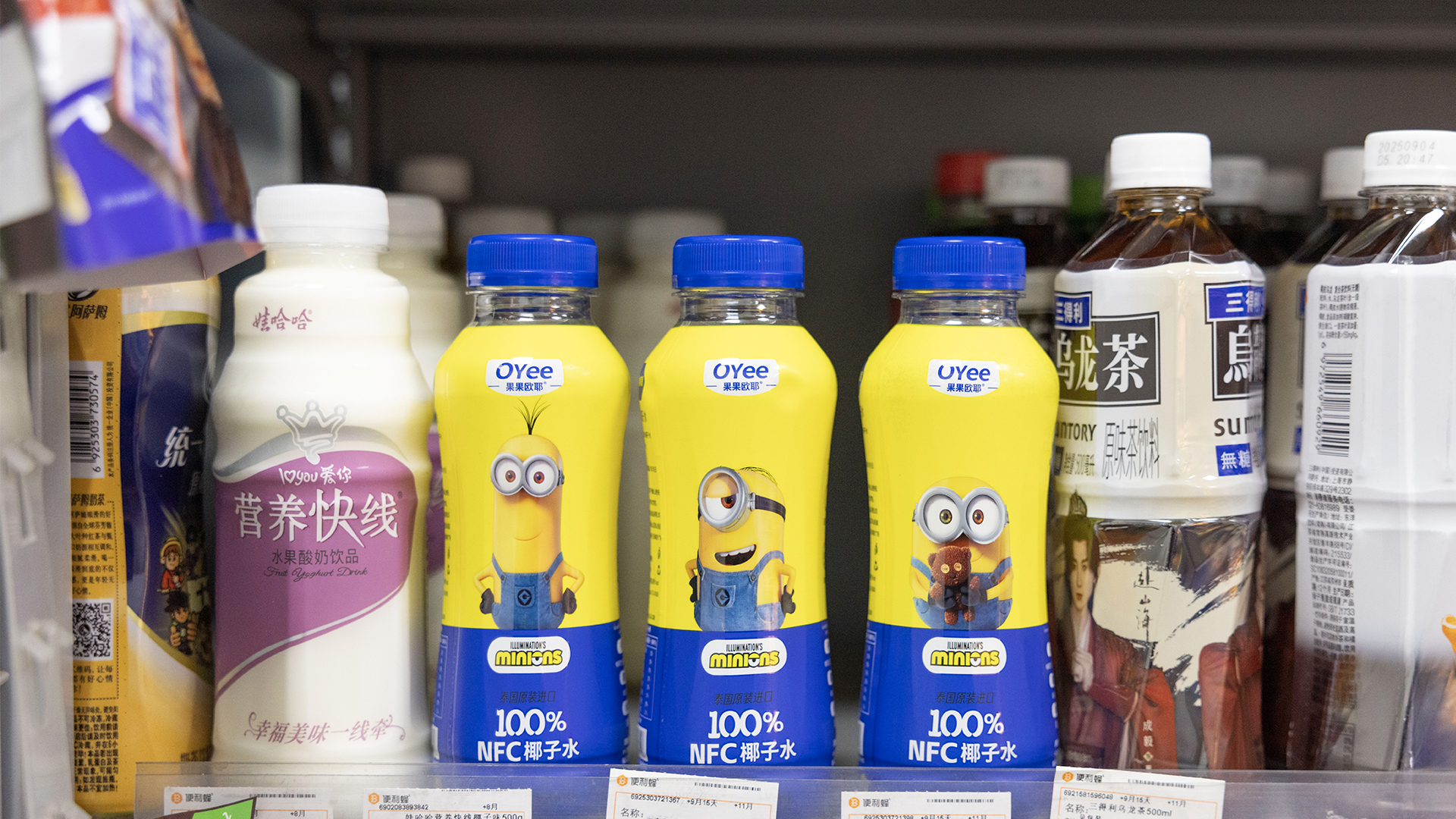
The front of the packaging features the three beloved Minions protagonists in the center of the image, creating a clear, direct, and emotionally engaging main visual focal point.
Their facial expressions and body language design emphasize “joy, relaxation, and fun,” creating an emotional connection with consumers from the outset and conveying the message that “drinking this bottle is a delightful little pleasure.”
(2) Clear categorization: easily identifiable, reducing the cost of selection.
The other side of the packaging features the brand’s main visual element, a coconut motif, which serves as the core element and provides an intuitive representation of the product’s origin and category attributes.
At the same time, “100% Coconut Water” is presented with an eye-catching logo, which reinforces the perception of the product’s authenticity, purity, and lack of burdens, helping consumers quickly make judgments and make choices.
(3) Balanced design of IP and the product.
Achieve a balance between the playful nature of IP and the professionalism of the product.
The front side emphasizes emotions and appeal, while the sides and back emphasize information and trust. This approach satisfies fans’ emotional fondness for the Little Yellow Person while ensuring that the functional value of the product itself is clearly understood.
Highlights
High IP recognition: The Minions’ image inherently conveys strong likability and virality, thereby reducing brand communication costs.
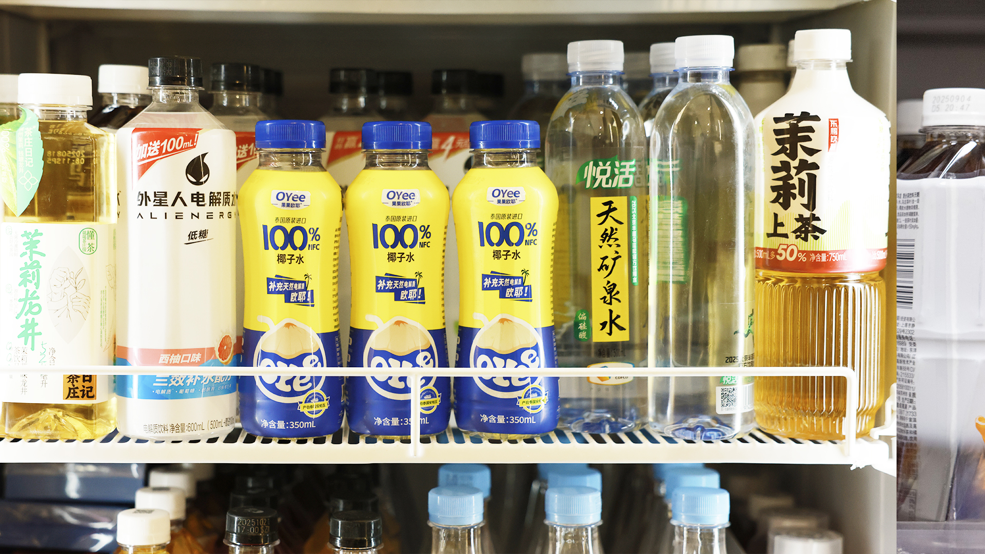
High shelf impact: The primary colors of yellow and blue are highly recognizable among similar beverages.
Emotive Design Language: Visualizing and Conveying “Joy”
Clear product information: The 100% character coconut water label is intuitive and trustworthy.
Streamlined bottle design: The lines are simple and the transitions are natural, creating a visually light and fluid appearance that aligns with the refreshing and natural attributes of coconut water.
Ergonomic design: The bottle’s curved shape has been designed with ergonomic considerations in mind, fitting naturally with the curvature of the hand. It can be held securely with one hand and is less likely to slip.
Added value.
Emotional value upgrade: It’s not just about drinking water; it’s about experiencing joy and companionship.
Younger audience resonance: Targeted engagement with young consumers who appreciate IPs and seek a carefree lifestyle.
Social sharing potential: features for taking photos, sharing, and saving them.
Brand memory reinforcement: Establish a long-term mental association between “joyful emotions” and “coconut water.”
Market Performance
The company was officially incorporated on May 23, 2025, and quickly began operating in the market. During the six-month period following its establishment, which included market testing and model validation, the company achieved rapid business breakthroughs through its clear product positioning, differentiated channel strategies, and efficient team execution. It achieved cumulative sales of approximately 50 million yuan, laying a solid market foundation and instilling confidence in further scalable expansion.
Material(For concept works, please choose the material you plan to use)
PET塑料 PET material
Craft
In terms of printing techniques, this coconut water packaging utilizes standardized printing solutions that have been proven to be mature, stable, and widely adopted within the beverage industry. This ensures consistency and high-quality presentation during mass production.
The overall printing process is supported by a well-developed and professional industry-wide supply chain system. From front-end design conversion and color management to post-production output, all stages are executed using established processes and standardized criteria, effectively ensuring image fidelity, color stability, and production efficiency.
In terms of color representation, the technique allows for the precise depiction of the high-saturation yellow-blue main color scheme, ensuring that the color gradation of the Minions’ images is clear and visually rich. This also prevents issues such as color cast and distortion, thereby maintaining a consistent visual identity for the IP across different batches and production environments.
The print layer’s border is clear, and the details are consistently rendered. The text and critical information such as “100% Coconut Water” are clear and easy to read, meeting the practical needs of beverage packaging for display on shelves, close-up reading, and rapid circulation environments.
Furthermore, the production process boasts excellent adaptability and reproducibility, making it suitable for mass production and long-term supply. This not only reduces production risks but also effectively controls costs, providing a reliable foundation for the sustained operation and market expansion of the brand.