Country
中国(China)
Official website
https://jkrglobal.com/
Images
Brand Name
Budweiser
Designer Name
René Chen, Yolanda Tang, Du Yi, Fancy Cai, Peggy Chen, Robert Lu
Position of Designer
Chief Creative Officer, Chief Design Officer, Senior Designer, Mid-Weight Designer, Designer, Implementation Manager
Client
Budweiser Brewing Company APAC
Target Group
As a high-end beer in China, Budweiser's core consumer group is 18 to 29 years old urban young early adopters. They are open-minded and always want more fresh news. However, during the Chinese New Year every year, they were bombarded with blessings that are lacking distinctiveness and an attitude that befits their appetite for trend and novel experiences. They want brands to bring them a new year experience that’s authentically Chinese, yet progressive at the same time.
Major sales
电商 E-commerce; 大型商场 Shopping Mall; 小型商超和便利店 Supermarket & CVS
Positioning
大货 Mass Production
Design Story
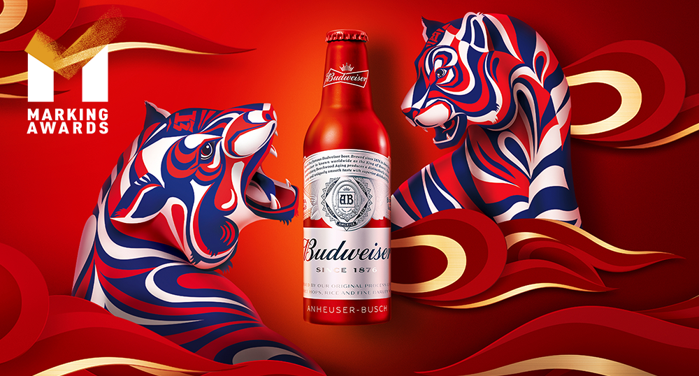
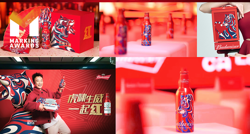
The Spring Festival of 2022 is the third year since we proposed the “Budweiser wants you ‘red’” idea, exclusively used during the Spring Festival with an icon that features Budweiser's unique red color which no other beer brands in China can own. Red is the color of good luck to the Chinese during new years and a natural representation of Budweiser. With the epidemic uncertainty, the “Red” icon also represents Chinese consumers' hope for more "red", more “luck” in the coming year. This year, we continued the "red" success based on the previous two years' record, the challenge? To inject freshness and create new news into this red idea that consumers have been familiar with for two years while keep pushing the concept of "Budweiser red = good luck". The idea of a “Dancing Tiger” sits through all creative assets and is used as the main visual identity for packaging, advertising, and online to offline events. On the forehead of the traditional Chinese tiger, the character "王", the king, is usually placed there as the finishing touch meaning the king of all beasts. To make our tiger distinctive to Budweiser, We inherited the "red" icon with the Budweiser logo, to place on its forehead as the meaning of "red luck", together with the dynamic lines and Budweiser’s very own red and blue brand colors to outline the tiger visual. The tiger identity was unique to the Budweiser brand and achieved the balance of communicating Chinese cultural heritage from an international brand. The 2022 Red campaign was able to keep the visual consistency and brought a fresh perspective to Chinese consumers.
Highlights
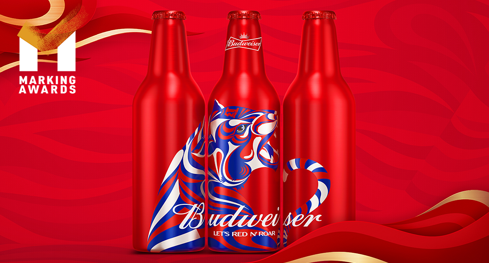
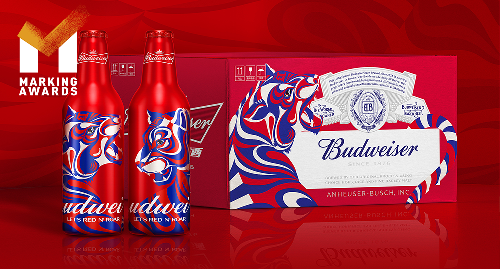
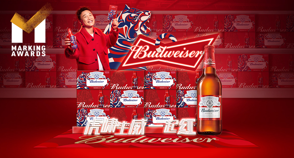
Our goal was not only to make the packaging design stand out but also to take into account the flexibility of the design assets in the entire campaign system, to increase marketing efficiency. The Budweiser Tiger has lived up to expectations and completed the great leap from packaging design to creative communication. Whether it is the advertisement on WeChat moments, the POSM in the supermarket, or even the flash mob activities and offline events, our Tiger was the link connecting the entire marketing campaign. To appear in 70+ Red luck street events in China, "Red" and the tiger identity have achieved consistency and flexibility at the same time. We have also extended this identity to other Budweiser product lines for maximum marketing efficiency. We also designed A and B, 2 types of limited collection bottles. To fans and collectors, we gamified the experience to like if they are opening blind boxes, giving Budweiser's most loyal fans a sense of engagement.
Market Performance
The full case design helped Budweiser reach No.1 on JD's beer brand list. Limited edition tiger bottles were snapped up as a traffic engine and sold out within an hour. Budweiser also topped the list, with GMV up 455% from last year. The total number of people reached was over 68 million, and 21 million consumers saw the tiger on WeChat moments, with a click-through rate as high as 2.1%, winning at design and at sales too. (Data source: JD.com Super Brand Day)
Material
其他
Craft
Budweiser limited Tiger edition uses the aluminum bottles to justify its premium price and to maintain the high-end image of the brand. For the gift pack, we used craftsmanship that’s deeply rooted in Chinese characteristics. We redesigned the Budweiser Year of the Tiger special gift grant inspired by the highly representative and collectible imperial lanterns found in traditional Chinese culture. The lantern also serves to make it an interactive experience for consumers. The rotating glowing lanterns are designed to be reused as storage boxes even after the occasion. The translucent paper printed the unique Budweiser tiger, with the light behind and traditional lantern experience, looks even more vivid.
Does the design solve the problems that are common across the product category?
Our challenge is to make Budweiser’s zodiac tiger unique and distinctive, to stand out where every brand is competing for consumers’ attention with their zodiac limited edition. We want consumers to directly associate our tiger with Budweiser and won’t mistake us with another brand or just another generic tiger. Taking cues from Budweiser’s brand identity, we use its iconic red and blue to outline every stroke of our tiger, highlighting the uniquely designed “Red” 红 character featuring Budweiser’s legacy bowtie. Our energetic dancing tiger exudes great vigor, full of vitality even when used in still. By championing the spirit of progressiveness and movement, our creative assets undeniably and distinctively match Budweiser’s international, bold, and “King of Beers” status.
What functional designs of the work have enhanced the user experience?
The "Red" icon and "Tiger" asset are not only visually distinctive but flexible and easy to use for marketers and easy to recall across the entire consumer journey. In this year's communications, consumers were able to create their own “red” character online based on pre-loaded assets. We have also created a tradition of giving the title "Chief Red Officer" to the celebrities the brand works with during the festival. From online engagement inviting consumers to create their own posters to playing with an animated mini tiger on WeChat moments, and to extending the red luck to 70+ activation events across China with the name of Red Lucky Street – We didn’t miss a single touchpoint for consumers. With the two assets, we maximized marketing efficiency, consistency, penetrating the consumer experience, whether it's online or offline. It’s a red on red experience.
Did the design help increase the sales performance of the product?
The special bottle sold out in an hour on JD and was named a "traffic engine“ by the retailer and the year of the Tiger ad on WeChat moments garnered 21 million views.
Does the work consider sustainability (environmentally or commercially, or both)?
Gift boxes are usually disposed of by consumers after they are given away. The main reason is that they lack practicality. We considered sustainability from the beginning by giving our gift pack a reason to stay and encouraging a greener way of living – We added storage space and lighting effects to the special gift box so that they don't go to waste and can even become a symbol of the brand that lives on in consumers' lives.
Additional Materials