
The material
The packages for liquid food serve several purposes. It is lightweight, flexible and convenient for everybody from liquid food producers to the end consumers. We believes in using less material from the start. Up to 33% of the package consists of chalk (dolomite or calcium carbonate), a natural mineral. By using chalk as a filler, the lightweight package uses a lower amount of plastic, while providing strength and stiffness, to the package. The chalk also makes the material white, which is great for printing opportunities.
The packaging format
We supplies packages for both chilled and ambient distribution, in both portion sizes and family sizes.
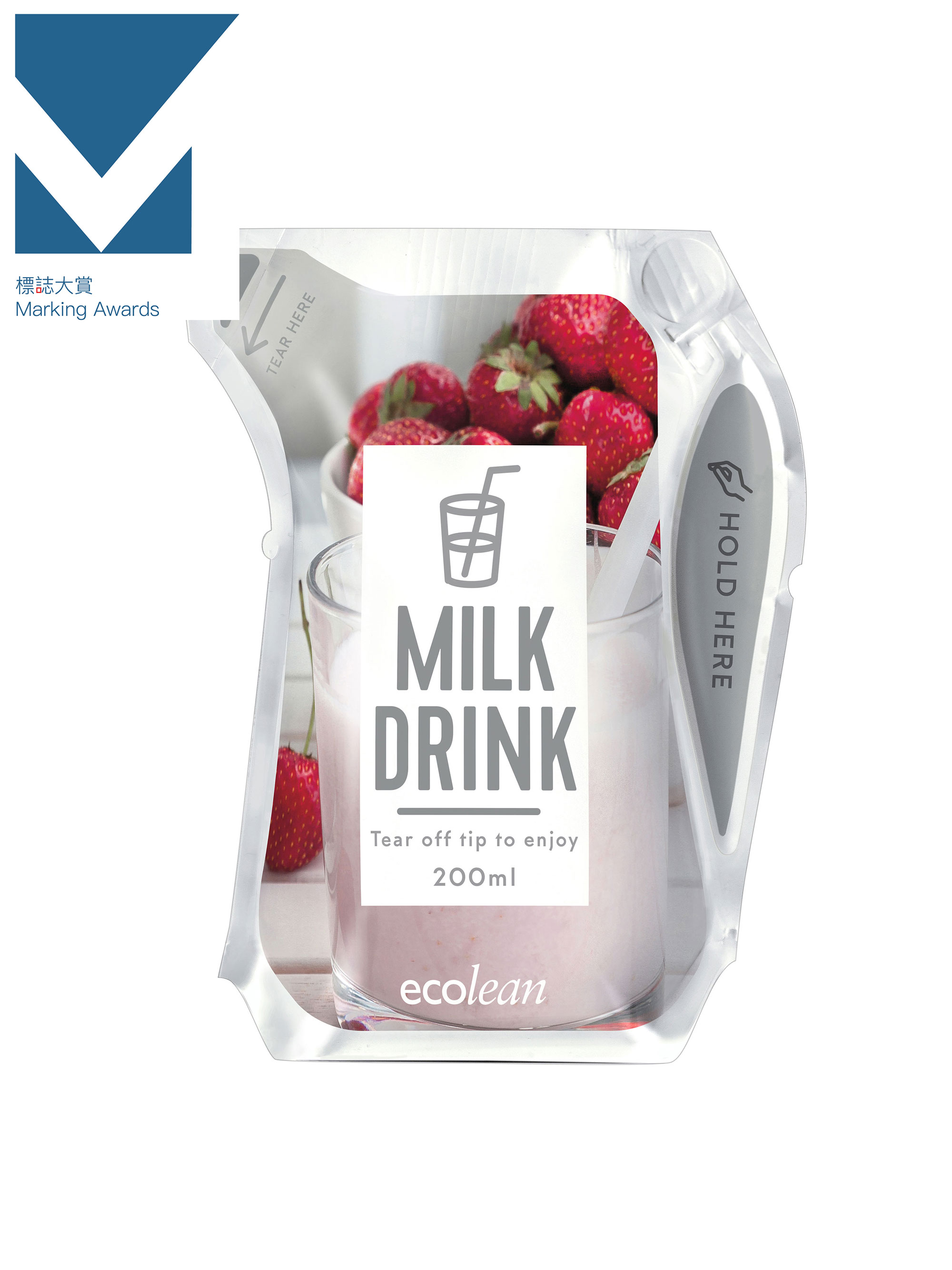
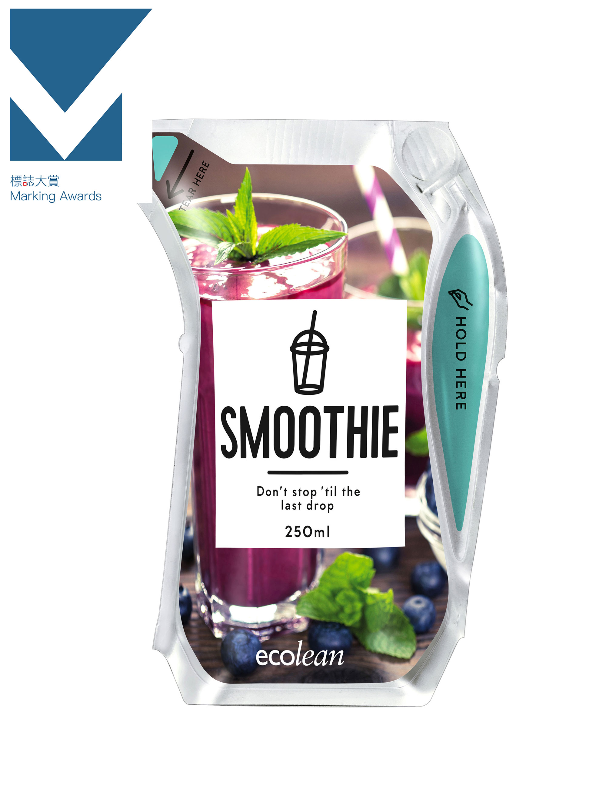
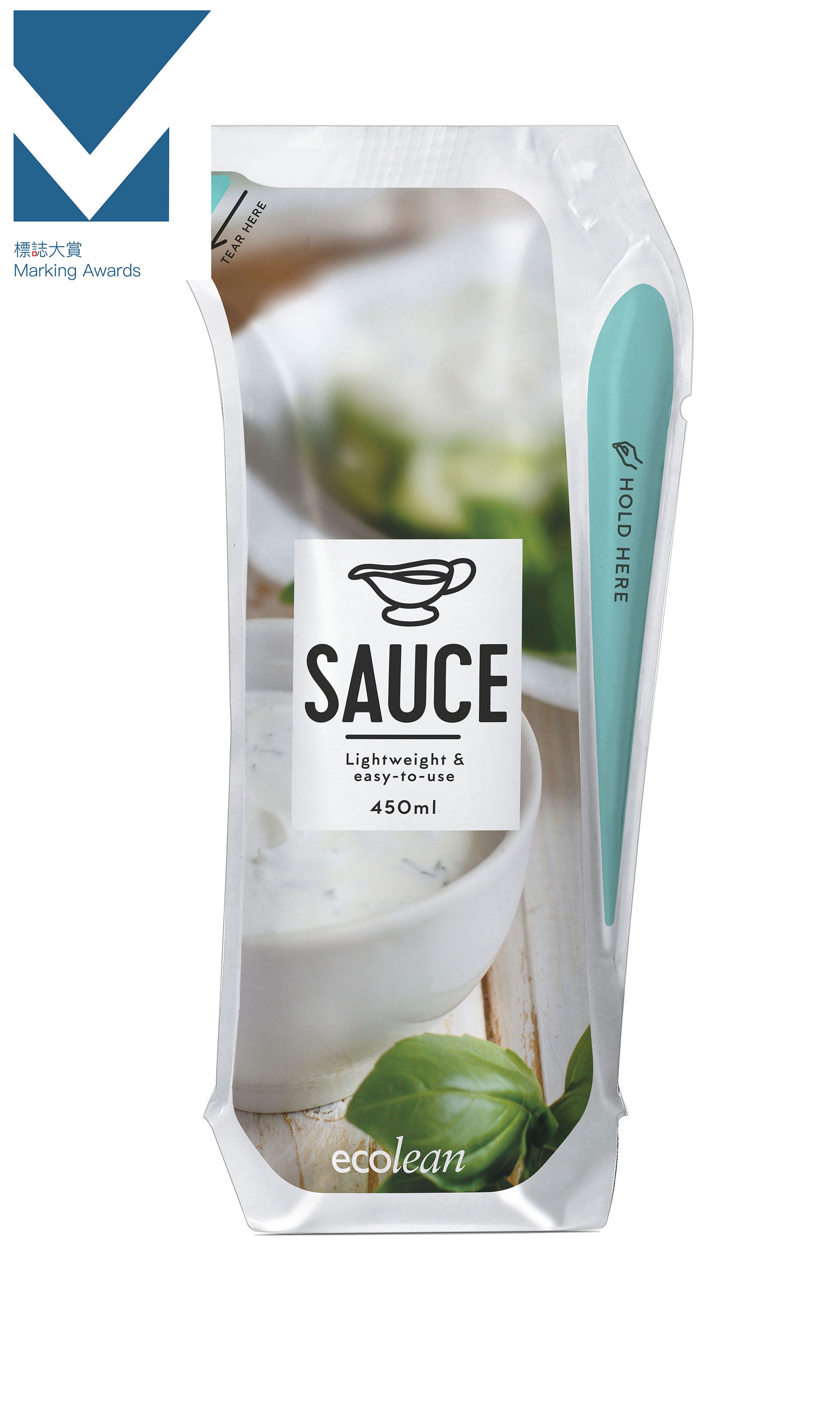
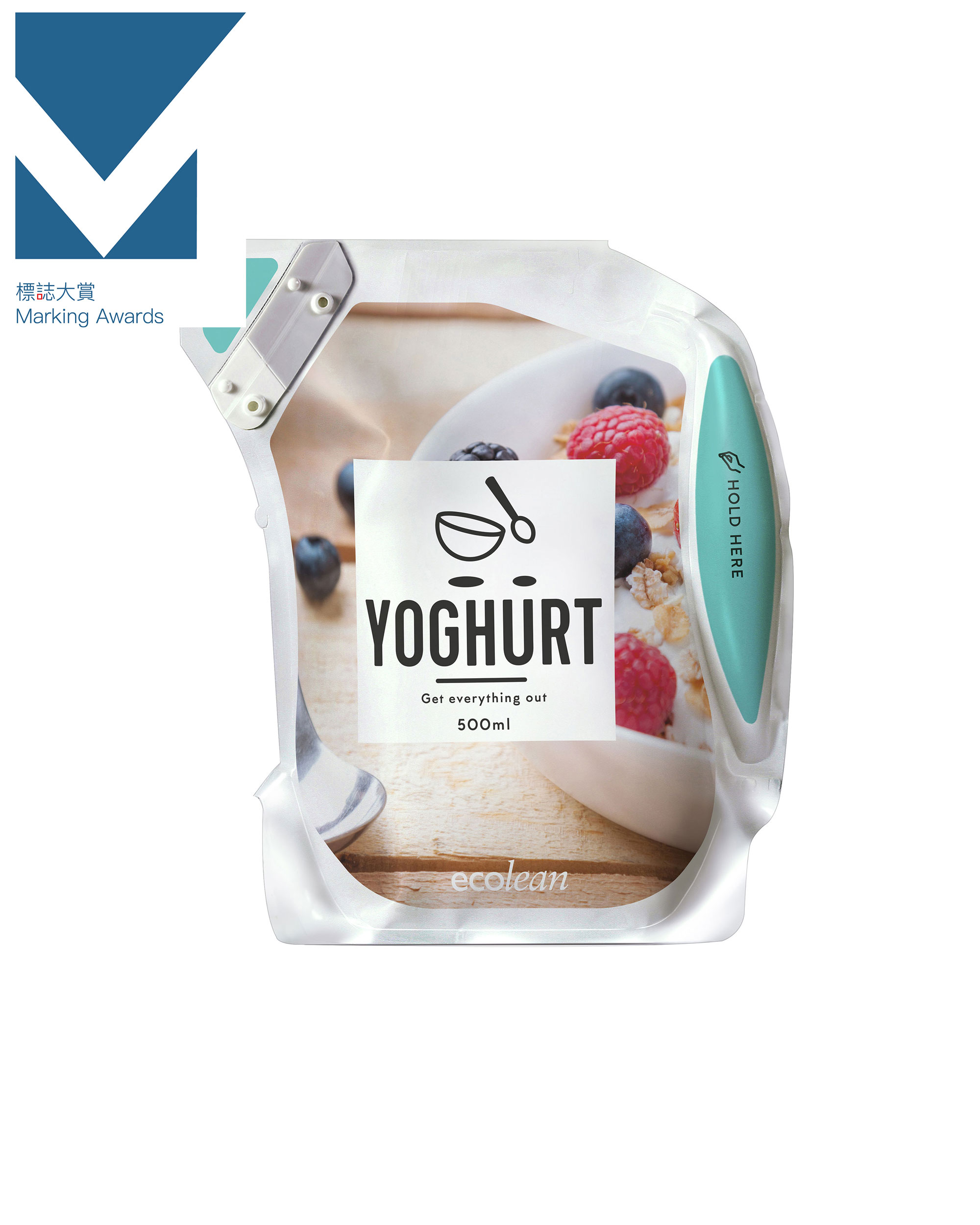
The unique package format is shaped as a pitcher which makes it easy to tear open, easy to pour from and easy to empty. No matter the size, a package always stands stable, even when it’s almost empty. The optional SnapQuick™ for family-sized packages, makes it easy to reclose - just fold and snap and your product will stay safe and fresh for longer. When emptied the package becomes flat as an envelope and will take very little space in the waste bin. The Swedish Rheumatism association recently acknowledged the convenient aspects of the packages. Great proof that the packages can be used by each and every one, and makes the consumers’ everyday life easier.
The sustainable perspective
Thanks to the soft, lightweight material the package ends its days totally emptied, flat as an envelope. Creating minimum waste and almost no food waste. Consumers can easily squeeze the last drop out of the package, no matter how viscous a product is. Once empty, the package is flat as an envelope and it weighs up to 50% less than regular cartons or bottles.
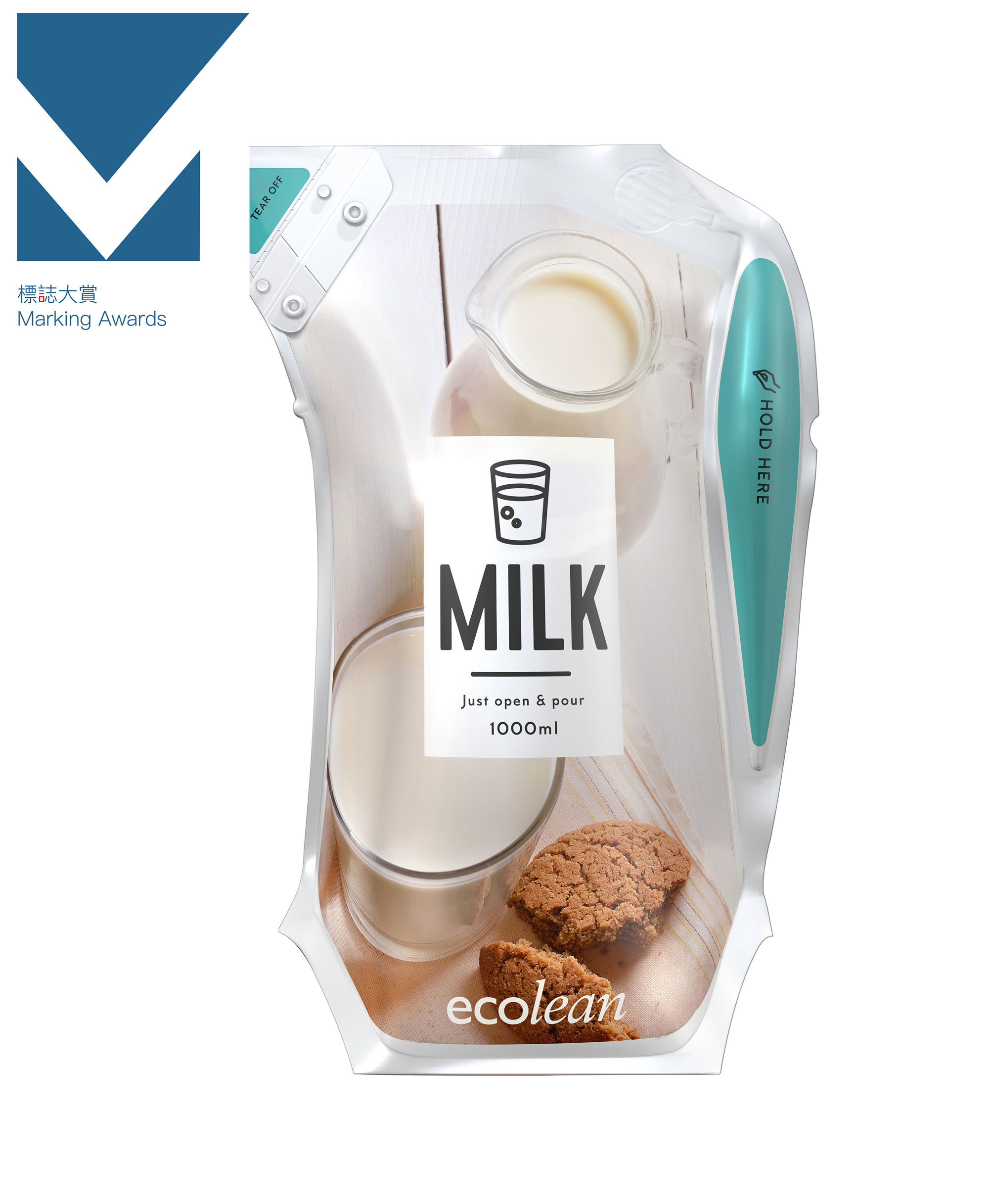
The conceptual designs
To showcase the unique packages we created conceptual designs. We wanted to create a design that could follow through the whole range and show what possibilities there are with the packages.
There are so many different non-carbonated liquid food products that can be easily packed in the packages. All from concentrate, soup and alcoholic drinks to milk. Our packages are perfect for printing, thanks to its white surface and large printing area.
The package design concept created, is close to how real products in the supermarket would look, but with a twist. They are well planned for recognition but at the same time, the combination of the pitcher shape and the modern design will catch the consumers’ eye.
All package sizes have a design adjusted for a specific liquid food product. The images used as a background, show the different contents of the package in a clear and stylish way.
The package design concept
The different package designs share the same type of layout to create a feeling of a product family rather than single products. They all share the same layout but the image, symbols and texts differs from package size to package size. The packages have also been color coded, with two modern colors; purple or turquoise on the handles, tip and backside, depending on if the package is for chilled or ambient distribution. This makes it easier for the consumer to know how to use and handle the product.
The pictures illustrate an opportunity to use the product and make the consumer longing for a nice still drink or an ice coffee.