
Country
Armenia(亚美尼亚)
Official website
https://backbonebranding.com/
Company Introduction
Backbone Branding was founded in 2009 in Yerevan, Armenia. Ever since, the agency has become one of the leading names in the branding and packaging design field, having earned more than 70 awards from international competitions (Pentawards, A’design Awards, Makring Awards, World Brand Design Society, etc.) as well as projects implemented all over the world. Our works published on numerous magazines, books and design platforms worldwide such as getting the cover of the 5th edition of the Pentawards book. Backbone Branding has received the Pentwards title of Agency of the Year 2019 and 2020, making it the first agency in the region to receive this distinction as well as the first ever in the history of this competition to get the title two years in a row. Given that design is a universal language, the team has various international projects world wide. The founder and creative director of the agency, Stepan Azaryan is a jury member of professional design competitions including the Pentawards, D&AD, the Marking Awards, C-IDEA Awards, ADC awards, etc.) He has been solicited abroad to give speeches and talk about design philosophy and approaches. In 2019, in Shenzhen, China, he was invited to speak in front of thousands and 4.2 million live streaming audiences at the 20th anniversary of Baixinglong Creative Packaging (BXL)
Images
Brand Name
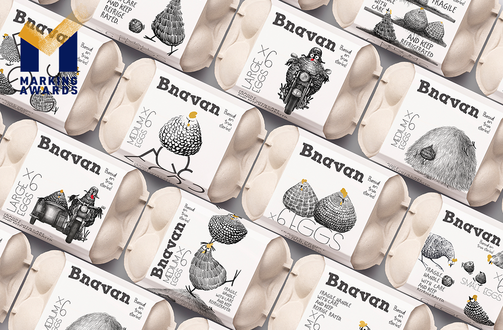
"Bnavan" Eggs
Designer Name
Lusie Grigoryan, Nelly Stepanyan, Stepan Azaryan, Elina Barseghyan, Mane Budaghyan
Position of Designer
Brand Strategist: Lusie Grigoryan Brand Strategy Assistant: Nelly Stepanyan Creative Director: Stepan Azaryan Illustrator: Elina Barseghyan Graphic Designer: Mane Budaghyan
Client
"Bnavan" LLC
Target Group
People who choose a healthy lifestyle, prefer to buy products with a natural base, and choose products from a reliable manufacturer. The main buyer is women who buy products for the family.
Major sales
Other D2C
Positioning
Other D2C (direct-to-customer) and not a mass production. To order the product the Customer have to Subscription.
Design Story
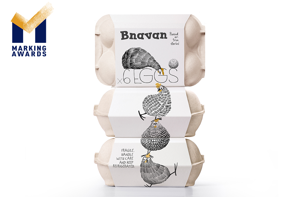
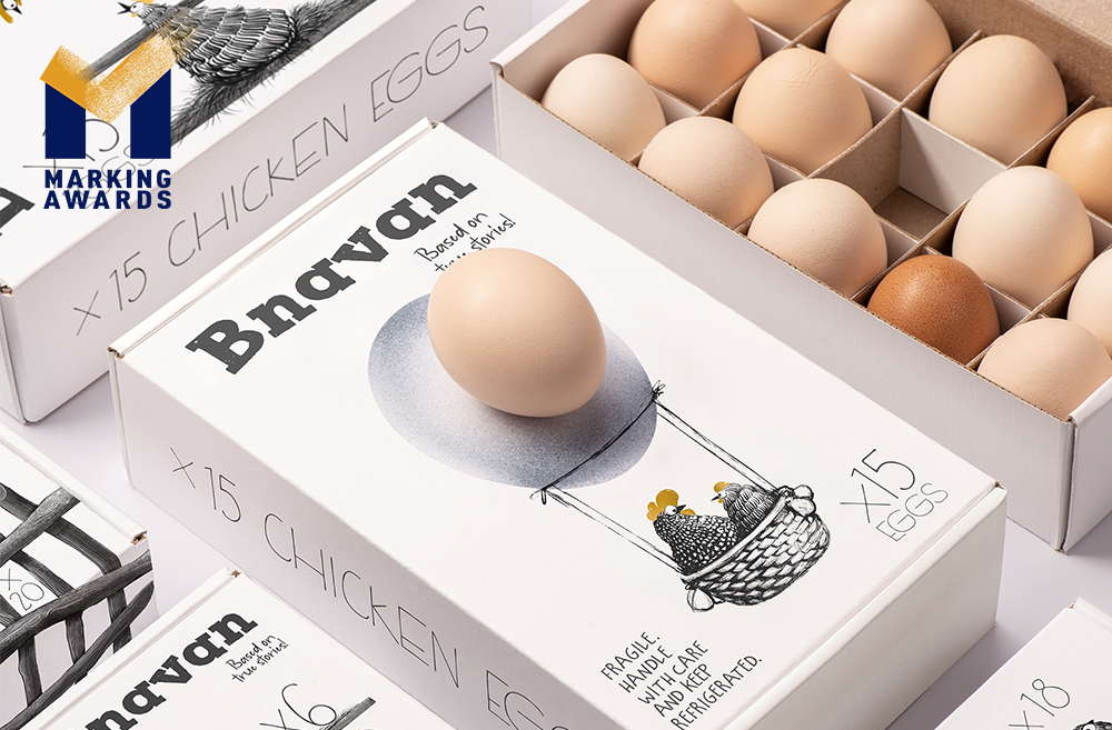
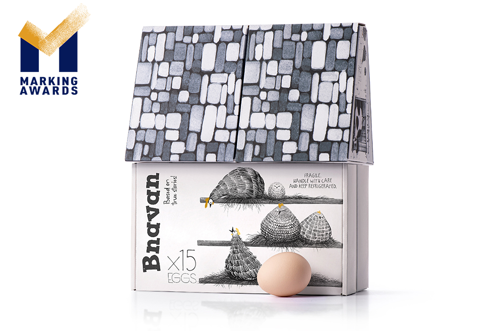
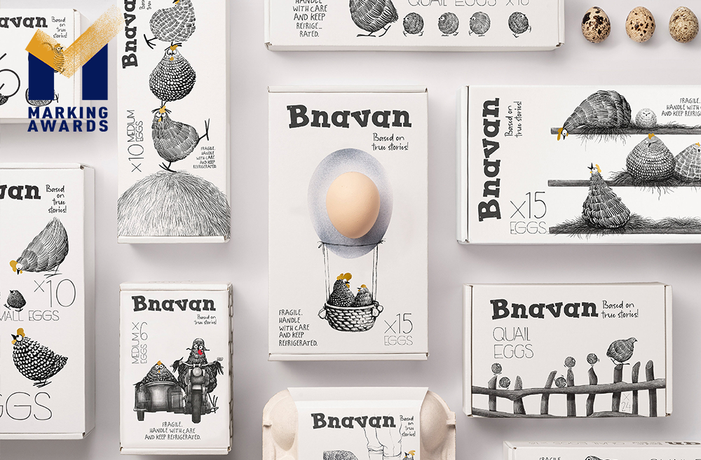
CHALLENGE Our loyal client that operates on the Direct-to-consumer market approached us to brand their dairy products. The specificity of their business model is private delivery of goods by permanent subscription, so the challenge was creating an engaging brand that would reach the consumers that go for a healthy lifestyle, originate strong emotional connections with them and communicate the concept and story of the brand. SOLUTION Taking into consideration the low-end type of our client’s activity, we suggested a solution that required a standard budget packaging, with illustrations that create an emotional bond acting beneficially for the brand promotion. We chose the brand's main characters - hens and turned them into fearless, friendly, fun-loving characters looking for endless adventures to turn their day into a game and illustrated different episodes of their farmline stories on the packaging. As the brand's strategy is D2C, it allowed us to regularly change the graphics on the packaging. On one hand it gives the designer an endless ground of imagination and creativity, which also contributes to the brand’s quick adaptation to the market’s needs and strong positioning of the brand in the market. On the other hand, the 2 color illustrations make the continuously changing graphics on the packaging affordable for the client. RESULT Our hens live in freedom with other farm animals, which is also essential as a healthy environment contributes to the product quality. We used limited colors: we kept white as a color typical for dairy products, highlighting its naturalness, contrasting with black and gold as an accent color.
Highlights
CHALLENGE Our loyal client that operates on the Direct-to-Consumer market approached us to brand their dairy products. The specificity of their business model is private delivery of goods by permanent subscription, so the challenge was creating an engaging brand that would reach the consumers that go for a healthy lifestyle, originate strong emotional connections with them and communicate the concept and story of the brand. SOLUTION Taking into consideration the low-end type of our client’s activity, we suggested a solution that required a standard budget packaging, with illustrations that create an emotional bond acting beneficially for the brand promotion. We chose the brand’s main characters – hens, and turned them into fearless, friendly, fun-loving characters looking for endless adventures to turn their day into a game and illustrated different episodes of their farmline stories on the packaging. As the brand’s strategy is D2C, it allowed us to regularly change the graphics on the packaging. On one hand it gives the designer an endless ground of imagination and creativity, which also contributes to the brand’s quick adaptation to the market’s needs and strong positioning of the brand in the market. On the other hand, the 2 color illustrations make the continuously changing graphics on the packaging affordable for the client.
Market Performance
As the product is new to the market time is needed for more accurate marketing indicators.
Material
Paper
Craft
We have used simple 2 color funny and lively illustrations, which took the role of creating a strong emotional connection with the customers and generating benefits for the brand. The white background is used for affordable printing and at the same time, communicates the freshness and pureness of dairy products. So we dispensed the different scenes of farm life storyline on different products’ packaging, maintaining the brand identity and making the customers discover the new scene of the farm life ordering a new pack of healthy natural products.
Does the design solve the problems that are common across the product category?
none
What functional designs of the work have enhanced the user experience?
none
Did the design help increase the sales performance of the product?
none
Does the work consider sustainability (environmentally or commercially, or both)?
none