
Country
U.S.A.(美国)
Official website
https://www.pepsico.com/
Company Introduction
PepsiCo products are enjoyed by consumers more than one billion times a day in more than 200 countries and territories around the world. PepsiCo generated more than $67 billion in net revenue in 2019, driven by a complementary food and beverage portfolio that includes Frito-Lay, Gatorade, Pepsi-Cola, Quaker and Tropicana. PepsiCo's product portfolio includes a wide range of enjoyable foods and beverages, including 23 brands that generate more than $1 billion each in estimated annual retail sales.
Images
Brand Name
Quaker
Designer Name
PepsiCo Design & Innovation
Position of Designer
None
Client
PepsiCo
Target Group
Food Consumer
Major sales
E-commerce; Supermarket & CVS; Grocery
Positioning
Mass Production
Design Story
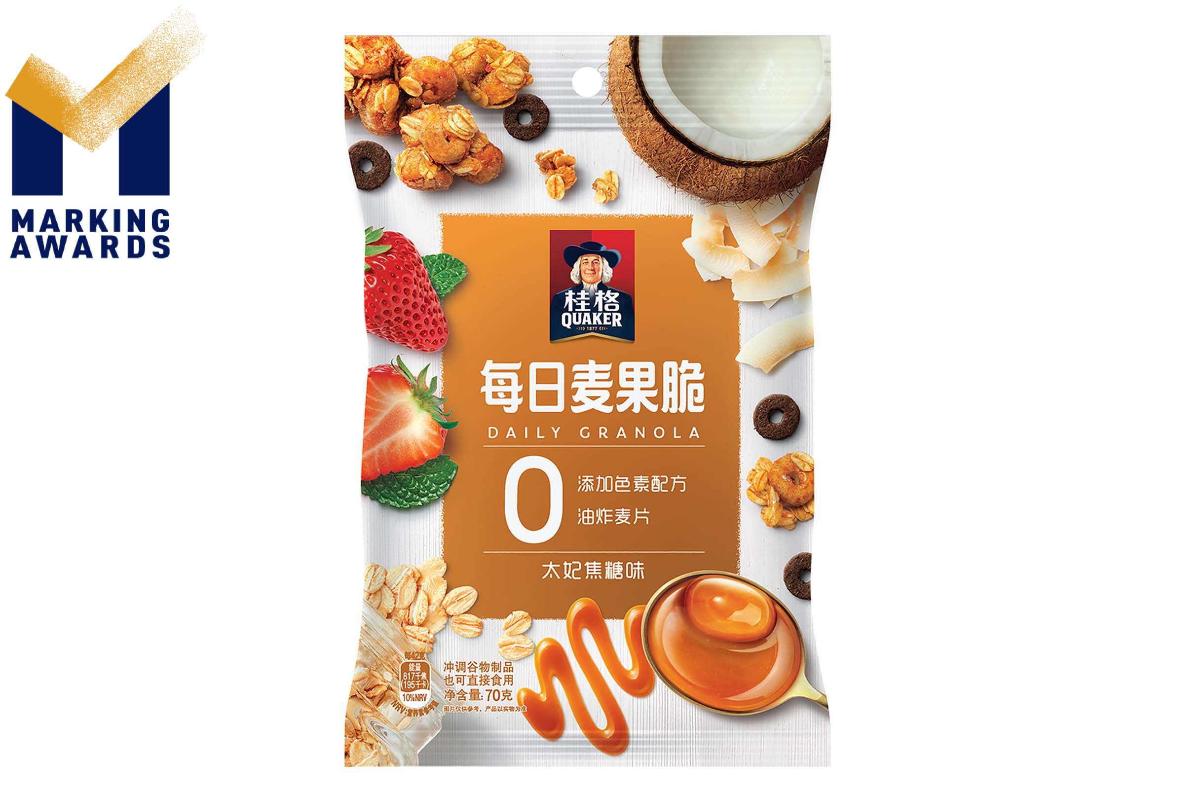
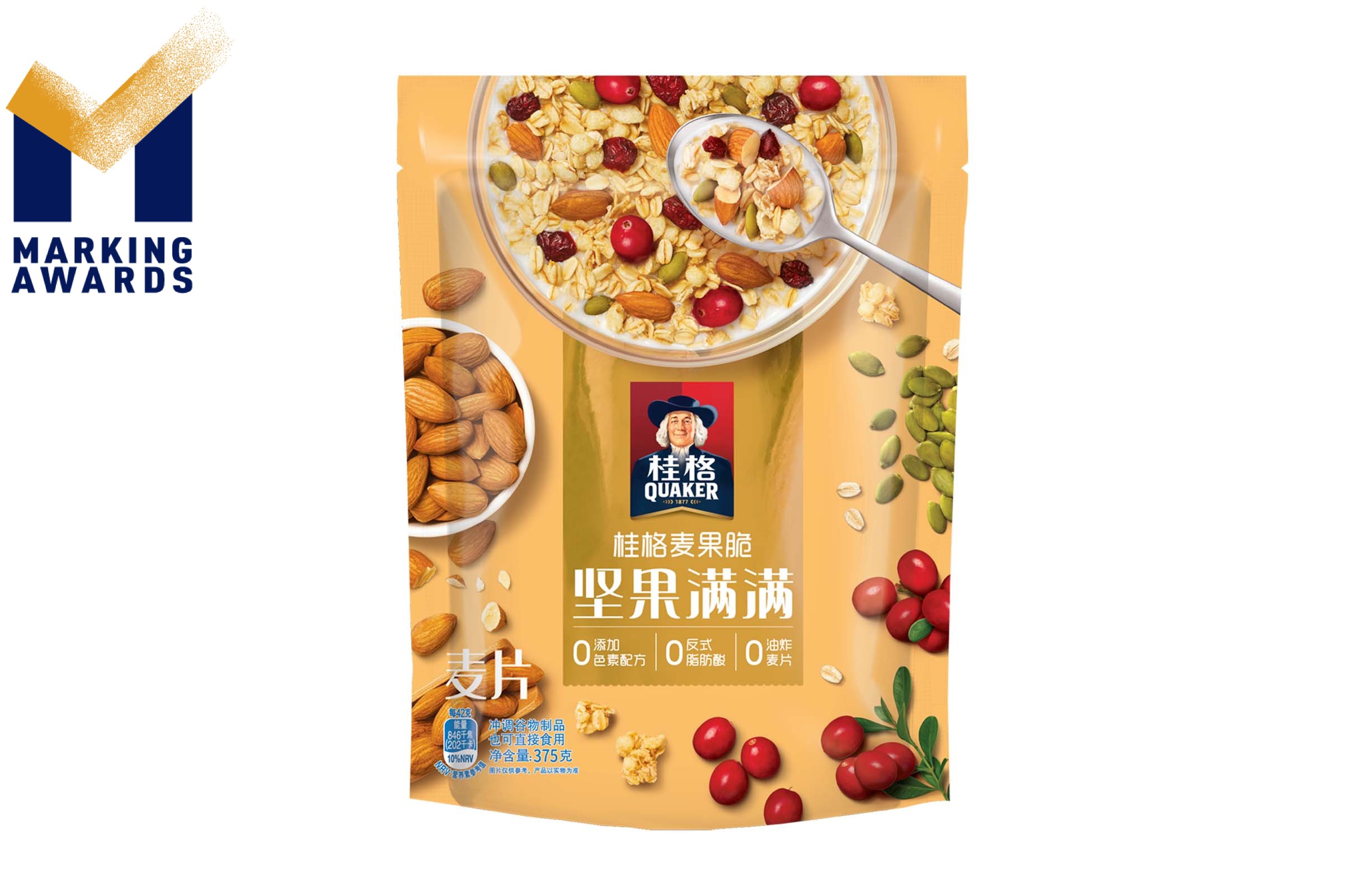
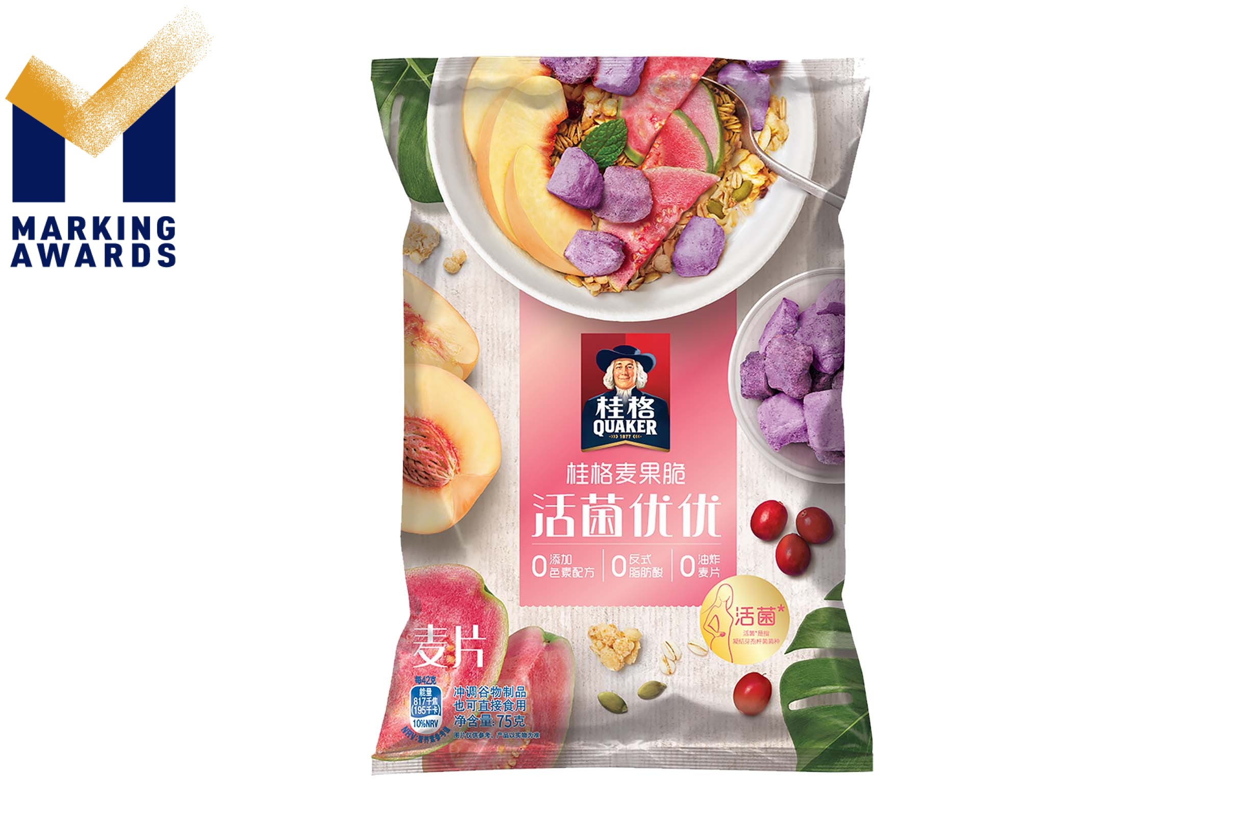
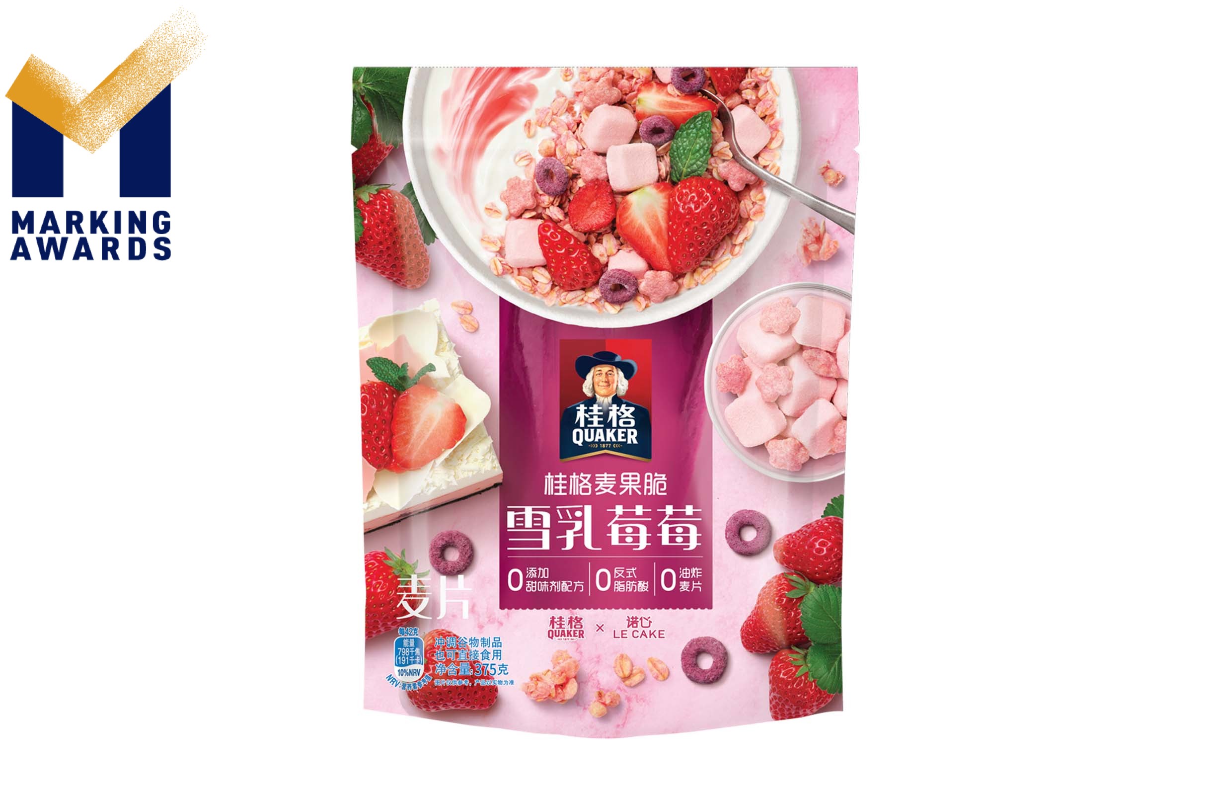
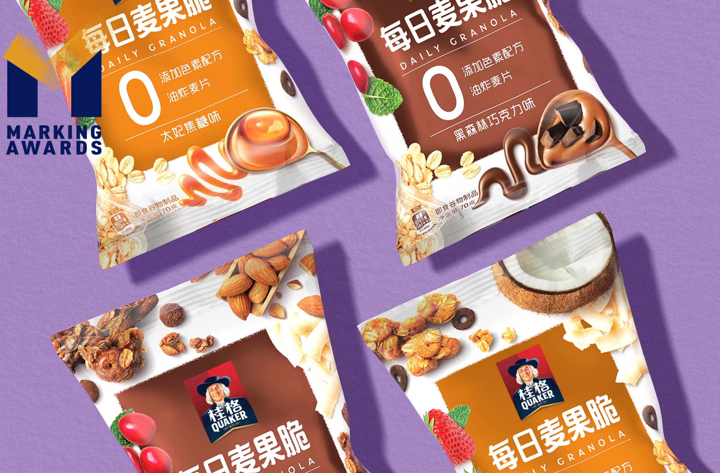
Consumers around the world are becoming more conscious in their food choices, and the food trends in the Chinese market are following suit. Quaker is all about goodness you can taste, and it was time to update the Visual Identity System to strengthen that message for Quaker Granola in China. As the granola line kept evolving and bringing new novelties to the market, the need became clear to distinguish Quaker Granola from its competitors and upgrade the pack design to engage local consumers seeking out new snacking experiences. It was a priority for us to expand consumers’ recognition of Quaker Granola from a traditional tasty breakfast item to a delicious snack food option, as well. Granola is a relatively new product to the Chinese market but has quickly become highly competitive, so the challenge for this restage was for Quaker to cut through the noise in order to maintain relevance to our consumer. In designing these packs, it was important that we highlight the rich variety of flavors and ingredients and create a contemporary design that would be able to create resonance with local and global social media. The restage needed to maintain consistency with the previous design for recognition, but introduce a bold new layout for maximum impact. In a convention-breaking move, the Design Team placed the beautifully styled bowl of granola at the top center of the package. This way, the granola’s visual appeal is on display, while allowing the Quaker logo to take precedence front and center to ensure brand awareness. The new Quaker Granola packaging features beautiful bursts of color and a newly introduced metallic finish behind the Quaker logo which adds a premium, quality feel to the granola packaging. Ingredient-centric photography highlights granola as the hero ingredient with mixed flavors and a wide variety of creative serving possibilities, including fresh fruit ingredients.
Highlights
In a convention-breaking move, the Design Team placed the beautifully styled bowl of granola at the top center of the package. This way, the granola’s visual appeal is on display, while allowing the Quaker logo to take precedence front and center to ensure brand awareness. The new Quaker Granola packaging features beautiful bursts of color and a newly introduced metallic finish behind the Quaker logo which adds a premium, quality feel to the granola packaging. Ingredient-centric photography highlights granola as the hero ingredient with mixed flavors and a wide variety of creative serving possibilities, including fresh fruit ingredients.
Market Performance
Confidential
Material
Other
Craft
None
Does the design solve the problems that are common across the product category?
None
What functional designs of the work have enhanced the user experience?
None
Did the design help increase the sales performance of the product?
None
Does the work consider sustainability (environmentally or commercially, or both)?
None