
Country
中国(China)
Official website
无
Company Introduction
LightBrand is a brand studio founded on June 1, 2012, adheres to the idea that creative people should always get back to the origin and think like a child. We aim to bring emotions and impacts to the world with our creativity, audience-oriented solutions, and functional design. As your out-sourced CMO, we provide minimized and customized full brand services including branding consultation, design and marketing. We focus on high-quality output of brand content and providing unexpected experience for consumers, so as to help brands create its own unique brand experience and resonate with the feelings of the new generation even with limited budget. Lighting For You – together we shine like diamond!
Images
Brand Name
Superior Source
Designer Name
Tong Liu, Yan Tian, Peng Zheng
Position of Designer
CEO, Director of Visual, Design Director
Client
Shanghai Tangjia Enterprise Management Consulting Co., Ltd
Target Group
New generation of mothers aged 27 to 33 in the 1st- tier cities in the Chinese market. The portraits of core users are as follows: 1. New moms of post-90s generation with relatively younger age, strong emotional consumption, high acceptance to new things and pursuit in beauty and fashion; 2. New moms that love social and follow online mom communities, has strong community communication power and are easy to be influenced by community members; 3. Strong woman with career ambitions, high rationality and strong consumption power; 4. Housewife who focus on family’s needs and pay attention to cost performance.
Major sales
电商 E-commerce
Positioning
大货 Mass Production
Design Story
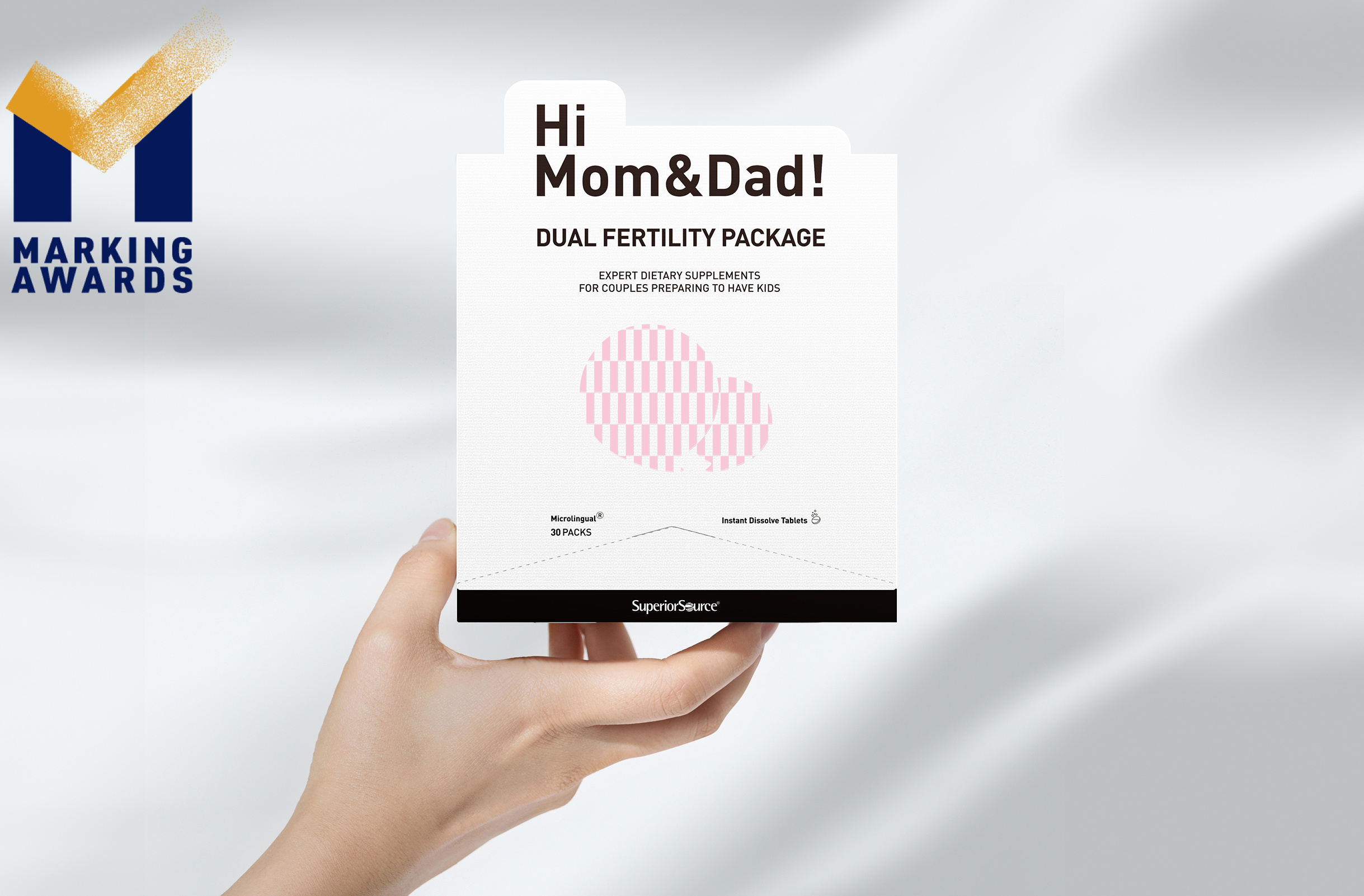
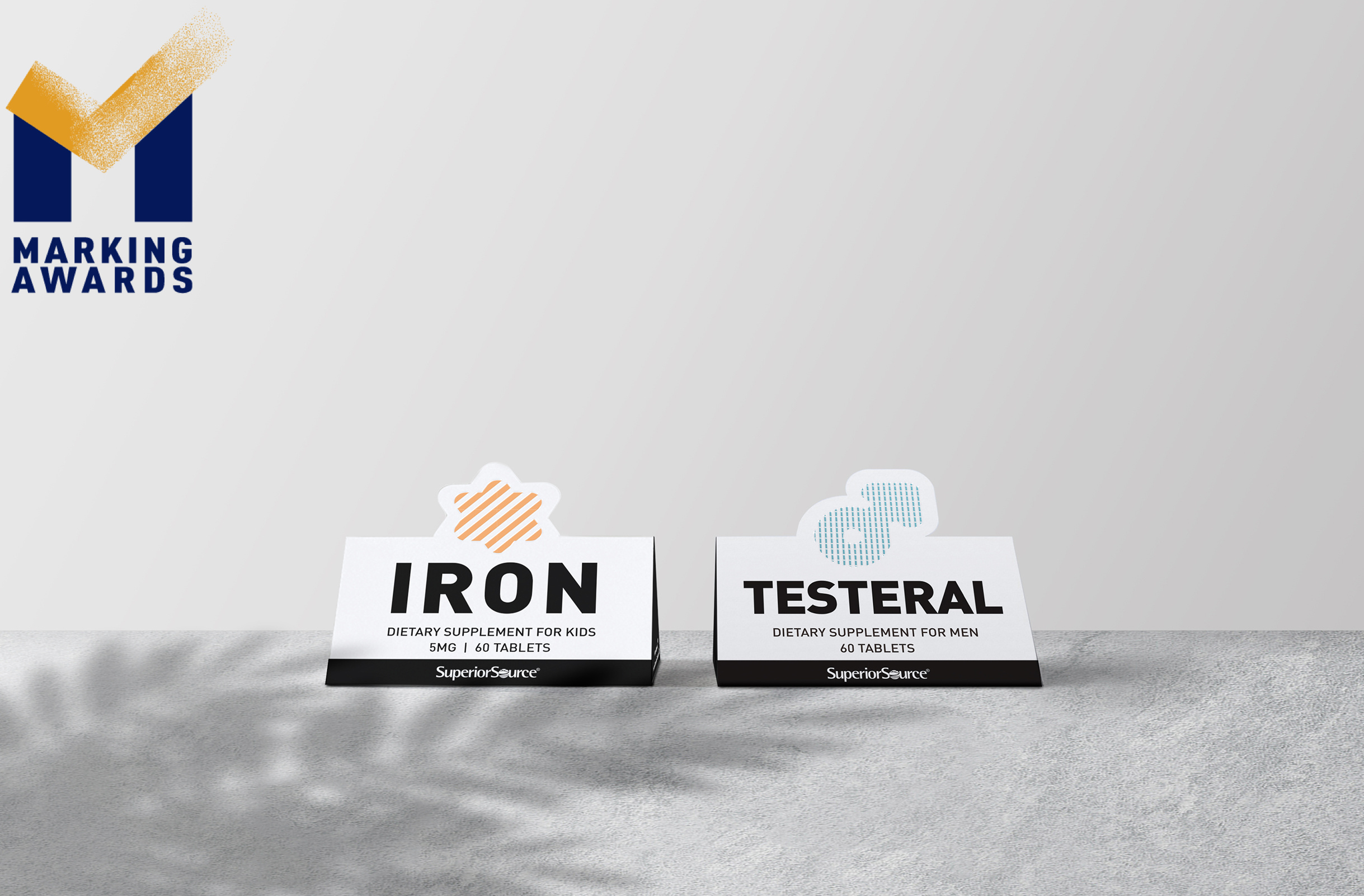
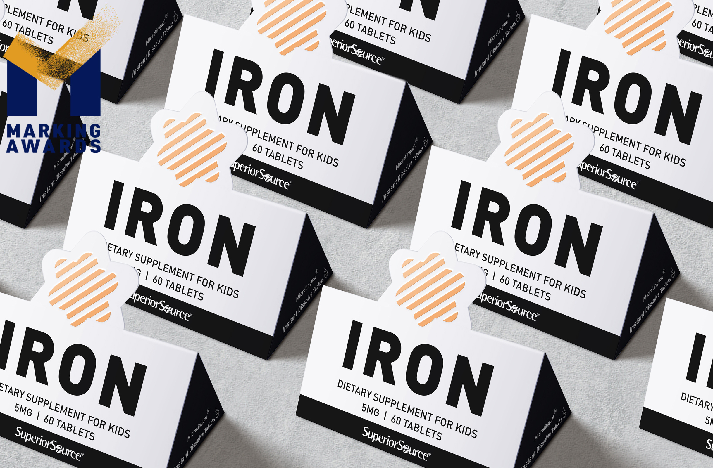
With the increasing status of women, pregnant women possess higher self-cognition and are no longer overwhelm by the roles that others expected them to be. They are individuals in the first place, and then the expectant mother. Therefore, the design of the work eliminates feminine stereotypes of "pregnant women", and adopts a young and cool style to highlight self-awareness of pregnant women and to covey the idea that they can still be themselves even in pregnancy. In terms of design techniques, we adhere to the brand concept of "less is more". The main tone is minimalism in black and white to expresses the brand’s value of pursuing simplification and efficiency. Without any redundant decorative elements, different product lines are clearly distinguished by colored icon patterns supplemented by the special-shaped cutting design. The prenatal and dual fertility draw-out boxes feature dynamic icons adapted with interlaced color patches, ripples of amniotic fluid, and crossing lines representing connections to symbolize the three stages of preparation, pregnancy and postpartum period.
Highlights
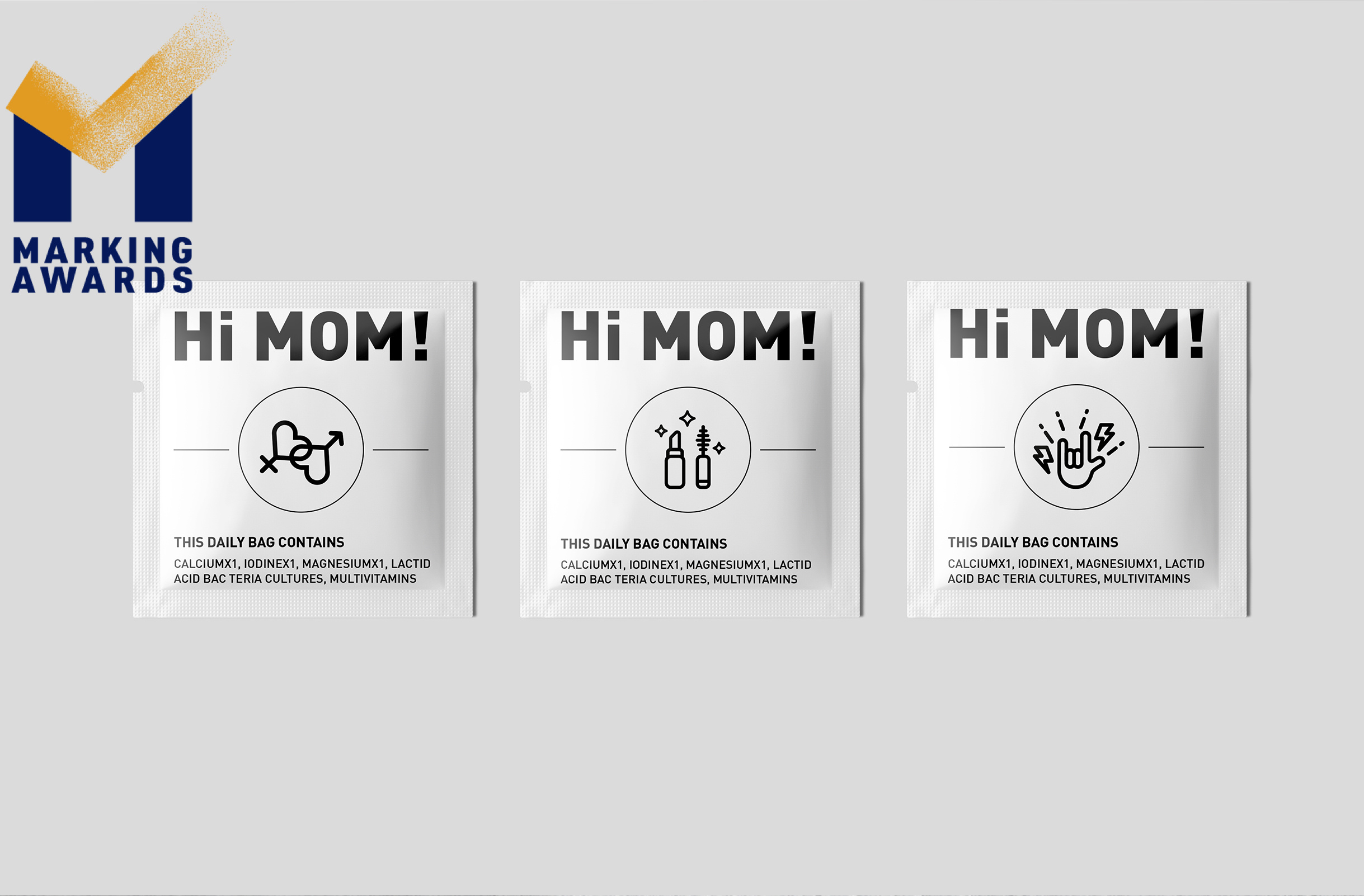
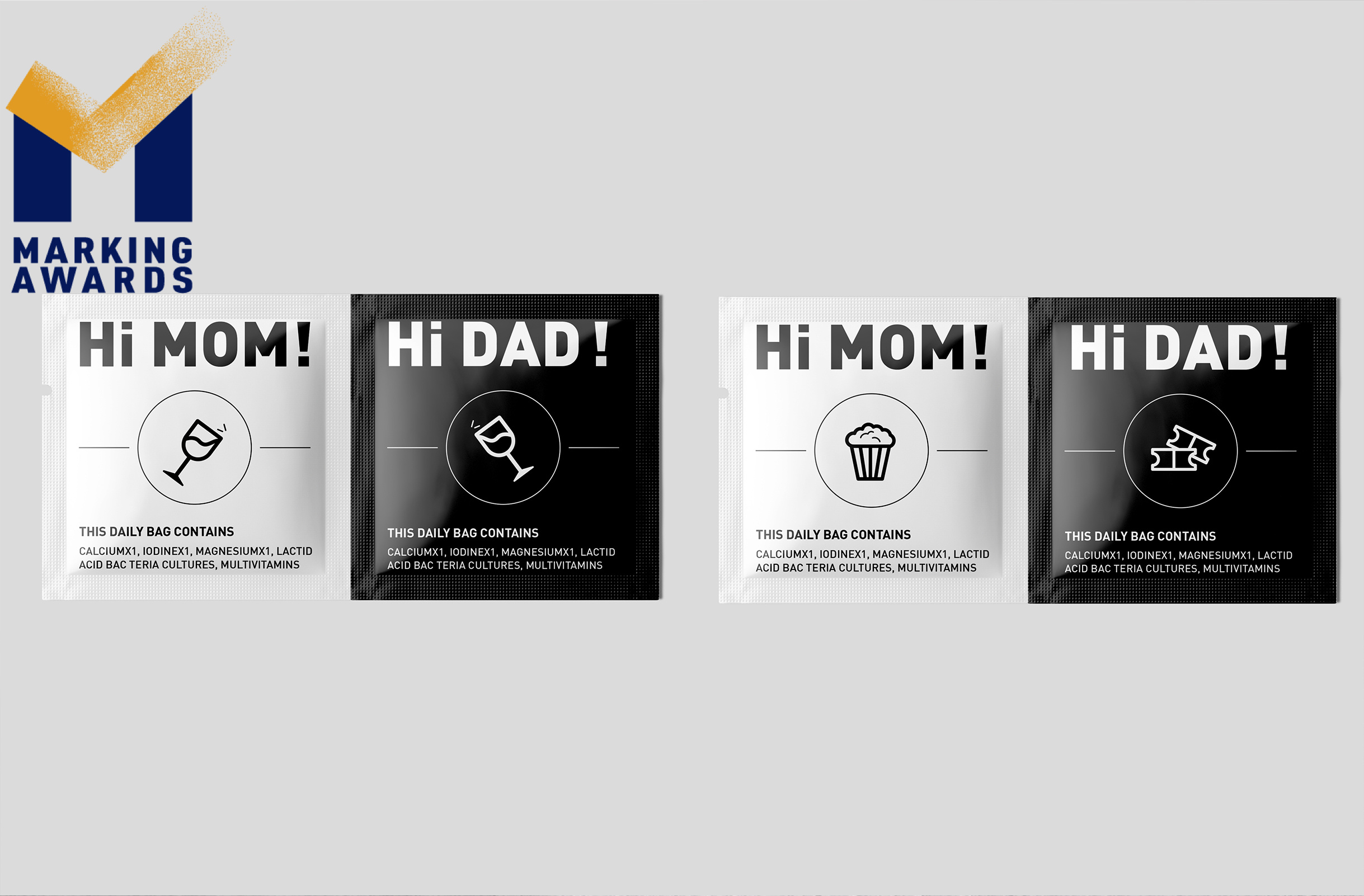
Individual daily packs have interactive small icons designed to add human touch and to strengthen the brand’s connection with consumers: For prenatal packs: icon of gradually enlarged bellies representing the growing of fetus as customer taking the packed supplements; For postpartum packs: icons of compensatory postpartum activities that they can’t do in pregnancy, such as drinking cocktail, doing extreme sports and manicure; For dual fertility packs: icons of couples’ activities, such as paired game handles, to recall good memories, enhance couple bonding, and help prepare for pregnancy from the psychological level.
Market Performance
Planed to go to market in 2022 Q3-Q4.
Material
纸质 Paper
Craft
The work adopts three widely used techniques, namely CMYK printing, UV coating and special-shaped knife cutting. The techniques endow the package with significant difference without increasing too much cost or difficulty of implementation. The work is realized with CMYK printing. The special-shaped standing icons is realized by means of knife cutting and carried UV coating. The hollow-out visual progress bar is also realized by knife model cutting, which is common without additional process or cost.
Does the design solve the problems that are common across the product category?
Similar products with draw-out box package usually have the problem of consumption visualization. It’s hard to tell how many packs are left in the box. The hollow-out progress bar on the side of the box well addressed the problem by visually presents users the progress of usage. With the consumption progress being showed at a glance, the progress bar becomes a reminder for consumers to continue the habit of daily usage, and a trigger for repurchase behavior.
What functional designs of the work have enhanced the user experience?
[Draw-out Instruction Manual] The instruction manual is fixed on one side of the product box in the form of a draw-out card, so as to avoid the trouble of opening the box or the inconvenience of losing the instruction manual. [Easy-to-tear Opening] The top of the triangular opening on draw-out box is in full cut rather than pressed point line cut. Consumers do not need to buckle the triangular area with extra force, which may lead to the deformation of the box. They just need to hold the full-cut opening at the top and the triangular opening area can be teared easily and gracefully.
Does the work consider sustainability (environmentally or commercially, or both)?
The triangular-prism-shaped box design shows sustainability by reducing material usage and collision loss. Compared with the conventional cube box package, the triangular prism box reduces one elevation, which saves nearly 20% of paper and printing consumables. The content of the box is a glass bottle containing instant dissolve tablets. The tablets are fragile due to no adhesive. With the triangular prism shape, the glass bottle is fixed perfectly in the box. With less shaking or collision caused by the gap between the bottle and the box, the design reduces the damage and waste of tablets. The triangular-prism-shaped box can be stored and transported in an inverted buckle mode, and the collision and loss are further reduced through the stable triangular structure.
Additional Materials