
Type of applicant company
设计机构
Country
中国
Company Website
无
Images


Brand of the Product
DE HUA LOU
Designer Name
Creative Director: Zhang Yanhu;Designer:ZhangXingTong、 XuYanLiang;Illustrator:LiAn;Technical director: Zhou Xiaoli
Position of Designer
Creative Director: Zhang Yanhu;Designer:ZhangXingTong、 XuYanLiang;Illustrator:LiAn;Technical director: Zhou Xiaoli
Target Consumer
A broad consumer group
Distribution Channels
大型商场 Shopping Mall; 小型商超和便利店 Supermarket & CVS; 餐饮&酒店 Restaurants & Hotel; 其他销售渠道 直营专卖店
Positioning
大货消费品 Mass Production
Design Story
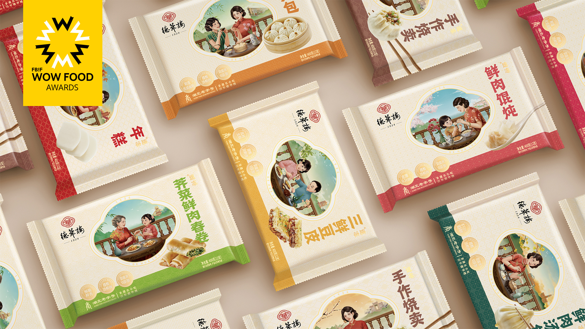
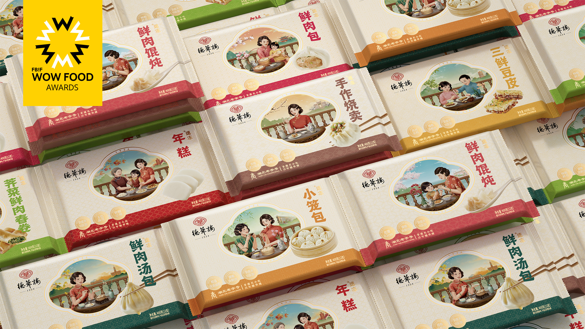
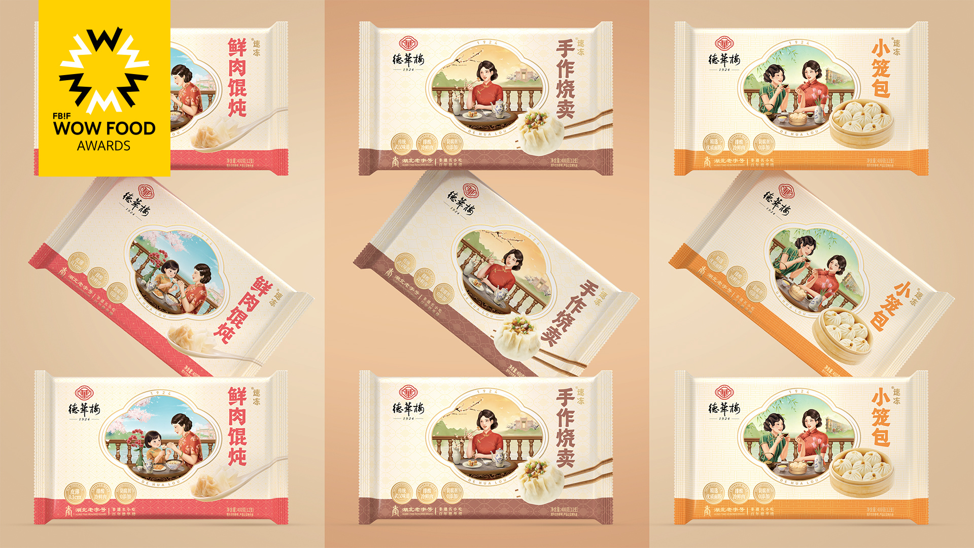
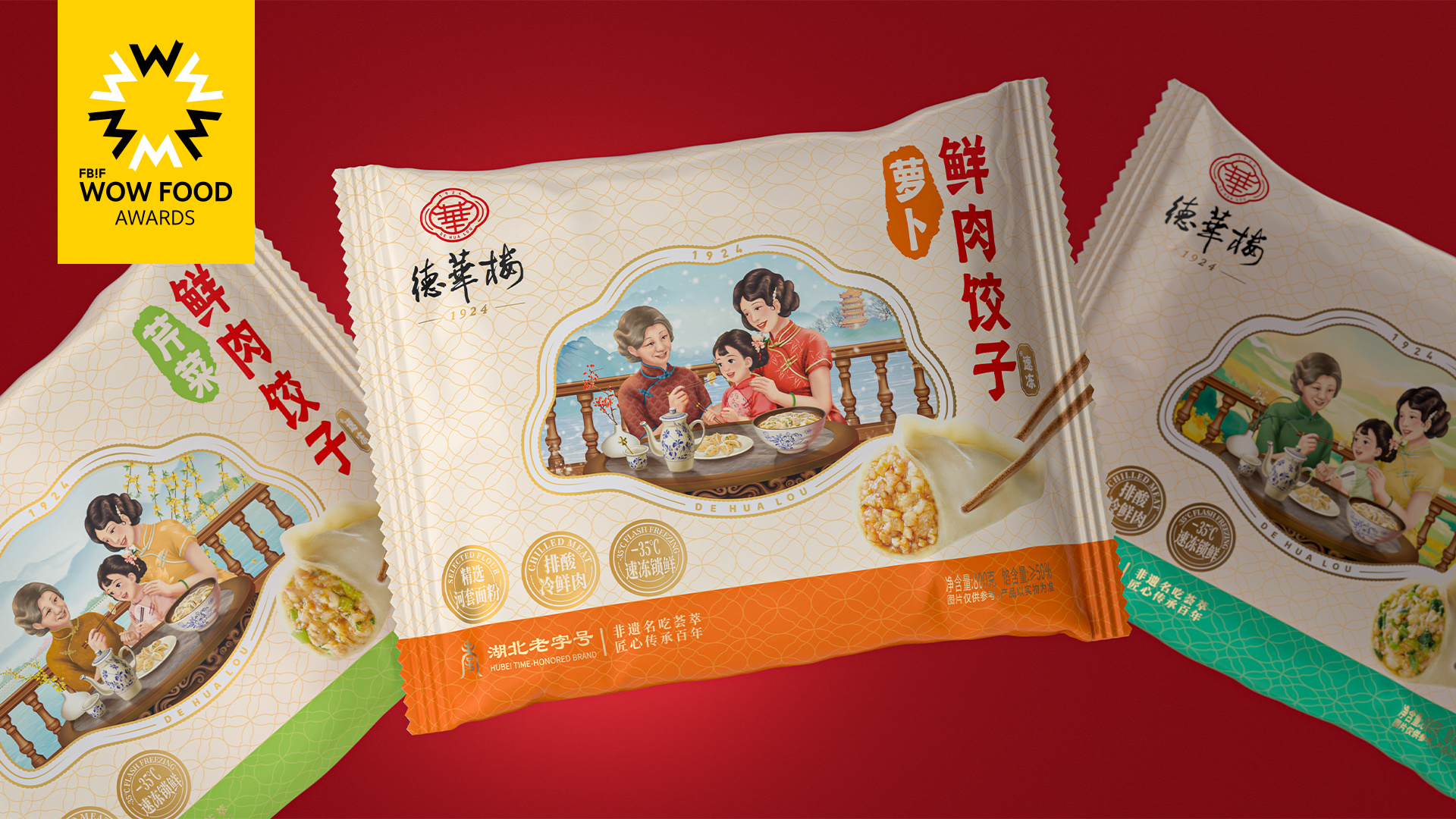
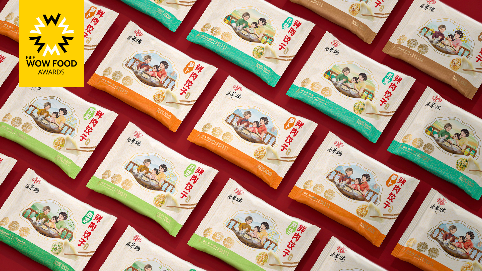
Dehualou is a century old chain brand that focuses on traditional Chinese snacks and has deeply rooted itself in the local community.However, the packaging of its own products lacks a sense of brand culture, quality, and series. In 2023, the brand hopes to upgrade the packaging of this series of products, improve brand quality and sales conversion, and promote it to a wider market.The packaging design starts from "culture and emotion", using delicate and retro illustrations, integrating the clothing, objects, and historical buildings of the brand's birth period, like old photos, expressing the vivid scene of consumers sharing food 100 years ago with strong warmth.The product is differentiated into series based on different character combinations, scenes, food photos, and auxiliary colors, making operational management more standardized and improving sales conversion!
Highlights
The packaging of this series of products is combined with the era when the brand was born, using delicate and retro illustrations to depict the vivid scenes of consumers experiencing and sharing food at that time. Firstly, it reflects the cultural value and product quality of the brand, and more importantly, it can resonate with consumers. It also expresses that no matter how time and environment change, what remains unchanged is that the brand pursues the original intention of product quality and human pursuit of harmony The emotional value of care and sharing.
Market Performance
None
Material(For concept works, please choose the material you plan to use)
PET塑料 PET material
Craft
The picture uses a 9-color UV printing process, and the bag is made of PET material.
Does the design solve the problems that are common across the product category? If so, please explain.
As a traditional snack packaging design for prefabricated packaging, transparent bags or physical photos are generally used, lacking the cultural, narrative, emotional, specialized, communicative, and quality sense of the product, and the shelf display cannot be standardized.The design of this series of products is based on the brand's culture and history, emotional experiences in consumer scenarios, shelf thinking, and brand communication,For example, using real-life images of different groups consuming products from a century ago to reflect culture and emotions; The outer frame of the screen is the design of the brand logo and product form, reflecting the specificity; Different categories correspond to different scenes and auxiliary colors, reflecting product serialization standards!
What functional designs of the work have enhanced the user experience?
None
Did the design help increase the sales performance of the product? If so, please give related evidence.
This series of packaging first established the packaging system standards for the series products, with different scenes and colors corresponding to different series products, making the display standards clearer and more efficient. Consumers are also more likely to choose products, improving purchasing efficiency and conversion.Combining scene images with different consumer groups to share different scenes of food, the warm and retro experience scene uses emotional means to increase consumer desire to purchase and generate memories. In the process of experiencing the product, there is also a motivation and habit of repeated purchases.
Does the work consider sustainability (environmentally or commercially, or both)? If so, please explain.
This series of packaging has established a product packaging system that aligns with the brand's positioning and exclusivity by repositioning and organizing the brand's culture, history, emotions, and product categories in the commercial aspect. It plays a crucial role in the development and extension of new products for the brand, standardized operation management of chain brands, and product marketing.The creative and visual elements with the theme of "culture and emotion" can be continuously and widely applied in different scenarios, combined with different marketing themes, generating commercial fission and dissemination, greatly increasing sustainable business opportunities and significance!