
Type of applicant company
设计机构
Country
中国
Company Website
http://www.hz-hotid.com/
Images


Brand of the Product
ZHEN YOU
Designer Name
Creative Director: Sean Design Director: Tiangui Chen Designer: Xiyue Jiang
Position of Designer
无
Target Consumer
The core target group is the sophisticated mother group of wealthy families aged 25-40 who pursue a healthy and quality life.
Distribution Channels
大型商场 Shopping Mall; 小型商超和便利店 Supermarket & CVS
Positioning
大货消费品 Mass Production
Design Story
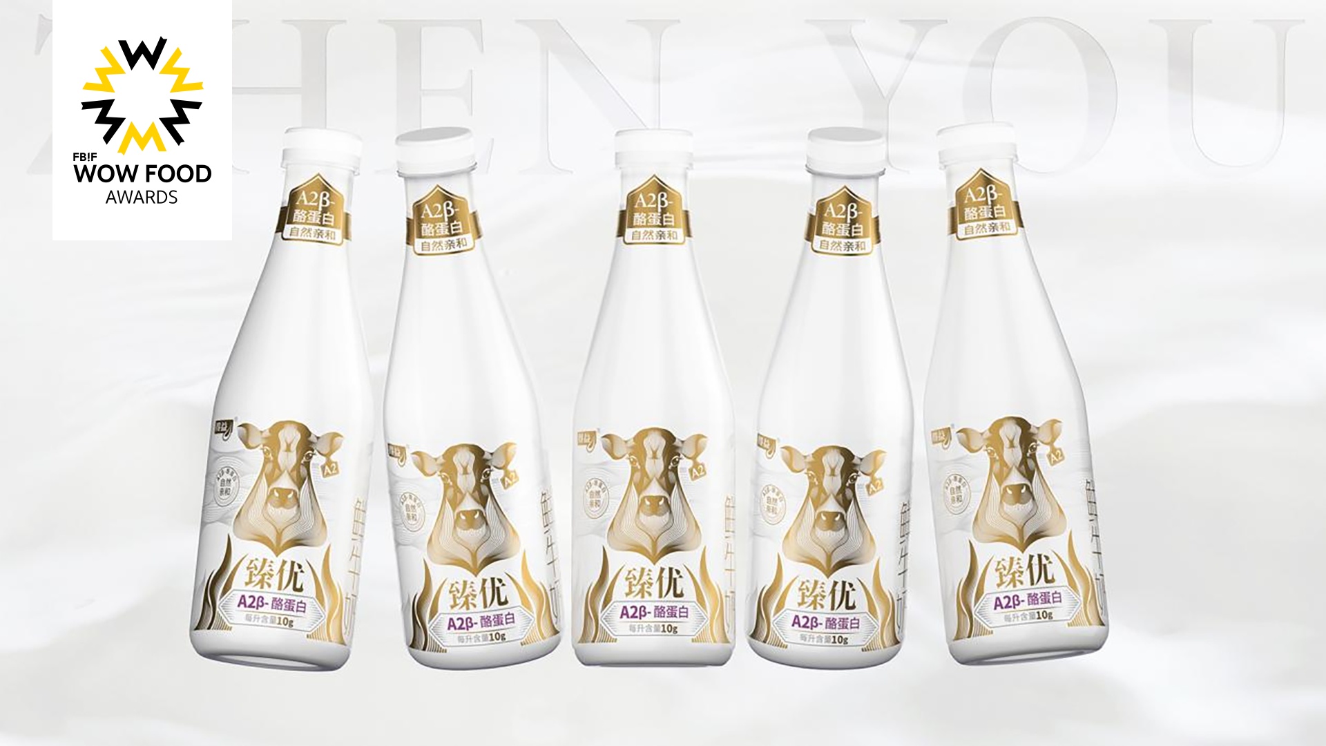
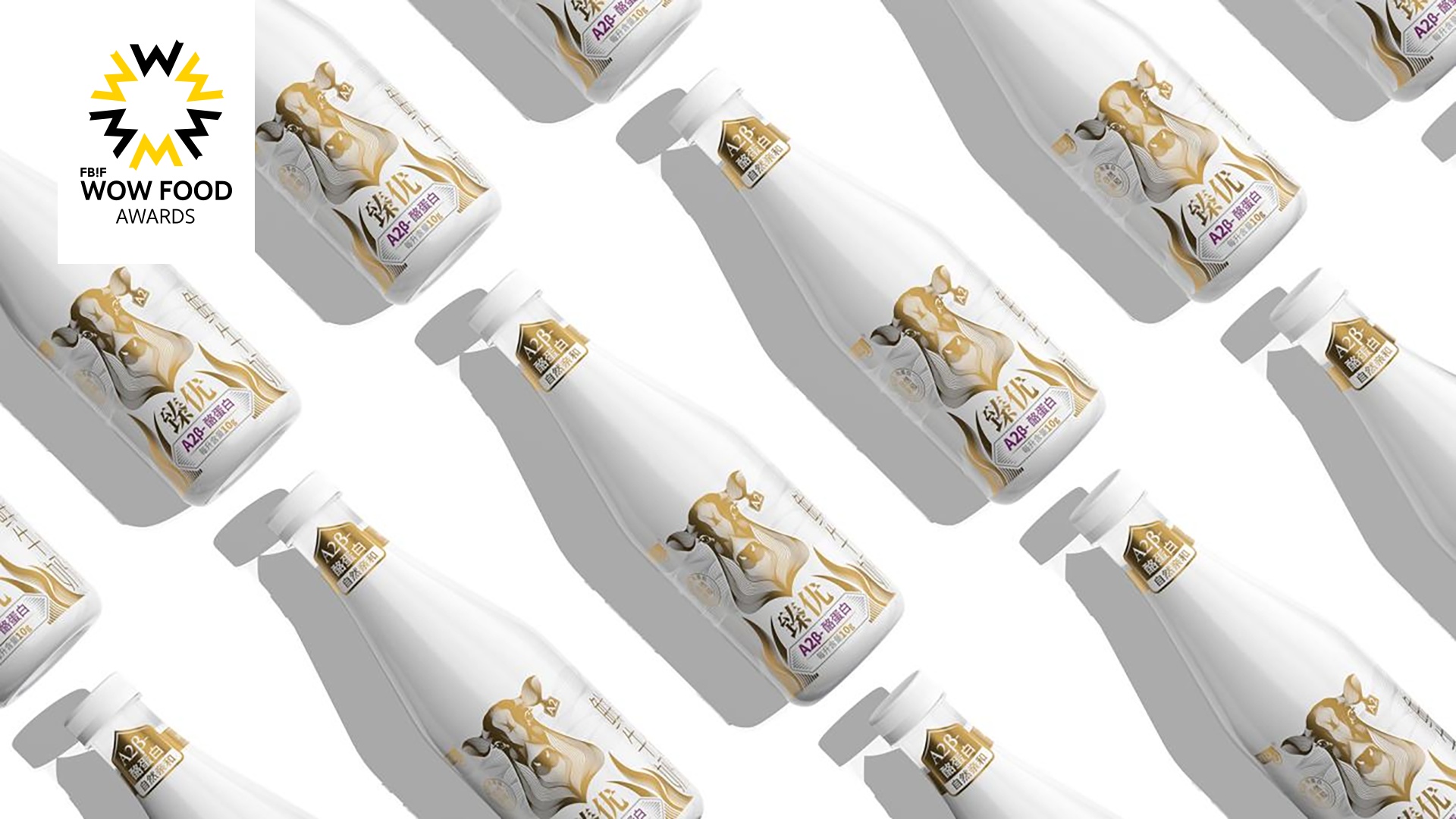
As milk consumption becomes increasingly "diversified" and "beverage-oriented", market product demand is more segmented. From dairy farming to a cup of good milk in the hands of consumers, the dairy industry has to go through a long industrial chain. HOTDI together with the Deyi brand, completed the "last three seconds" to impress consumers and explored more possibilities for dairy packaging design in the post-epidemic period. How to stand out from the sophisticated layout of traditional dairy companies is an urgent problem for emerging dairy brands. Heat Wave has joined hands with Deyi Dairy from Zibo, Shandong to bring a new visual upgrade of the brand's most high-end image product "Zhenyou" to the main consumers of low-temperature milk products - middle-class family groups aged 25-40 who pursue quality life.
Highlights
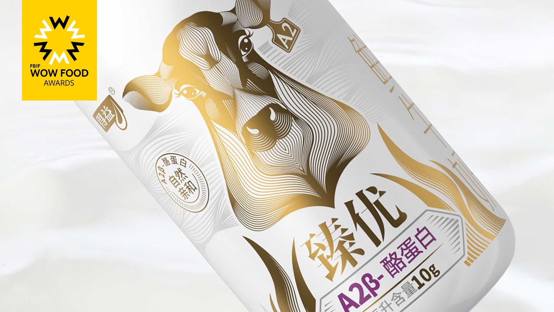
The "Zhenyou" series of fresh milk focuses on A2-β casein. Through the presentation of the A2 cow image in the main visual image, the color contrast of gold and purple fonts, and the extended symbol of the "A" letter on the bottle collar, it repeatedly emphasizes, Highlight your selling points. Let consumers accurately perceive the information that the product wants to convey in the shortest time and promote conversion. At the same time, gold is used as the main color, combined with gray lines, low brightness contrast and high brightness, exuding a low-key and elegant temperament, enhancing the sense of brand value and quality. Heat Wave Design Innovation, together with Deyi Brand, completed the "last three seconds" to impress consumers and explored more possibilities for dairy packaging design in the post-epidemic period.
Market Performance
none
Material(For concept works, please choose the material you plan to use)
PET塑料 PET material
Craft
The label as a whole is made of transparent self-adhesive material, and the main graphic is printed in "champagne gold" metallic color. The selling point RTB part uses silver-gray metallic color as the color transition of the picture, highlighting the exquisiteness and value of the product. At the same time, The main selling point "A2-beta casein" uses an "exclusive purple" metallic color to retain the product attributes of A2 milk.
Does the design solve the problems that are common across the product category? If so, please explain.
Consumer behavior research shows that 70%-85% of purchasing behaviors are decided in a split second. Unlike room-temperature dairy products, which focus on online sales and gift-giving, low-temperature fresh milk is sold more offline in large supermarkets. In front of the dazzling refrigerators, how can you not be impressed by the enthusiastic sales promotion by the shopping guide and the buy-one-get-one-free eye-catching tape, so that you can "rush out of the shelf" and capture consumers at a glance? Differentiated visual symbols are the key to brand success. The "Zhenyou" series focuses on A2-β casein. We repeatedly emphasized and highlighted the selling points through the presentation of the A2 cow image in the main visual image, the color contrast of gold and purple fonts, and the extended symbol of the "A" letter on the bottle collar. . Let consumers accurately perceive the information that the product wants to convey in the shortest time and promote conversion.
What functional designs of the work have enhanced the user experience?
Repeatedly emphasize and highlight the selling points through the presentation of the A2 cow image in the main visual image, the color contrast of gold and purple fonts, and the extension of the super symbol of the "A" letter on the bottle collar. Let consumers accurately perceive the information that the product wants to convey in the shortest time and promote conversion.
Does the work consider sustainability (environmentally or commercially, or both)? If so, please explain.
The self-adhesive used for product bottle labels uses degradable glue, which is more conducive to the separation of the label and the bottle body, thereby achieving more convenient recycling.