
Type of applicant company
设计机构
Country
中国
Company Website
www.szbxl.com
Images
Brand of the Product
BAMA TEA
Designer Name
BXL-Tea Team
Position of Designer
No
Target Consumer
The clientele of BAMA TEA Store consists primarily of young consumers aged between 20 and 40 years old.
Distribution Channels
其他销售渠道 八马门店(含加盟门店)
Positioning
大货消费品 Mass Production
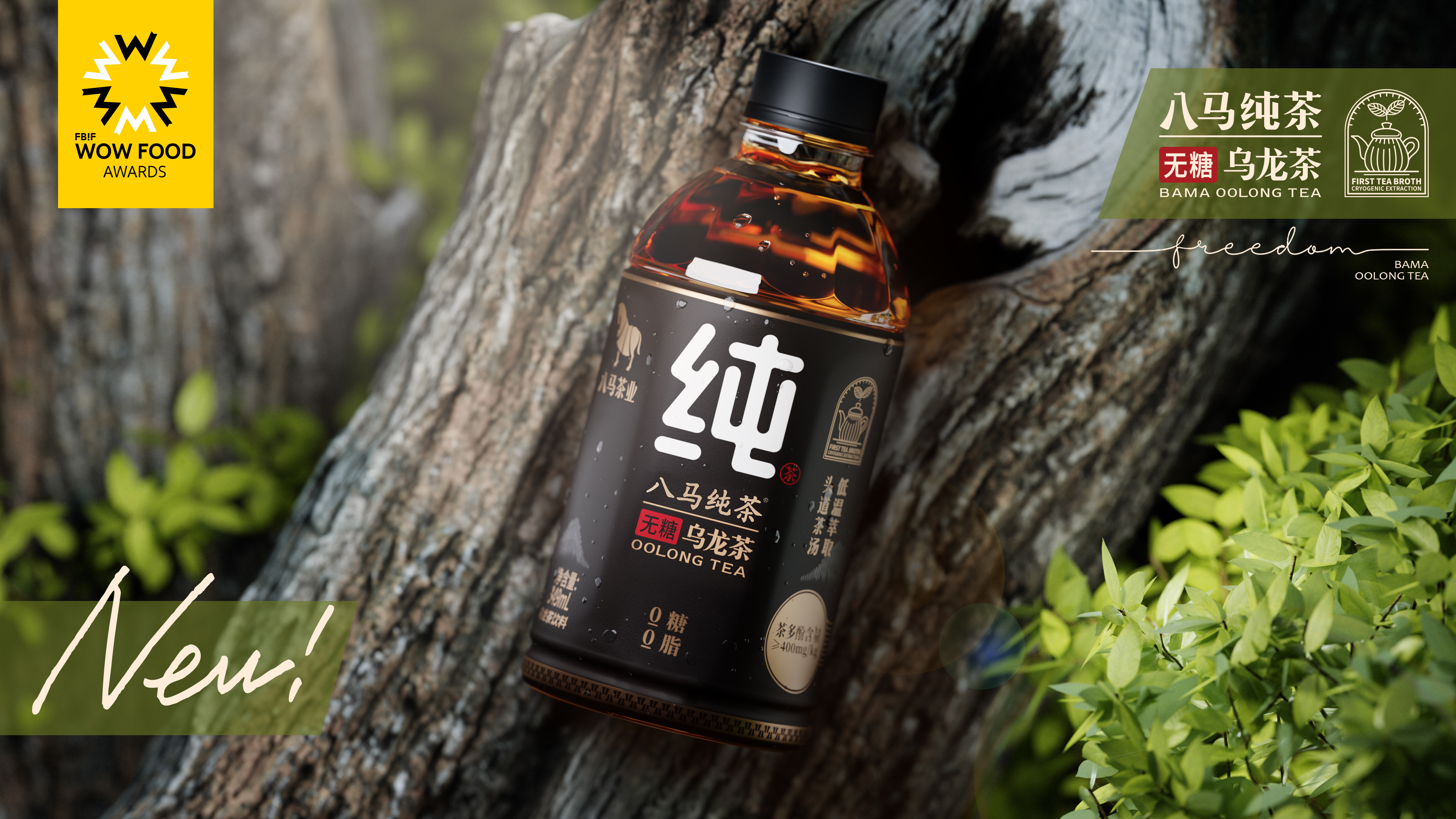
Design Story
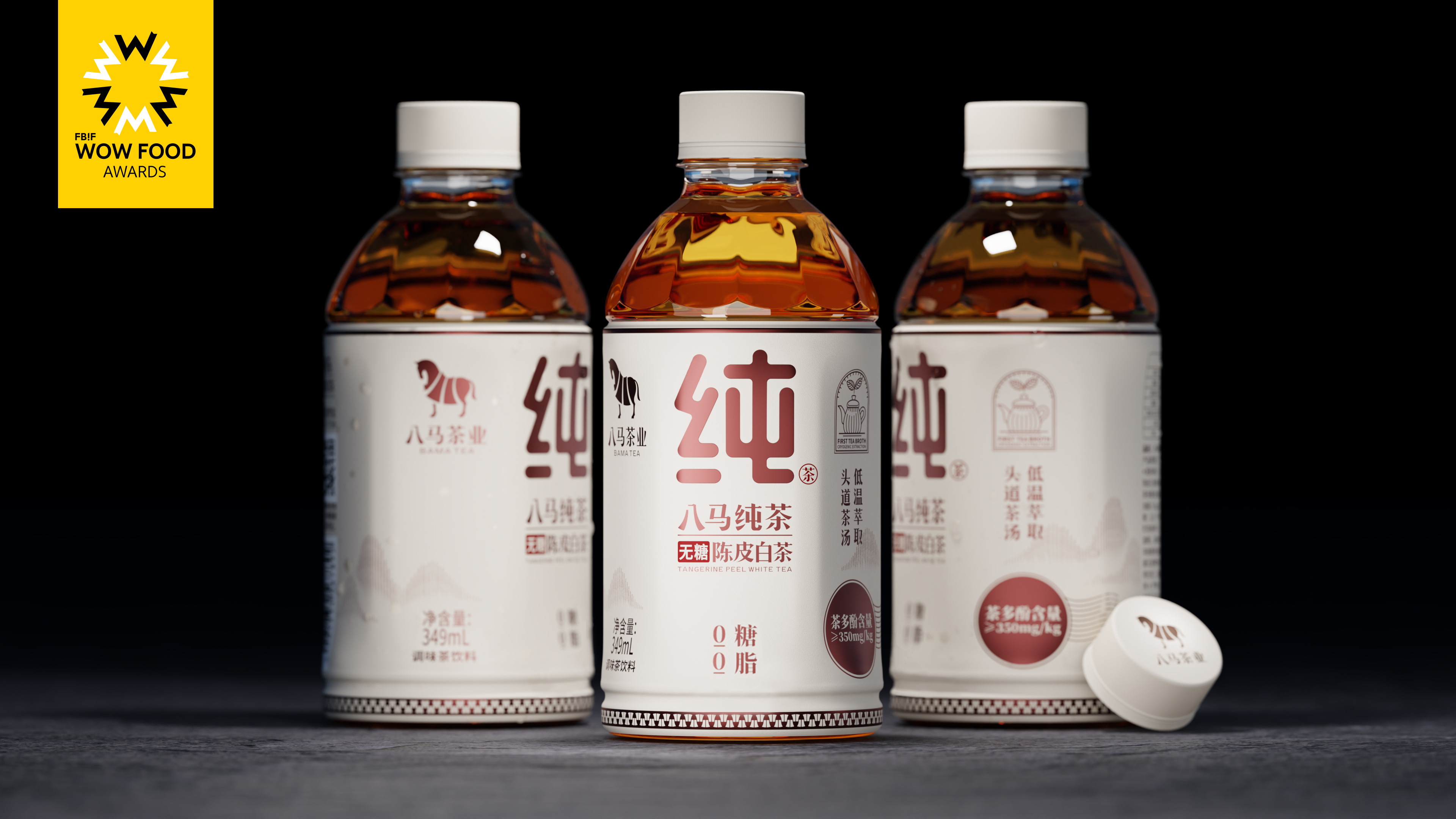
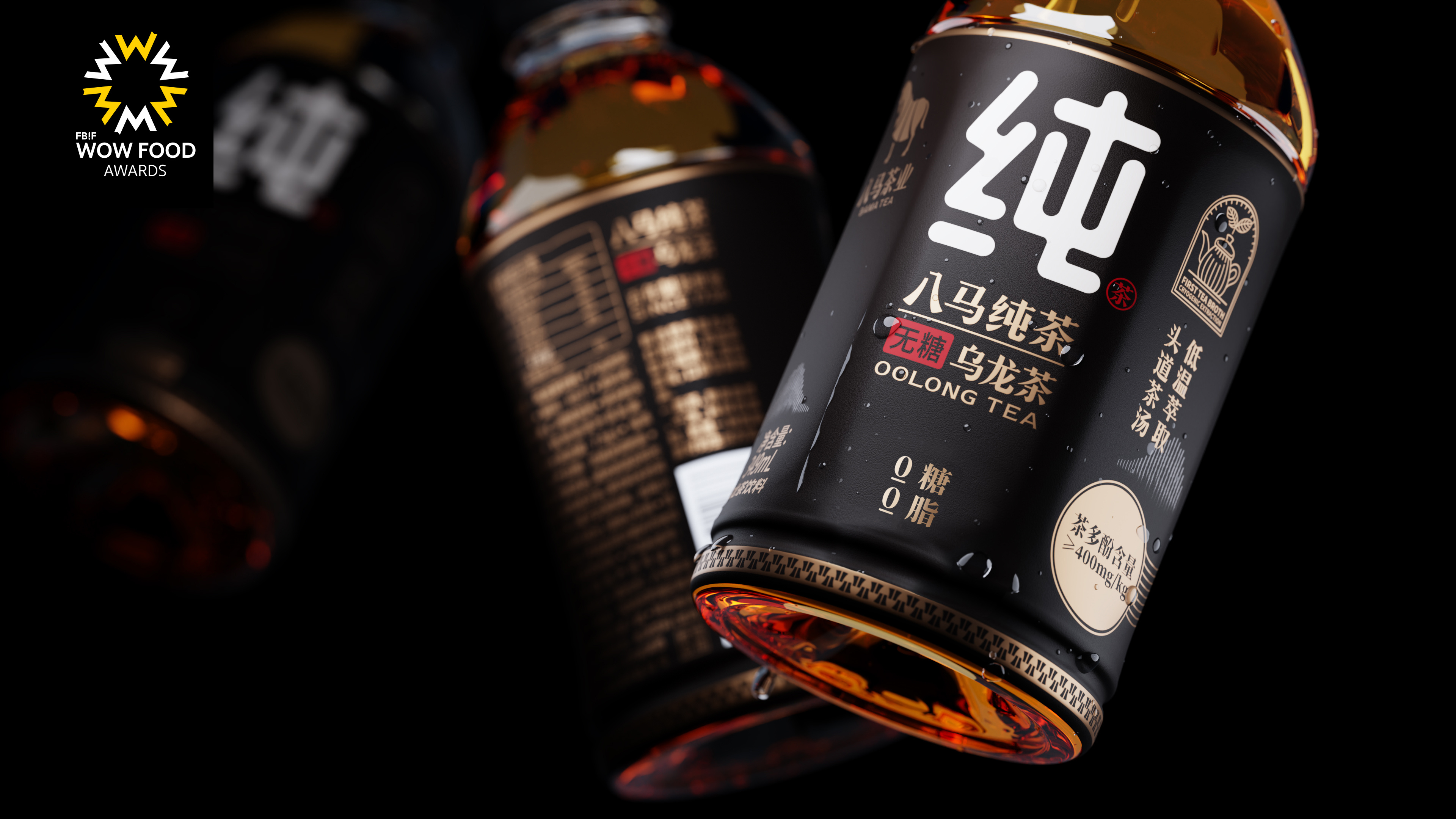
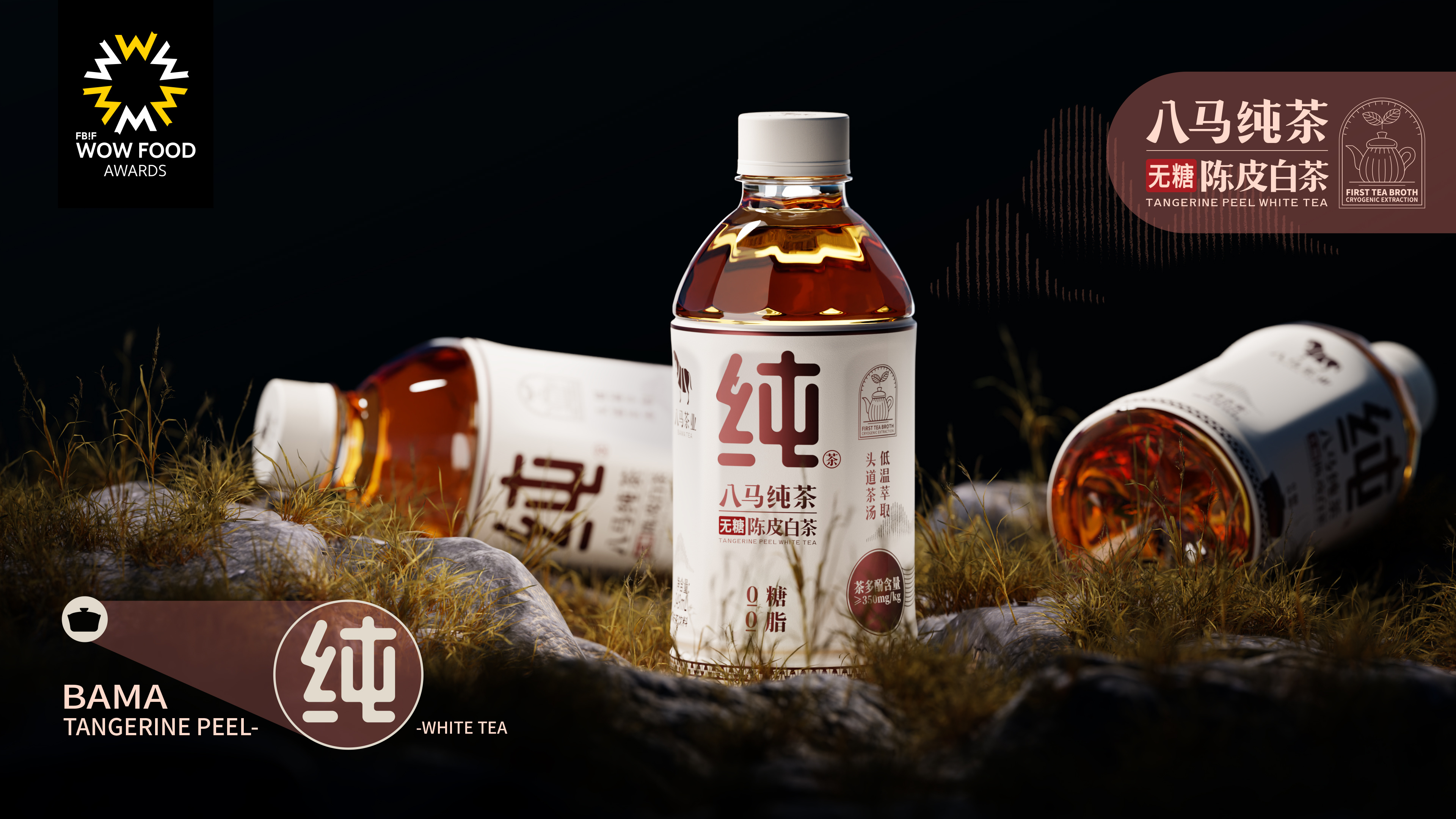
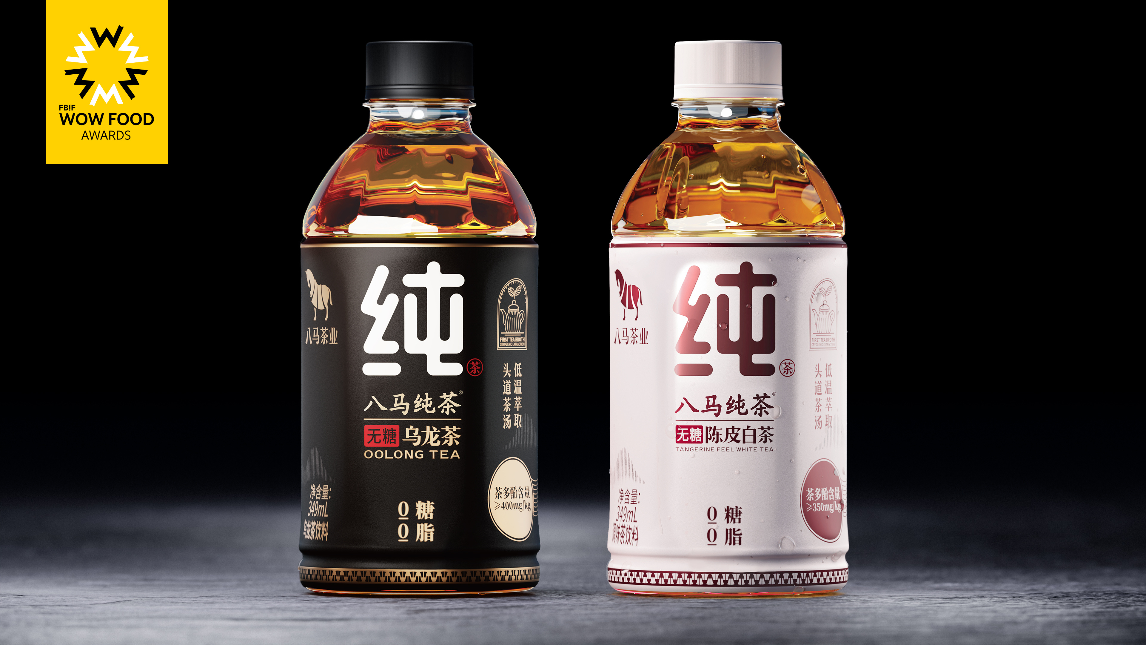
The concept is based on "premium Chinese tea," emphasizing the delivery of high quality, aesthetic appeal, extensive promotion, and a powerful experiential focus in the upgraded Ready-to-Drink (RTD) bottled tea beverages.
Highlights
In the market, few similar tea products use "pure" as a focal point for brand recall, making it a distinctive symbol. Content-wise, "pure" offers vast creative possibilities, such as expressing meanings like "authentic, pure, beautiful, and virtuous." These expressions can showcase product quality, craftsmanship, raw materials, or corporate culture.
Visually, both concrete depictions of the concept of "pure" and abstract representations of the associated feelings are viable. By magnifying the concept of "pure," the focus is on designing a super symbol around the idea of purity.
The word "pure" provides consumers with ample room for associations, such as being authentic and genuine, naturally pure, and free from impurities. The aromatic qualities devoid of impurities create a natural affinity for the product in the minds of consumers.
Market Performance
Not available
Material(For concept works, please choose the material you plan to use)
PET塑料 PET material
Craft
The bottle is made of PET plastic, which is recyclable, and the label is applied using labeling and printing processes.
Does the design solve the problems that are common across the product category? If so, please explain.
From a visual perspective, using the character "纯" (pure) as a super symbol and employing clever visual design can make it a deeply rooted symbol in the minds of consumers. This stimulates positive associations, guiding their purchasing decisions. Such a super symbol contributes to brand shaping and market differentiation.
What functional designs of the work have enhanced the user experience?
In terms of graphic design, refining the character "纯" (pure) as a super visual symbol enhances memorability. Regarding colors, using the steady black of oolong tea and the fresh white of aged tangerine peel white tea not only emphasizes product attributes but also aligns with consumer expectations for product color.
In the realm of typography, highlighting the taste and selling points of the tea is crucial. Through carefully crafted fonts and layout, the design ensures that consumers can feel the brand's dedication when reading the label.
To enhance transparency of information, the label provides detailed information about the type of tea, its origin, and the production process. This transparency helps build trust, as consumers are more inclined to purchase products that offer comprehensive information. These design elements together form a visually appealing and information-rich packaging, providing consumers with more reasons to choose the product.