
Type of applicant company
设计机构
Country
中国
Company Website
agilisdesign.com
Images
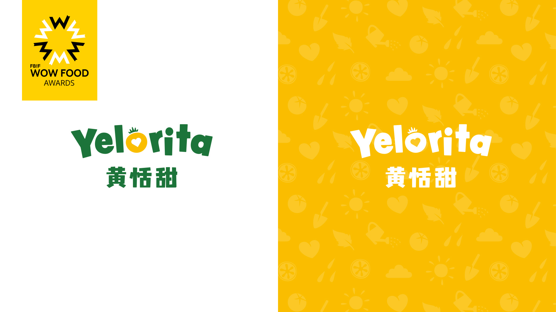
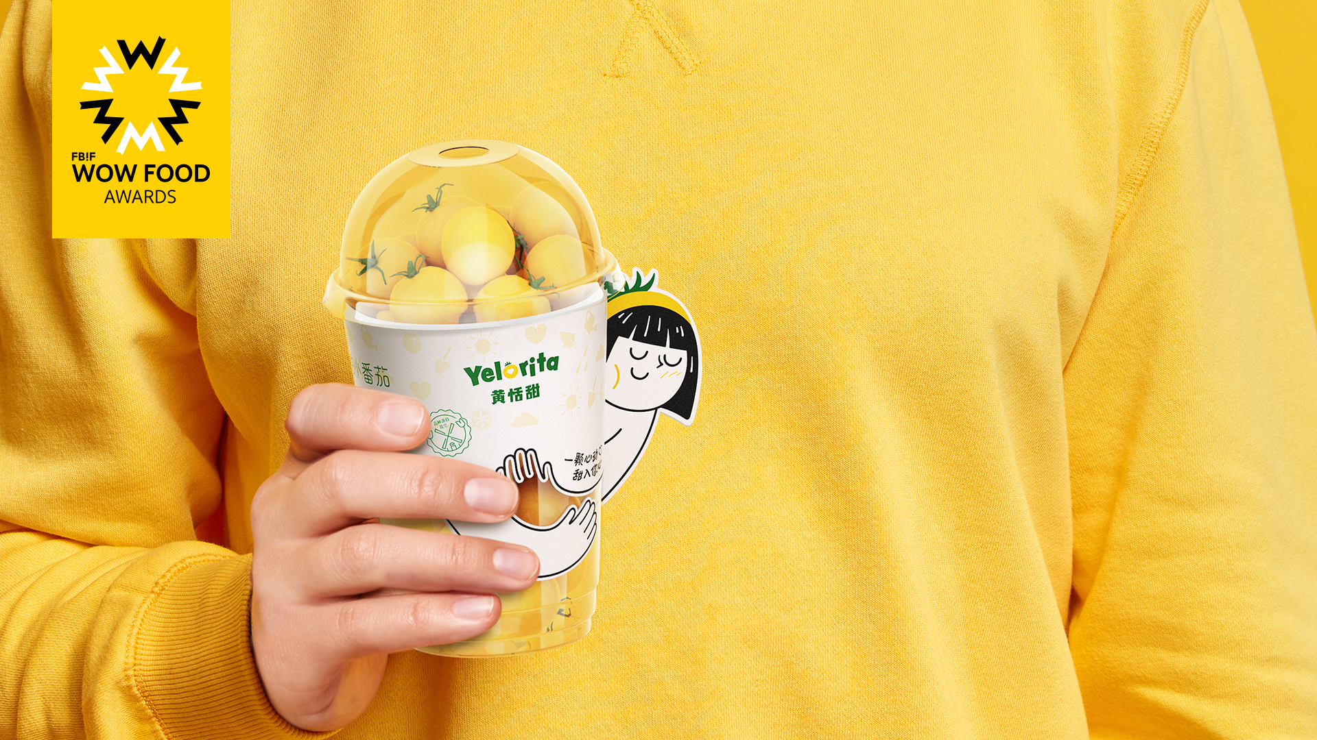
Brand of the Product
Yelorita
Designer Name
Guohua Pan, Shane Chiu, Guibin Ji, Meng He
Position of Designer
n.a
Target Consumer
Fresh produce consumer
Distribution Channels
电商 E-commerce; 小型商超和便利店 Supermarket & CVS; 杂货店 Grocery
Positioning
大货消费品 Mass Production
Design Story
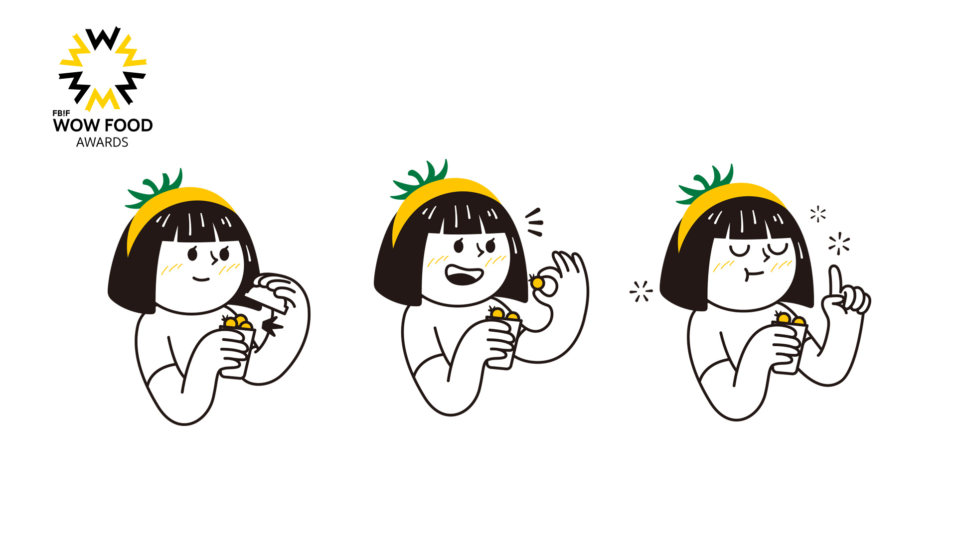
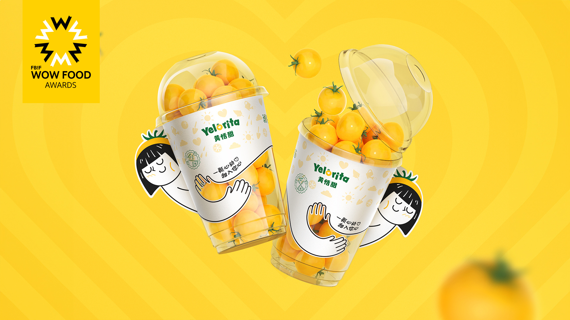
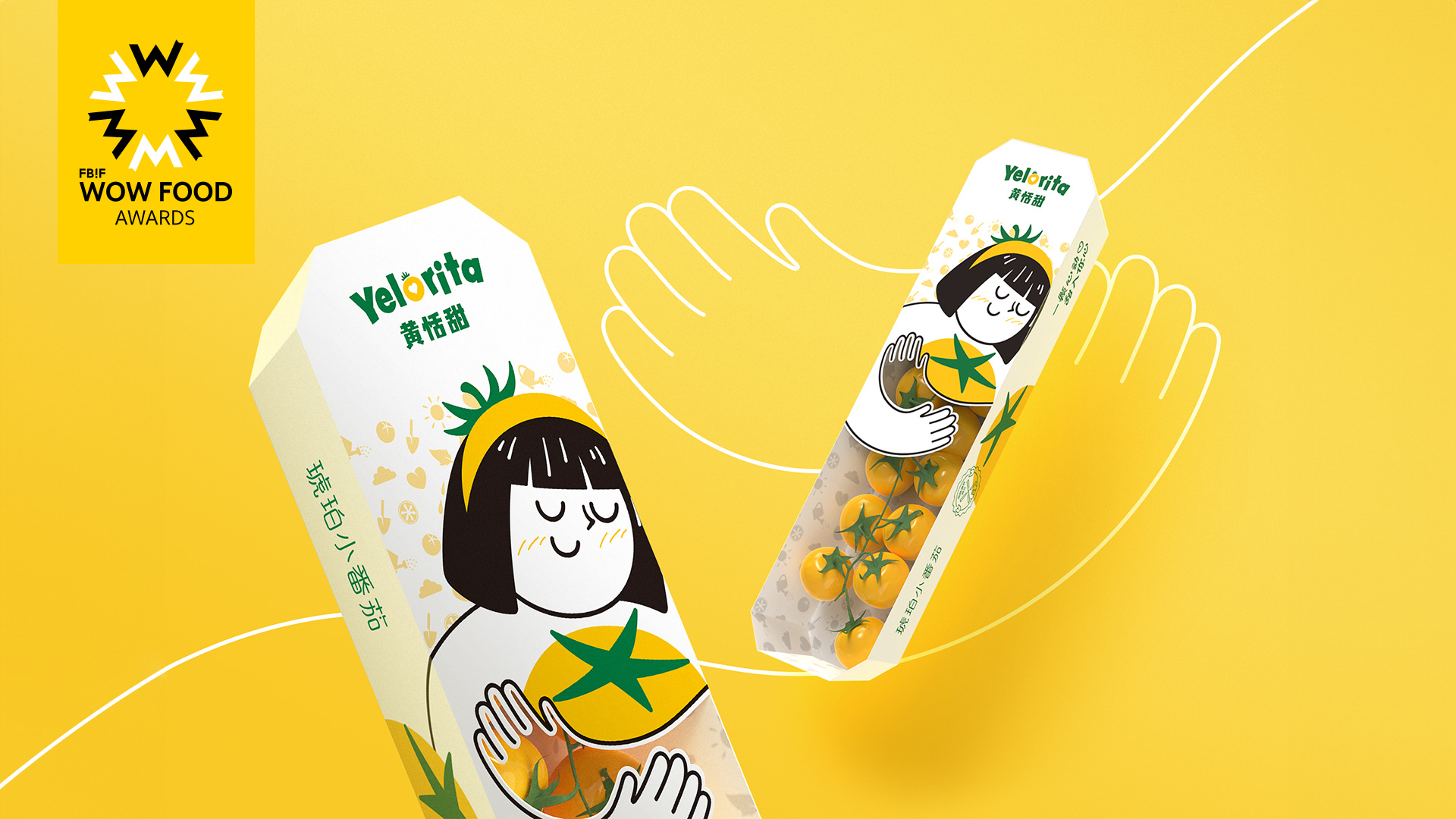
We're tasked by Bayer Digital Incubator (AP) to develop a Chinese brand name for the Yelorita tomato. The main selling points for this product were its sweetness and attractive appearance. To stand out from similar products and effectively impress the customers, we decided to emphasize the dual meaning of the word ‘sweet’ as both a taste and an emotion. The design sought to create a journey for consumers, starting from the moment they first see the packaging and continuing as they enjoy each sweet bite while recalling heartwarming and gratifying memories.
Highlights
Sweetness, as the most significant character of Yelorita tomato is hard to express by images and figures. And we surely don't want to use plain words. In the process of ideation, we came to the conclusion that it can only be connoted by emotional elements, such as a kind of reaction to the experience of sweetness. In combination with the Chinese naming of the brand, we created a lovely character that carries the message.
Market Performance
n.a.
Material(For concept works, please choose the material you plan to use)
PET塑料 PET material; 纸质 Paper; 其他 PE
Craft
PET transparent cup with paper sleeve; ship-shape paper tray with PE bag.