
Type of applicant company
Design organization
Country
Greece
Company Website
www.antoniaskaraki.com
Images
Brand of the Work
Yogg Protein Dessert
Designer Name
Andreas Daskas
Position of Designer
Graphic Designer
Target Consumer
Men and women 25-44 who take care of their nutrition, fitness and physical appearance.
Distribution Channels
Supermarket & CVS
Positioning
Mass Production
Design Story
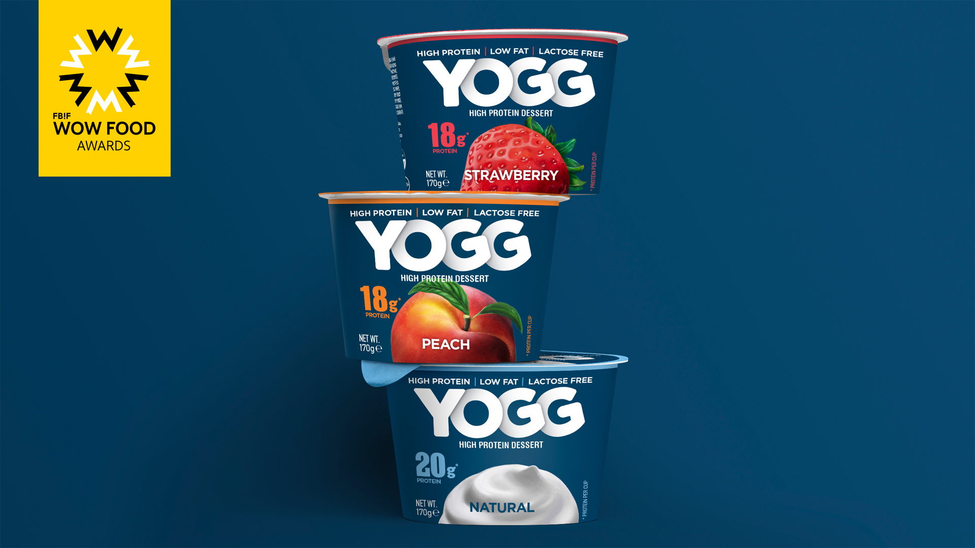
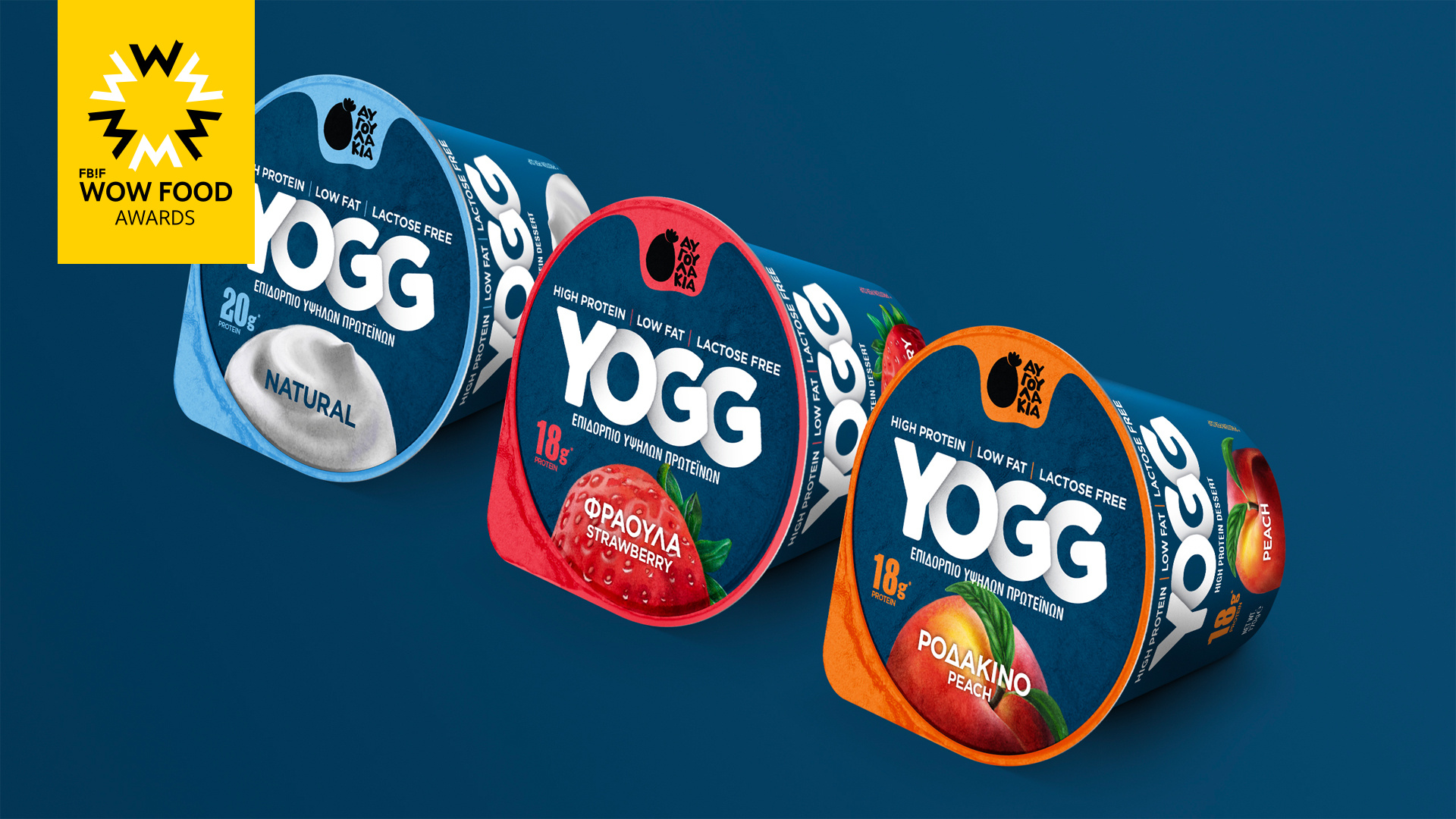
There is an overwhelming array of yogurt desserts available in the Greek market, each offering different variations in terms of milk sources, fat content, origin, and flavours. However, a new trend has emerged recently, dominating the market: high protein yogurt products. In response to this saturated market, our client sought innovation and tasked us with naming and designing the first high protein yogurt enriched with real egg protein. This groundbreaking product boasts 18%-20% protein content, low fat, and is lactose-free, catering not only to those who prioritize their body as a temple but also to anyone seeking a balanced and healthy nutritional choice.
To create a captivating and memorable brand name we used a clever amalgamation of the two ingredients, taking 'yo' from 'yogurt' and integrating it with the double 'g' from 'egg,' resulting in an original, catchy and dynamic name. The double 'g' in the name infuses dynamism into this product, expertly tailored for health-conscious individuals. Subliminally, it conveys a perception of double nutritional value.
Highlights
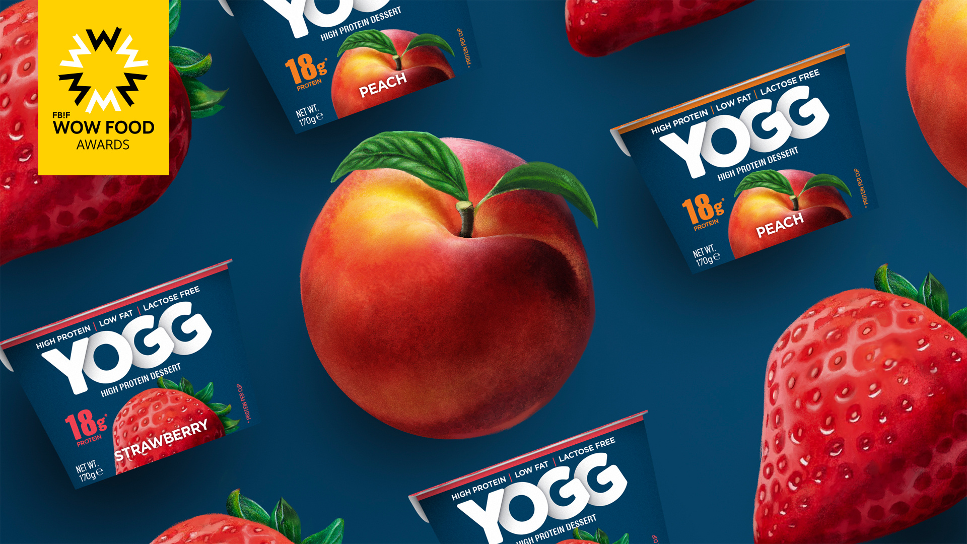
The use of blue colour instead of the standard black in this category creates a softer and different experience on the shelf. Also, the extreme zoom on the spoon creates a dynamic and mouth watering feeling which enhances the value of taste.
Market Performance
None
Material(For concept works, please choose the material you plan to use)
PET material
Craft
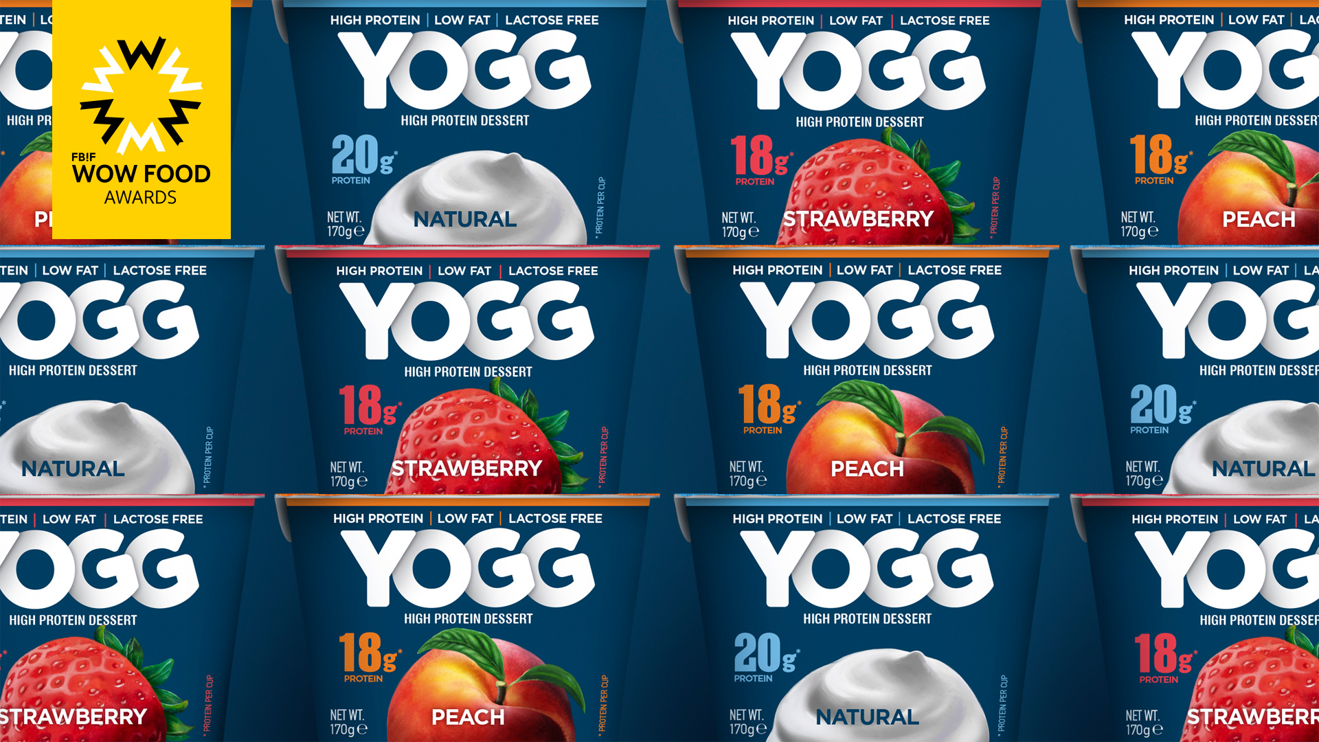
The design revolves around the name, utilizing a bold and rounded font, with the letters arranged as if they were part of a playful paper-cut game. As each letter is stacked upon the other, it symbolizes the process of building a strong and resilient body. Furthermore, the 'yo' portion of the name remains straight, while the 'gg' section adopts a slight inclination, creating a visually captivating and distinctive interplay within the font and the overall brand identity.
Another standout feature of the packaging is the vibrant depiction of fruits, indicating the flavour within each cup. These illustrations exude dynamism and power, with extreme close-ups, bold colors, a lustrous shine on the strawberry, a velvety texture on the peach, and a silky impression on the dollop of yogurt. This not only creates an immediate impact on the visual senses but also serves as a promise for the delectable taste of the product.
Diverging from the conventional black background often seen in the competition, our packaging employs a soothing shade of dark blue. This choice not only provides a gentler visual experience but also conveys a sense of balance, harmony, and serenity. With YOGG, we have redefined the high protein yogurt category and created packaging that conveys strength, health, and enjoyment.