Type of applicant company
品牌方
Country
中国
Company Website
无
Images


Brand of the Product
GUOLIFANG
Designer Name
Shenzhen unknown creative design
Position of Designer
none
Target Consumer
Young men and women with a drinking habit, mainly including college students and new employees in the workplace.
Distribution Channels
电商 E-commerce; 大型商场 Shopping Mall; 小型商超和便利店 Supermarket & CVS; 杂货店 Grocery; 餐饮&酒店 Restaurants & Hotel
Positioning
大货消费品 Mass Production
Design Story
GUOLIFANG is a fruit liquor brand under Bottle Planet. Positioned as a "little wild liquor" targeting the young generation, it breaks the mold and charts an unconventional path. Does drinking always have to take place at a formal wine table? Must there always be rigid drinking etiquette? Alcohol is an amplifier of emotions. Shouldn't people be able to drink wherever they want and however they please? We've discovered that young people are more inclined to drink in places where they can relax and unwind. They yearn to break free from the shackles of worldly norms, be true to themselves, return to their own wild worlds, and let loose.
This perfectly aligns with GUOLIFANG's brand concept of "Return to the wild and indulge freely". Alcohol is the smallest - sized playground. What does the world look like through the eyes of people after they've had a drink? It's a world full of strange and wonderful things, with fruit - shaped people flying in the sky, and all kinds of fantastical imaginations. It's like looking at the world upside - down, offering a completely different set of feelings and experiences.
Therefore, in terms of packaging design, from the perspective of young people, we aim to create a fantastical otherworld. We want consumers to feel the collision among fruits, liquor, and human emotions, and empower the product with creativity.
Highlights
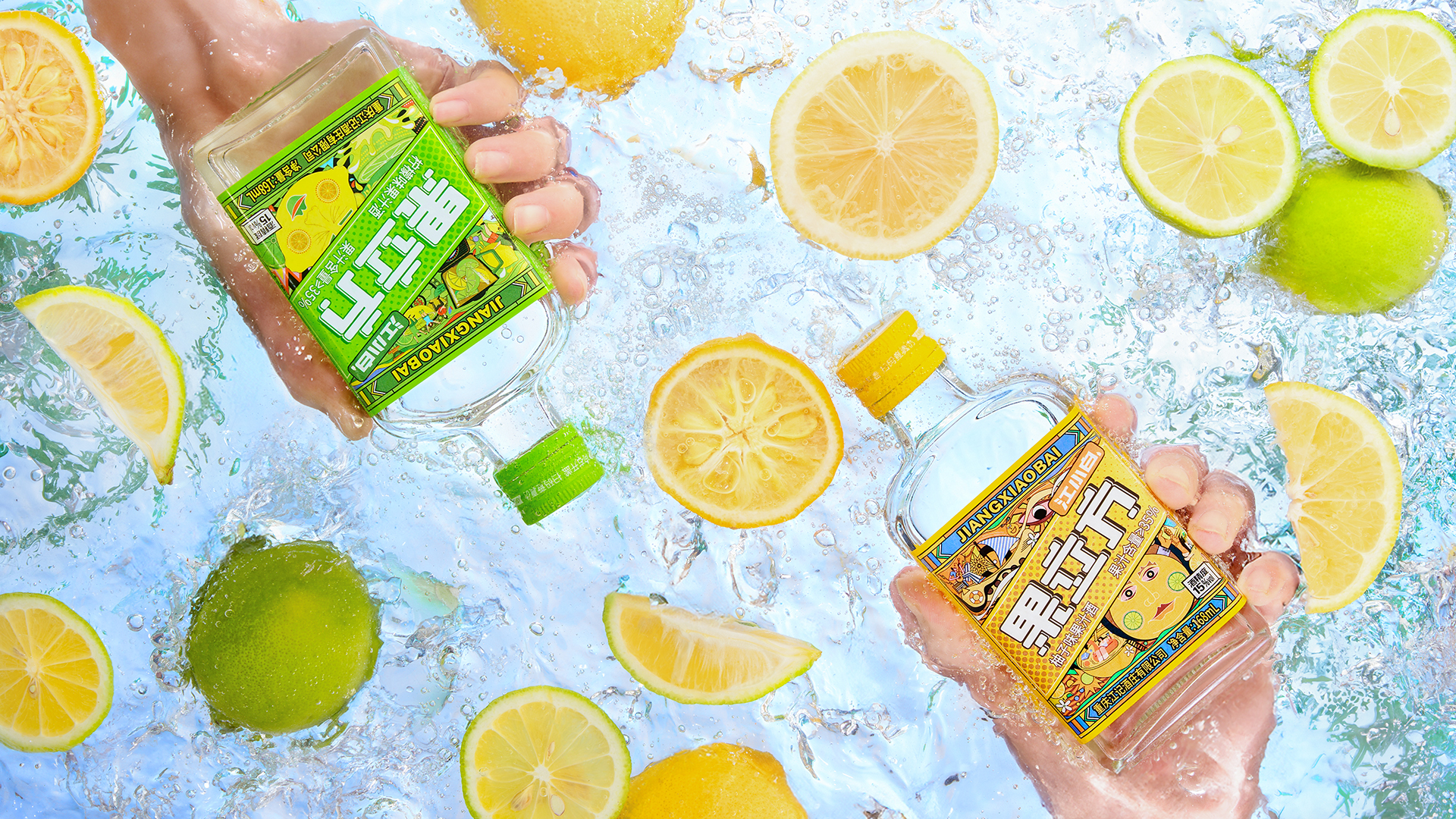
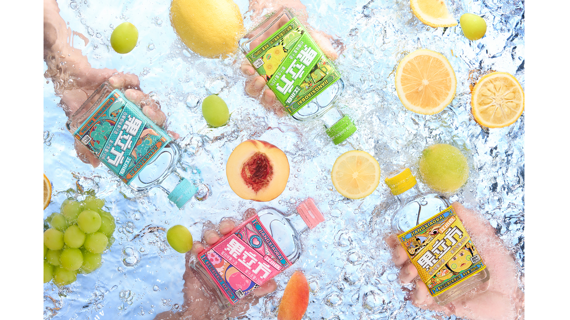
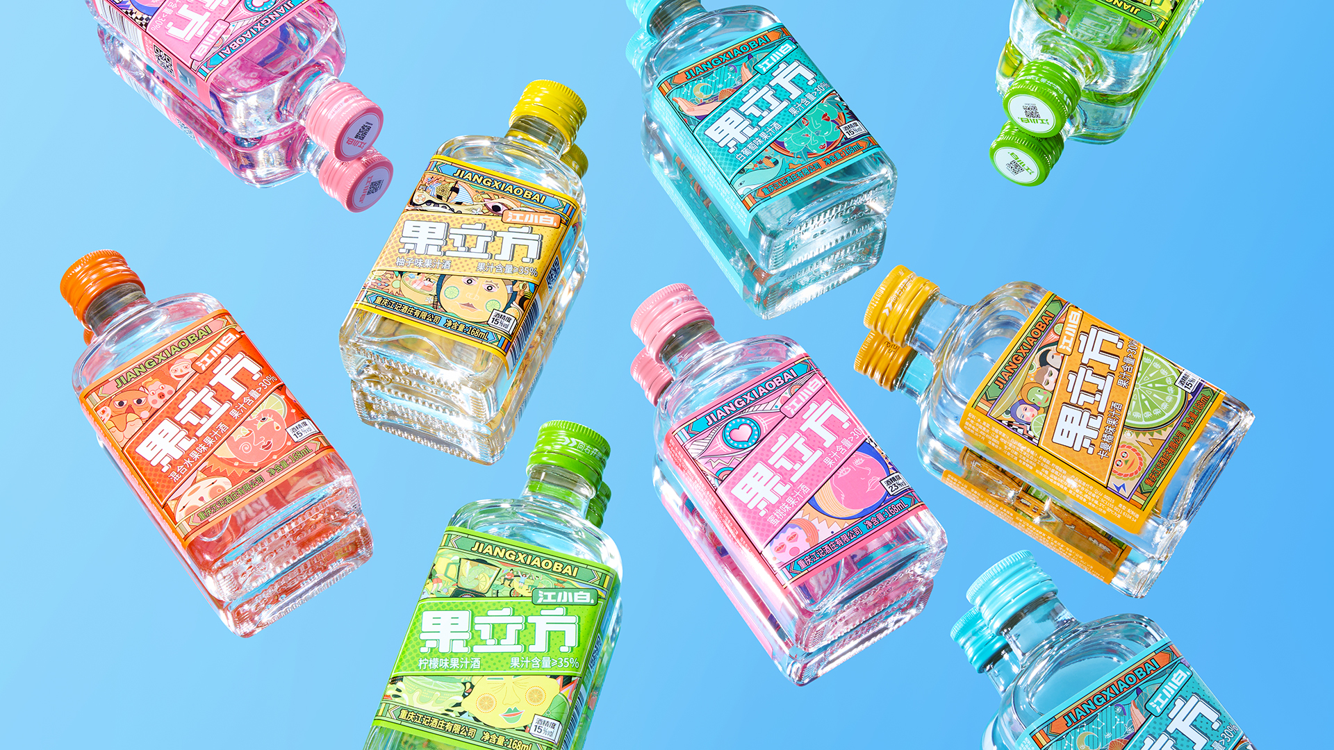
Alcohol is the antidote to emotions, capable of dissolving the troubles of life. Different from the traditional one - dimensional visual representation of raw materials in traditional fruit liquors, GUOLIFANG has re - interpreted the relationship between liquor and people. Each variety of GUOLIFANG liquor has its own distinct personality. By leveraging modern - style illustration designs, every product visually integrates corresponding life scenarios. Through fantastical paintings, GUOLIFANG creates a romantic, tipsy world for all users, endowing the products with a touch of warmth.
For example, the peach - flavored GUOLIFANG. The pink love - heart pattern may seem gentle, but with an alcohol content of 23 degrees, it poses a rather strong challenge. As for the lemon - flavored GUOLIFANG, since it is more acidic compared to other flavors, the eyes in its packaging design are depicted as squinted eyes, conveying the refreshing and sweet - sour taste.
Market Performance
The pomelo - flavored product has been distributed to 30,000 stores nationwide. It was launched on August 9th. By December, a total of 2,551,400 bottles had been sold, making it a best - selling item that frequently went out of stock.
Material(For concept works, please choose the material you plan to use)
其他 玻璃 + 印刷
Craft
The product bottle is made of glass, and the label is a double - sided printed waterproof self - adhesive sticker with a glossy film treatment. Currently, the product has been fully launched on the market for sale.
Does the design solve the problems that are common across the product category? If so, please explain.
The design of fruit liquors in the domestic market is prone to homogenization. GUOLIFANG, however, adopts a more youthful and trendy perspective to present a new visual expression of fruit liquors, casting aside the sense of heaviness typical of traditional low - alcohol fruit liquors. To highlight its differentiation, GUOLIFANG makes bold innovations in design.
First and foremost, it uses exquisite and imaginative illustrations to establish the trendy and fashionable main visual identity of the product. Secondly, it employs a unified layout to convey an aesthetic of order on the shelves.
What functional designs of the work have enhanced the user experience?
Each flavor of GUOLIFANG corresponds to its exclusive dopamine color, and the fantastical illustrations construct a wild world where one can do as they please after having a drink. The GUOLIFANG series of products has brought new thinking to the handling of labels, proposing a two - sided printing communication logic. The front label addresses the aesthetics of order and super visual communication, while the back label holds a hidden secret. The symbols of wild emotions are also integrated into the back - side copy: "Who Wants a Peach", "You're the Grapest", "You're So Lemon - Lovely", "Getting Richer with Pomelo". Hidden on the back, these serve as interactive copy that can be used in drinking games and for personal emotional expression.
Did the design help increase the sales performance of the product? If so, please give related evidence.
The dopamine - inspired product series enhances the integrated effect of brand building and sales results. In 2021, four flavors of GUOLIFANG were launched (white grape, peach, mixed fruit, and calamansi). Among them, the peach - flavored one became an extremely popular item. Since the end of 2023, the wild - liquor mixed - drink culture of GUOLIFANG has gained great popularity. The online topic of "GUOLIFANG + Shuirong C" has received over 1 billion exposures. In 2024, the pomelo and lemon flavors were successively launched. Maintaining the same illustration style as before, these new flavors have made the product matrix and series feel even stronger. Once launched, they were well - received by numerous users and became best - selling items that frequently went out of stock. Currently, GUOLIFANG products are sold overseas, and the positive review rate on e - commerce platforms reaches 98%.
Does the work consider sustainability (environmentally or commercially, or both)? If so, please explain.
The GUOLIFANG series of products consists of the bottle body and the label. Departing from the traditional rule of using front - and - back double - labels, it adopts a single three - sided wrap - around label. This reduces the use of paper and ink, achieving true green, environmentally - friendly, and sustainable development.