
Type of applicant company
设计机构
Country
中国
Company Website
无
Images
Brand of the Product
XI LUO HUI
Designer Name
PUFINE
Position of Designer
Creative Director: Zhang Yanhu Creative Director: Xia Ling Designer: Tian Feng Technical Directors: Zhou Xiaoli, Zhang Yuxiuan Rendering: Luo Kang
Target Consumer
Mainly targeting young people aged 18 to 25
Distribution Channels
电商 E-commerce; 大型商场 Shopping Mall; 小型商超和便利店 Supermarket & CVS; 杂货店 Grocery; 餐饮&酒店 Restaurants & Hotel; 其他销售渠道 零食专卖店
Positioning
大货消费品 Mass Production
Design Story
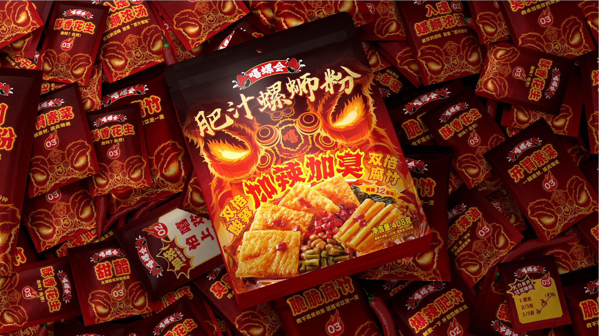
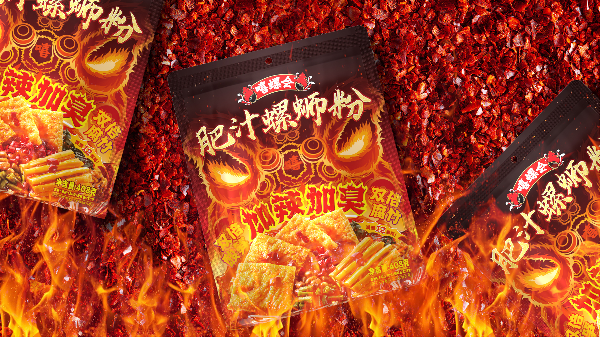
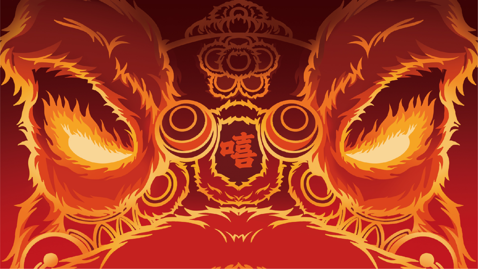
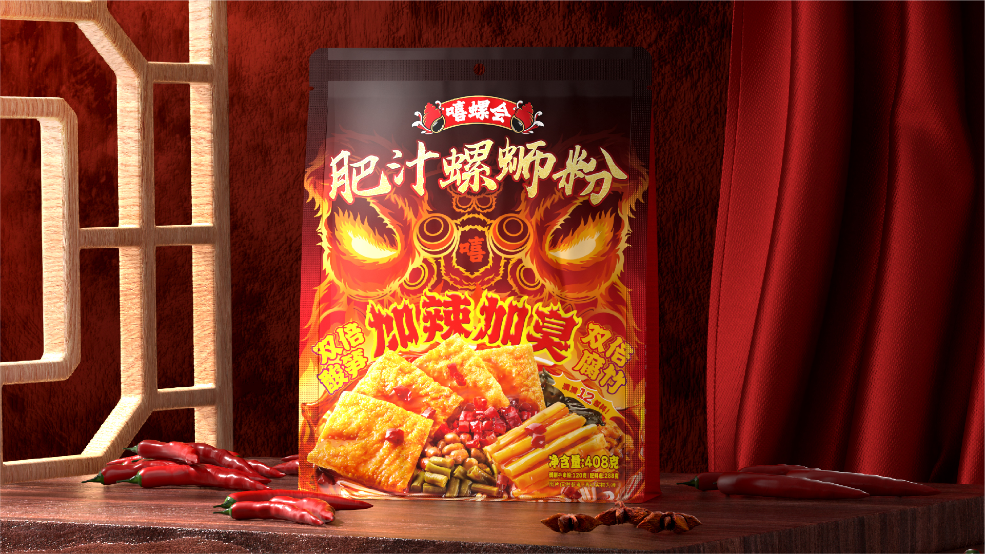
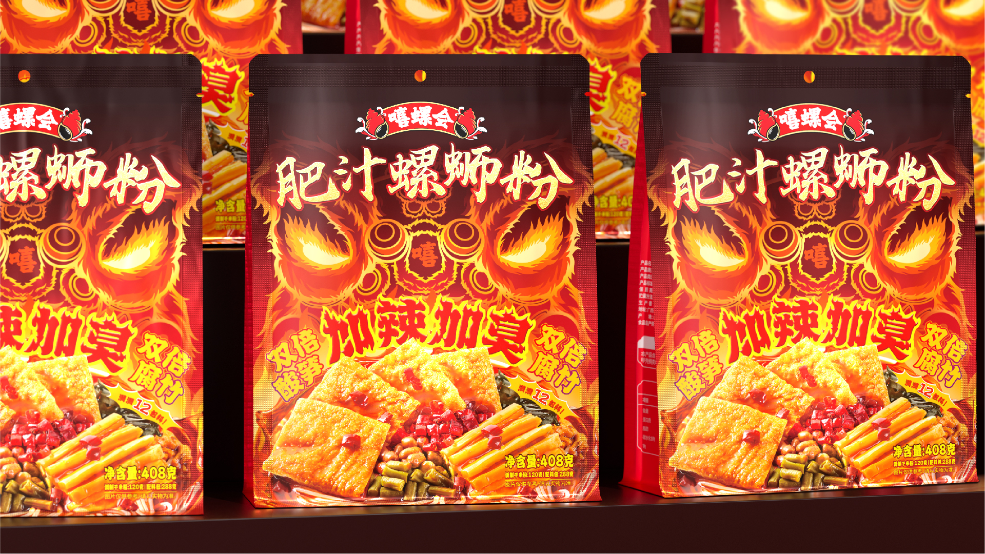
As a super product launched by XiluoHui in 2022, Feizhi Luosifen has achieved good market performance and response once it is launched.In 2024, the launch of a new single product called "Spicier and Stinker" also means that Feizhi is moving from a single product to a series.The design concept of this product still integrates traditional Chinese culture, with the "Black Awakening Lion" with a blazing flame as the main visual of the packaging, making it even more powerful and prominent. It not only continues the visual assets of the Feizhi family, but also highlights the product experience of "spicier and more smelly", making the products more serialized and recognizable.This creative packaging has ingeniously linked with the most popular China-Chic movie "I Am What I Am" in 2024 and the China-Chic game "Black Myth Wukong", which not only improves the popularity and influence of its products, but also allows consumers to feel the charm and charm of Chinese traditional culture while buying and tasting products.
Highlights
The main visual design is a "black awakening lion" with raging flames, and the lion's eyes are made of "chili peppers" with flames, further highlighting its "spicy" attributes.The font design of "spicier and more smelly" is in the form of a "burning flame", endowing the text with strong vitality and conveying the warmth and passion of the product.Combining real product photography, local magnification, and fine processing, it has a greater visual impact and appetite in different sales channels.
Market Performance
nothing
Material(For concept works, please choose the material you plan to use)
PET塑料 PET material; 其他 亮光铝箔
Craft
Using four-color printing and glossy aluminum foil composite bag
Does the design solve the problems that are common across the product category? If so, please explain.
As a traditional local specialty food, Luosifen has now gone to the whole country. Most product designs are expressed through photos that evoke a sense of appetite, with severe homogenization and a lack of visual symbols that consumers can remember. Additionally, there is a lack of support from Chinese culture.And this product is based on traditional Chinese culture, continuing and upgrading the super visual symbol of "awakening lions" representing Chinese culture, truly establishing the brand's cultural visual assets.At the same time, the design ingeniously links Chinese fairy tales with popular China-Chic movies and games, which can be better promoted and spread.
What functional designs of the work have enhanced the user experience?
The outer packaging of this product adopts bright film technology to enhance the overall texture of the packaging, with more eye-catching colors and more delicate and realistic product photos.The font and graphics of burning flames, as well as the chili shaped eyes, greatly enhance consumers' product experience and visual impact visually.
Did the design help increase the sales performance of the product? If so, please give related evidence.
Firstly, the visual symbol of "awakening the lion" is highlighted more prominently, with burning fonts, chili eyes, appetizing photos, and intense colors all highlighting and amplifying the taste characteristics of the product.This work is based on traditional Chinese culture and can generate more topics and spread in commercial and cultural promotion, which can directly enhance the sales of the product.
Does the work consider sustainability (environmentally or commercially, or both)? If so, please explain.
The commercial sustainability of today's products cannot be separated from the empowerment of culture, and the creative design of this work is closely linked to the traditional Chinese lion dance culture, first standing out among many peers and forming a differentiated competitive advantage.At the same time, the unique spiritual connotation of the product can also stimulate emotional resonance among consumers, thereby building a more stable brand loyalty.Through the sales, experience, and dissemination of products, it promotes the inheritance and development of traditional culture, achieving a win-win situation for economic and social benefits.