
Type of applicant company
品牌方
Country
中国
Company Website
http://www.huashanmu.com/
Images
Brand of the Product
hua shan mu
Designer Name
NEW IDEA
Position of Designer
Design Director
Target Consumer
People who cannot absorb A1 casein or have sensitive stomachs, people who need high nutritional supplements, and people who need certified organic food
Distribution Channels
电商 E-commerce; 大型商场 Shopping Mall; 小型商超和便利店 Supermarket & CVS; 杂货店 Grocery
Positioning
大货消费品 Mass Production
Design Story
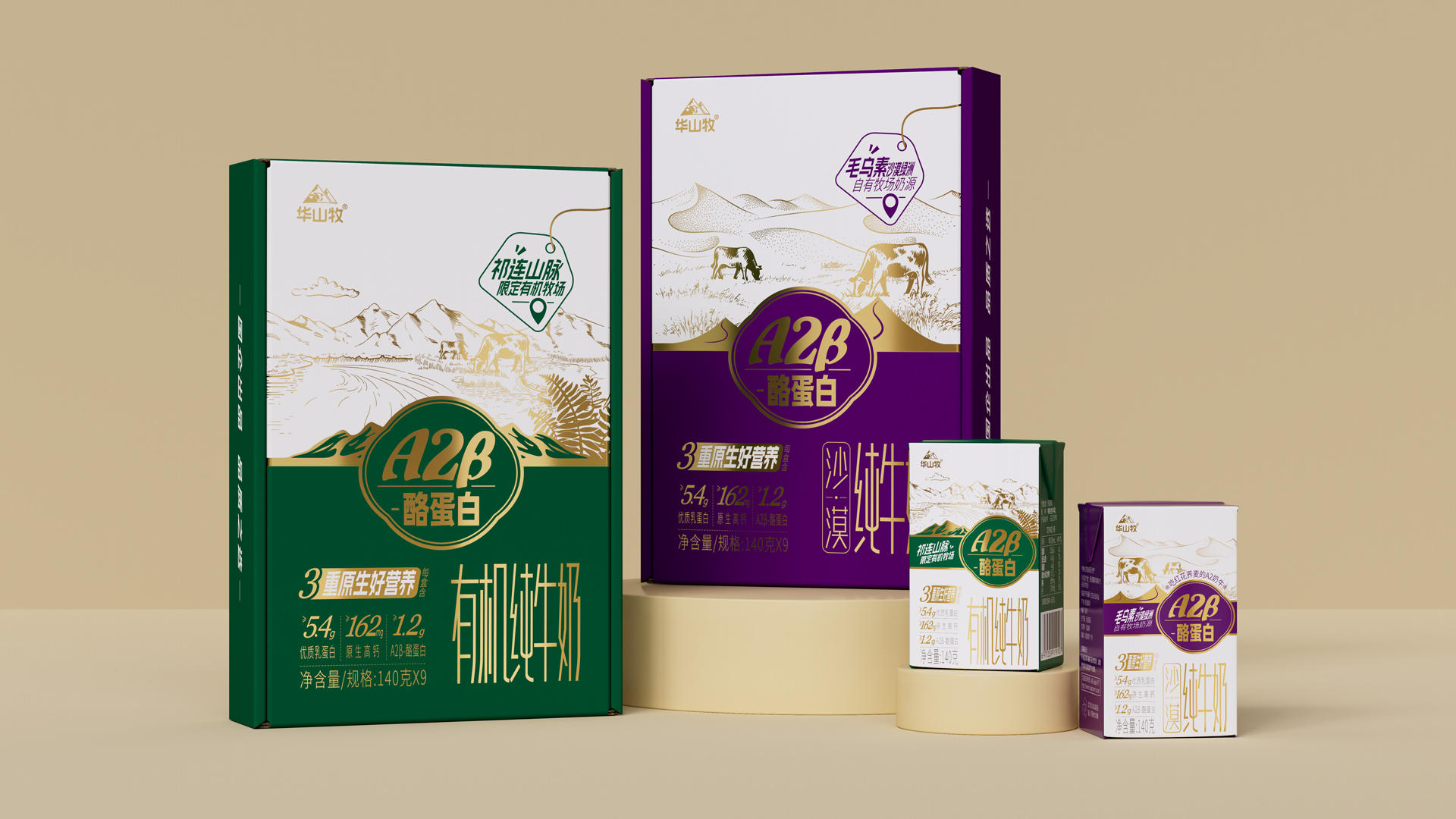
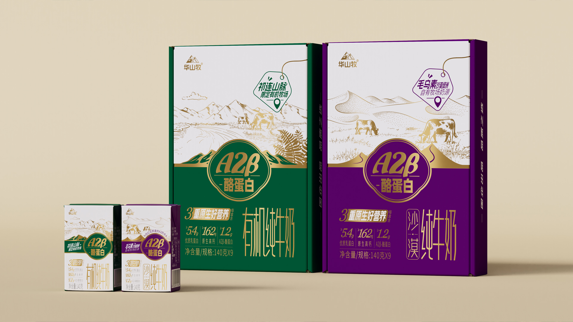
In the current milk consumption market, product demand shows a significant trend of segmentation and high-end. From the careful breeding of dairy cows, to the fine production of dairy products, to the final presentation of a cup of high-quality milk in front of consumers, behind the dairy industry is a long and complex industrial chain. In this process, we strive to use the key link of product packaging design to accurately convey the core concept of "good cows, good milk" to consumers. The packaging cleverly uses the form of flat illustrations to show in detail the "rarity of milk source and the strict standards of quality control", so that consumers can accurately and comprehensively receive the key to the brand and product in a very short time.
Highlights
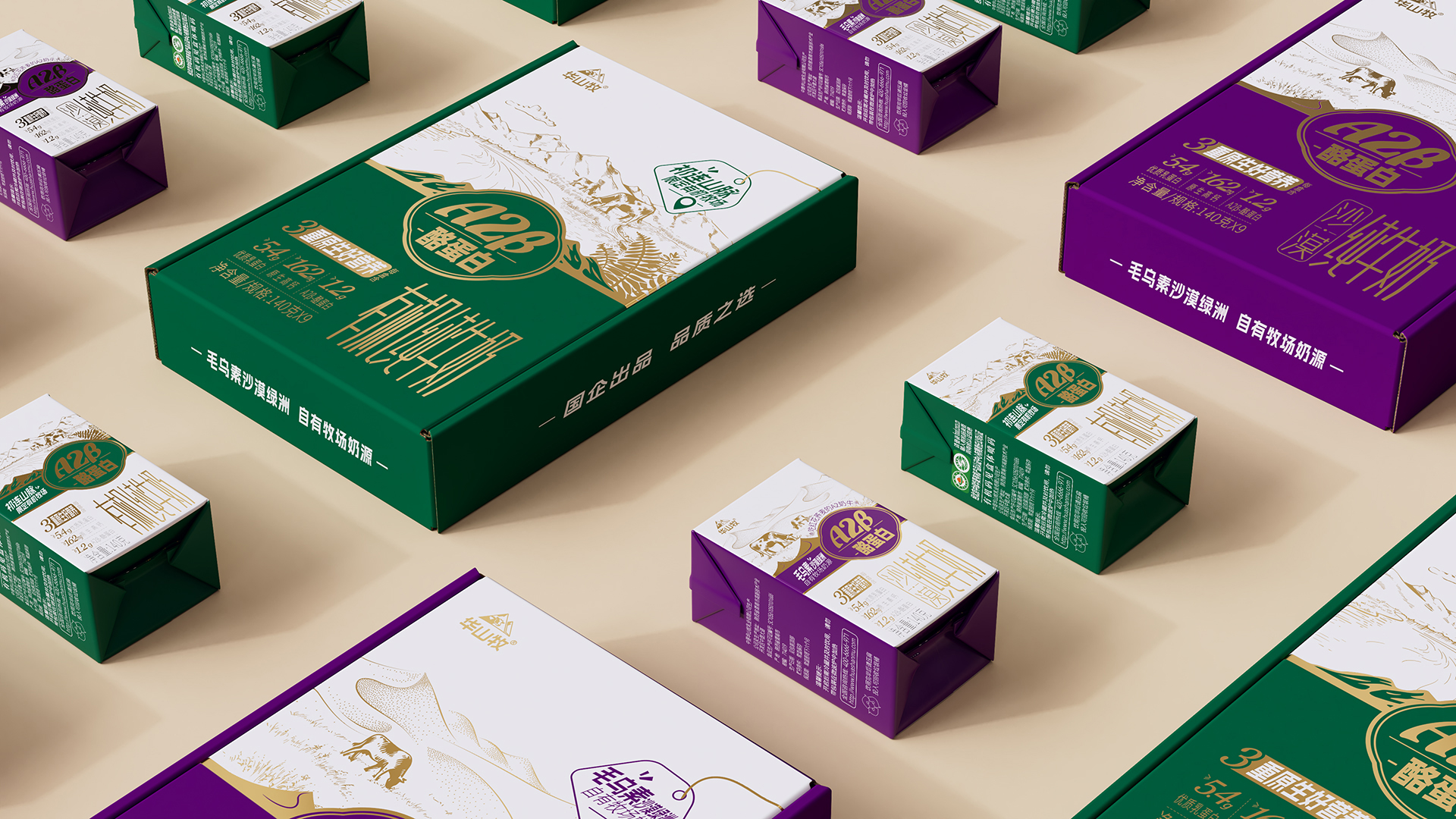
The application of China's distinctive line drawing traditional painting, into the new product packaging design. The lines of different thicknesses, lengths, sizes and sparse changes delicately outline the vivid forms of deserts, mountains, plants and cows, and skillfully present the unique sense of limitation and scarcity charm of the milk source of the Mu Us Desert Oasis and the Qilian Mountains on the packaging with a very story-like picture, so that consumers can perceive the unique charm of the milk source of the product at a glance. In terms of the selection of shades, it is also ingenious. The pure milk packaging features a purple and gold color scheme, while the organic pure milk is made of green and gold, exuding a mysterious and noble atmosphere, combined with exquisite line drawing illustrations, which greatly enhances the brand's sense of value and quality.
Market Performance
无
Material(For concept works, please choose the material you plan to use)
纸质 Paper
Craft
the structural design of the SIG Combibloc aseptic carton fully considers the product's preservation needs and environmental factors. Through the use of multi-layer composite materials and unique design processes, the SIG Combibloc aseptic carton provides consumers with safe, hygienic, and environmentally friendly packaging solutions.
Does the design solve the problems that are common across the product category? If so, please explain.
In the same category, most brands use eye-catching large text to bluntly inform consumers of their own milk source, product nutrition and other information, in order to solve this problem, we have created a three-level information system. First of all, the delicate line depiction is used to intuitively outline the source of the product, so that consumers can have a vivid visual impression of the origin of the milk; Secondly, the visual symbol of A2β-casein is matched with the concise and accurate selling point text of "3 original good nutrition" to explain the nutritional advantages of the product; In addition, a flat illustration is drawn on the back of the package to further extend the safe journey of the product from milk source, cattle raising, production to table.
What functional designs of the work have enhanced the user experience?
In terms of packaging design: the front of the package uses line drawing combined with the flat illustration on the back of the package to show in detail the "rarity of the milk source and the strict standards of quality control", so that consumers can more immersively understand the concept of "good milk will be good when the cow is raised", and enhance the physical value experience of consumers' products;
Does the work consider sustainability (environmentally or commercially, or both)? If so, please explain.
In terms of capacity design: 140 grams of small packaging, easy to carry, and can meet the needs of people of different ages to drink milk, to avoid waste.