
Type of applicant company
设计机构
Country
英国
Company Website
https://pearlfisher.com
Images
Brand of the Product
Xiang Piao Piao
Designer Name
Pearlfisher
Position of Designer
无
Target Consumer
22-35yo office lady; Living in Tier 1&2 cities; Average income, with own disposable income; Health conscious; Milk tea lover
Distribution Channels
电商 E-commerce; 大型商场 Shopping Mall; 小型商超和便利店 Supermarket & CVS; 杂货店 Grocery
Positioning
大货消费品 Mass Production
Design Story
Project Background:
As the pioneer of cup milk tea in China, Xiangpiaopiao has gradually lost its market advantage due to the rise of emerging tea brands. To regain consumer attention, Xiangpiaopiao launched a strategic new product line focusing on health and premium quality. Pearlfisher first helped Xiangpiaopiao establish a cup milk tea strategy centered around the family consumption scenario. Additionally, we created a visual identity and packaging design that aligns with the product positioning and brand strategy—showcasing modern Chinese aesthetics, conveying a natural and premium brand tone, and standing out in a saturated market to re-engage consumers.
Design Concept:
Home, sweet home. Xiangpiaopiao is a small treat to reward yourself when you return home, bringing light and warmth to your life and your home. It brings the outside world indoors, filling your home with the beauty of nature and the delightful aroma of tea. Xiangpiaopiao represents a new, self-rewarding tea-drinking habit that helps you relax, slow down, and focus on yourself.
Highlights
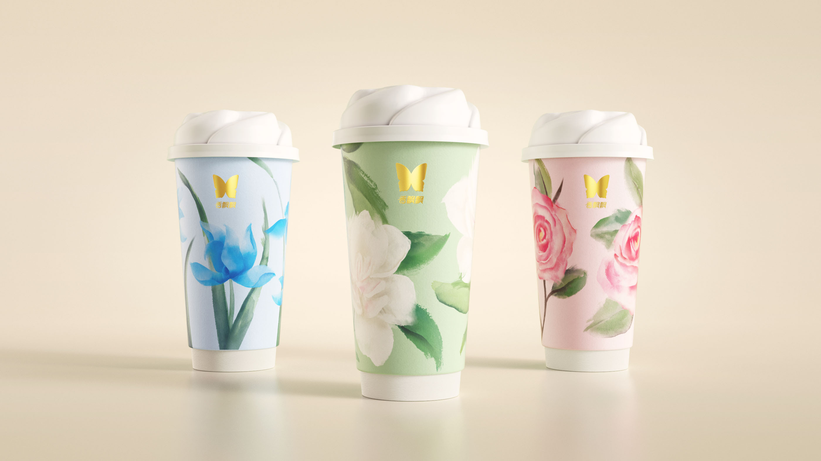
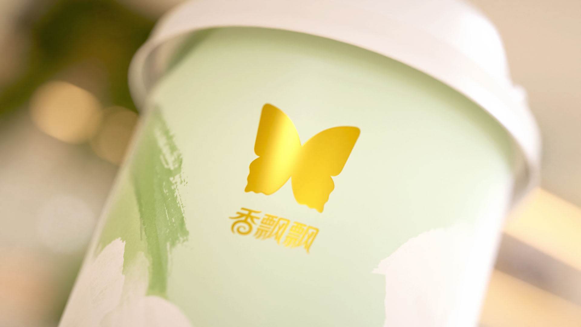
1. Brand Assets and Visual Symbols – Butterfly Logo and Its Extended Use
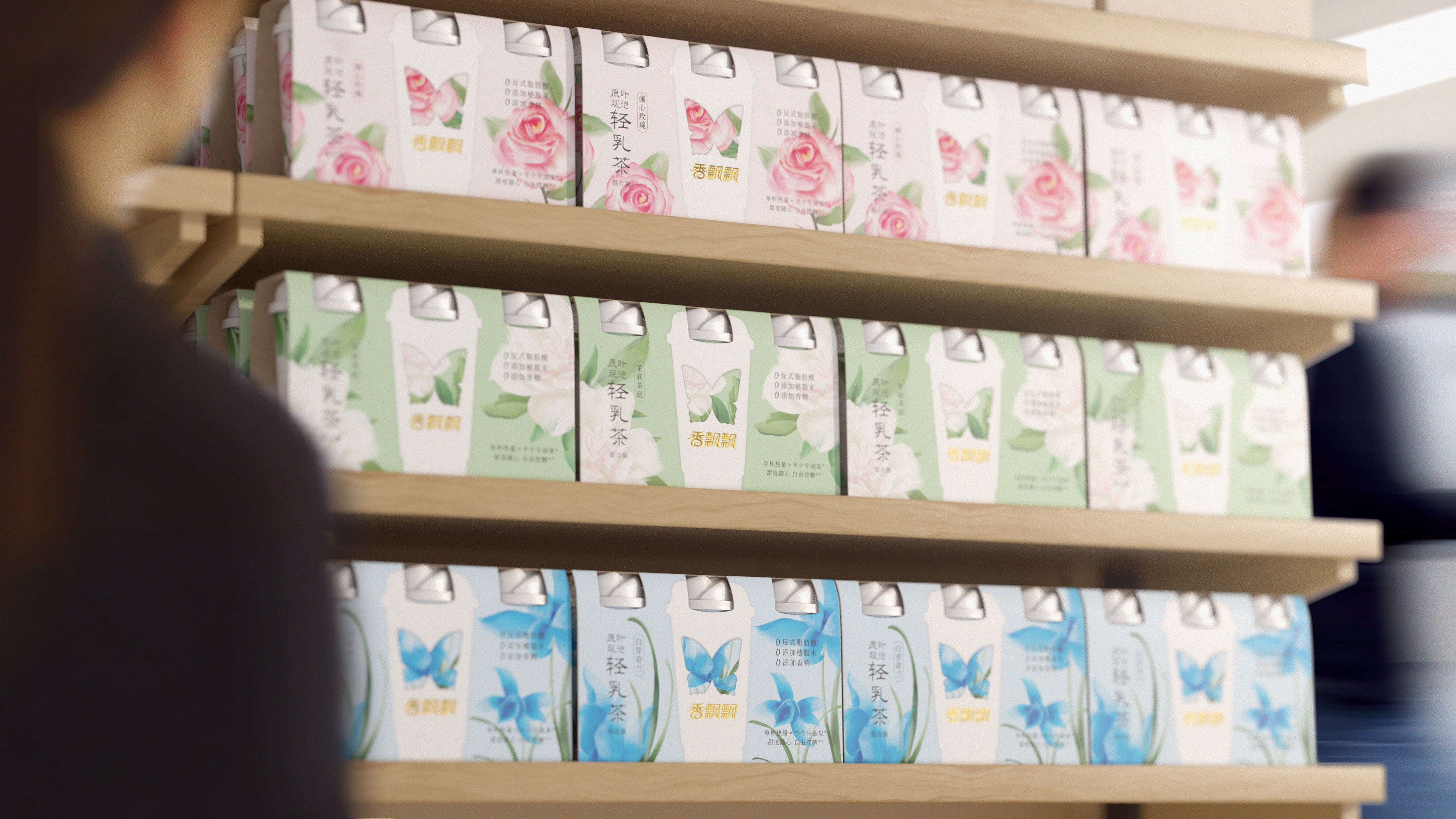
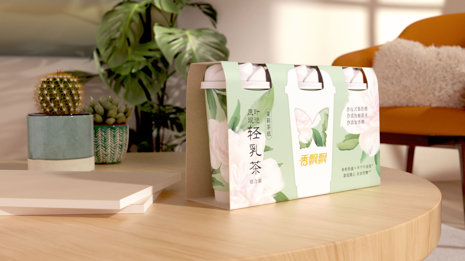
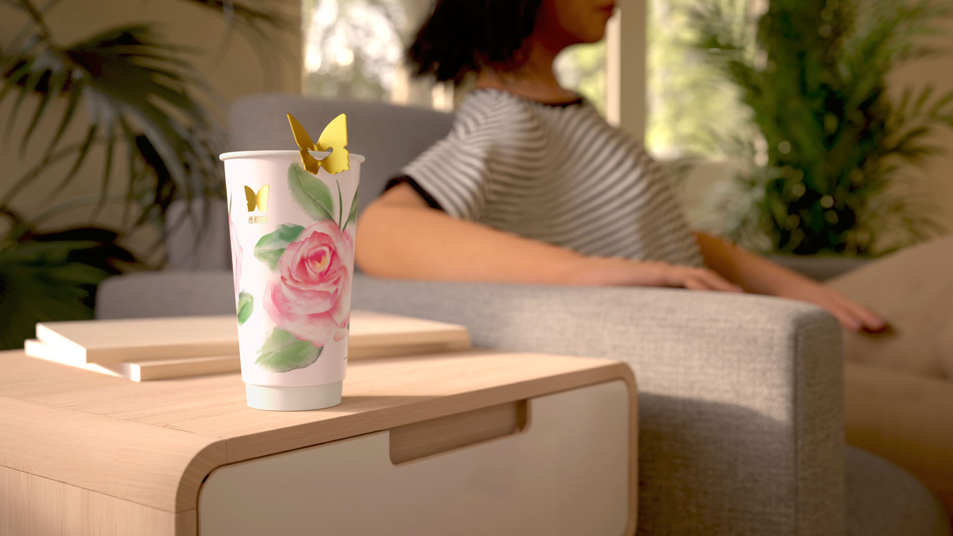
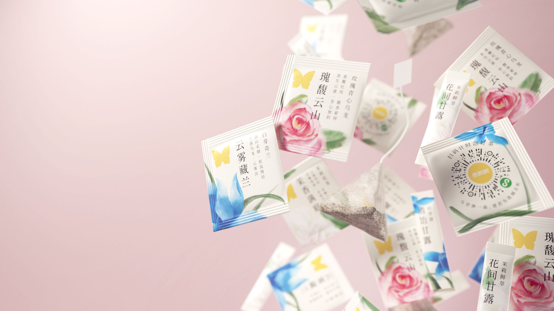
Inspired by Xiangpiaopiao’s original butterfly logo and the golden birdwing butterfly, a new butterfly emblem was designed to showcase the brand's refreshed, premium image. The butterfly logo is widely applied across materials and marketing, creatively integrated into the triple-pack packaging structure and tea bag tags, combining playfulness with social appeal. Additionally, the brand launched an interactive tea-making mini-program featuring dynamic butterfly animations, offering an immersive digital experience. Offline stores also incorporated butterfly elements, significantly enhancing brand recognition and consumer attraction.
2. Modern Interpretation of Chinese Aesthetics
Using Chinese freehand painting techniques, natural elements such as jasmine, rose, and orchid flowers were incorporated into the design, blending traditional charm with elegance and vitality.
3. Premium and Health-Oriented Positioning
The packaging highlights the natural ingredients of the tea and uses background colors like orchid blue, rose pink, and jasmine green to emphasize the health benefits and natural beauty, creating a premium and sophisticated brand image.
Market Performance
Sales data is not available for public disclosure at the moment, but the new product line has already become the star of Xiangpiaopiao’s Double 11 campaign, with sales exceeding twice that of the previous best-selling product and continuing to perform strongly. Meanwhile, offline stores are experiencing overwhelming popularity, with scenes of customers lining up for over two hours, showcasing the immense demand.
Material(For concept works, please choose the material you plan to use)
纸质 Paper
Craft
The bottle features a premium textured material with delicate patterns on the surface, enhancing the richness of its tactile experience. The bottle cap and tea bag use matte-finished plastic, while the cap itself is elegantly designed in the shape of a rose.
Does the design solve the problems that are common across the product category? If so, please explain.
Objective: Premiumization
1. Activating Brand Assets to Convey a Premium Image
Pearlfisher revitalized Xiang Piao Piao’s original butterfly logo, inspired by the Golden Kaiser-i-Hind butterfly, to create a new symbol of harmony, elegance, and balance. This logo is integrated into packaging, digital displays, and tea bag designs, reinforcing the brand’s premium positioning.
2. Blending Neo-Chinese Aesthetics for Unique Visual Identity
The packaging design combines traditional Chinese ink painting with soft tones like orchid blue, rose pink, and jasmine green, highlighting the natural ingredients while balancing tradition and modernity to attract young, quality-focused consumers.
3. Creating Visual Consistency and Interaction
The series distinguishes flavors through unique colors and elements while maintaining a cohesive visual identity.
What functional designs of the work have enhanced the user experience?
Interactive Design: The butterfly-shaped tea bag tag hangs gracefully on the cup rim, adding a sense of ceremony. A digital interactive mini-program centered on butterfly animations provides an immersive and engaging experience for consumers.
Efficiency and Practicality: The packaging uses distinct colors and patterns to clearly differentiate flavors, making selection easy, while its optimized structure is designed for convenient home use.
Scene-based and Emotional Design: By incorporating natural and health-oriented elements, along with ink-painting-inspired designs and soft color tones, it creates a sense of ritual and enjoyment, evoking emotional resonance.
Social Sharing Appeal: The aesthetically pleasing design enhances its gift-like quality, making it ideal for photo sharing, while refined details elevate the sense of satisfaction during use.
Did the design help increase the sales performance of the product? If so, please give related evidence.
The new series has become one of the hero SKU for Xiangpiaopiao, helping the brand initiate its premiumization process and further expand into overseas markets.