
Type of applicant company
设计机构
Country
英国
Company Website
https://pearlfisher.com
Images
Brand of the Product
Havana Club
Designer Name
Pearlfisher
Position of Designer
无
Target Consumer
Urban Lifestyle Gen Z
Distribution Channels
大型商场 Shopping Mall; 小型商超和便利店 Supermarket & CVS; 餐饮&酒店 Restaurants & Hotel
Positioning
大货消费品 Mass Production
Design Story
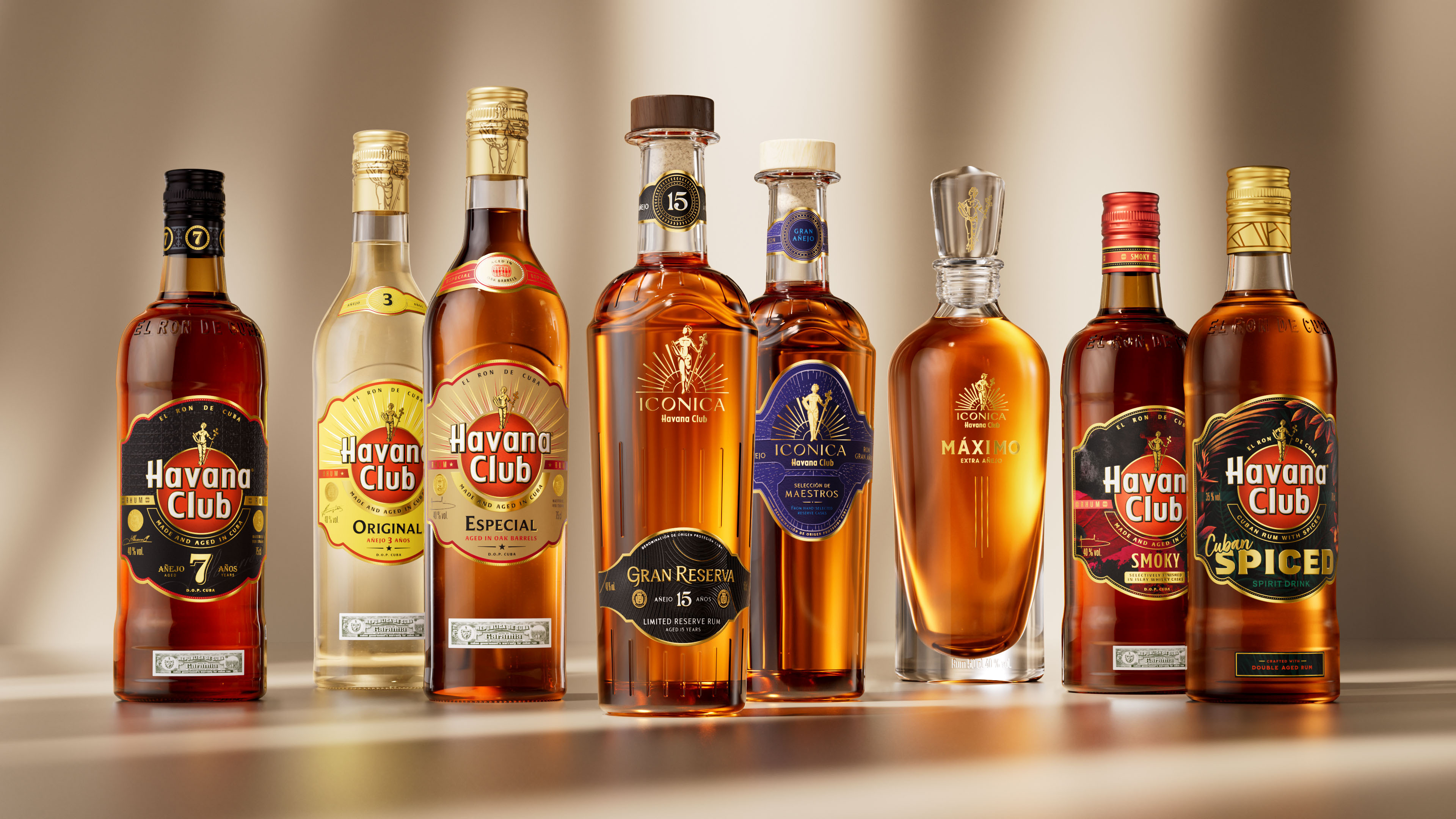
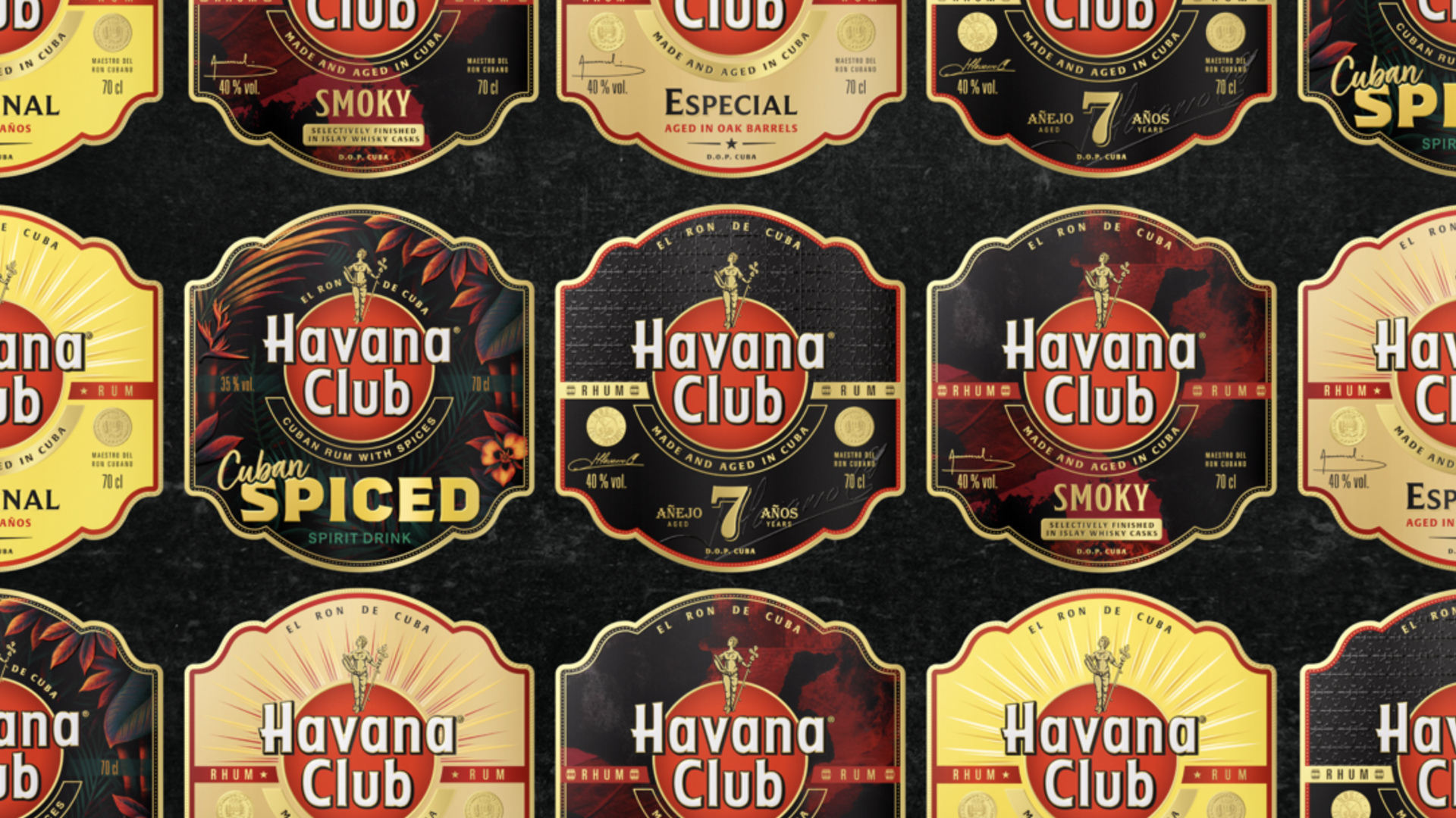
Project Context: Havana Club partnered with Pearlfisher to embark on an ambitious portfolio redesign, activating a new segmentation strategy while reinforcing its reputation as a premium, global icon in rum. Spanning from some of the most accessible liquids to the rarest blends in market, Havana Club looked to harmonise the range while simultaneously highlighting the unique qualities and character of each rum.
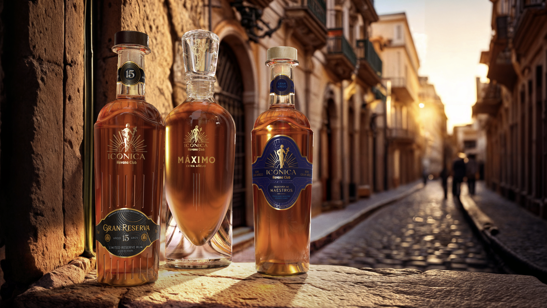
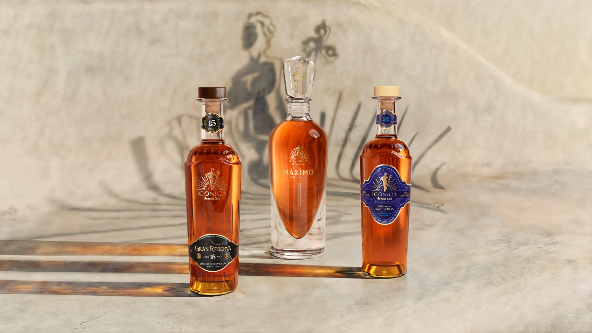
Design Concept:A new, unified label shape inspired by the ornate architecture of Havana immediately unifies the core range, framing the brand’s iconic logo anchored at its heart—a proud symbol of the vibrant pulse and energy that flows through Havana’s streets. This created a canvas for each product’s unique story to be expressed, taking consumers on a journey from the unrestrained confidence and vibrancy through to richer, layered, more crafted and complex taste experiences.
Highlights
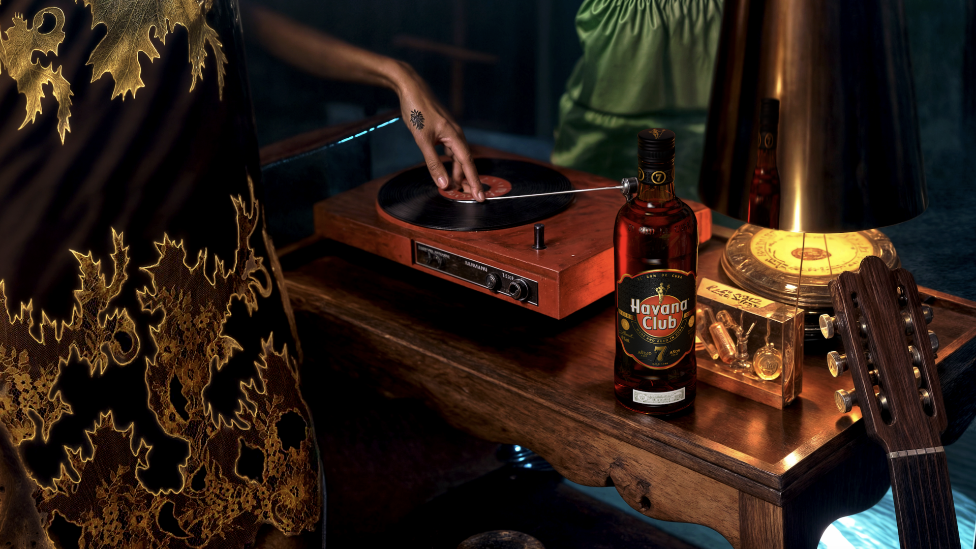
Taking inspiration from the vibrant city of Havana, Cuba—the city the brand calls home—the refreshed portfolio is diverse, storied and full of character, bringing to life the brand’s rich legacy in rum-making and elevating its Cuban DNA through a timeless yet modern transformation.
Market Performance
无
Material(For concept works, please choose the material you plan to use)
其他 玻璃材质
Craft
- The bottle features engraved or embossed designs, showcasing exquisite decorative elements and a premium positioning.
- The label utilizes embossing, foil stamping, debossing, or textured finishes to highlight a sense of luxury.
- Incorporating visual language inspired by Cuban cigars, it emphasizes handcrafted details and textural nuances.
- The logo, prominently placed at the center of the label, is further accentuated through special techniques such as foil stamping or gloss finishing, enhancing brand recognition.
Does the design solve the problems that are common across the product category? If so, please explain.
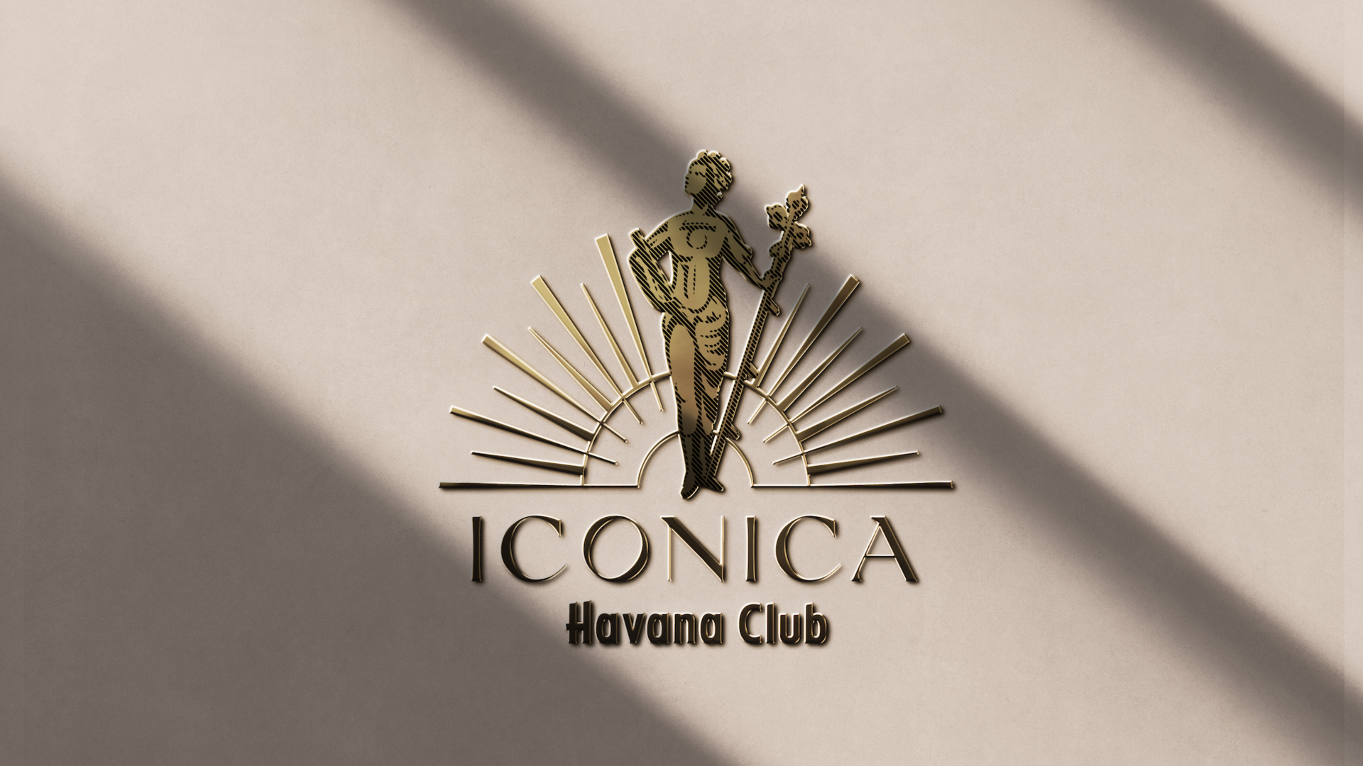
Firstly, to address the issue of homogenization, the design replaces the overused pirate and skull imagery with the historic symbol of La Giraldilla, infusing the brand with a unique cultural essence and enhancing its distinctiveness. Secondly, by utilizing a unified label shape and refined design details, the product series achieves overall consistency, while colors and symbols are used to differentiate individual product characteristics. Lastly, in crafting a sense of luxury, the bottle design of the Iconica Collection draws inspiration from Havana’s architecture and the graceful stance of La Giraldilla, combining intricate details to showcase a refined and premium aesthetic.
What functional designs of the work have enhanced the user experience?
By adopting a unified label shape and core visual elements (such as the brand logo and color system), the design enhances shelf recognition while using subtle differences (such as color schemes and detail design) to clearly distinguish between different product lines, making it easier for consumers to identify and choose.
Each product’s packaging not only highlights its uniqueness but also integrates the brand’s story. For example, the label shape draws inspiration from the architectural art of Havana, adding cultural depth and emotional resonance to the packaging, allowing consumers to experience the brand’s heritage and innovation while enjoying the product.