
Type of applicant company
设计机构
Country
英国
Company Website
https://pearlfisher.com
Images
Brand of the Product
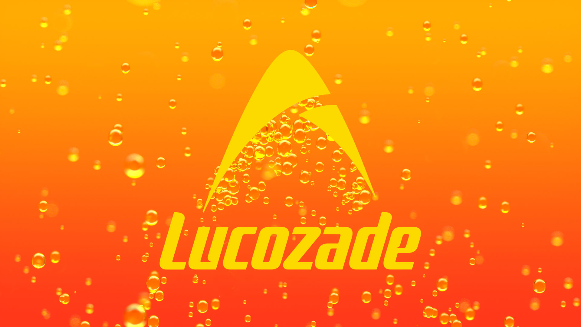
Lucozade
Designer Name
Pearlfisher
Position of Designer
无
Target Consumer
UK, 30-50 YO, daily striver and everday raiser
Distribution Channels
大型商场 Shopping Mall; 小型商超和便利店 Supermarket & CVS; 杂货店 Grocery
Positioning
大货消费品 Mass Production
Design Story
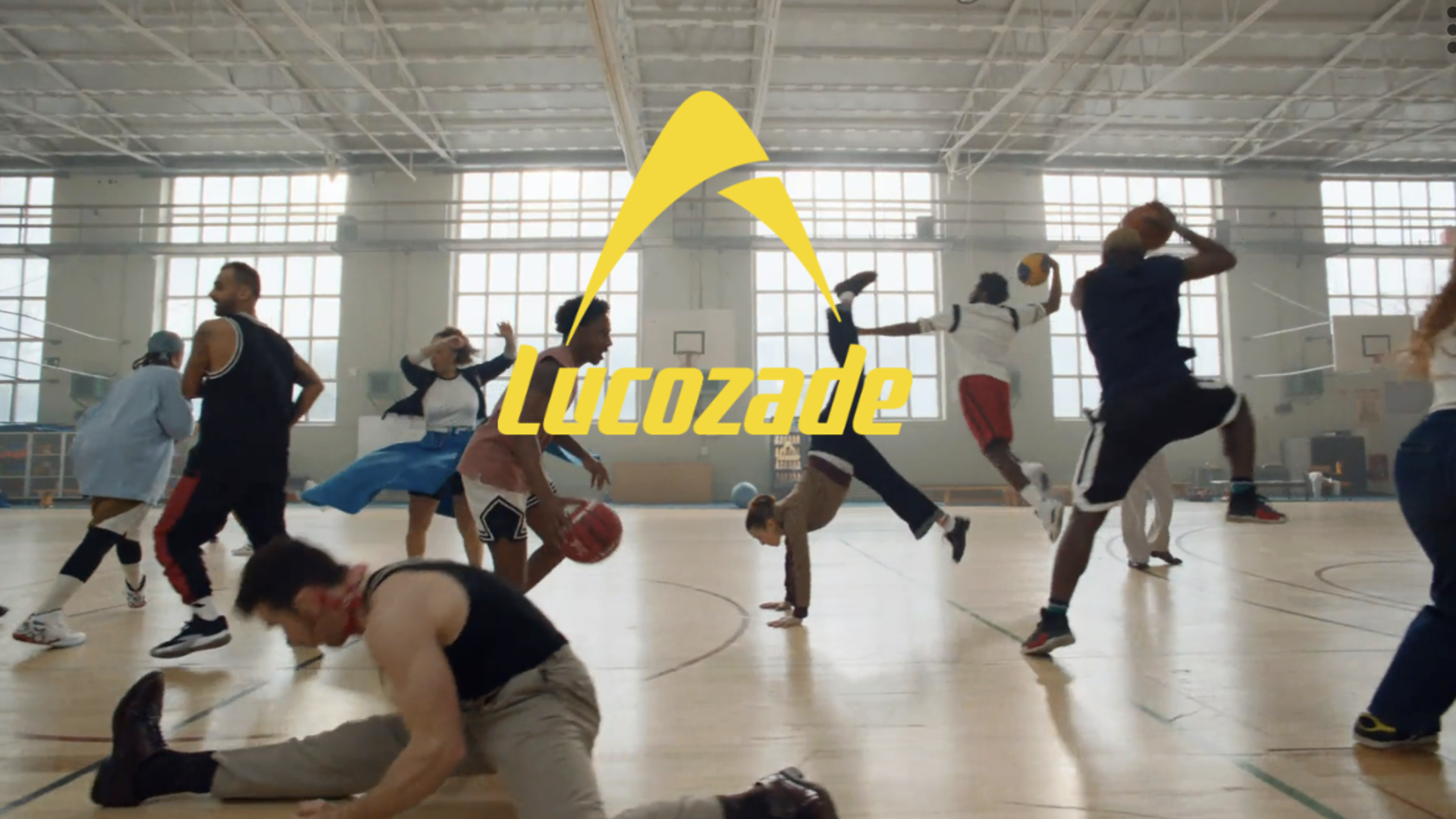
With nearly a century of history, Lucozade has become a globally popular functional beverage brand. In 2024, Lucozade entrusted Pearlfisher to execute its first comprehensive brand overhaul in almost 100 years, aiming to rejuvenate the brand with renewed energy and vitality.
Pearlfisher's vision for Lucozade was clear: to create a powerful and cohesive brand presence that resonates with both long-standing fans while also appealing to new shoppers. Strategically, this meant capturing and expressing the inherently vibrant energy and dynamism of Lucozade, and uniting this across every drink in the portfolio through design. With a consistent Lucozade look and feel, it was still important to flex the sub-brands.
Highlights
The redesign was informed by extensive consumer research, including agile prototyping and real-time workshops that allowed for immediate integration of consumer feedback into the design process.
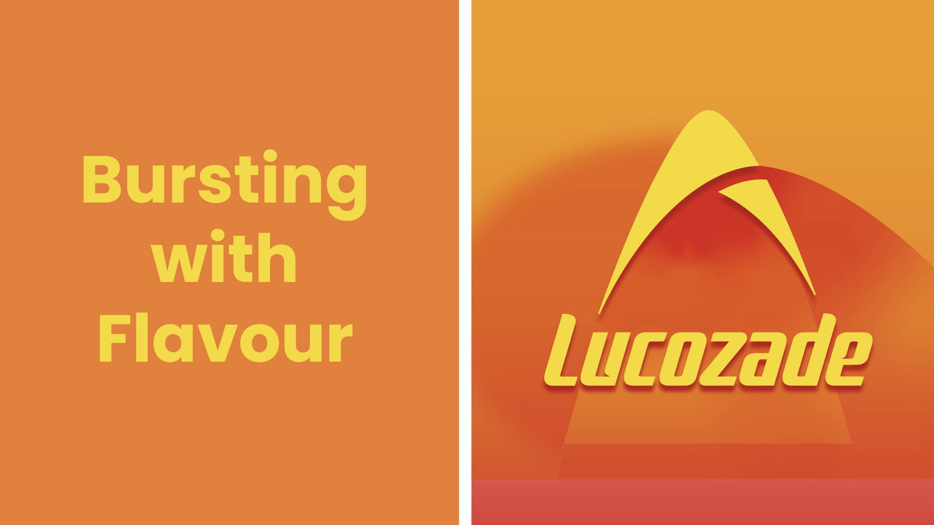
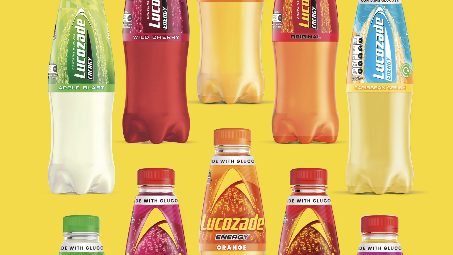
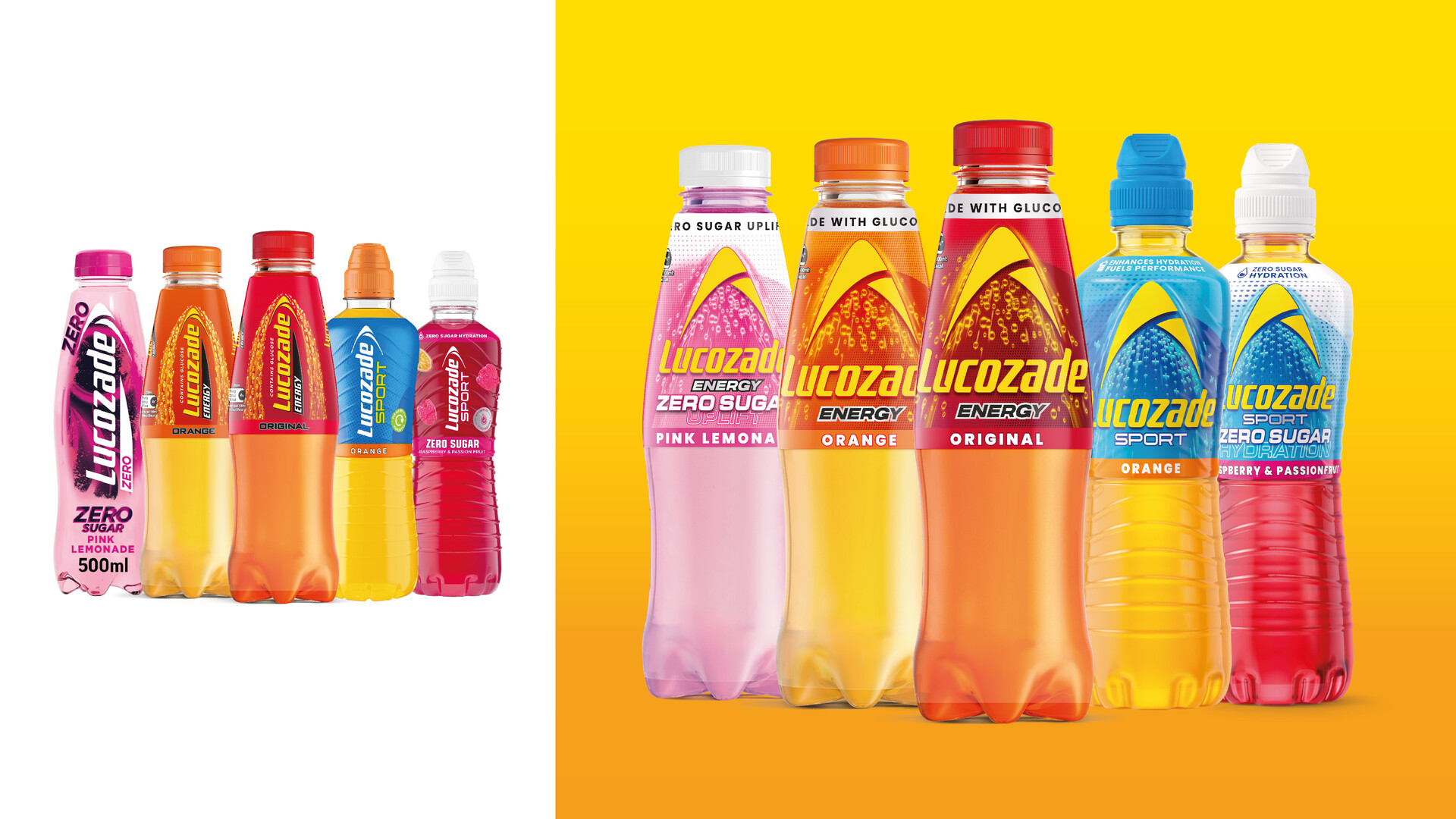
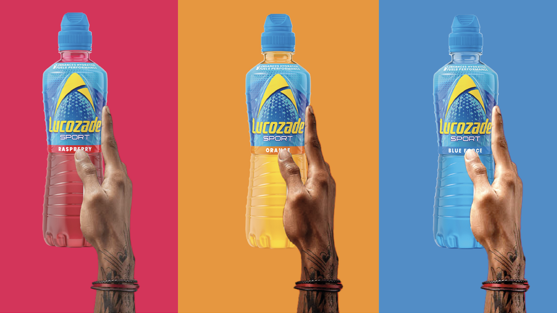
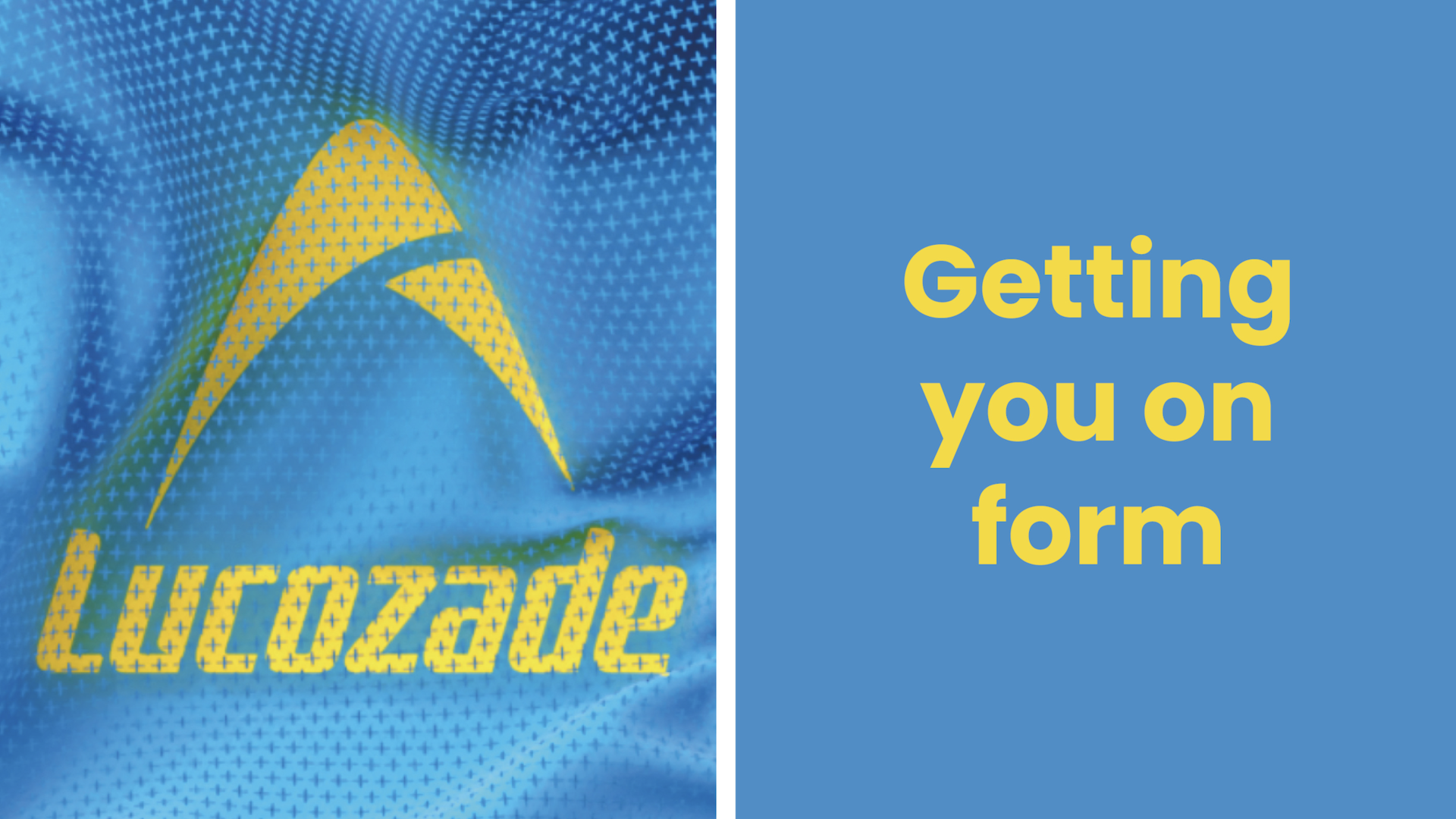
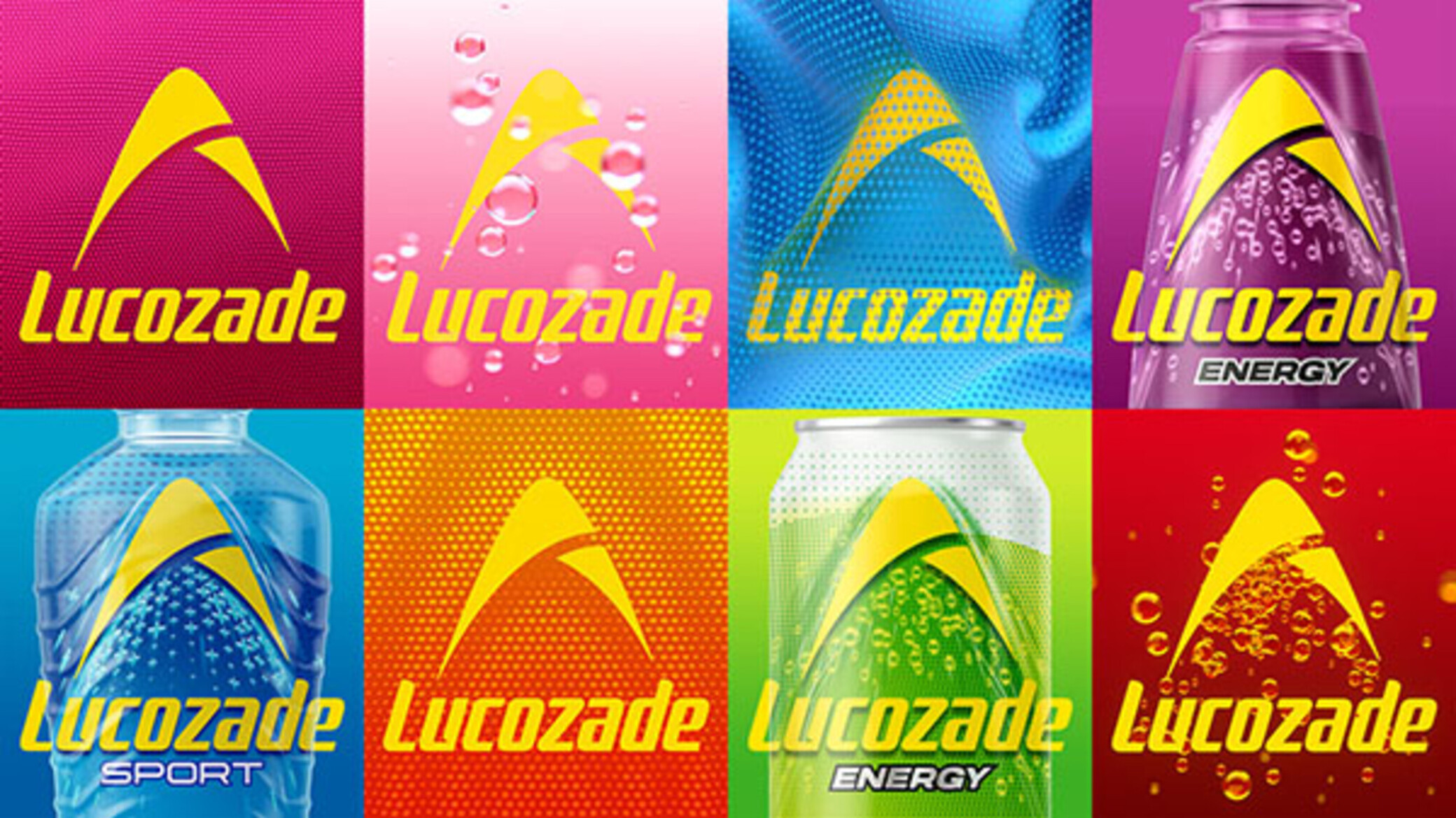
The new design consciously moves away from the vertical Lucozade wordmark, rotating it to lock up and amplify the arc with a burst of bubbles. The arc has been redrawn, modernised and flooded with an optimistic, vibrant yellow. It remains constant and prominent across the portfolio, cementing it even further as the iconic symbol of Lucozade’s positive energy. The flexible graphic system differentiates between product ranges: for Energy, a background of pure bubbles; for Sport, an athletic mesh-like pattern, akin to sportswear; and for Zero, the introduction of white at the top of the pattern to evoke lightness.
Market Performance
不方便透露
Material(For concept works, please choose the material you plan to use)
PET塑料 PET material
Craft
无
Does the design solve the problems that are common across the product category? If so, please explain.
1. Low Brand Recognition and Difficulty Standing Out on Shelves
- Redesigned the iconic arc logo with a brighter, more vibrant yellow to enhance visual impact and quickly capture consumer attention.
- Unified the main brand identity while maintaining clear differentiation for sub-brands, addressing the confusion caused by a wide product range.
2. Overloaded Packaging Information, Making It Hard for Consumers to Grasp Key Details
- Optimized the information hierarchy by making the arc logo the focal point and highlighting functional details (e.g., “Energy,” “Sport”) for easier consumer understanding.
- Utilized white space, color contrast, and a clean design language to improve clarity and visual appeal.
What functional designs of the work have enhanced the user experience?
1. The bright yellow arc serves as the core visual identifier, enhancing brand recognition and enabling consumers to quickly spot the product on shelves.
2. The design refined the expression of functional attributes: for example, the Energy range uses dynamic bubbles to highlight energy replenishment, while the Sport range incorporates athletic mesh patterns to emphasize its connection to sports scenarios. Additionally, the design optimized the information hierarchy with clear labels and intuitive layouts (e.g., “Energy,” “Zero Sugar”), reducing information overload and making it easier for consumers to understand product functions and make informed choices.