
Type of applicant company
设计机构
Country
中国
Company Website
www.bamboodesign.com.cn
Images
Brand of the Product
Huishan
Designer Name
Group Creative Director: Andrew Wan Associate Creative Director: Serean Tan Art Director: Gaga Li Senior Creative Designer: Megan Chen Strategy Director: Wayne Lan Strategy Manager: Orchid Pan Senior Strategy Planner: Reley Xia Strategy Planner: Peony Zhu Senior Artist: Eva Yang
Position of Designer
NONE
Target Consumer
Young and healthy hipsters mainly at the age of 18-35, who are keen on pursuing new trends and special flavors, especially preferring products with rich and layered texture and regional characteristics. They are trend pushers, pursuing high-quality and good-looking products; special healthy and delicious flavors and pleasing visual experience can tug at their heartstrings.
Distribution Channels
电商 E-commerce; 大型商场 Shopping Mall; 小型商超和便利店 Supermarket & CVS
Positioning
大货消费品 Mass Production
Design Story
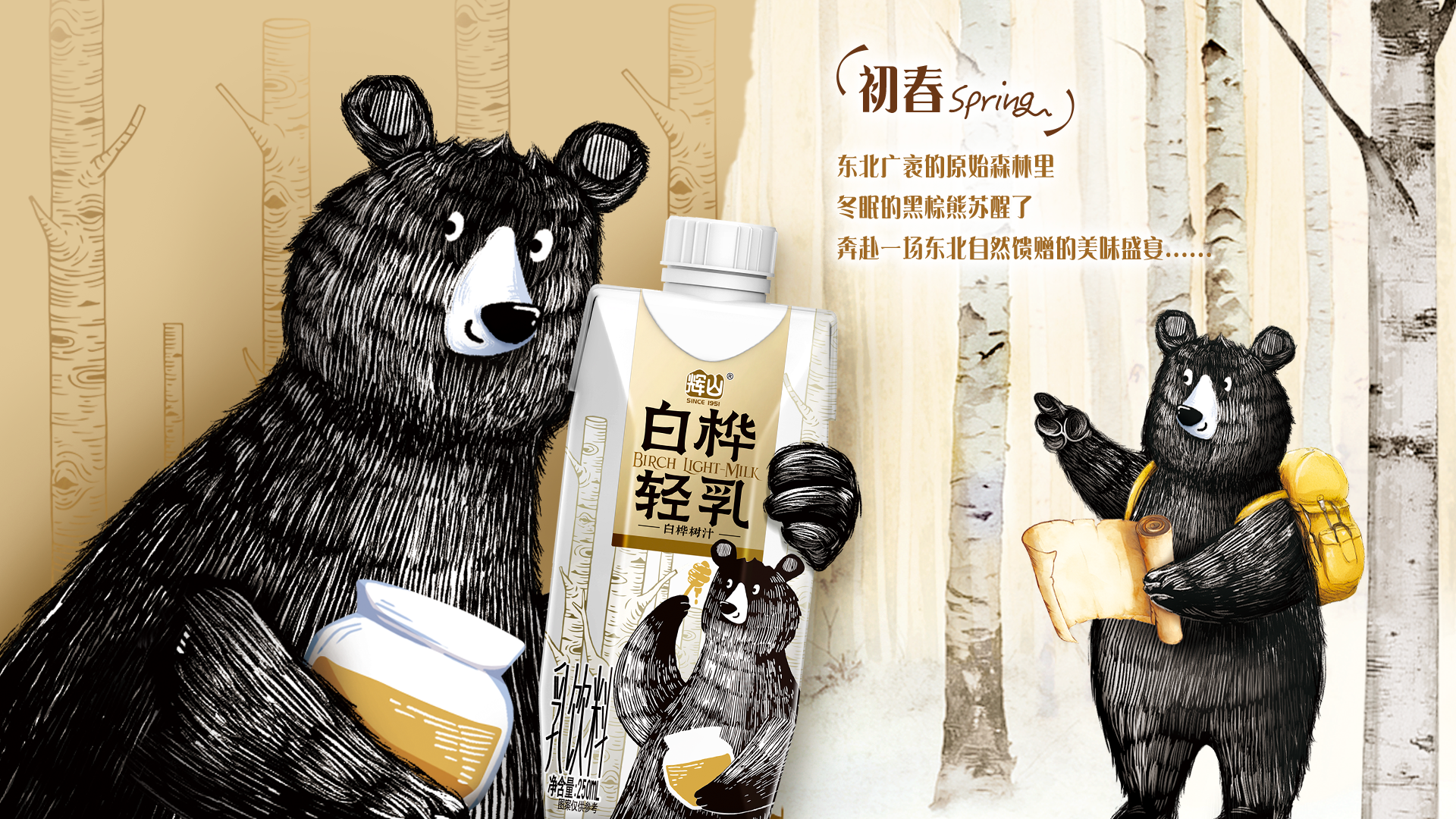
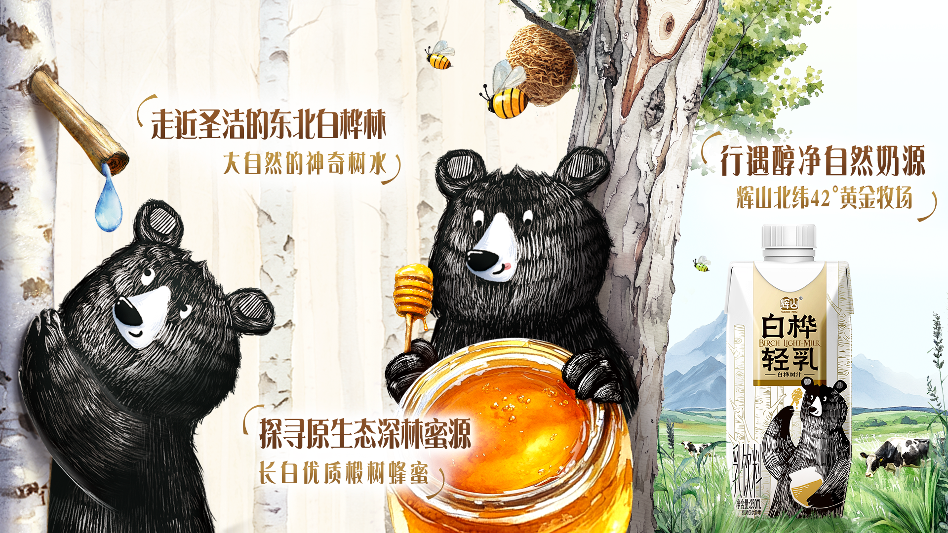
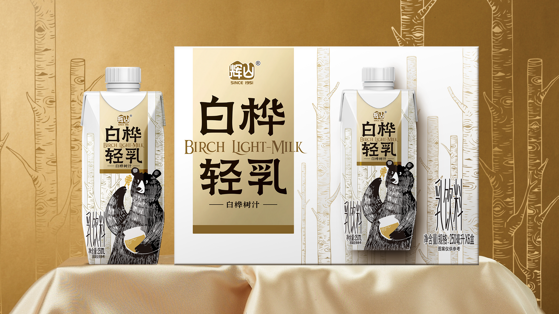
Catering to the modern consumer‘s preference for self-pleasing and trendy specialty flavors, the packaging is inspired by the vast and holy birch forests of Northeast China and the black bears who love to drink birch sap and honey, with the black bears holding honey jars as the core vision, and with the primitive method of simple sketching, without too much ink and brush modification, clean, sharp, and atmospheric. Matching with the white birch background outlined with delicate gold lines, it creates a visual experience of natural originality and elegance; weaving a vivid story of a delicious stacked feast enjoyed by a little black bear in a birch forest, which not only makes the visual effect of the package more unique and bright, but also helps the brand to create a deeper connection with the consumers. The overall color tone is dominated by white and gold, highlighting the white purity of the birch forest and the premium texture of the product. The bottle adopts the Dream Cap Tetra Pak Diamond bottle shape, and the streamlined “willow leaf” design shows the birch forest and the sketched bear elements in a more three-dimensional way.
Highlights
The product design, using vivid natural objects to convey the theme, through artistic re-creation, makes the association of northeastern birch juice, bears and honey, into a special delicious story illustration on the packaging.
When a hibernating bear wakes up in early spring, the first thing it does is to take birch sap to restore its strength, and travel through the forest in search of the wild honey it loves to eat... Taking this inspiration source, with the small black bear of Northeast China as the “protagonist”, the birch, honey and buttermilk are linked together to trace a richer, more vivid and more sincere brand story, and a “Delicious feast of birch bears from the Northeast China” is thus visually presented in front of consumers' eyes. The brand story is richer, more vivid, and more sincere. Compared with the common cartoon bears, the ugly-cute “little black bear” not only has a sense of intimacy and social conversation, but also has a strong visual impact and attraction on the shelf, and can be quickly recognized and remembered.
Market Performance
NONE
Material(For concept works, please choose the material you plan to use)
其他 利乐钻材质 纸塑铝复合
Craft
The inner package of the product adopts the dream cover Tetra Pak diamond package commonly used for high-end liquid milk, locking the delicious taste and convenient to open at the same time. The craftsmanship starts from the silver material of Tetra Pak diamond, adopts the partial translucent metallic color, and for the fresh and natural design style, specially chooses an understated light champagne gold, which is in line with and highlights the product's light taste and refreshing milk aroma.
Does the design solve the problems that are common across the product category? If so, please explain.
Nowadays, special flavored milk drinks are prevalent, and packaging needs to think about attracting young people while retaining its own product core. Huishan Birch Light Milk adds storytelling and fun to its design, and on the basis of retaining the regional cultural heritage of Northeast China, it cleverly uses the elements of black bears, birch forests, and honey, and creates light and interesting illustrations that are more easily accepted by young people, making it distinctly differentiated from other products in the same category.In terms of the image of the core visual “bear”, most bears on the market are cartoonish, cute and rounded, but this work creates the ugly-cute and naive “little black bear”, injecting a sense of intimacy and uniqueness into the product.
What functional designs of the work have enhanced the user experience?
The color scheme of simple texture is cleverly used to increase visual comfort, and the bottle model adopts the dream cap Tetra Pak diamond bottle, the streamlined “willow leaf” design and the front constitute a sense of depth and space, so that the birch forest and the sketch paper bear pattern has a more three-dimensional sense and vivid visual effect, the shape is easy to hold, comfortable to the touch, and it is easy to open the cap, the opening is moderate, and the drinking experience is smooth, in addition, the pattern symbolizes the “little black bear” as the central visual, which has a strong visual impact in the terminal presentation and strengthens the user's memory point. In addition, the pattern symbolizes “small black bear” as the central vision, which has a strong visual impact in the terminal presentation and strengthens the user's memory.
Did the design help increase the sales performance of the product? If so, please give related evidence.
NONE
Does the work consider sustainability (environmentally or commercially, or both)? If so, please explain.
This package design focuses on environmental protection and sustainability. The carton is made of renewable cardboard to reduce the environmental impact and increase the percentage of renewable components in the package, thus reducing the consumption of natural resources and the accumulation of waste, easy to disassemble and separate the design structure for easy recycling.