Type of applicant company
设计机构
Country
中国
Company Website
https://mohoo.zcool.com.cn/
Images
Brand of the Product
QINGYI
Designer Name
Newcannery shipinshiyebu Brandteam
Position of Designer
无
Target Consumer
The target audience includes white-collar workers, sophisticated mothers, and urban seniors, who have certain demands for improving their health quality and seeking health care functions.
Distribution Channels
电商 E-commerce
Positioning
大货消费品 Mass Production
Design Story
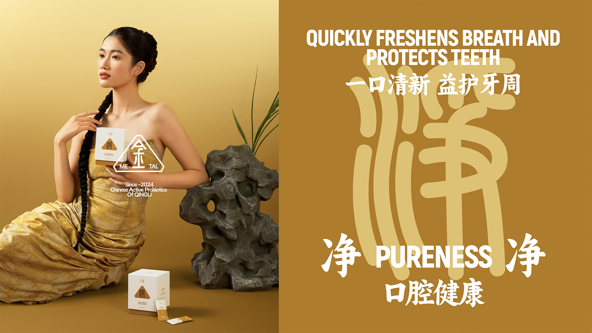
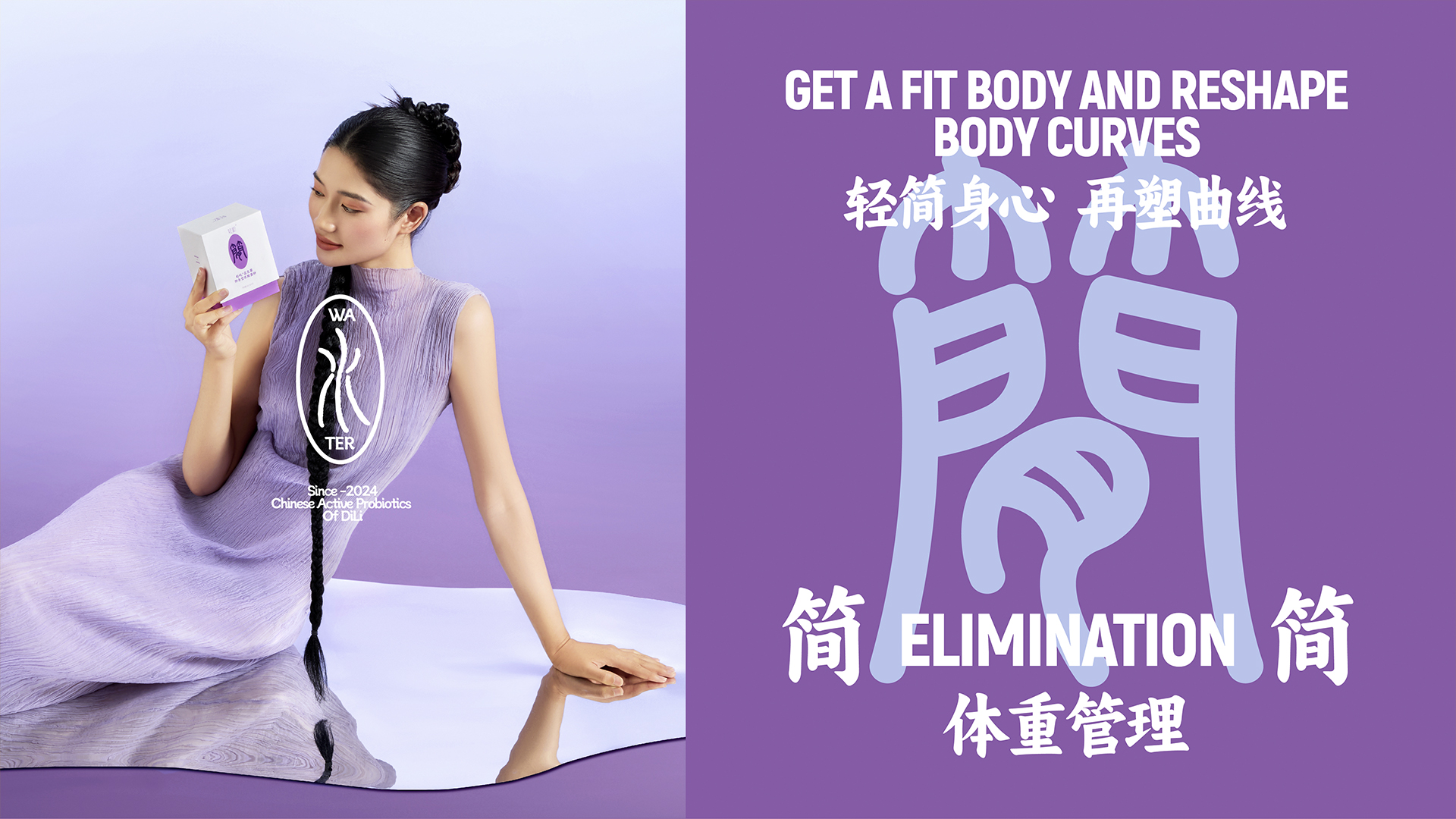
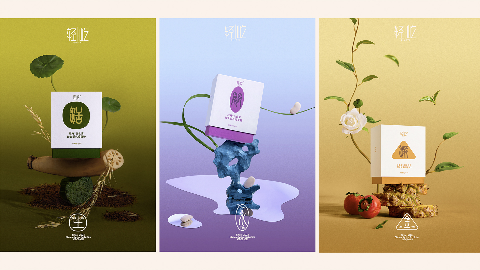
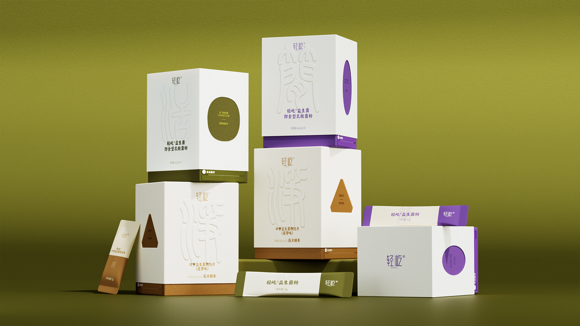
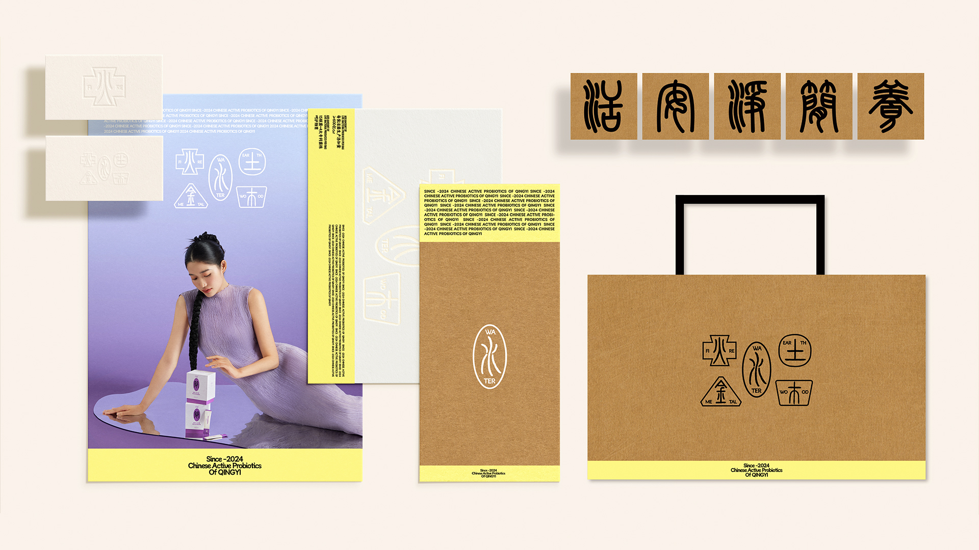
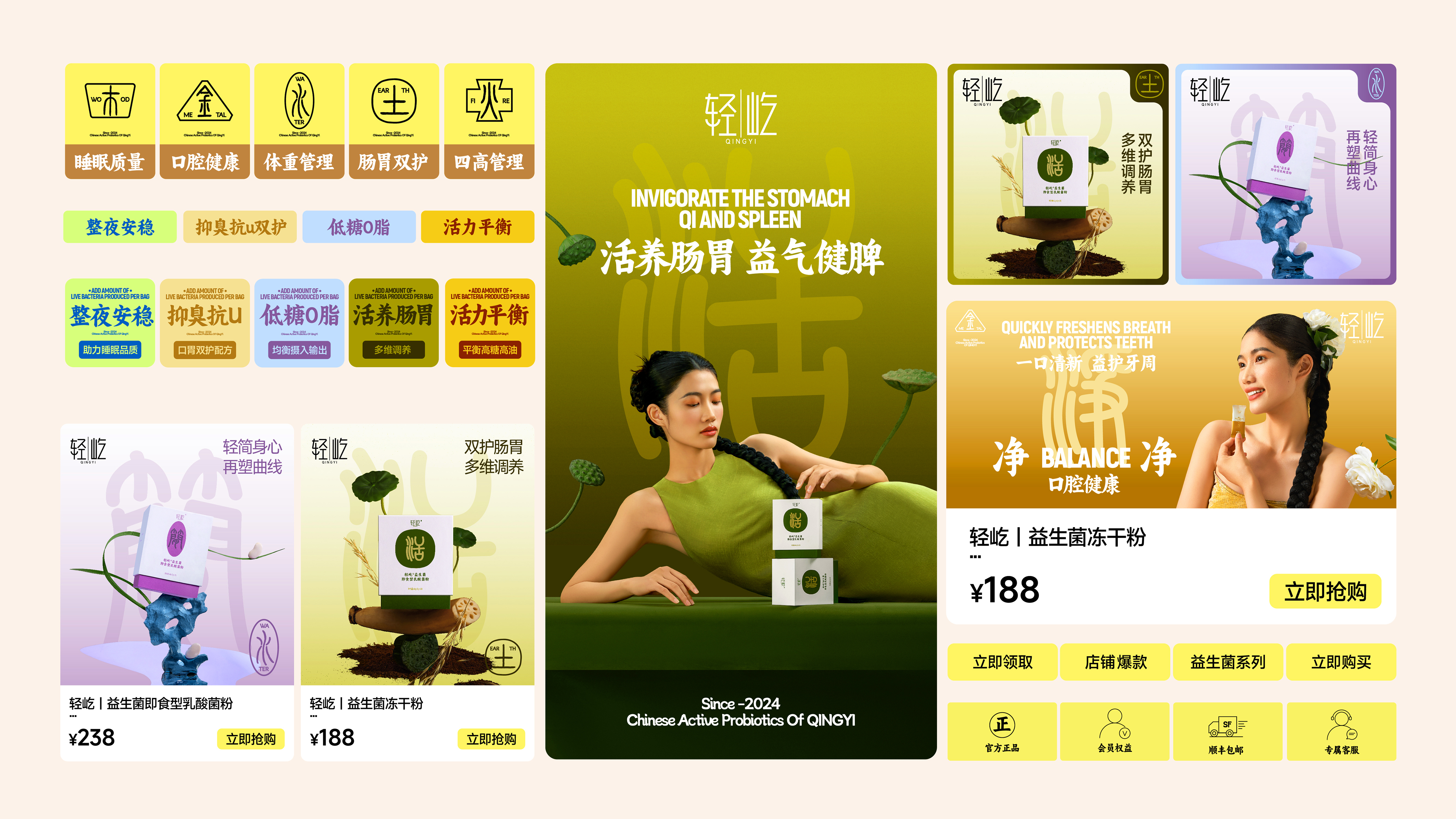
This product is a probiotic functional solid beverage, and different probiotic products with various effects have been developed for different parts of the body, which are more suitable for the physique of Chinese people. We want to highlight the functional attributes of the product and its compatibility with the physique of our compatriots. Therefore, in the overall visual expression, we draw on the 'Five Elements' concept from traditional Chinese health practices. We use the colors and graphic symbols of metal, wood, water, fire, and earth to distinguish probiotic product series with different effects. At the same time, we have chosen the seal script font, which has a sense of heritage, to highlight the core efficacy of individual products. The probiotic content is directly labeled on the packaging, giving consumers a sense of effectiveness and nurturing functionality, which increases their initial trust in the product. The combination of a new Chinese style with an international aesthetic highlights the fashionable temperament of the packaging and conveys the functional attributes of the product. The brand and the product achieve a perfect unity in terms of both visual appeal and functionality.
Highlights
We have insights into the fact that when users select 'probiotic' products, their primary concern is 'effectiveness'. Therefore, we have combined the 'Five Elements' concept from traditional Chinese wellness with the nurturing effects of probiotics. Based on the colors of the Five Elements—gold, wood, water, fire, and earth—we have categorized probiotic products with different effects using an international style of color contrast. Additionally, we have chosen Chinese seal script fonts to highlight the core benefits of individual products. This approach has created a unique visual identity from product to brand, which not only interprets the product series' philosophy of 'probiotics more suited to the Chinese constitution' but also accurately conveys the core benefits of the products' synergy of medicine and food. It increases the trust users have in the products while capturing a larger share of the younger target demographic.
Market Performance
The product has been on the market for less than 2 months.
Material(For concept works, please choose the material you plan to use)
纸质 Paper
Craft
Taking into account the product's focus on health, we have opted for a more textured embossing technique in our craftsmanship, which conveys a sense of health and effectiveness. In terms of box design, we offer two options: one is a pentagonal box shape that forms a more intuitive connection with the visual symbol of the "Five Elements," and the other is a top-and-bottom box style, which makes it easier for users to access and store the product during use.
Does the work consider sustainability (environmentally or commercially, or both)? If so, please explain.
In terms of material selection, choose textured kraft paper material, and the box design also takes into account that users can use it as a storage box for repeated use.