
Type of applicant company
品牌方
Country
中国
Company Website
https://www.szeastroc.com/
Images
Brand of the Product
Coco Island
Designer Name
ICC
Position of Designer
无
Target Consumer
Coconut juice is a widely recognized category with a broad audience, suitable for all ages and genders. At the same time, considering the three major consumption scenarios of banquets, ready to drink, and gift giving, packaging design needs to be tailored to the category and scenario.
Distribution Channels
大型商场 Shopping Mall; 小型商超和便利店 Supermarket & CVS; 杂货店 Grocery; 餐饮&酒店 Restaurants & Hotel; 其他销售渠道 餐饮渠道(含大小餐饮)
Positioning
大货消费品 Mass Production
Design Story
In recent years, the concept of "everything can be coconut-based" has gained popularity, leading to a significant increase in coconut content in the beverage market. The market's expectations and acceptance of coconut-related products are relatively high. Therefore, Dongpeng plans to launch a mass-market coconut juice beverage that is highly cost-effective.
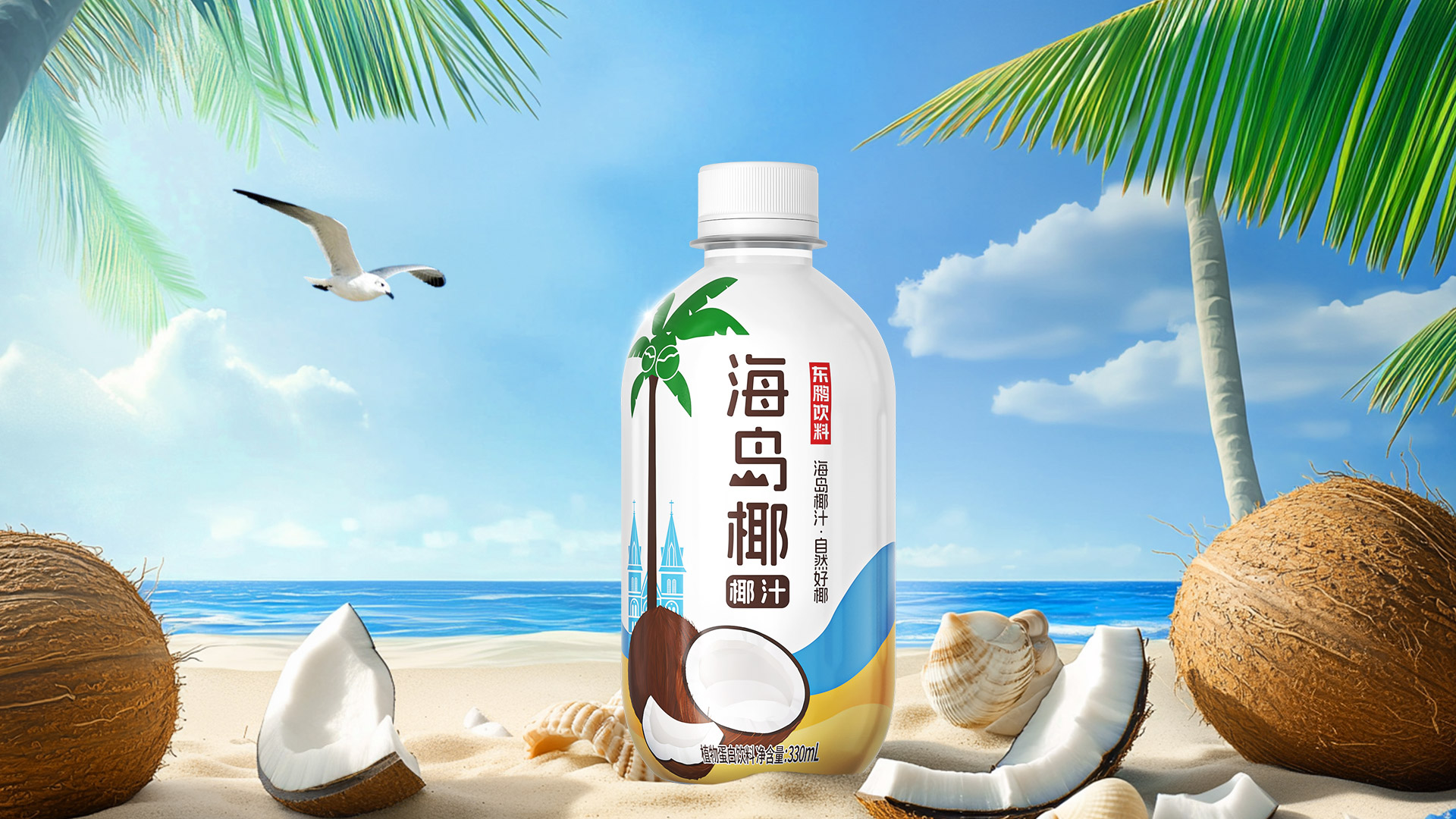
The main elements of the packaging design are beaches and Vietnamese architecture. Through minimalist illustrations, patterns such as waves, sand, and palm trees are depicted to create a relaxed and joyful vacation atmosphere. The font used is a minimalist sans-serif style, which is simple and modern, making the text clear and easy to read. The font also incorporates the shape of an island to highlight the island vibe. The overall packaging color scheme is harmonious, with ample white space giving a sense of minimalist sophistication and enhancing the overall aesthetic.
Highlights
As the first medium for terminal promotion and sales, the product's outer packaging not only needs to stand out on the shelf but also needs to provide more trust and endorsement through necessary design techniques.
The overall color scheme and design elements of Island Coconut's packaging directly reflect the attributes of the coconut juice category. It is created in a minimalist illustration style combined with the product name and island vibe. The design highlights the corporate endorsement of Dongpeng Beverages and its slogan to gain consumer trust while reinforcing the brand impression that Island Coconut is a naturally good coconut product.
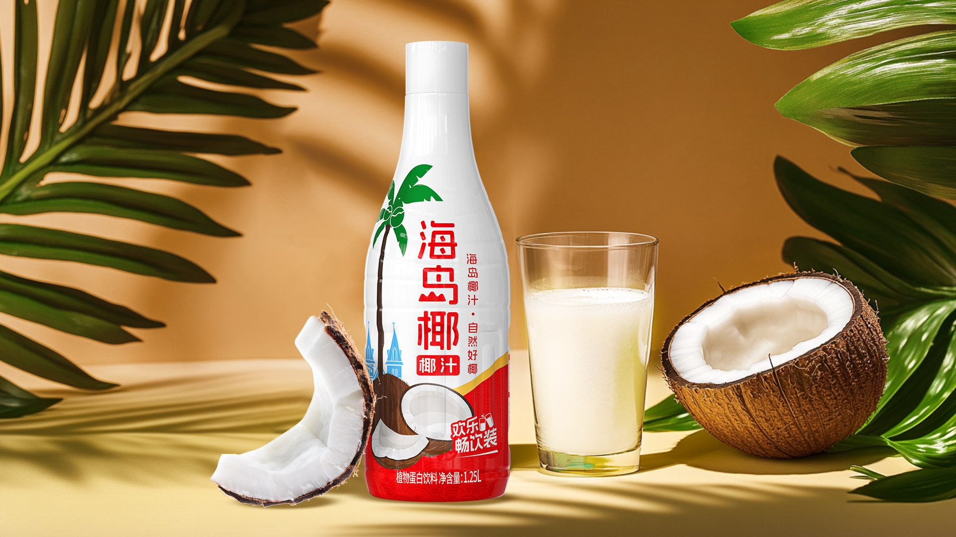
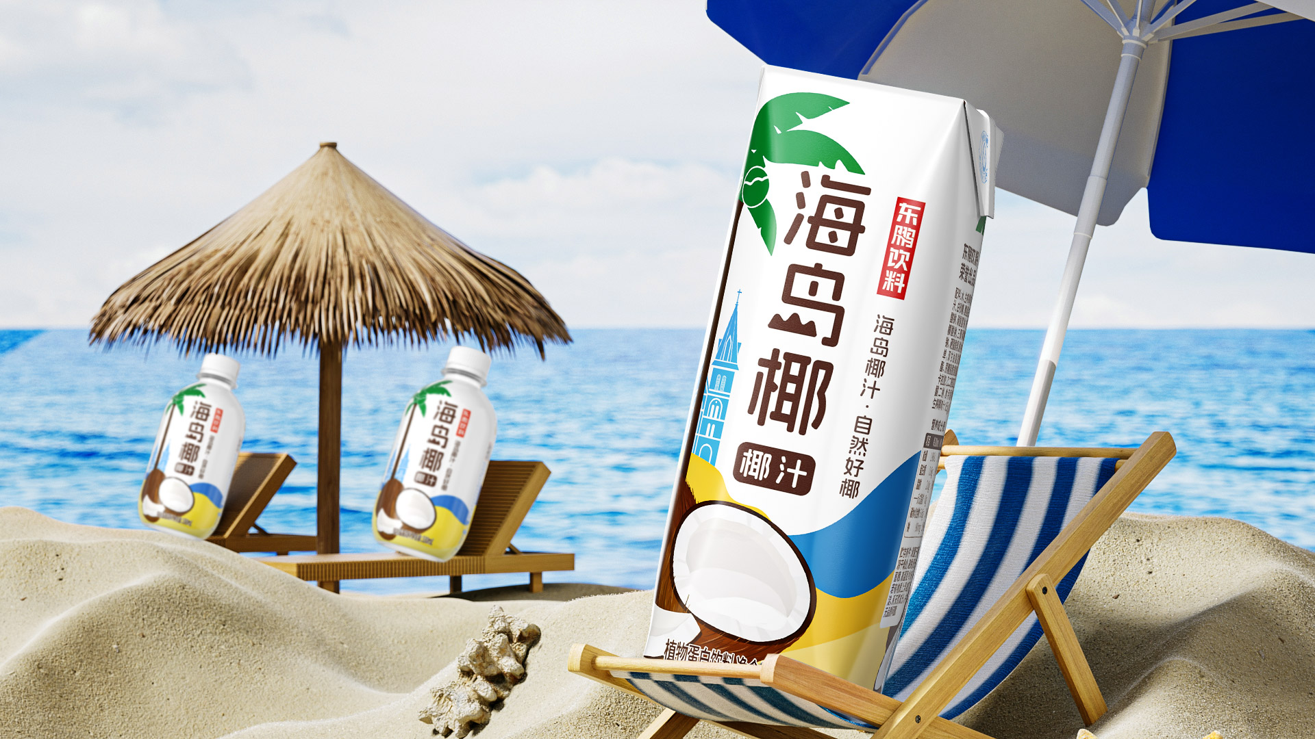
The packaging is extended in terms of size, with different colors tailored to various specifications and usage scenarios. For example, the red and yellow color scheme of the large sharing bottle maintains the overall series feel while fitting the festive atmosphere of banquets and gatherings.
Market Performance
Since their launch, 330ml and 250ml have been popular in terms of taste and packaging, quickly launching 1.25L free to drink packs, but the products are in short supply.
Material(For concept works, please choose the material you plan to use)
PET塑料 PET material; 纸质 Paper
Craft
Bottles use industry standard PET labels with high color reproduction, which can better display the coconut juice properties of beaches and islands;
Does the design solve the problems that are common across the product category? If so, please explain.
With the improvement of consumer spending power, the下沉market is also beginning to pursue products with a greater sense of quality. Previously, the packaging of coconut juice products in the下沉market was generally colorful and focused on a down-to-earth style. In contrast, the packaging design of Island Coconut is more streamlined and sophisticated. It also extends the product specifications to cater to different consumer scenarios. The sharing pack, which is mainly aimed at banquets, features a festive red and yellow color scheme that better captures the joyful atmosphere of gatherings, giving consumers an additional reason to purchase.
What functional designs of the work have enhanced the user experience?
无
Did the design help increase the sales performance of the product? If so, please give related evidence.
无
Does the work consider sustainability (environmentally or commercially, or both)? If so, please explain.
无