
Type of applicant company
设计机构
Country
中国
Company Website
www.mywishdesign.cn
Images
Brand of the Product
Fortune
Designer Name
Sunshine Design Team
Position of Designer
no
Target Consumer
1. Loyal users of the original Natural Fragrant Rice, who understand the characteristics of the 9% golden milling process of Natural Fragrant Rice and often purchase healthy concept products. 2. New users of Natural Fragrant Rice, attracted by the renewed packaging, and then have a favorable impression of the 9% golden milling process of Natural Fragrant Rice. They have higher aesthetic tastes and rational cognition and are willing to try new things.
Distribution Channels
电商 E-commerce; 大型商场 Shopping Mall; 小型商超和便利店 Supermarket & CVS; 杂货店 Grocery
Positioning
大货消费品 Mass Production
Design Story
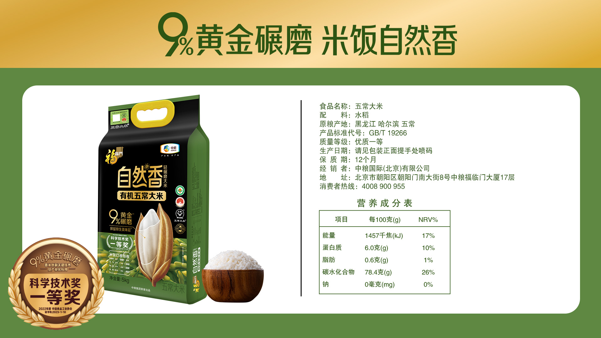
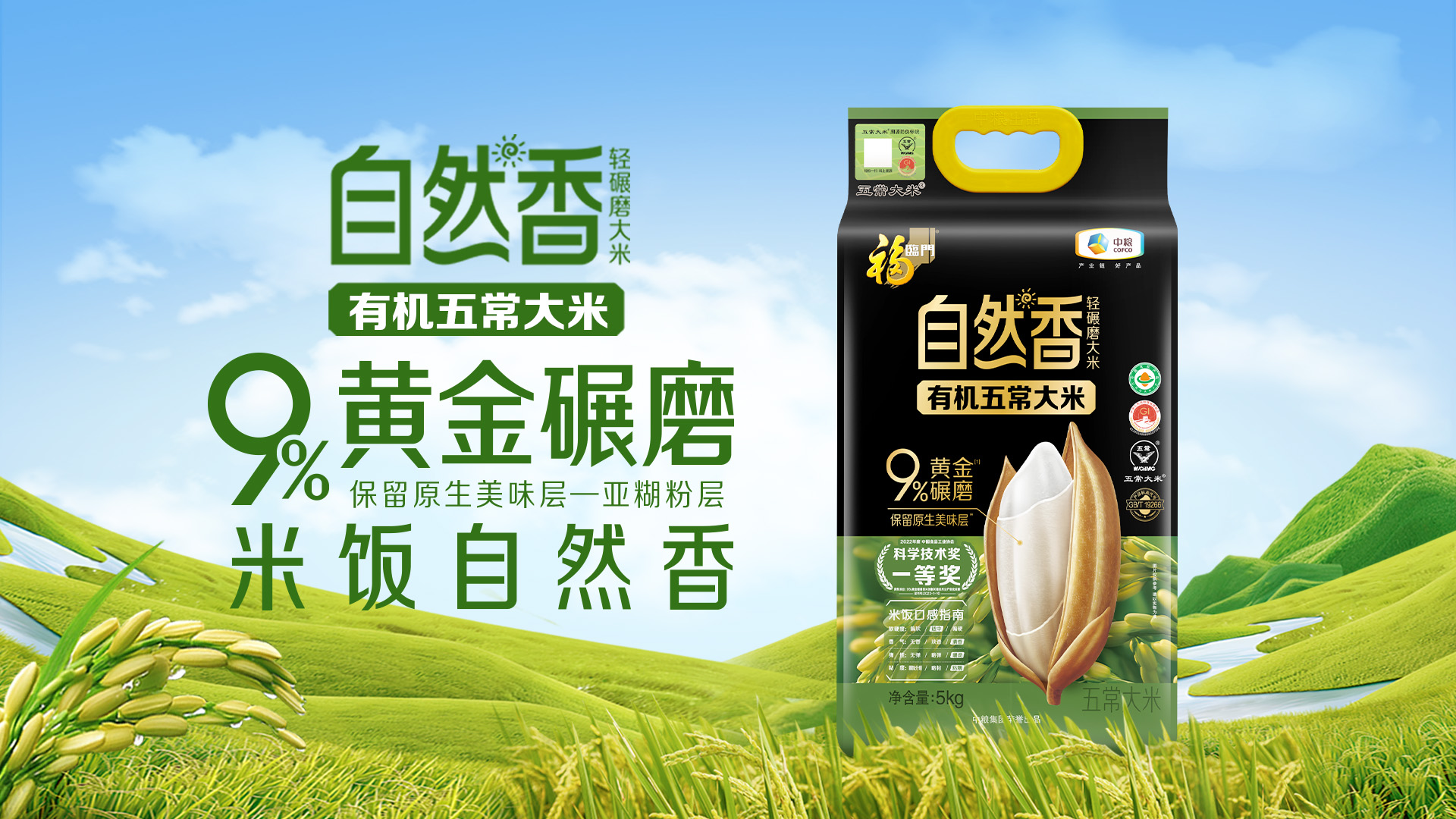
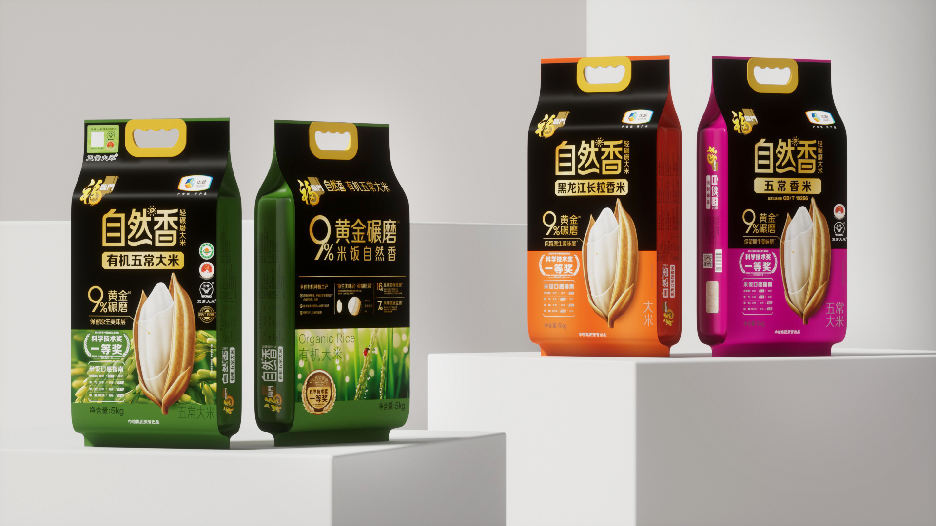
Natural Flavor Rice is a premium mid-to-high-end rice product under the Fortune brand. It features the innovative 9% golden milling technology (compared to 12% for ordinary rice), which preserves more of the original taste and nutrients of the rice grains. This product has been recognized with the First Prize for Science and Technology by the China Food Industry Association. The Natural Fragrant series has been on the market for three years, establishing itself in the mid-to-high-end rice market with its distinctive minimalist black packaging. As the flagship sub-brand in Fortune’s rice sector, it is backed by an annual promotion budget of hundreds of millions of yuan.
After three years, however, sales growth slowed, prompting a quality and packaging redesign to address key pain points:
1. The predominantly black packaging was perceived as overly cold and lacked appeal, particularly in the gift market.
2. Differentiation between products from various origins relied solely on subtle color changes in the product name and side panels, limiting distinctiveness and hindering sales.
3. The original aluminized film packaging, while offering a metallic sheen that conveyed a sense of technology, appeared cold and raw. Additionally, it was prone to visible scratches from friction, affecting its visual appeal and sales performance.
Highlights
Highlights:
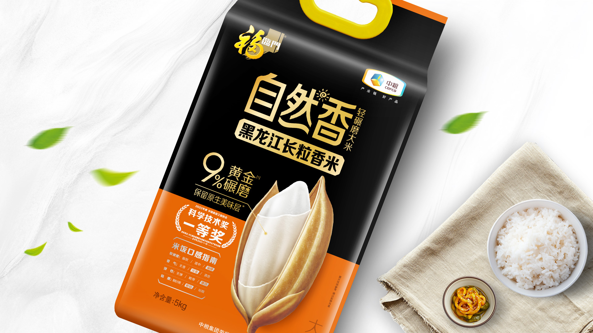
1. For the first time in the rice industry, a double-front packaging design was introduced. Endorsement information is strategically placed on the side of the packaging, while sides A and B focus solely on the information most relevant to consumers. This innovative design allows for the flexible presentation of the product’s multi-dimensional selling points in offline displays.
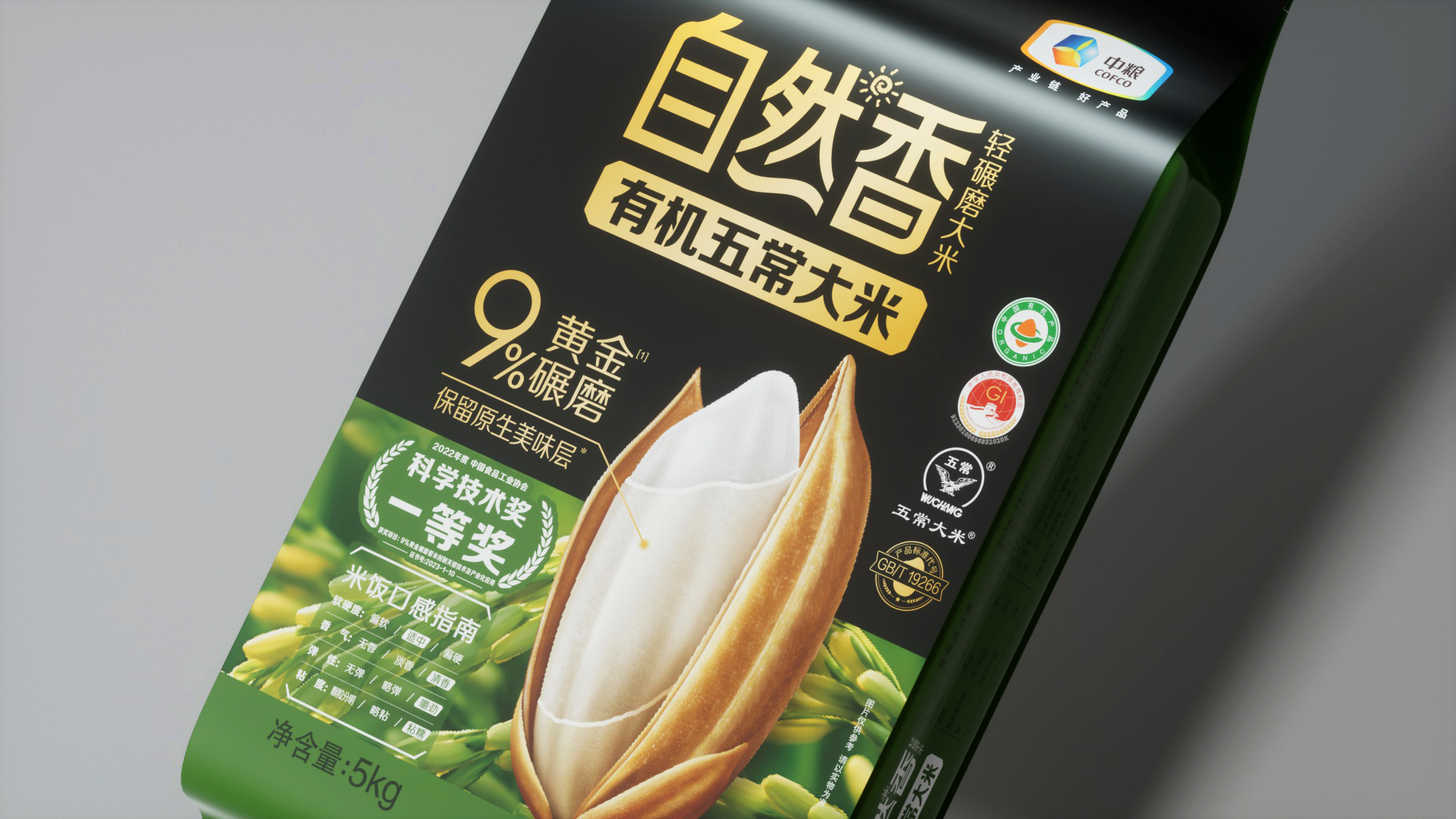
2. Front A features a close-up of a rice grain with an enhanced subaleurone layer as a striking visual symbol, helping consumers easily grasp the unique 9% golden milling process. Alongside a taste guide and large color-variable areas, this design brings energy to the packaging while leaving room for product line extensions.
3. Front B mirrors the layout of Front A but highlights the product benefit, “Natural Fragrant Rice,” attributed to the 9% golden milling process. Additionally, the color block area showcases a scenic depiction of rice fields, evoking a sense of the product’s origin and increasing its appeal, ultimately stimulating consumer desire.
The packaging upgrade was widely praised by the sales team and partners. Post-launch, it significantly boosted sales performance, reinforcing confidence among the sales team.
Added Value:
The divided color blocks can serve as adaptable containers, such as background patterns or illustrations, tailored to the varying visual needs of different sales channels. This versatility, highly regarded by customers, preserves the sub-brand’s unified visual system while providing room for differentiation. It is recognized as having substantial commercial value.
Market Performance
1. The new packaging was rolled out nationwide between November and December 2024. A survey conducted among frontline sales staff in stores that had completed restocking by December 25th revealed significant improvements compared to the old packaging:
• 87% of respondents found the new packaging more attractive.
• 84% indicated it was more effective in driving successful sales interceptions.
• 90% reported enhanced wear and dirt resistance.
• 86% noted improved wrinkle resistance.
2. The revamped Natural Fragrant products successfully entered Sam’s Club, marking a significant milestone as the first-ever Fortune Gate rice products to be stocked in this premium retail chain.
3. In December 2024, both the overall sales volume of Natural Fragrant and the purchase quantities from distributors showed year-on-year growth, reflecting the positive impact of the product upgrade.
Note: COFCO Fortune Gate can provide official proof for the above data.
Material(For concept works, please choose the material you plan to use)
其他 纸塑复合(PE+纸质) Paper-plastic composite (PE + paper)
Craft
Natural Fragrant Rice features a paper-plastic composite material that gives the packaging a refined and elegant appearance, moving away from the rough and rugged style typically associated with traditional grain and oil product packaging. To highlight the innovative essence of Natural Fragrant Rice, a cutting-edge printing technique was employed: silver printing overlaid with color ink. This method leverages the effect of metallic inks (silver or gold) on color tones, subtly altering the warmth or coolness of the original hues while adding a metallic sheen.
This breakthrough printing process, rare in the rice industry, achieves a dual effect. The packaging retains the approachable and familiar qualities associated with staple food products, thanks to the paper-like texture of the composite material. Simultaneously, it incorporates a sense of technological sophistication, enhanced by the metallic luster. The result is an upgraded packaging design that balances elegance, innovation, and consumer appeal, setting a new standard in the industry.
Does the design solve the problems that are common across the product category? If so, please explain.
China has a vast area of rice cultivation, with diverse planting and climatic conditions across regions. These differences result in significant variations in the taste, texture, and flavor of rice. Even in southern China, there is a saying, “each region has its own unique product.” Additionally, northern and southern consumers have distinct eating habits, and regional cuisines greatly influence rice preferences.
In the past, rice packaging designs offered only vague origin names, leaving consumers to guess the taste and texture. To address this, the new packaging design for Natural Fragrant Rice incorporates a taste guide on the front (Side A). This guide highlights key characteristics such as aroma, stickiness, and elasticity, enabling consumers to select products based on their taste preferences.
What functional designs of the work have enhanced the user experience?
The design of Natural Fragrant Rice features a pioneering double-front layout, a first in the rice category. Side A showcases a close-up of a rice grain, emphasizing the golden delicious layer (subaleurone layer) preserved through 9% light milling, creating a strong visual symbol for the product. Side B mirrors the layout of Side A, with the core message, “9% golden milling, natural fragrant rice,” prominently displayed, supported by scenic imagery of the rice’s origin to enhance emotional appeal.
Unlike traditional packaging, Side B is designed as a poster, while regulatory details like the factory address are moved to the side. This design caters to consumer habits and maximizes display impact, blending practicality with visual appeal.