
Type of applicant company
设计机构
Country
中国
Company Website
www.mywishdesign.cn
Images
Brand of the Product
Fortune
Designer Name
Sunshine Design Team
Position of Designer
no
Target Consumer
First, the mid-to-high-end urban customer group chooses rice as a gift for relatives and friends. The four-character idioms in red and gold color schemes are sufficient for giving gifts and have face. Second, the high-sensitivity purchasing group has higher aesthetic tastes. Compared with the vigorous “rustic feeling” of traditional grain and oil products during festivals, they value the elegance and magnificence of the New Year packaging of the Year of the Dragon more.
Distribution Channels
电商 E-commerce; 大型商场 Shopping Mall; 小型商超和便利店 Supermarket & CVS; 杂货店 Grocery; 其他销售渠道 企业团购平台
Positioning
大货消费品 Mass Production
Design Story
Fulinmen rice has launched zodiac limited editions continuously for three years before the arrival of the Chinese Lunar New Year. 2024 is the Year of the Dragon. The dragon is the most important auspicious beast in traditional Chinese culture, and Chinese people even claim themselves as descendants of the dragon. Most idioms related to the dragon represent auspicious and inspiring meanings, and thus are widely used in various blessing scenarios. The Spring Festival of the Year of the Dragon is the first New Year that has fully returned to normal in the post-COVID era, and its significance far exceeds other years. Fulinmen hopes to convey the inspiring and blessing intentions to consumers on this auspicious New Year, highlighting Fulinmen's strong brand culture of celebrating together with the general public as a national brand.
Highlights
Highlights:
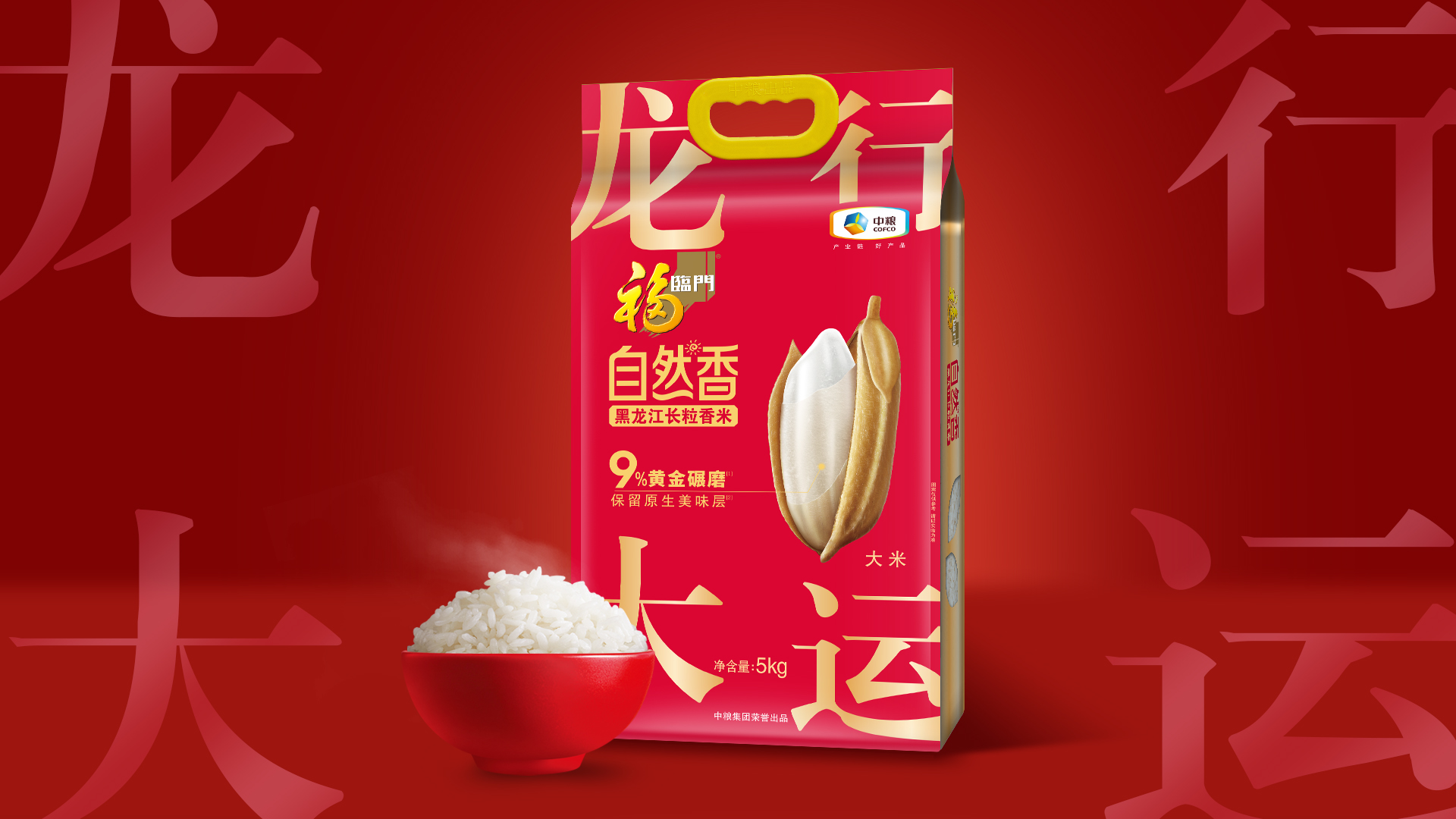
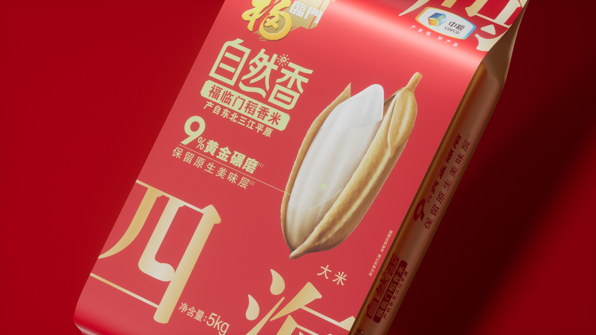
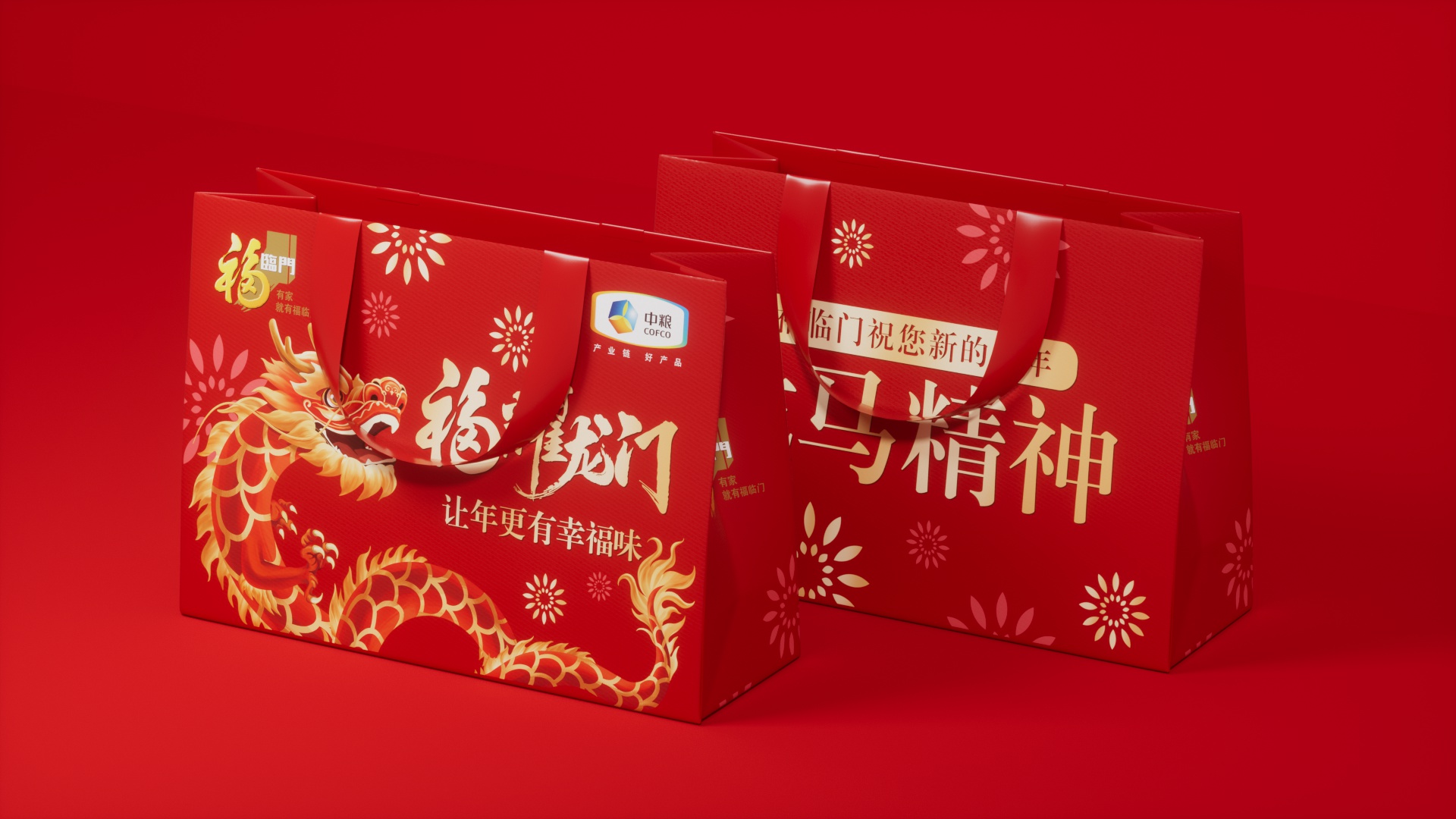
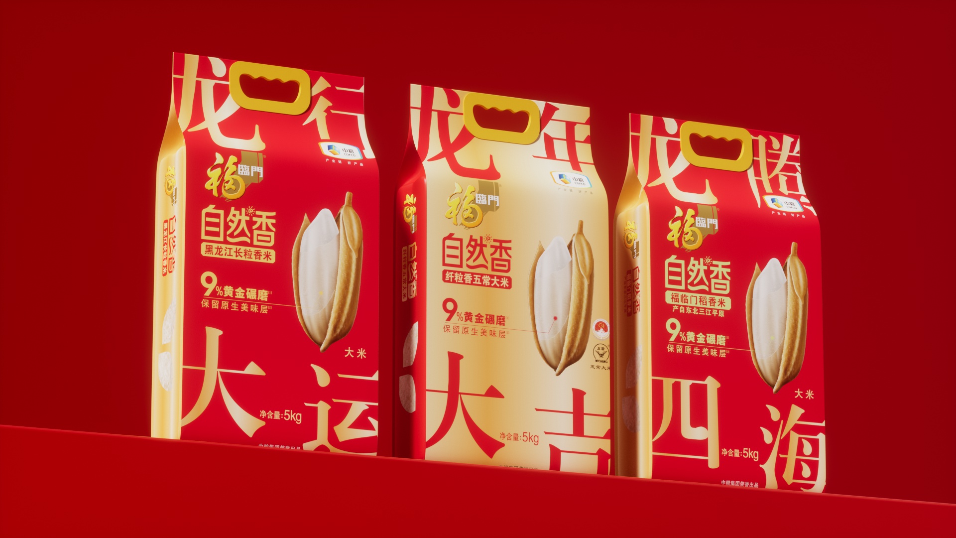
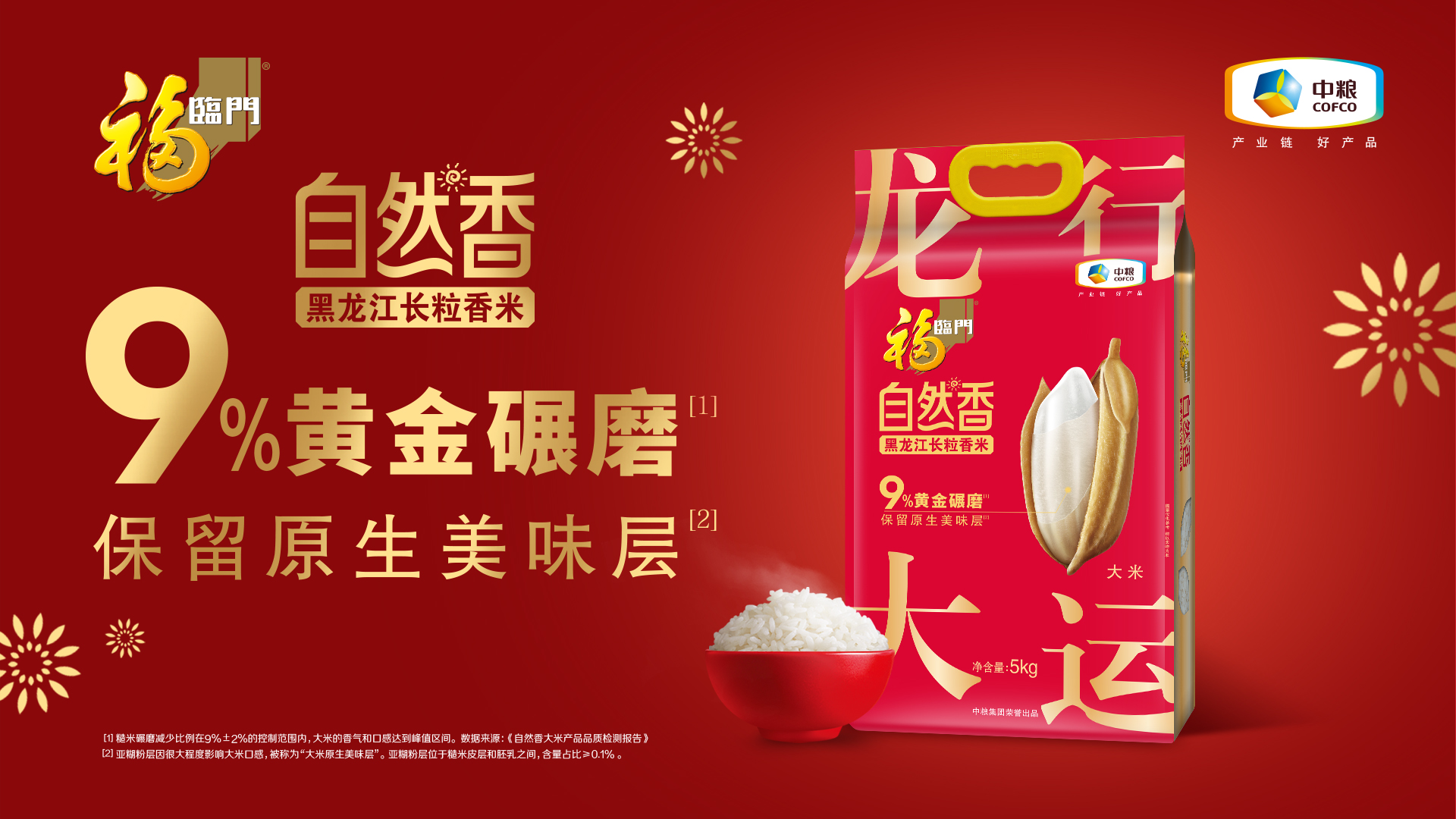
1. It is the first to not adopt the traditional animal image on the zodiac packaging but use the four-character idioms containing the character "dragon" as the main element for the Year of the Dragon. Idioms such as "龙马精神" and "龙行大运" are distributed at the four corners of the packaging, written in a modern and simple style. It not only decorates the picture but also directly conveys a good meaning, appearing fashionable and a little trendy and cool. The red and gold color combination is full of the flavor of the New Year.
2. Different from previous years when only one product was selected as the zodiac limited edition to embellish the daily display, this time, the main selling products from three categories - rice, flour, and dried noodles - were chosen to change their packaging together, forming a strong visual momentum. At the same time, when promoted in terminals and media, it complements the main picture of the dragon totem, creating a strong and dazzling atmosphere of the Year of the Dragon and fostering a consumption atmosphere.
Additional value: The zodiac edition packaging of Fulinmen and its industry competitors in the past usually just added the zodiac image to the original packaging. This zodiac packaging design with Chinese characters as the main element is the first in the rice industry. The sense of fashion far exceeds the previous retro zodiac packaging style. The bold use of new design styles and design languages also expresses the innovative spirit of the 30-year-old national brand Fulinmen keeping pace with the times.
Market Performance
The idiom version of the Year of the Dragon limited edition packaging has brought great confidence to the regional sales teams, shopping guides, and distributor partners. The nationwide market deployment in supermarkets began successively from November to December 2023, bringing about a dual increase in sales enthusiasm and performance before the Spring Festival. The Year of the Dragon packaging of the mid-to-high-end Natural Fragrance series products even exceeded expectations, and production needs to be stepped up to ensure supply. The summary and evaluation in March 2024 showed that the idiom version of the Year of the Dragon packaging products brought a 10% to 50% increase in sales performance to 90% of the sales regions, and some regions even applied to extend the new packaging throughout the Year of the Dragon.
Note: COFCO Fortune Gate can provide official proof for the above data.
Material(For concept works, please choose the material you plan to use)
其他 PE镀铝/PE PE aluminized / PE
Craft
The mid-range products of the Year of the Dragon limited edition adopt PE printing, while the high-end products adopt yin-yang aluminum material. The front of the packaging fully utilizes the metallic texture of the aluminized film. The red packaging presents a high-end sense of a velvet-like texture, and the color changes to a bluish pure red due to neutralizing the cold tone of the aluminum. The four-character idioms are directly printed in transparent yellow and covered on the aluminized metallic silver, presenting a bright gold color. The golden packaging is a large area of transparent yellow overlaid on aluminized silver, presenting a bright gold color, and the idioms are printed in red characters. For the pattern part, a white ink base is used to restore the true color to the greatest extent, achieving the interspersion of metallic and non-metallic textures on the same packaging plane. The sides and the back are not aluminized, and transparent rice windows can be opened to allow consumers to directly see the quality of the rice and purchase with confidence.
Does the design solve the problems that are common across the product category? If so, please explain.
Most rice and flour products have a strong rural flavor. Zodiac edition products usually tend to be traditional after adding zodiac animal patterns, and with the bright red color scheme of the Spring Festival, they seem overly lively but lack refinement, making it difficult to attract younger generation consumers. Decorating the four corners of the packaging with the four Chinese characters of four-character idioms instead of traditional New Year elements such as auspicious cloud and dragon patterns, the picture is neat and modern. Good meanings such as "龙马精神" and "龙行大运" leap directly onto the packaging, catching people's eyes. The square and modern writing style of Chinese characters has a somewhat trendy and cool flavor, bringing a sense of fashion to staple food products such as rice, flour, and dried noodles.
What functional designs of the work have enhanced the user experience?
Chinese people have always had the habit of stocking and giving rice during festivals. On the one hand, it implies having enough food at home and a bumper harvest of grains. On the other hand, the extended meaning of "rice" is "money", and having "rice" means having "money". Chinese people are called the descendants of the dragon. The Year of the Dragon is an important zodiac year for Chinese people. The idioms with the character "dragon" are magnificent. A bag of rice combined with an auspicious idiom containing the character "dragon" is the best New Year gift combination. The new year packaging combines the two. When giving rice, auspicious blessings are sent along. The person receiving the gift has both practical rice and magnificent blessings, achieving a double harvest in both material and spiritual aspects.
Did the design help increase the sales performance of the product? If so, please give related evidence.
In the feedback assessment after the festival, among 532 salespeople, 79.5% believed that the New Year packaging was helpful for sales; among 432 store managers, 19.62% said that the New Year packaging brought a sales growth of more than 40%, and 70.21% said that the sales super growth was between 10% and 40%.
Does the work consider sustainability (environmentally or commercially, or both)? If so, please explain.
The zodiac series products can be continuously developed and designed as the brand's annual limited editions. Always maintain the latest design language to present the current aesthetic trends.