
Type of applicant company
品牌方
Country
中国
Company Website
无
Images
Brand of the Product
Qu Xiang
Designer Name
Quxiang Marketing Department-Ceci Chen,Selina Zheng
Position of Designer
无
Target Consumer
This caramel sea salt toffee is primarily aimed at sophisticated women aged 25-45 who enjoy pampering themselves and value quality (suitable for afternoon tea or home settings); it also appeals to younger people aged 12-25 who like trying new flavors, as well as gift-givers looking for light presents and consumers who prefer sharing at home.
Distribution Channels
电商 E-commerce; 大型商场 Shopping Mall; 小型商超和便利店 Supermarket & CVS; 杂货店 Grocery
Positioning
大货消费品 Mass Production
Design Story
1. The Demand and Background for the Product
The emergence of this caramel sea salt toffee is the result of the combined effects of upgraded snack consumption and the demand for specific scenarios. On one hand, the traditional candy's "overly sweet and monotonous" taste is gradually failing to satisfy consumers, leading the market to demand "complex flavors"—the caramel sea salt flavor combines sweet and salty, retaining the rich milky aroma of toffee while using sea salt to balance the sweetness, catering to today's preference for a "lightly sweet, layered" taste experience. On the other hand, the "scenario attribute" of snacks has been strengthened: consumers no longer view candy merely as a treat for indulgence but also require it to fit various situations such as office afternoon tea, sharing with friends, or light holiday gifts, raising higher expectations for "elegance, portability, and a sense of ceremony" in packaging. Additionally, the rise of "self-pleasure consumption" has led women aged 25-45 to be willing to pay for small-sized snacks that are both "delicious in taste and beautiful in packaging," which has become a key opportunity for this product to precisely enter the market.
2. Product Design Concept
The design of this toffee revolves around three core elements: "taste innovation, scenario adaptation, and emotional resonance":
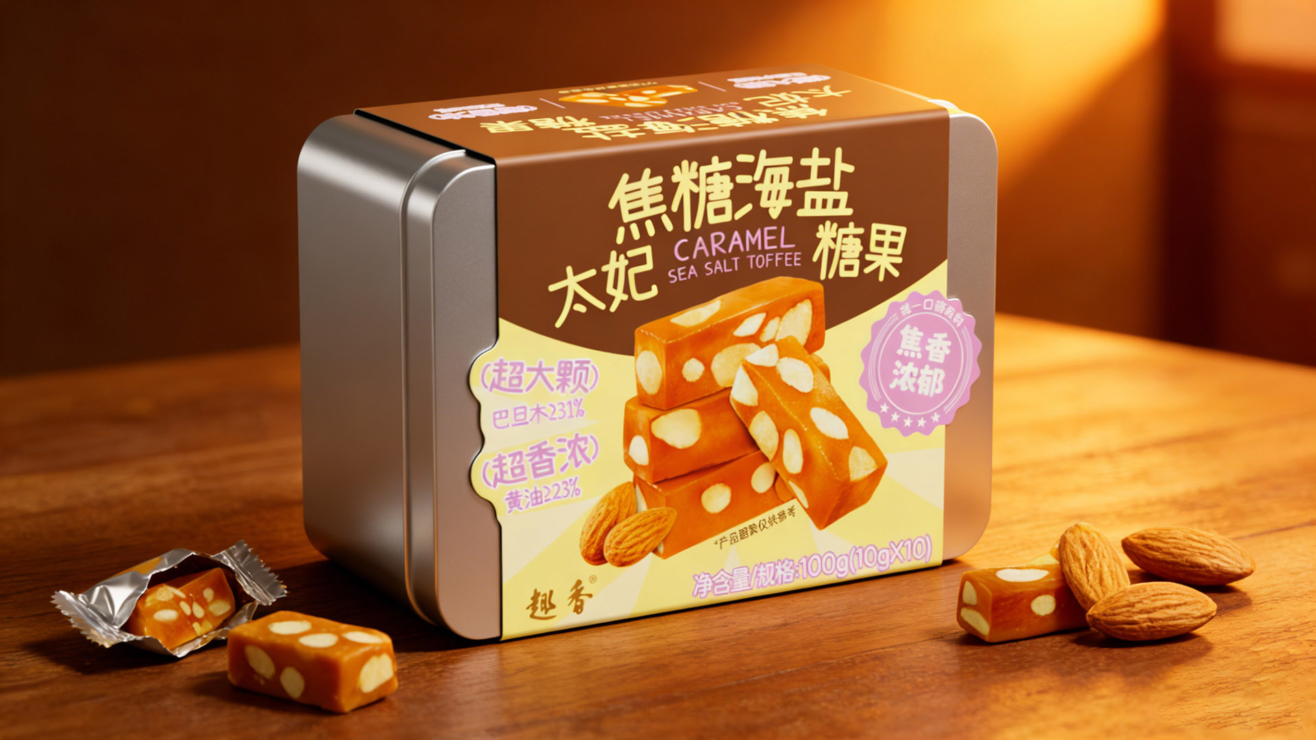
Taste Design: Balancing and upgrading the traditional toffee's sweetness, it features a triple-layered taste of "caramel's roasted aroma, sea salt's freshness, and the crunch of large nuts." This preserves the classic milky base of toffee while reducing the heaviness through a sweet-salty balance, catering to contemporary consumers’ contradictory desire of "wanting something sweet but fearing it will be too rich."
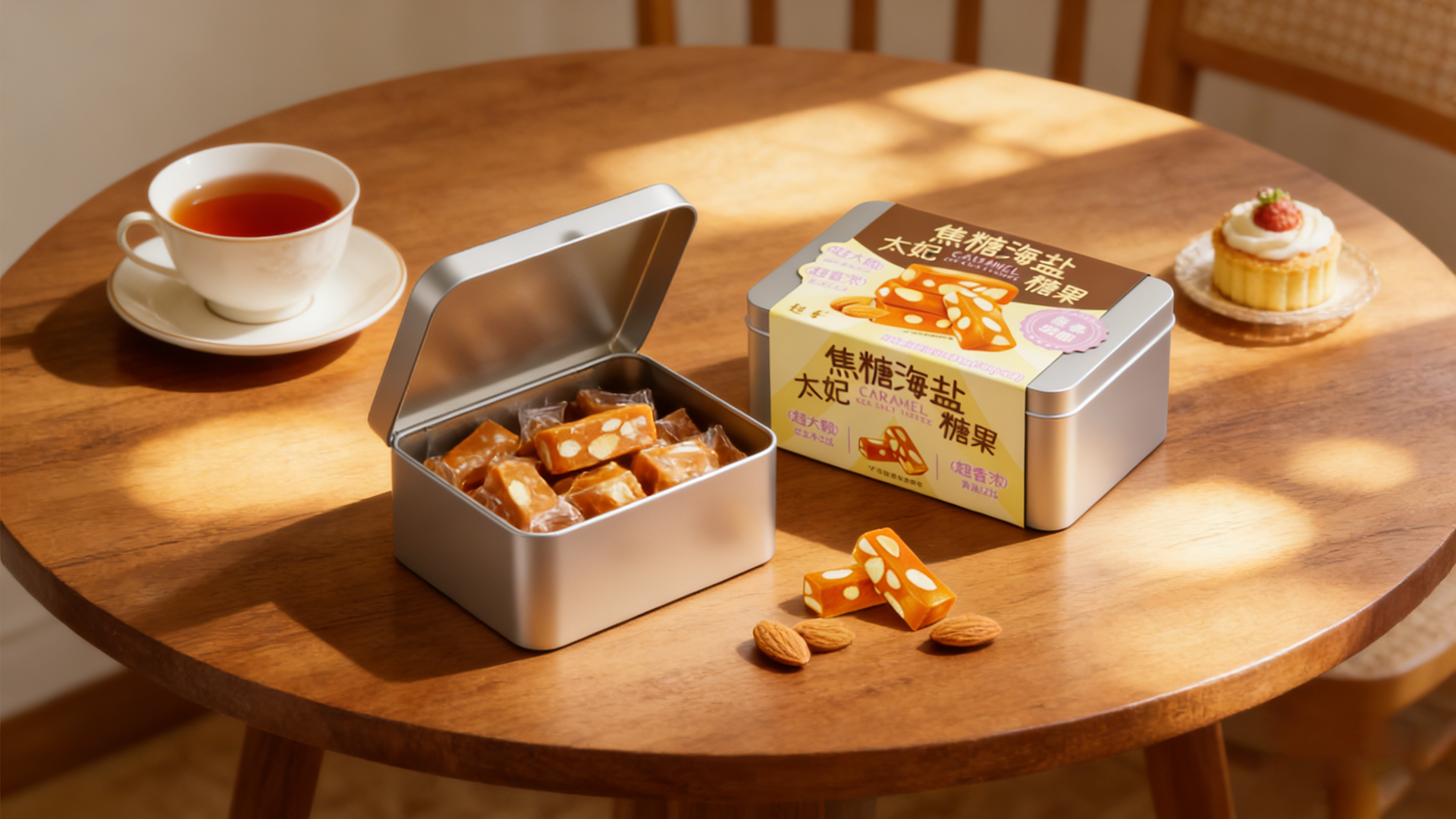
Packaging Design: Combining functionality and emotion, the tin packaging meets practical needs for "portable storage" (suitable for office or on-the-go) while conveying a sense of "refinement and quality" through warm tones and product photography. At the same time, the reusability of the tin makes the product more appealing as a light gift, aligning with gift-givers' mindset of "thoughtful but not wasteful."
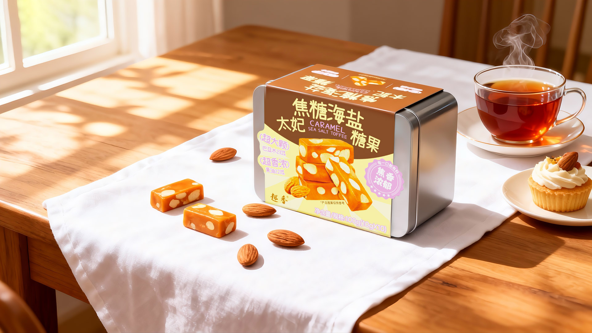
Scenario Design: Covering diverse needs—from the "extra-large" size (providing personal indulgence satisfaction) to the "rich aroma" (paired with coffee or tea), and the ceremonial feel of the tin (suitable for sharing and gifting)—the design proactively addresses three core scenarios: "personal enjoyment, daily socializing, and light gifting," making the product more versatile in niche markets.
The essence of this product's design is to "solve taste pain points through flavor innovation and match consumer emotions through packaging and scenario design," ultimately conveying the value that "even a small snack can embody a sense of quality in life."
Highlights
1. Key Memory Highlights
1. In terms of taste, the caramel sea salt flavor balances sweet and salty, offsetting cloying sweetness, paired with the crispy nut texture, creating a distinct multi-layered taste impact with strong memorability;
2. In terms of scenario, the individually wrapped small packages in aesthetically pleasing tin boxes are suitable for various occasions such as afternoon tea, sharing, and light gifting, with a sense of refinement that is immediately perceptible;
3. In terms of experience, the combination of soft and chewy with crispy textures delivers strong satisfaction, distinguishing it from the single texture of ordinary toffees.
2. Differentiated Added Value
Compared with similar products, its added value focuses on 'health adaptation and emotional extension': using a lightly sweet formula to meet sugar control needs and avoid the burden of excessive sweetness; tin packaging allows for storage and reuse, extending usage scenarios; at the same time, it carries social attributes, becoming a pleasant medium in light social interactions, satisfying the taste buds while conveying emotional value.
Market Performance
无
Material(For concept works, please choose the material you plan to use)
纸质 Paper
Craft
In terms of scenarios, it is generally suitable for foods that require “freshness and texture” such as candies, chocolates, tea, and nuts, especially matching high-end snacks and holiday gift settings — tin boxes can ensure product sealing and extend shelf life, while 250g single copper paper with a matte film cover balances visual appeal with practical protection and can also flexibly carry brand information.
On the production side, core processes such as offset printing, matte film lamination, stamping, and die-cutting are all common industry techniques. With a well-established supply chain, from small factories to large-scale production enterprises, stable implementation is achievable, costs are controllable, and there are no technical barriers. It is a mainstream packaging choice that balances practicality, cost-performance, and a high-end feel.
Does the design solve the problems that are common across the product category? If so, please explain.
The packaging design of this caramel sea salt toffee precisely addresses three major pain points of products in the same category: To tackle “unclear flavor/ingredients,” it directly highlights the core flavor 'Caramel Sea Salt' and indicates ingredient proportions with almonds ≥31% and butter ≥23%, using labels to emphasize 'rich in ingredients and flavor,' so users immediately understand the product's value; to solve 'limited usage scenarios,' it uses a metal tin with individually wrapped portions, balancing a refined afternoon tea feel with practicality for sharing or gifting, covering diverse usage occasions; to address 'weak visual memory,' it combines a caramel-colored main visual, photo of the actual filling, and stamp-style selling point labels to create strong brand recognition.
What functional designs of the work have enhanced the user experience?
This packaging enhances the experience through three functional designs: Information visualization: directly indicating the proportion of ingredients and flavor, allowing consumers to quickly determine if it meets their needs and avoid trial-and-error; Consumer-friendly: individual small packages (10g×10) for portion control and portability, suitable for afternoon tea, sharing, and other scenarios, keeping it clean and hygienic; Container reuse: the metal tin can be reused (for storing small items, etc.), increasing the added value of the packaging and enhancing the sense of refinement.
Does the work consider sustainability (environmentally or commercially, or both)? If so, please explain.
There are dual considerations in terms of sustainability: Environmental aspect: Metal box packaging can be reused (such as for storing small items or portioning snacks), reducing disposable packaging waste and lowering overall waste generation; Commercial aspect: Reusability enhances the added value of the packaging, reinforcing the product's 'delicate and practical' tone, and through long-term user use of the container, creates brand recall, indirectly reducing marketing costs.