
Type of applicant company
品牌方
Country
中国
Company Website
https://www.bairun.net
Images
Brand of the Product
RIO Qingshuang
Designer Name
RIO RTD Design Grope:Qi Wang、Yayu Yu
Position of Designer
none
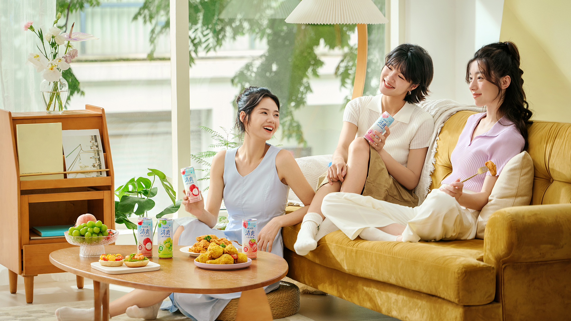
Target Consumer
Core audience: women 25-30, extending to ages 18-40. This group prefers a laid-back, pressure-free social environment, moderate flavors, and light social interactions.
Distribution Channels
电商 E-commerce; 大型商场 Shopping Mall; 小型商超和便利店 Supermarket & CVS; 杂货店 Grocery
Positioning
大货消费品 Mass Production
Design Story
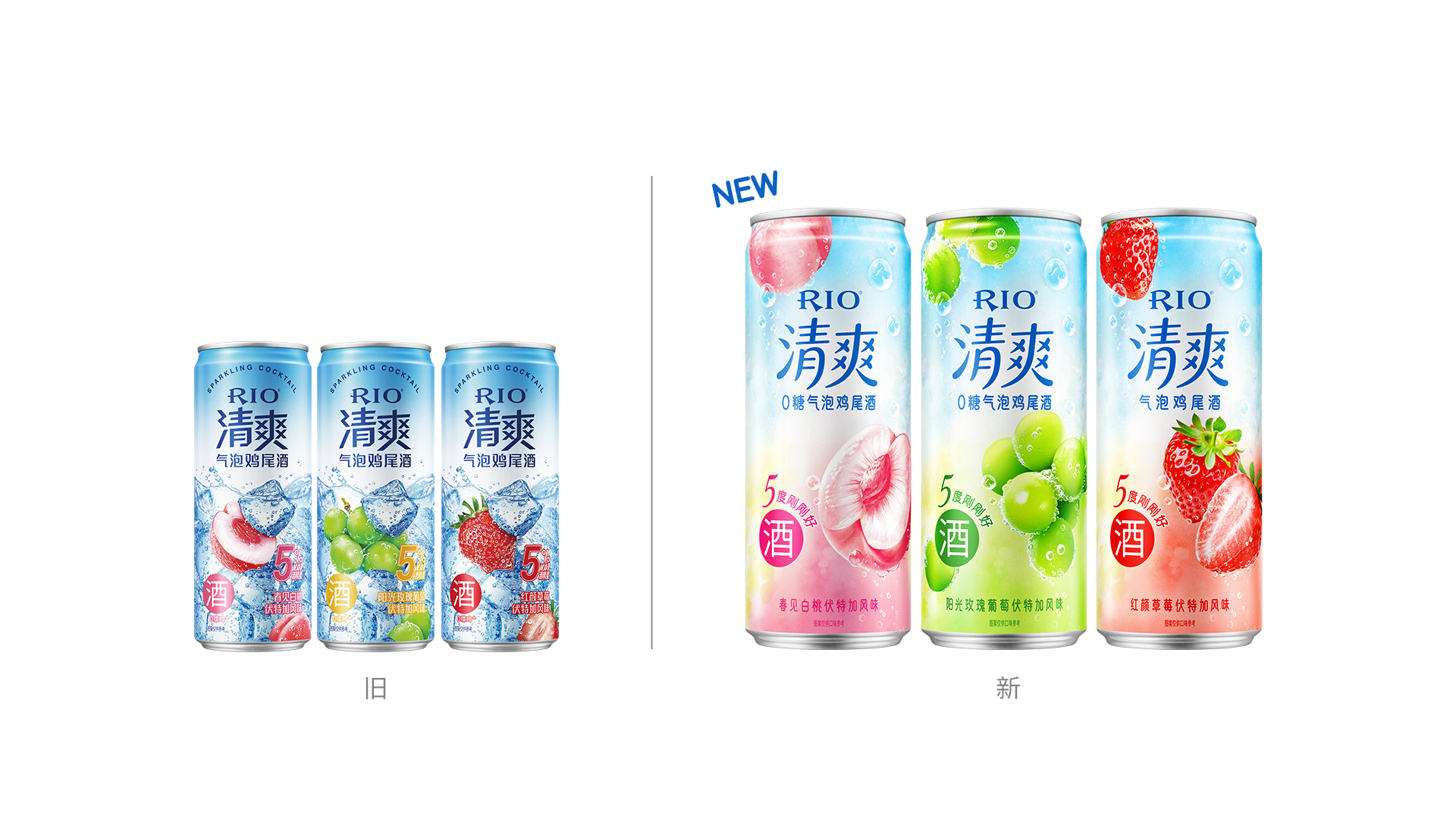
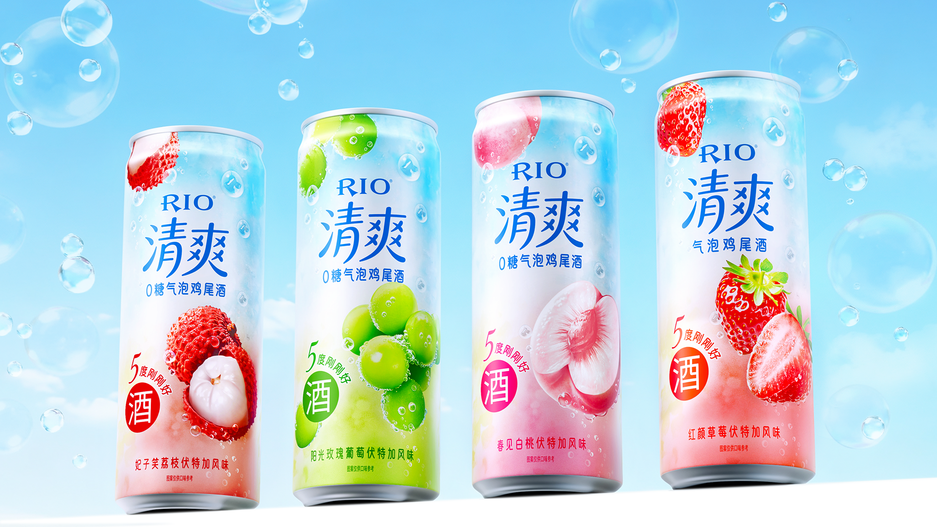
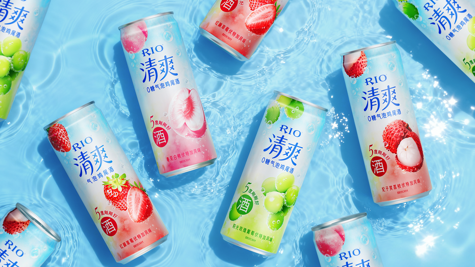
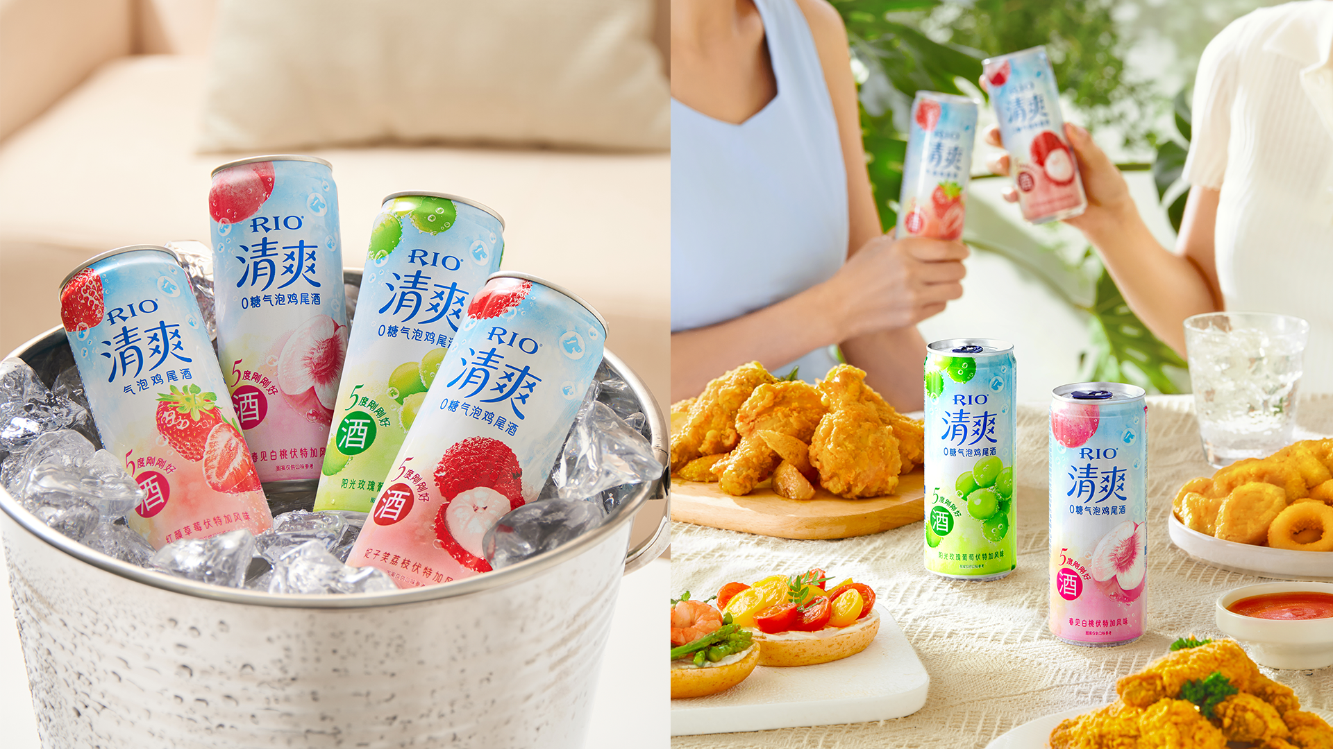
The new packaging for RIO "Qing Shuang" is strategically designed to establish a clear visual identity with its "watercolor dreamy bubbles + vibrant fresh fruits" theme. The translucent watercolor bubble background creates a light and sweet ambiance, while the photorealistic fruit elements instantly stimulate the appetite. The bright, lively color palette precisely targets the aesthetic preferences of young women aged 25-30. The unified logo and highly recognizable fruit symbols serve a dual purpose: they anchor the sub-brand's unique identity and ensure it stands out from the broader RIO product line. This successfully addresses the previous packaging's weaknesses of low distinctiveness and an ambiguous sub-brand image, resulting in a quantum leap in both shelf impact and e-commerce visual appeal.
The packaging communicates the product's core value proposition—"5% ABV, fruity, refreshing, and light"—directly and effectively through the prominent "Qing Shuang" text, the "5% Perfect ABV" identifier, and the "Zero-Sugar Cocktail Soda" descriptor, all complemented by bubble textures and fruit graphics. This execution perfectly aligns with the brand's "Just Right" positioning, achieving a harmonious unity between design language, product selling points, and brand tonality.
From a design perspective, it breaks away from the literal, "what-you-see-is-what-you-get" visual model of its predecessor. It pioneers an ethereal, watercolor aesthetic on a ready-to-drink can, effectively solving the prior issues of poor recognition and a vague sub-brand image. Since its launch, this packaging has significantly enhanced shelf standout and user acclaim.
On a functional level, the aluminum can fulfills fundamental requirements such as sealing and portability. The packaging information is clear and legible, and its lightweight nature suits various consumption scenarios. Regarding sustainability, the aluminum material offers a high recycling rate and cost stability, contributing to a sustainable model that benefits both the environment and the business.
Highlights
The design is industry-leading, being the first to implement a dreamy watercolor bubble aesthetic on a canned beverage. It breaks away from the traditional canned goods paradigm of literal realism or minimalism. Instead, the translucent watercolor background creates a light and sweet ambiance, injecting a differentiated aesthetic into the ready-to-drink fruit beverage category.
The large-scale, photorealistic fruit illustrations demonstrate top-tier printing quality for can production. The fruits appear plump and three-dimensional with highly accurate color reproduction, which directly enhances the appeal. This achievement pushes the boundaries of visual expression for can printing technology.
While competitors often rely solely on color-coding for flavor differentiation, lacking unique sub-brand visual symbols, RIO "Qing Shuang" employs a unified logo coupled with distinctive fruit icons. This strategy ensures the product stands out within the broader RIO portfolio and creates a clear visual differentiation from competing brands on the shelf.
Market Performance
After the upgrade of the new packaging, consumers' overall preference for the product has increased significantly, with notable rises in image indices such as "vitality", "fashionability" and "greater appetizing appeal". The representative POS system data demonstrates outstanding performance: single-point sales of the product with the new packaging have grown markedly, and as of mid-October 2025, it has driven a year-on-year growth of 39% in e-commerce business.
Material(For concept works, please choose the material you plan to use)
其他 铝制易拉罐
Craft
While aluminum cans are widely used across food, beverage, and personal care industries with mature manufacturing systems, their mass production faces inherent printing constraints. Limitations in web press registration accuracy and ink adhesion on aluminum surfaces, coupled with the need to control plate-making and setup costs, often result in products with low color saturation, poor detail reproduction, and an overall coarse print quality.
The new "Qing Shuang" packaging represents a key breakthrough in can printing technology. By strategically combining screens of different line counts, we achieved smooth and natural color gradients. This, integrated with the precise application of spot colors and CMYK overprinting, allows for an accurate replication of the fruit's texture and vibrant freshness. This technique successfully transcends the traditional limitations of color depth and dimensionality in aluminum can printing.
Does the design solve the problems that are common across the product category? If so, please explain.
The new "Qing Shuang" packaging represents a key breakthrough in can printing technology. By strategically combining screens of different line counts, we achieved smooth and natural color gradients. This, integrated with the precise application of spot colors and CMYK overprinting, allows for an accurate replication of the fruit's texture and vibrant freshness. This technique successfully transcends the traditional limitations of color depth and dimensionality in aluminum can printing.
What functional designs of the work have enhanced the user experience?
none
Did the design help increase the sales performance of the product? If so, please give related evidence.
The representative POS system data demonstrates outstanding performance: single-point sales of the product with the new packaging have grown markedly, and as of mid-October 2025, it has driven a year-on-year growth of 39% in e-commerce business.
Does the work consider sustainability (environmentally or commercially, or both)? If so, please explain.
This product is packaged in an aluminum can, which offers significant environmental benefits, featuring a global recycling rate of over 70% and a substantially reduced carbon footprint, aligns with the beverage industry's green trends. Commercially, it helps brands build an eco-friendly image that appeals to modern consumers. It's lightweight and portable design also ensures easier refrigeration and transportation, catering to a wider range of drinking occasions.