
Type of applicant company
品牌方
Country
中国
Company Website
http://yijiaxinfood.com/
Images
Brand of the Product
Yijiaxin
Designer Name
RECO Design &Creative Co.,Ltd
Position of Designer
None
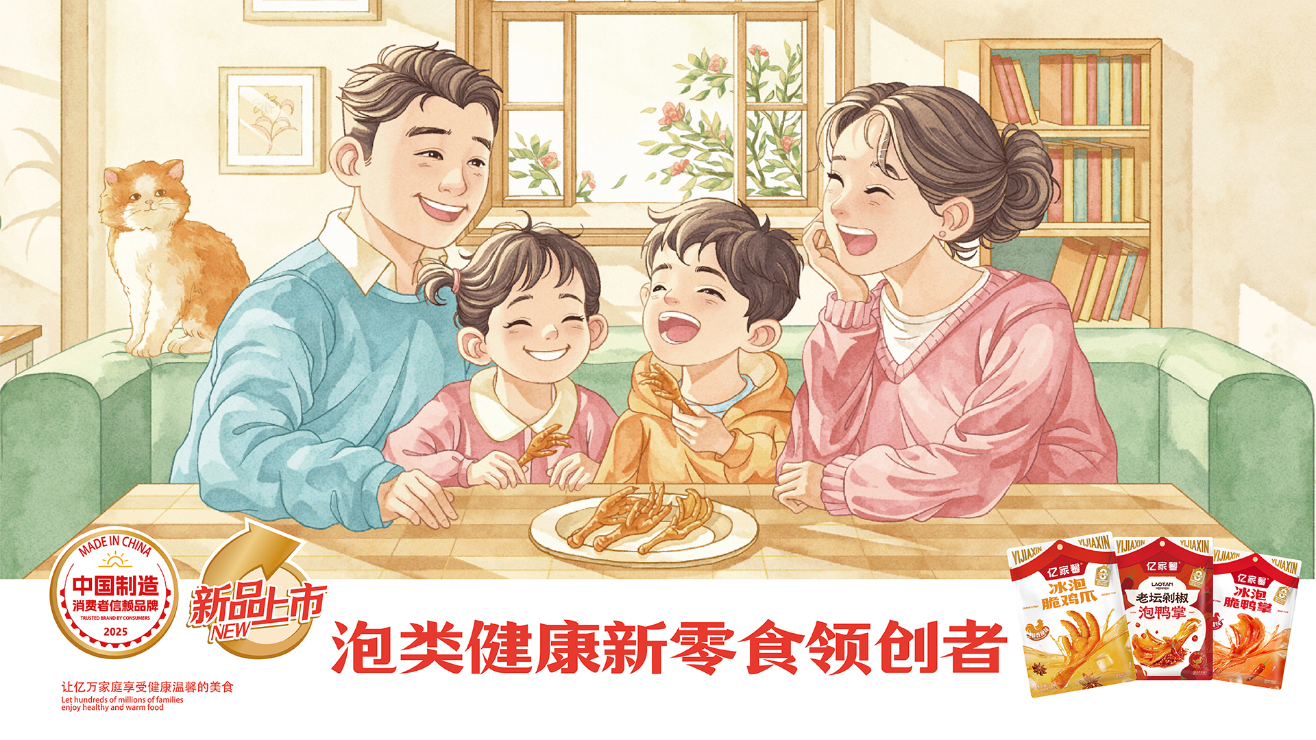
Target Consumer
Young snack consumers who prefer a refreshing and non-greasy flavor, pursue delicious yet guilt-free snacks, and value both product quality and aesthetic appeal.
Distribution Channels
大型商场 Shopping Mall; 小型商超和便利店 Supermarket & CVS; 杂货店 Grocery
Positioning
大货消费品 Mass Production
Design Story
To address the market challenges of confusion between "marinated" and "soaked" meat snacks, low consumer awareness of the "soaked" category, homogeneous and unmemorable packaging for "soaked" products, and unclear health credentials, this series of packaging design adopts the core concept of being the "Pioneer of Healthy Soaked New Snacks."
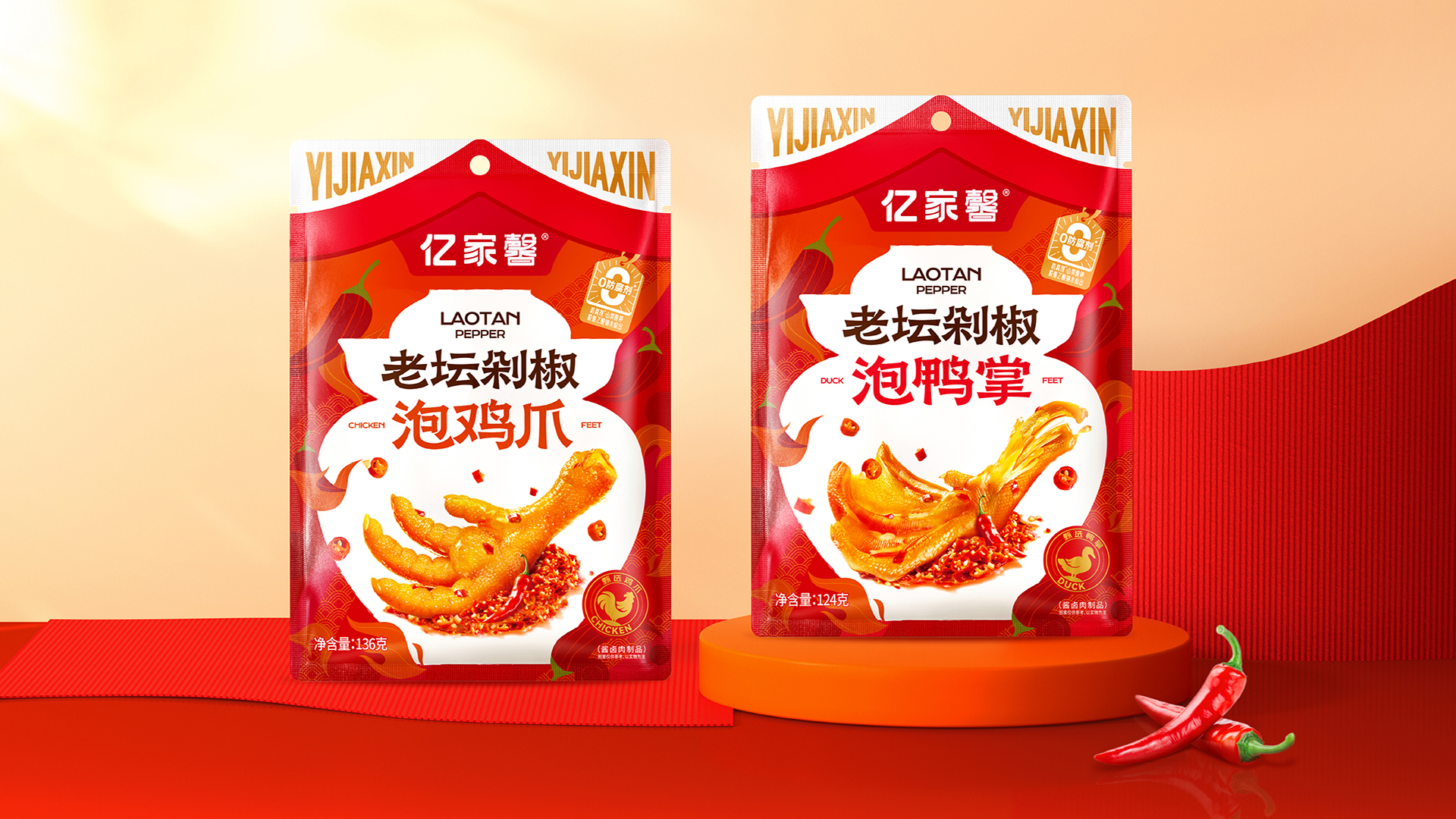
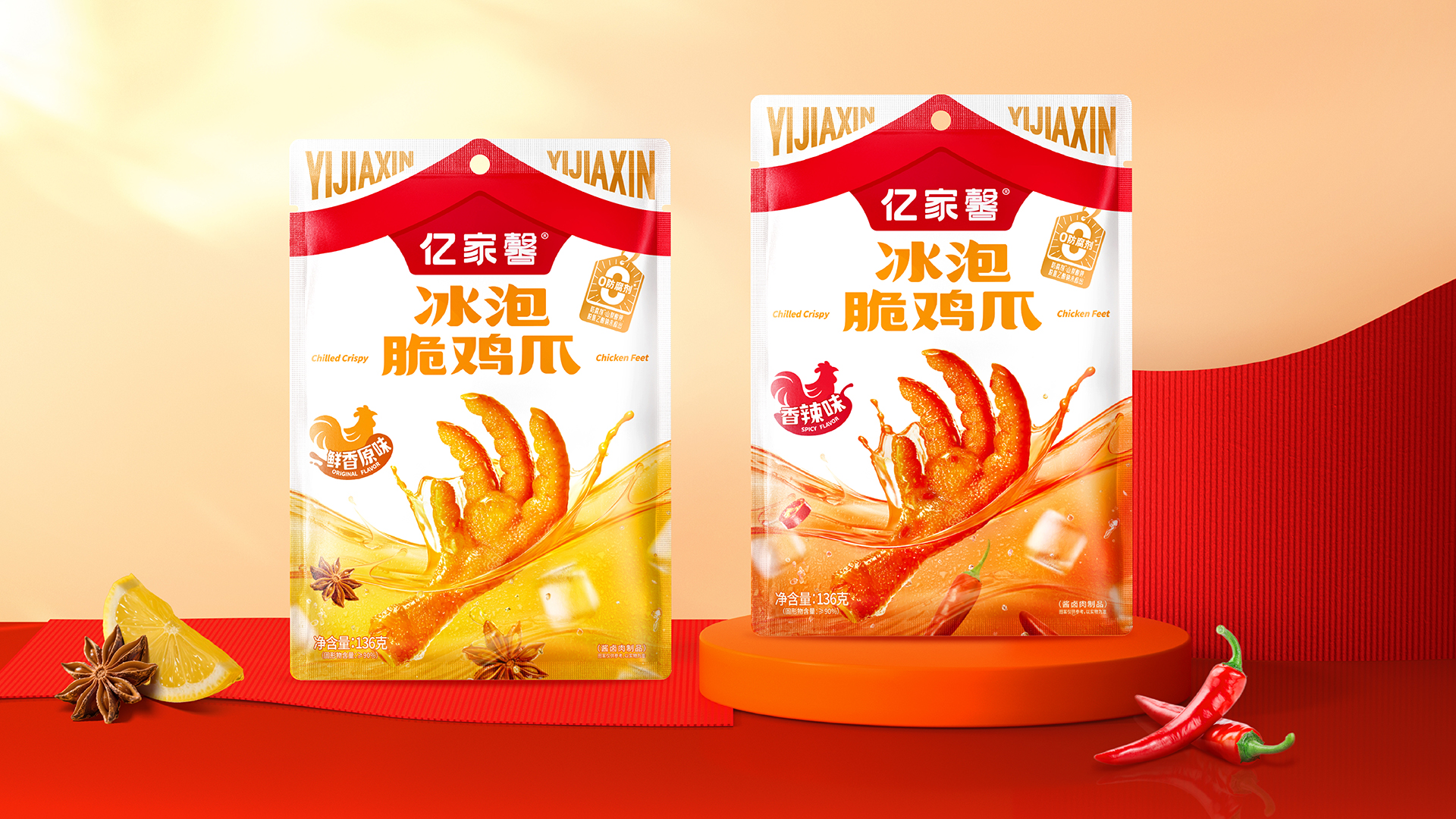
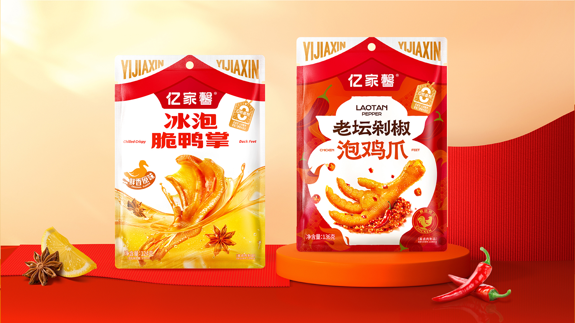
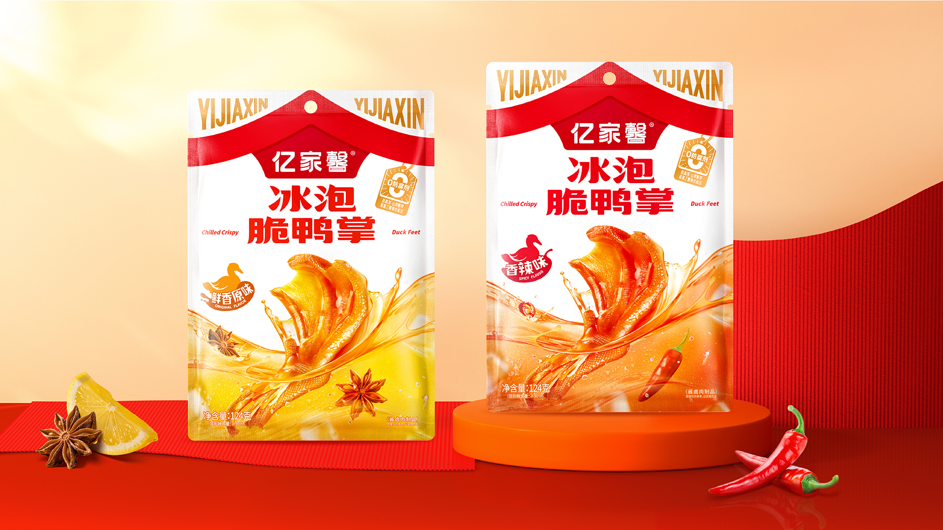
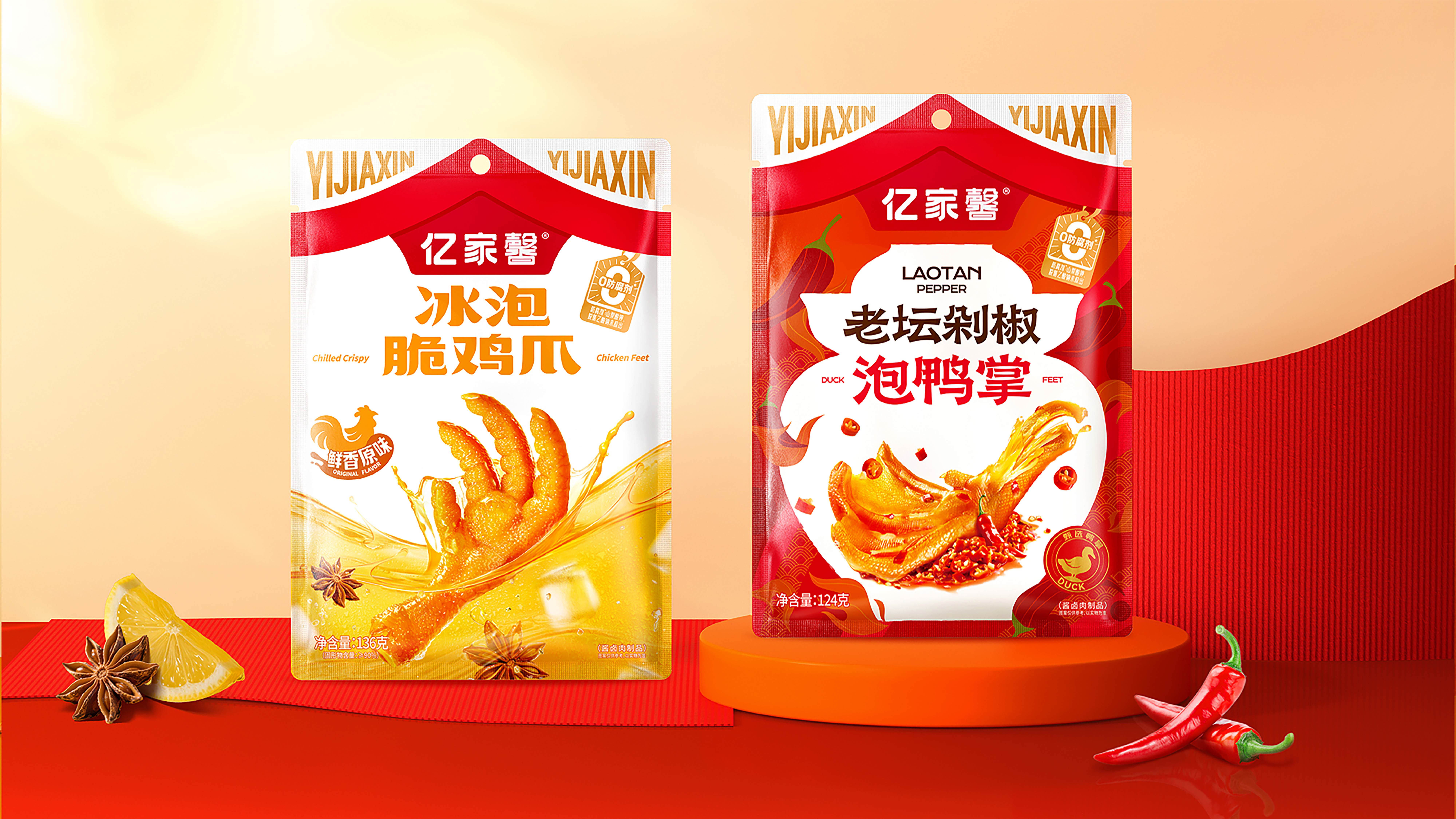
Extracting the characters "家" (home) and "馨" (fragrance/warmth) from the brand name, a unique "Roof" super identification symbol was created, implanting the concept of "home warmth" into the brand's DNA. The overall visual system utilizes clear broth imagery, vintage jar graphics, process-refined communication phrases like "Ice-Soaked" and "Lao Tan," and dynamic labels such as "0 Preservatives."
While preserving the appetite appeal of the meat products, it clearly communicates the process characteristics and product advantages. This intuitively establishes the "soaked" category's perception of a refreshing taste, mildly sour and grease-cutting, and healthy lightness, highlights the flavor characteristics of each "soaked" product variety, and creates a distinct separation from oily, heavy traditional marinated snacks.
Highlights
①By deeply exploring the craft differences between soaking and marination, a distinct visual identity is created for each flavor. For the Ice-Soaked Flavor, clear, dynamic broth and floating ice cubes are depicted to convey a refreshing and crispy taste experience. For the Fermented Chopped Chili Flavor, symbols of traditional fermentation jars and dynamic splashing spice textures illustrate the cultural essence of Hunan-style flavor. Combined with appetizing product photography, these visual elements translate the abstract soaking process and the previously indistinct Ice-Soaked and Chopped Chili flavors into a perceptible visual language, effectively educating consumers about the craftsmanship and flavor characteristics.
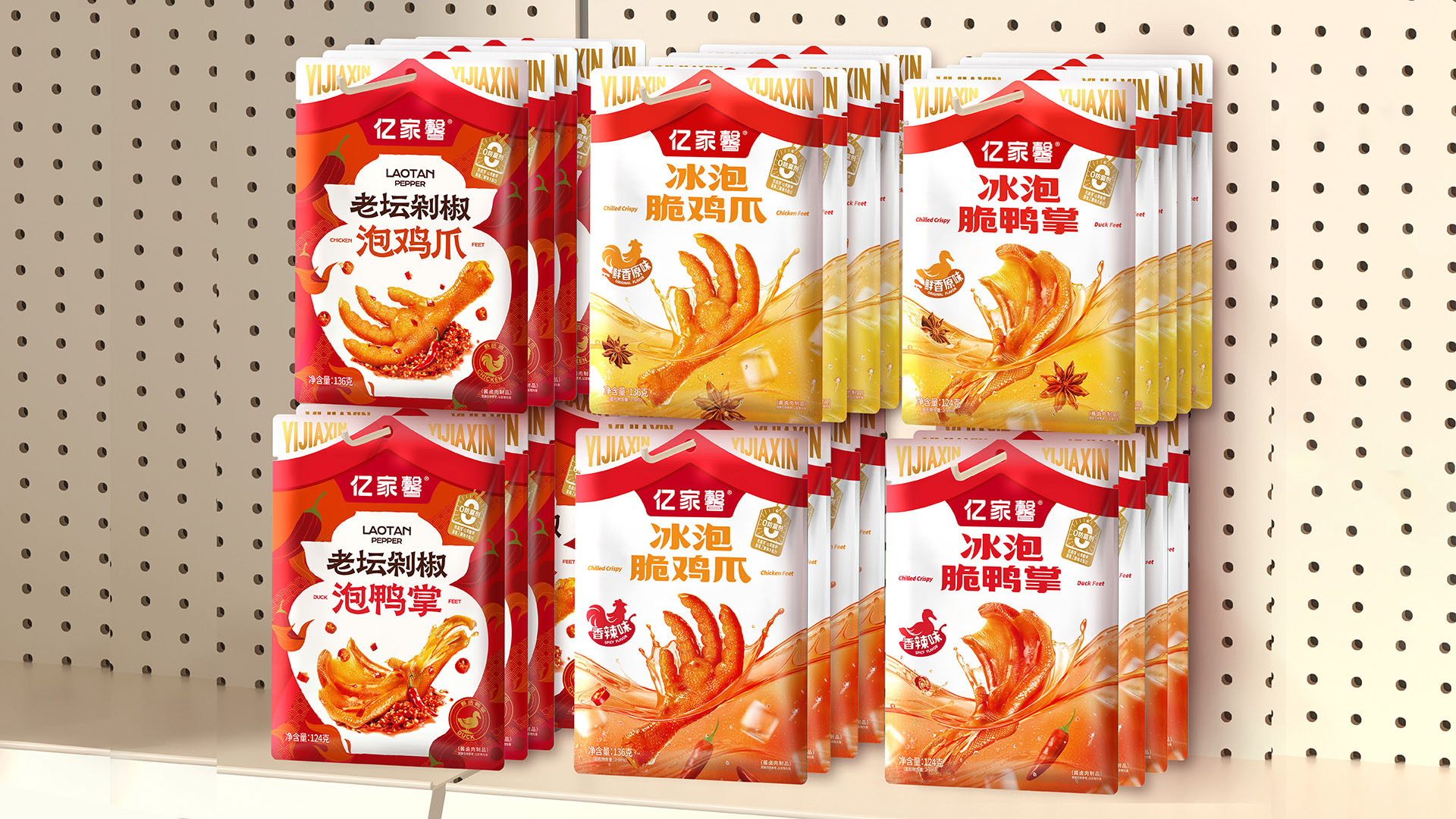
② Creating the Brand Asset "Roof": The core keywords from the brand logo "亿家馨" were distilled into an abstract "Roof" symbol, forming a unified, highly recognizable brand visual asset. When the product series is displayed on shelves, the stacking of roof graphics creates a warm atmosphere reminiscent of countless households, making it eye-catching while strengthening the emotional association between the food and "home-style taste," adding emotional value to the snack purchase.
Market Performance
None
Material(For concept works, please choose the material you plan to use)
其他 热封袋/自立袋 Pouch
Craft
The packaging utilizes high-definition color printing to ensure visual appeal and accurate color reproduction. Spot UV and hot-stamping techniques are applied to enhance the tactile and visual quality of the “Roof” symbol and key information. The product is packed in a hanging self-standing pouch, offering both hanging and upright display functionality.
Does the design solve the problems that are common across the product category? If so, please explain.
It successfully addresses the issue of "soaked" snacks often being confused with "marinated" flavors due to low category awareness. By refining core process communication phrases like "Ice-Soaked" and "Lao Tan," and combining them with visual symbols like clear broth, floating ice cubes, and fermentation jars, it accurately conveys the "crispy" and "refreshing" flavor characteristics of "soaked" meat snacks, achieving clear differentiation from marinated snacks on the shelf.
What functional designs of the work have enhanced the user experience?
①The "Roof" symbol and warm color palette create emotional interaction related to "home" and enhance brand memorability.
②The hanging stand-up pouches greatly facilitate both store display and consumer handling.
③High-definition printing and localized special finishes enhance the product's perceived quality both visually and tactilely, increasing the pleasure of both purchase and consumption.