
Type of applicant company
设计机构
Country
中国
Company Website
https://www.xiaohongshu.com/user/profile/6424488b0000000011021057
Images
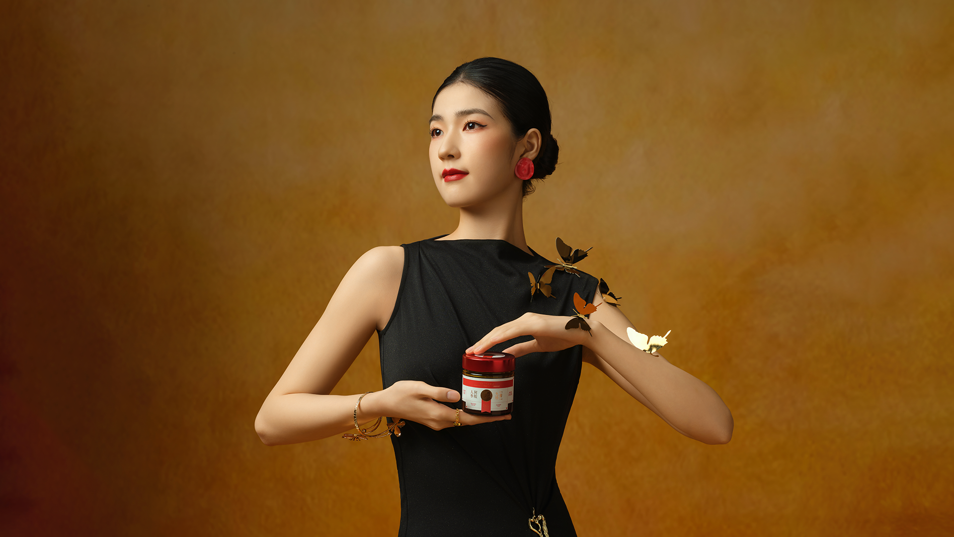
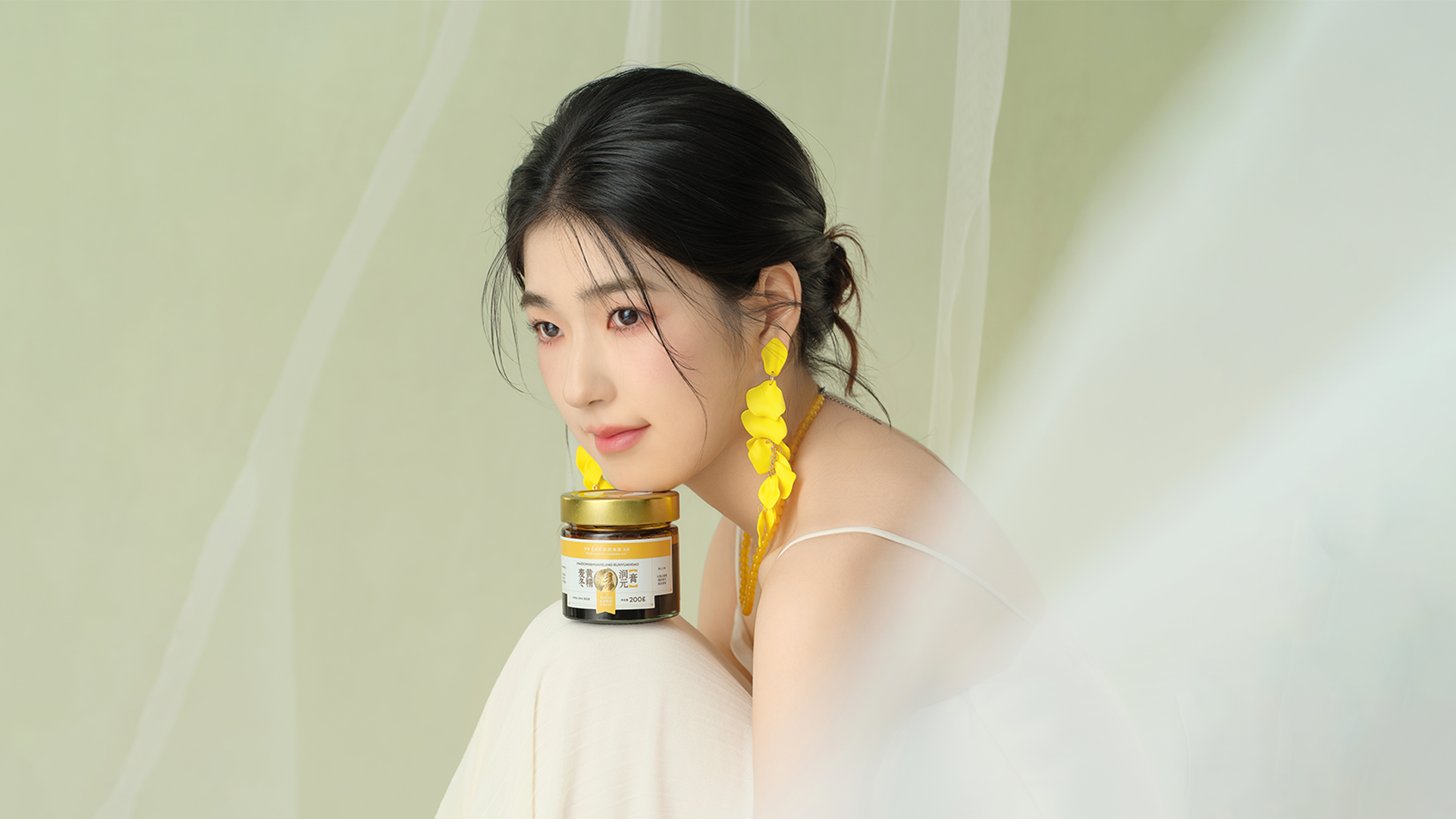
Brand of the Product
TIAN CAO SHI ZHEN
Designer Name
YELLOW、KAI、RUOYUN、YUAN、LI ZHIHAO、ZIDI
Position of Designer
无
Target Consumer
Smart Chinese women aged 25-45 who follow Eastern nourishment and pursue convenient, scientific and light nourishment, as well as some elders with similar health care needs
Distribution Channels
电商 E-commerce; 其他销售渠道 线下门店、大健康私域
Positioning
大货消费品 Mass Production
Design Story
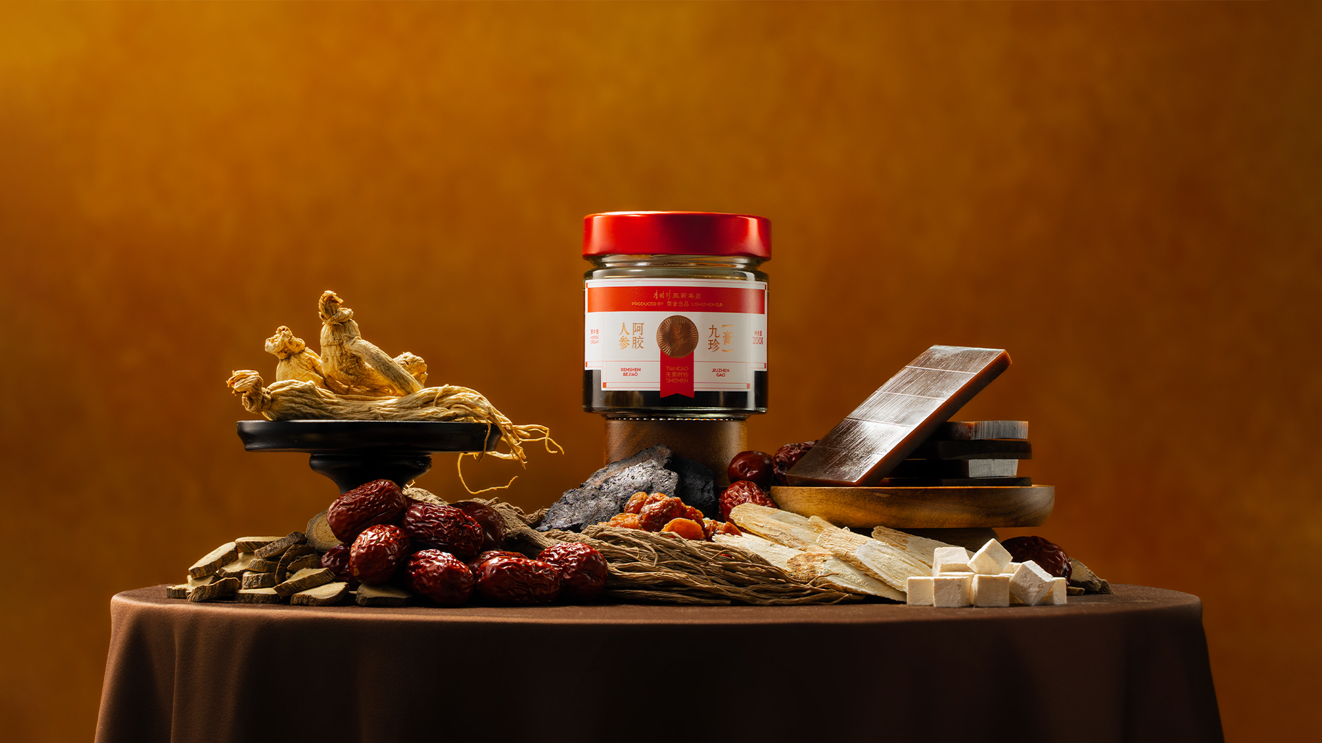
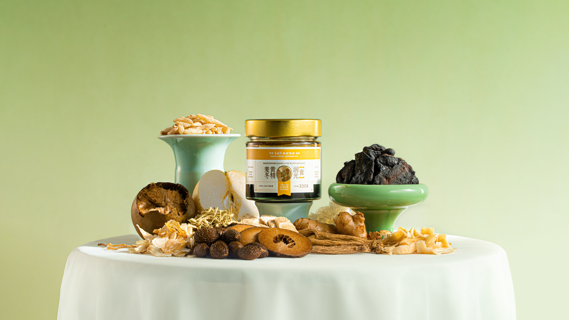
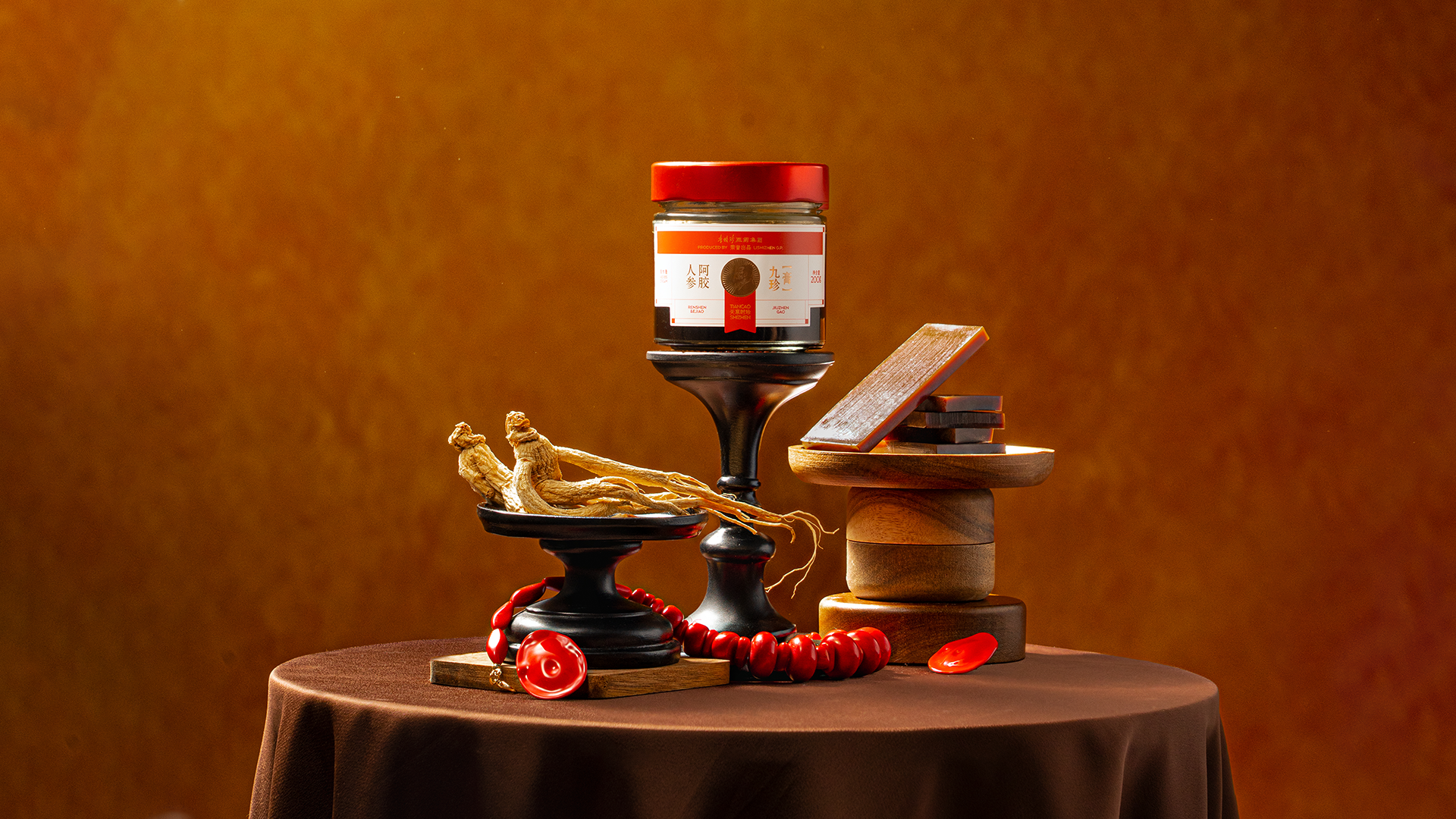
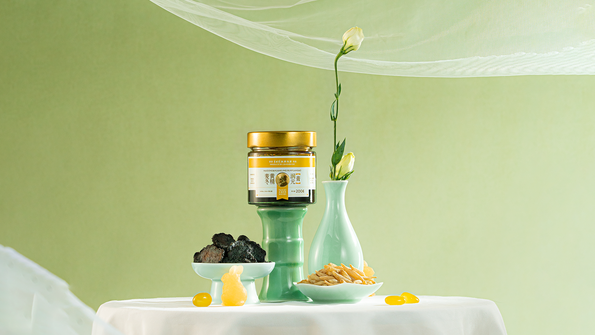
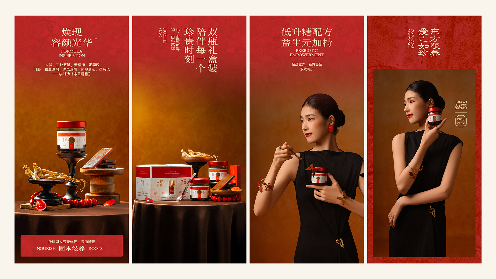
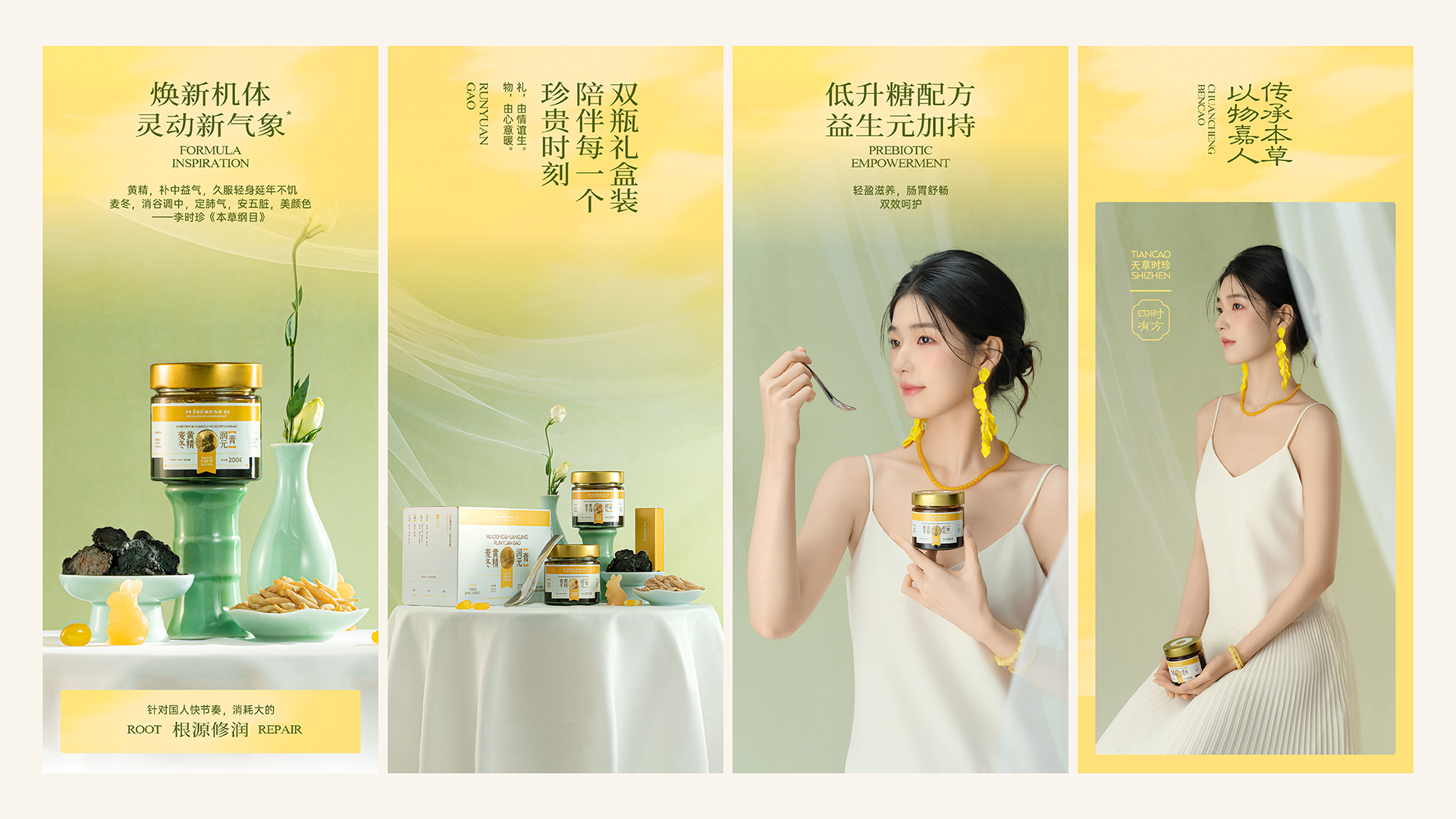
Market background: The ointment market is mixed, making it difficult for consumers to choose and distinguish. After receiving the Amakusa Shizhen Jiuzhen ointment project, we first conducted market research on the product. After online and offline research, we found that the paste market is in a state of chaos: the raw materials lack standards, the quality is uneven, the selling points are confused and unclear, the price range of similar products ranges from 20 yuan to 200 yuan, making it difficult for consumers to distinguish, and the selection cost is too high. Design concept: The current cream market is in urgent need of a game-breaker that combines professional endorsement and deep emotional value. It designs the brand and packaging visuals by building a professional background and a sense of trust.
Highlights
Product strategy: Use the endorsement of major pharmaceutical companies to inject trustworthy genes into every gram
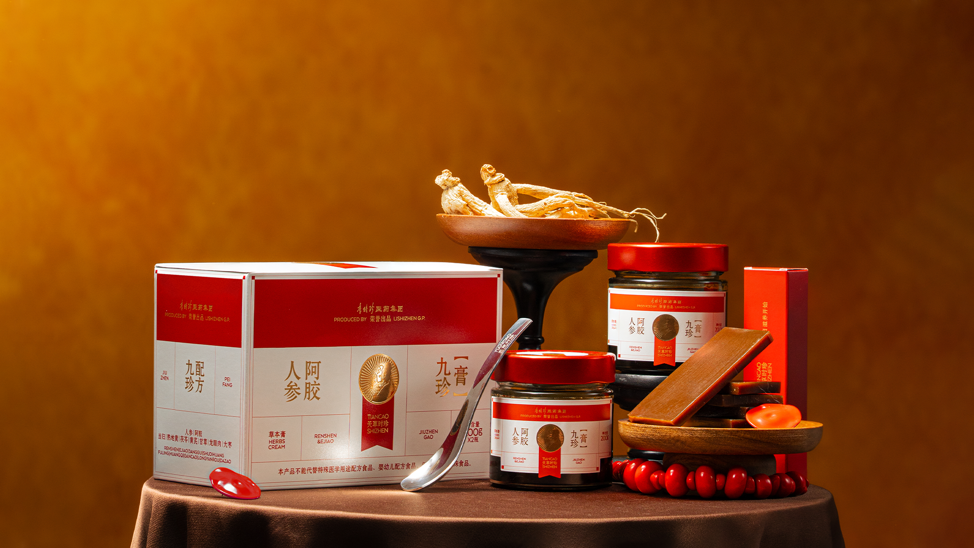
Through the endorsement of major pharmaceutical companies and the empowerment of Li Shizhen’s IP, we can build a professional background and trust in our products. The main steps are divided into three steps: The first step is to cooperate with Li Shizhen, a major pharmaceutical company, relying on Li Shizhen Pharmaceutical Group's complete pharmaceutical industry chain and pharmacy-level production standards, transparent processes, and scientific production in modern sterile workshops to achieve core guarantees of product quality. The second step is to trace the source of high-quality raw materials. The use of authentic donkey skin raw materials can be traced to the batches of the breeding farms, and the heavy metal and pesticide residue detection data are visible; the third step is to use Li Shizhen’s super IP to empower: from cultural symbols to emotional resonance, the specific super IP is used to empower the product and make professional authority concrete. Through the combination of the above three steps, the professionalism and reliability of the product are further enhanced.
Market Performance
The ointment series relies on Li Shizhen Pharmaceutical Group (the whole industry chain traditional Chinese medicine group of Medical Saint Hometown) and Duan Aitang's nationwide 50+ store network, with an average annual service of 1 million+ users. It uses a meridian moxibustion external adjustment + ointment internal nourishment collaborative plan to reach the health customer base, and the offline immersive experience drives instant transactions; in the private sector, a team of practicing doctors analyze authentic raw materials and ancient techniques and share real cases, with a repurchase rate of 40%. The two ointments are suitable for diverse groups of people, and the monthly sales in the private domain have increased by 15%, creating a closed loop of collaborative growth of store customer acquisition-private domain retention-two-way feedback.
Material(For concept works, please choose the material you plan to use)
其他 玻璃、银卡纸
Craft
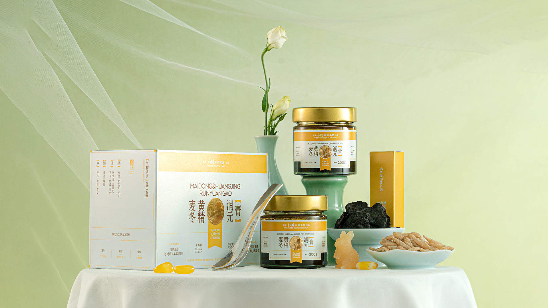
The triple process of padding, reverse UV, and embossing is used to create a high-end texture for the packaging: padding strengthens the texture of the packaging; reverse UV creates a matte glossy color contrast and increases the graininess; embossing creates a three-dimensional relief texture, and the concave and convex texture can be touched by fingertips. The integration of the three processes gives the packaging both visual beauty and tactile experience, showing a refined style.
Does the design solve the problems that are common across the product category? If so, please explain.
In order to break down the trust barrier, the concept of "Herbal Laboratory" was implanted into the packaging design of Amakusa Shizhen Jiuzhen Ointment. Because this product is produced by Li Shizhen Pharmaceutical Group and the formula is derived from the "Compendium of Materia Medica", the certification mark is specially designed during the packaging design to highlight professionalism and strengthen trust. Secondly, the image of Li Shizhen was embedded in the logo, which is strongly related to the medical concept. Then, in setting the tone of the overall visual style, the philosophy of visual subtraction was adopted, with a pure white base and precise line design, minimalist and rational, conveying a rigorous research and development attitude. Finally, in the presentation of core information, redundant elements are completely stripped away to create a trustworthy product.
What functional designs of the work have enhanced the user experience?
The minimalist packaging design style abandons all redundant decorative elements and only uses lines to divide the picture, allowing consumers to quickly identify important information such as brand, product information, selling point information; while saving the cost of composing pictures with consumers, it also makes it easier for consumers to gain a sense of security in decision-making in this calm and professional look.
Did the design help increase the sales performance of the product? If so, please give related evidence.
Use packaging design to create a sense of professionalism and quality in products: create Li Shizhen IP medals to build certification-level trust; digitally present the group's advantages to strengthen professionalism and trust; refine product names to directly focus on efficacy and achieve rapid identification; streamline the ingredients and selling points of the paste to lower the reading threshold and make the core ingredients clear at a glance. The ointment series relies on Li Shizhen Pharmaceutical Group, with an average annual service of 1 million + users. It reaches the customer base through outsourcing + in-house maintenance plans. It is operated by a private physician group and has repurchases of 40%. The ointment series is suitable for a diverse group of people. Monthly sales in the private sector increased by 15%, forming a closed loop of store-private two-way growth.
Does the work consider sustainability (environmentally or commercially, or both)? If so, please explain.
The use of minimalist packaging and modular layout reduces the use of printing materials and inks, and is easy to extend the series, reducing subsequent packaging development costs and resource consumption, and achieving the unification of environmental protection and commercial efficiency. Both ointments are based on the traditional Chinese medicine concept of "preventing disease" and are designed to target common physical problems of modern people. They are suitable for long-term use and help users gradually regulate their body and mind, enhance their physical fitness, and form a sustainable healthy lifestyle. The attached check-in sheet encourages users to record usage, cultivate the habit of persisting in taking it, enhance user stickiness and product repurchase, and at the same time convey the health concept of "continuous conditioning" and enhance the product life cycle value.