
Type of applicant company
设计机构
Country
中国
Company Website
无
Images
Brand of the Product
POWER GOAL
Designer Name
boombrand
Position of Designer
无
Target Consumer
The target audience comprises parents aged 30-45 in first- and second-tier cities, primarily middle-class individuals and discerning mothers. They have high expectations for their children's intellectual, physical, and academic development, and are aware of the need to supplement their children's nutrition. When making purchasing decisions, they prioritize product quality and possess a certain understanding of nutritional components.
Distribution Channels
电商 E-commerce
Positioning
大货消费品 Mass Production
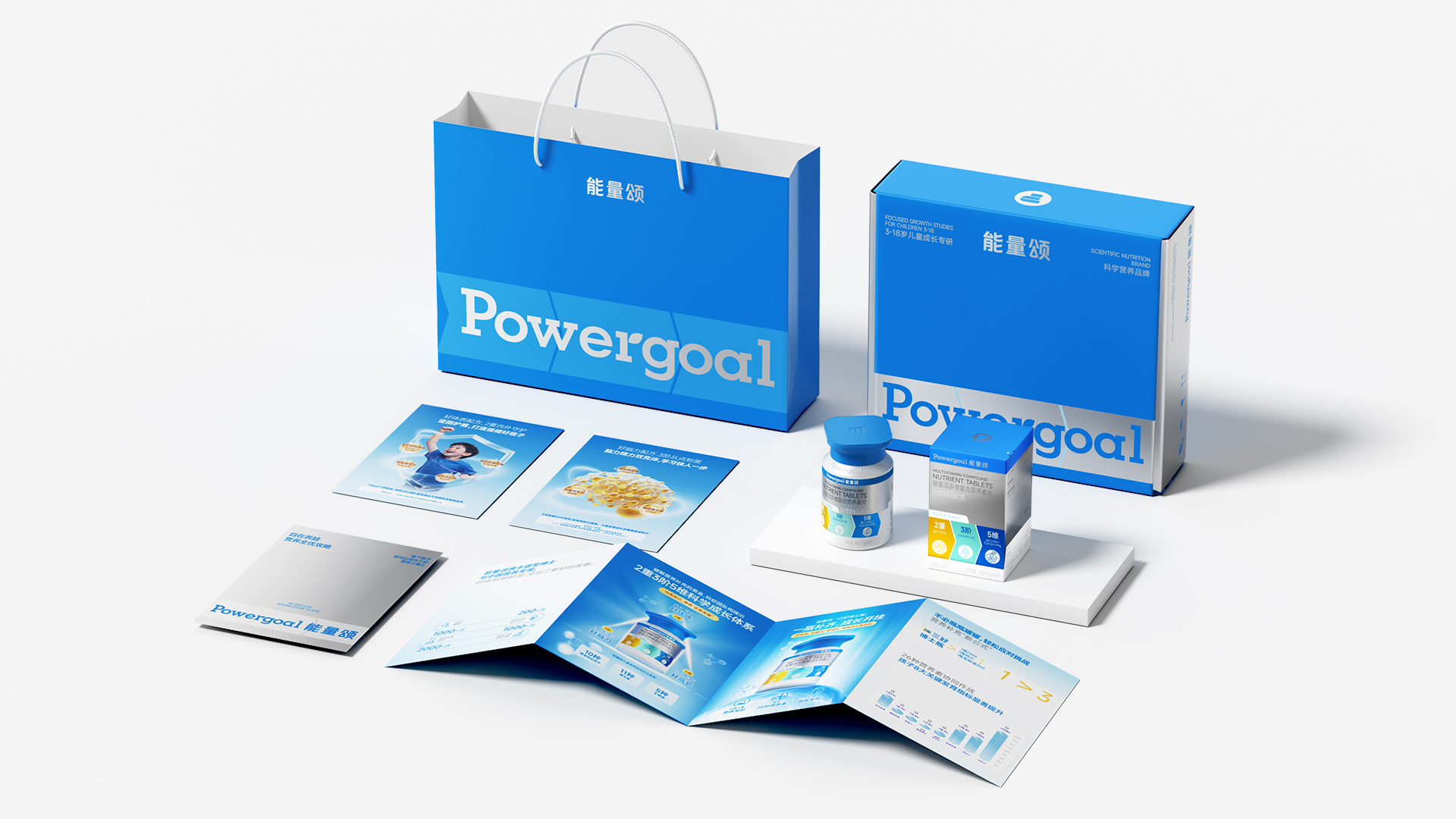
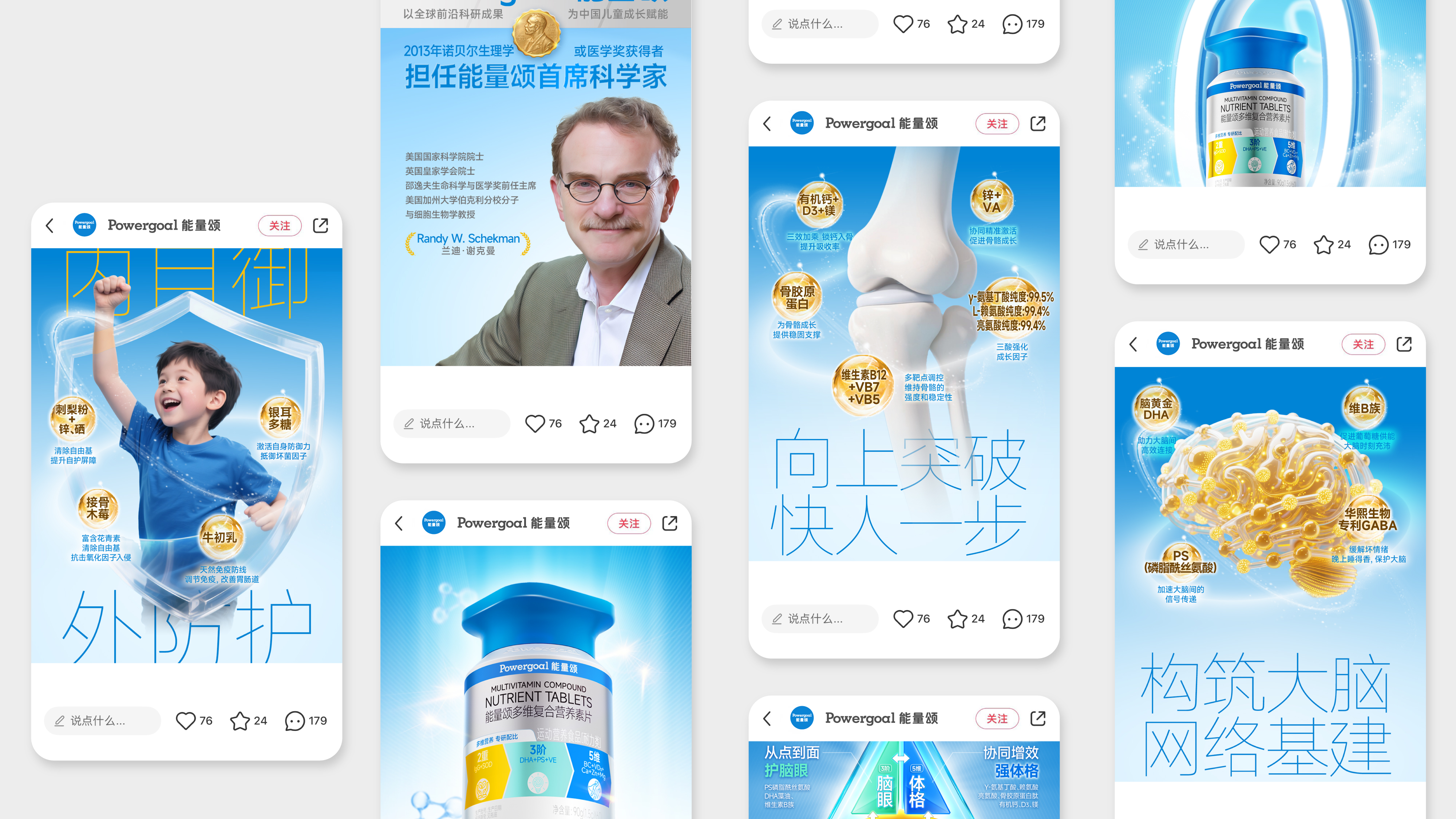
Design Story
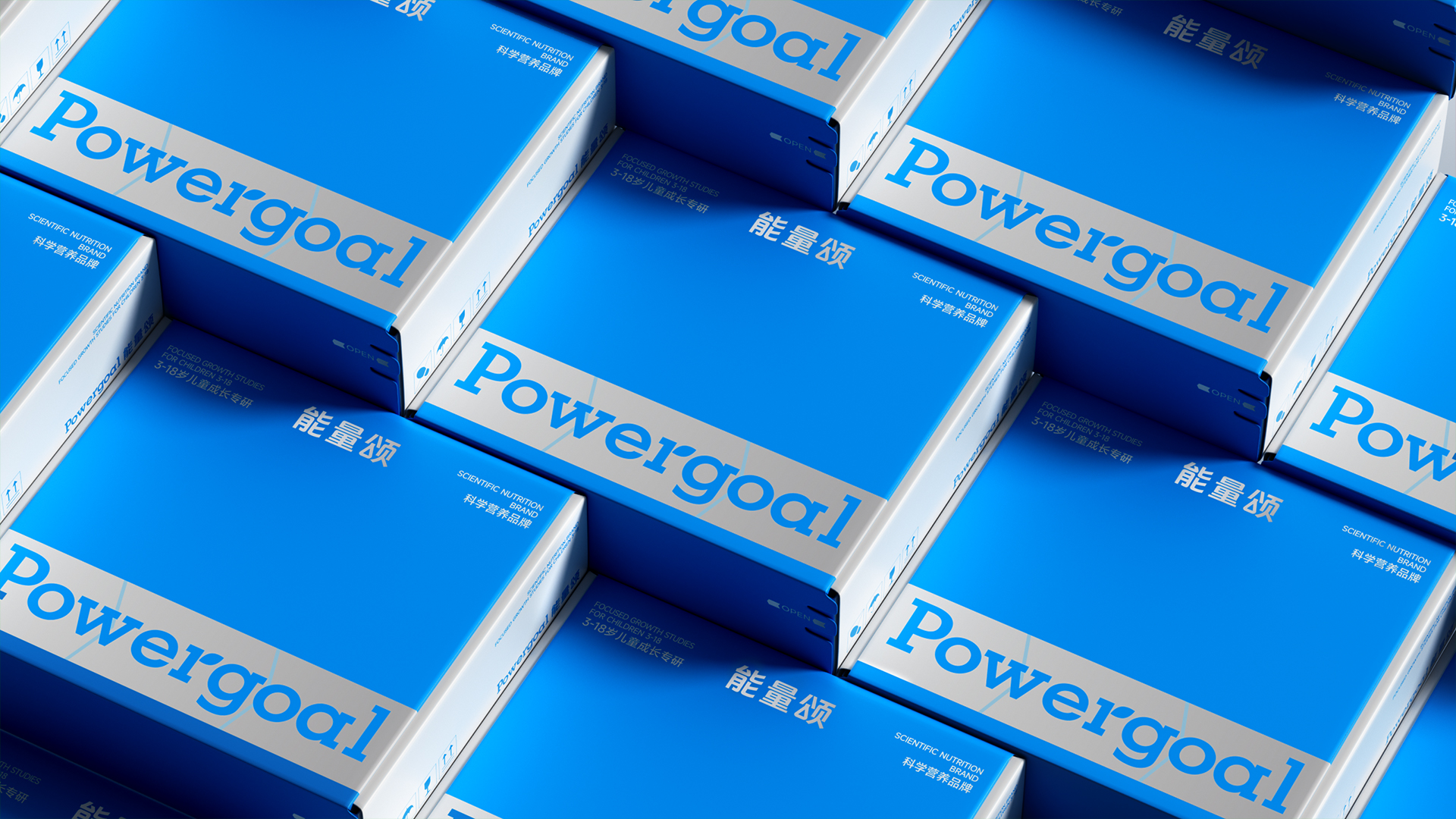
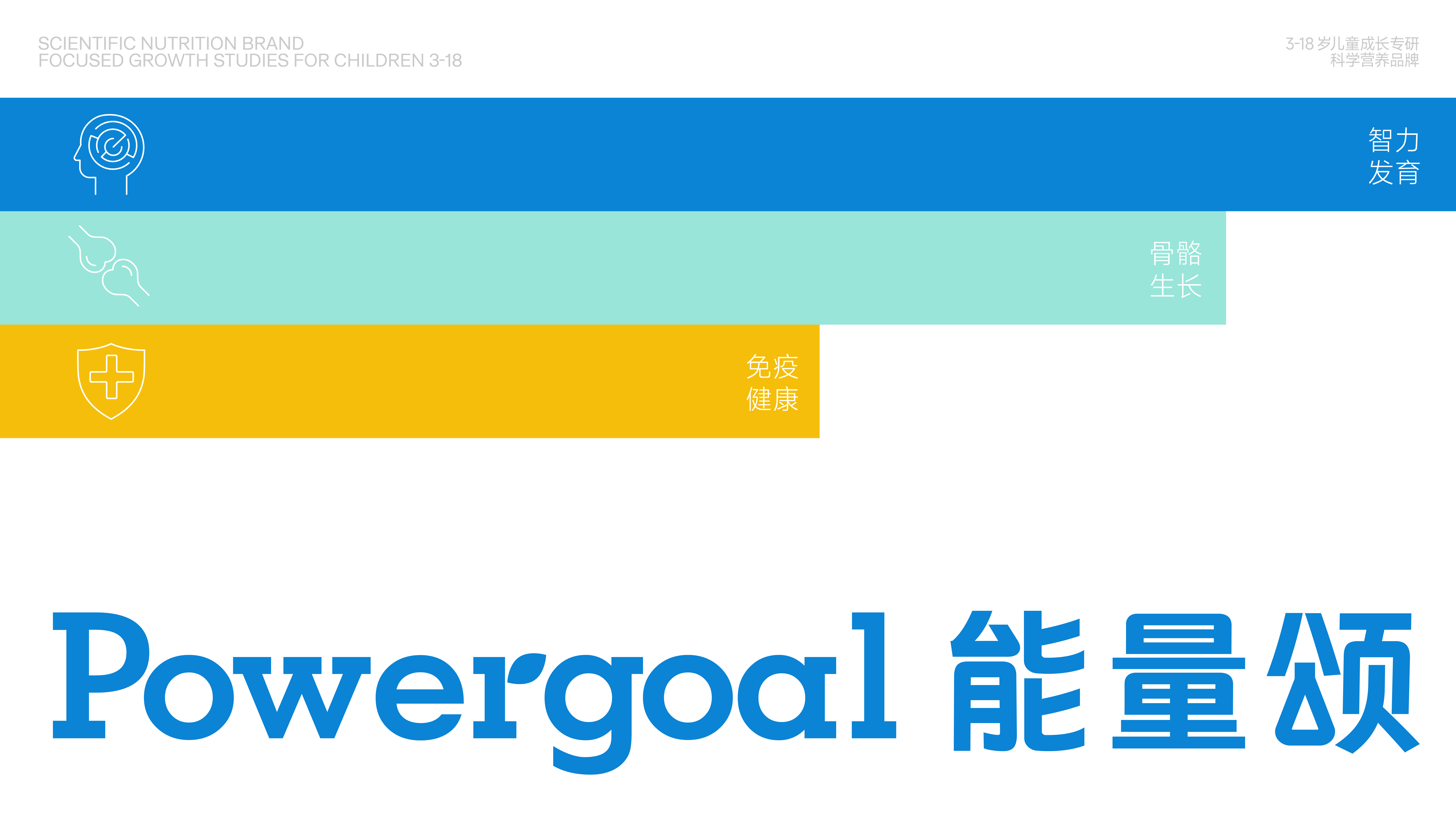
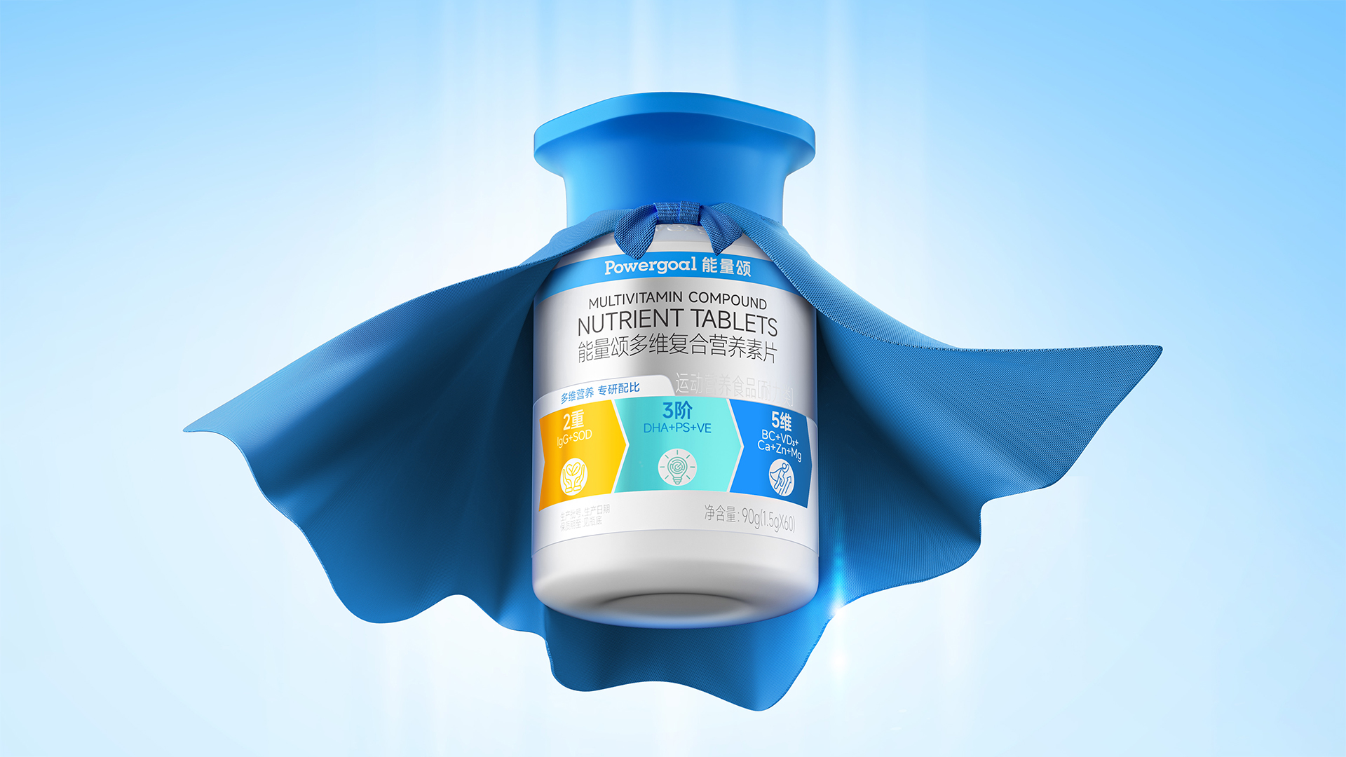
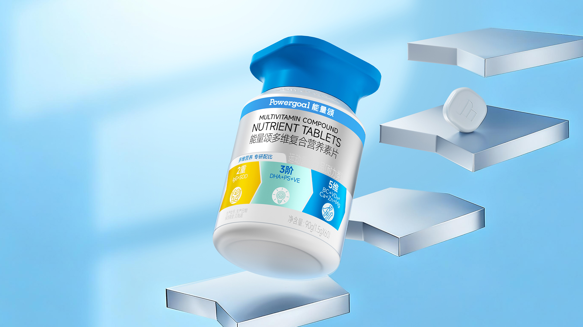
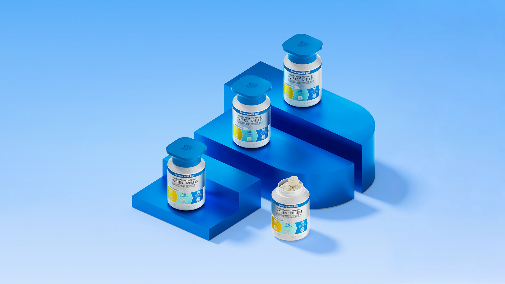
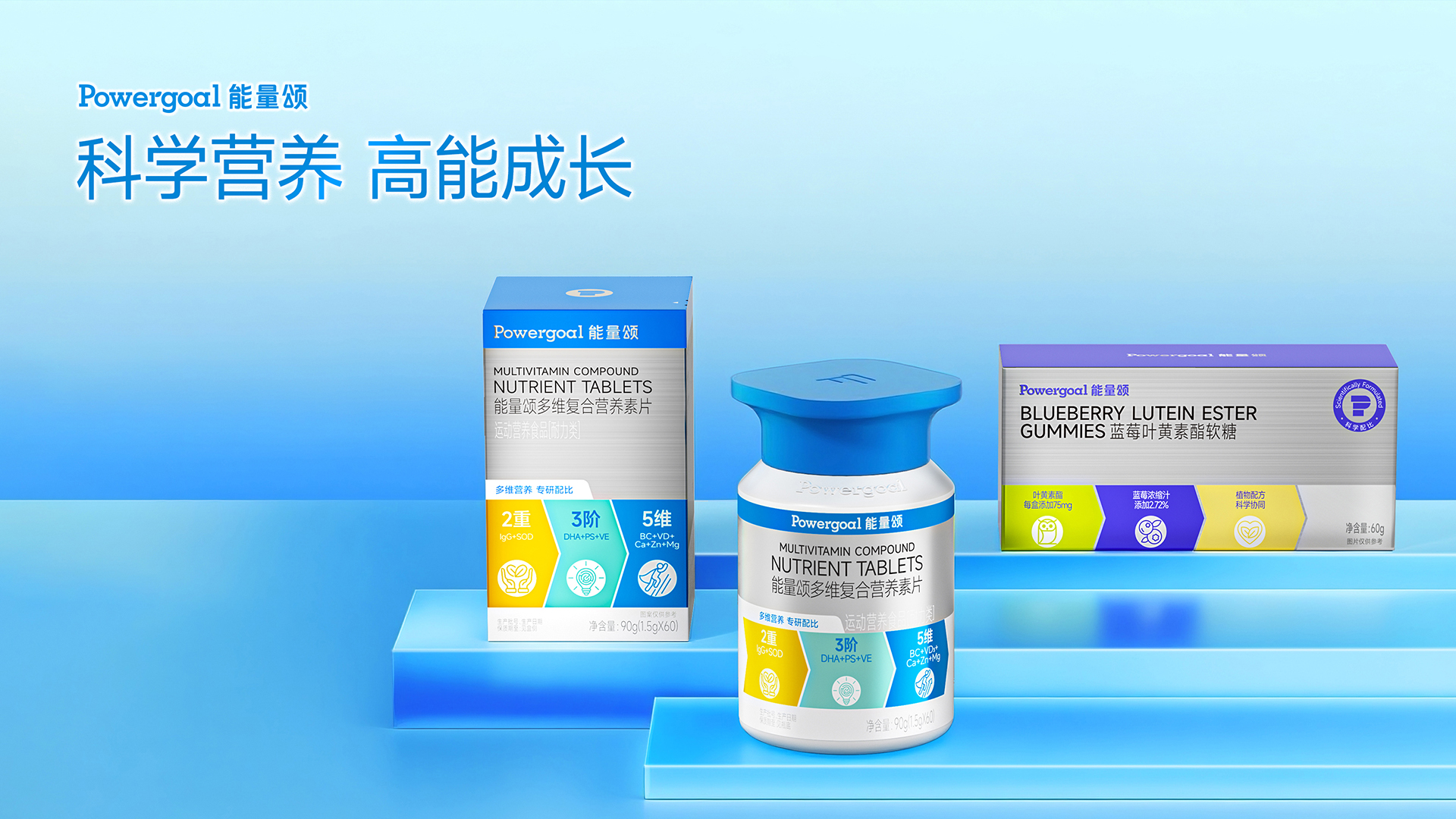
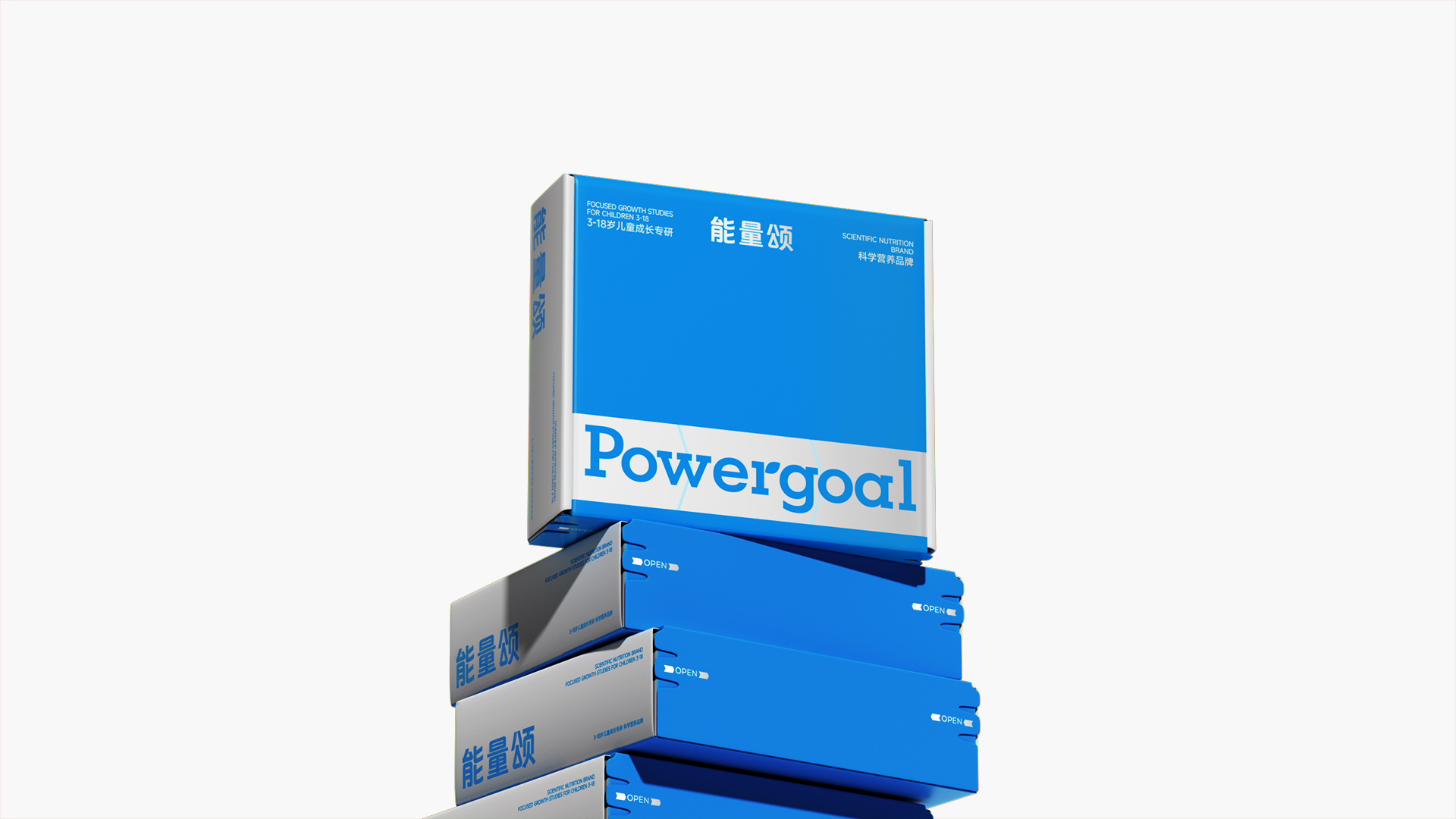
The Chinese children's health product market lacks local brands focused on children. The professionalism and scientific approach offered by specialized brands are precisely what a new generation of parents desire. Therefore, Energy Song is positioned as a brand specializing in children's nutrition and providing scientific nutrition. The overall visual style is minimalist and scientific, with light blue as the primary brand color, balancing professionalism with a youthful, childlike vibrancy. The brand symbol is based on the initials "P" of the brand's English name, "Power Goal," and extends in a stepped, three-dimensional pattern, embodying the brand's proposition of "celebrating every step of growth." During the product design phase, the functionality, cost, and differentiation of the health product bottle were comprehensively considered. While retaining the cylindrical bottle body, the cap was privately molded and designed to resemble a "doctoral cap." This design not only reflects the brand's endorsement as a Nobel Prize-winning researcher, but also reflects expectations for children's growth. The overall product nickname, "Three Good Doctor Bottle," is used to create a consistent concept, selling point, and visual identity.
Highlights
The product bottle design development for this project was a major highlight. Most domestic children's health products use the same packaging as adult products, remaining largely identical, with only minor differences in the bottle label. Energy Song's core product, a multi-nutrient complex, features a bottle designed in the image of a doctoral hat. This symbolizes balanced nutrition, providing children with ample energy and helping them achieve success in all areas. It also fulfills parents' expectations and associations with the word "doctor." The unique doctoral bottle also distinguishes Energy Song from the crowd, making it more noticeable and memorable for parents.
Market Performance
无
Material(For concept works, please choose the material you plan to use)
PET塑料 PET material
Craft
The product bottle uses thin aluminum foil silver card material as the label, and different spot colors are overprinted to create a rich and layered color effect.
Does the design solve the problems that are common across the product category? If so, please explain.
Similar designs for children's nutritional supplements often use flat labels as a differentiating feature, rarely focusing on the shape of the product itself to create a hard-to-replicate brand identity. Energy Song's design, however, uses a "doctoral hat" to create an anthropomorphic product image. This combines functionality with brand recognition, and offers strong scalability for subsequent product series, facilitating the development of a family-wide product image and gradually building a holistic impression of the Energy Song brand among consumers.
What functional designs of the work have enhanced the user experience?
无
Did the design help increase the sales performance of the product? If so, please give related evidence.
无
Does the work consider sustainability (environmentally or commercially, or both)? If so, please explain.
无