
Type of applicant company
设计机构
Country
中国
Company Website
https://www.lbdbrand.com/
Images
Brand of the Product
WakeFresh
Designer Name
LBD Brand Creative
Position of Designer
无
Target Consumer
High-net-worth individuals, white-collar workers, fashion seekers, early adopters willing to pay for novelty, health-conscious trailblazers
Distribution Channels
电商 E-commerce; 大型商场 Shopping Mall; 小型商超和便利店 Supermarket & CVS; 餐饮&酒店 Restaurants & Hotel
Positioning
大货消费品 Mass Production
Design Story
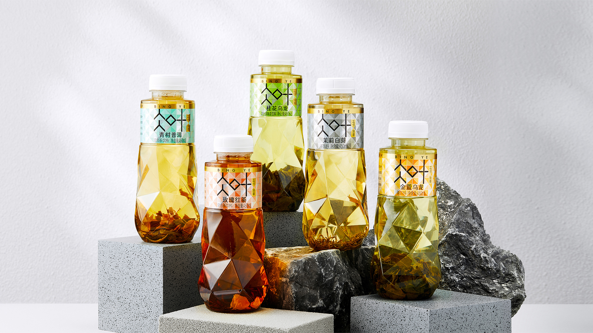
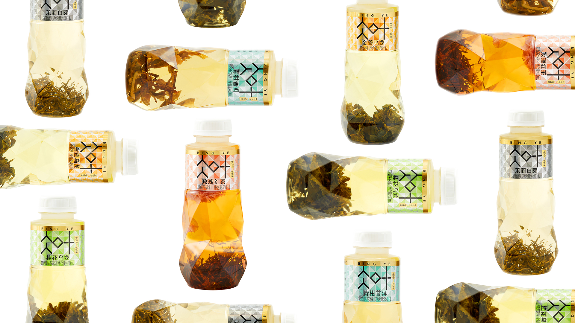
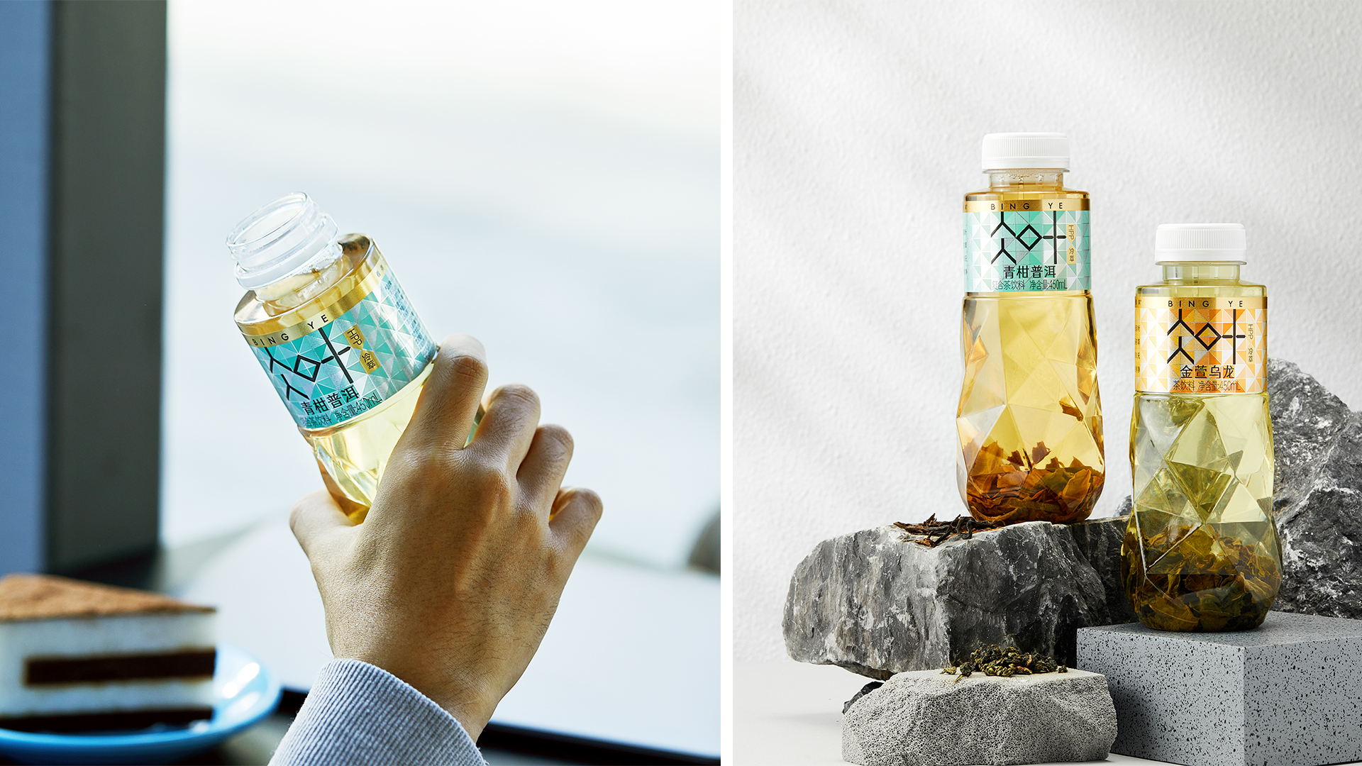
Bingye is a cold brew tea brand best known for its distinctive feature of packaging real tea leaves inside the bottle. While most Chinese tea beverage brands follow traditional design styles—such as brush calligraphy and classic Chinese illustrations—resulting in a high degree of visual similarity, we aimed to differentiate Bingye by emphasizing the visible tea leaves and reinforcing its identity as a cold brew tea.
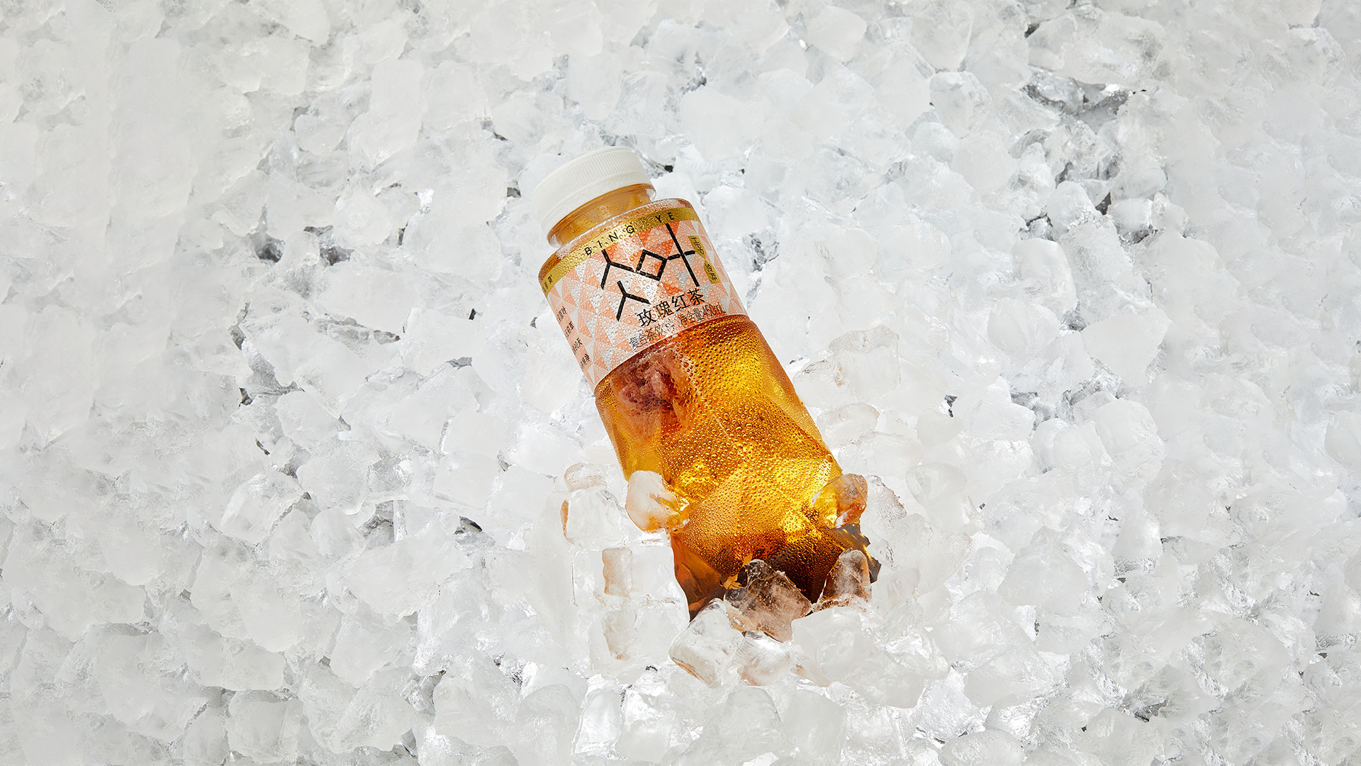
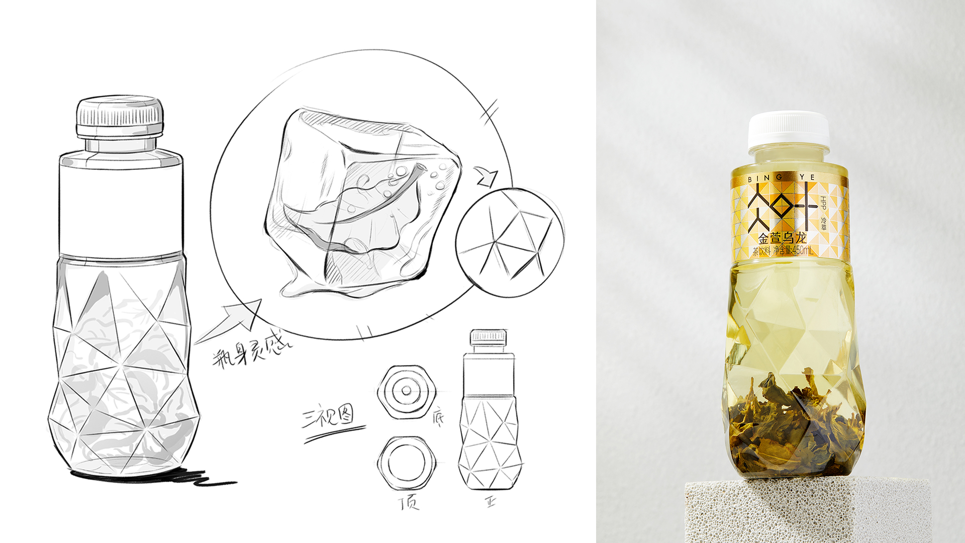
The creative concept draws inspiration from leaves frozen in ice. The Bingye logo serves as a visual framework, extended into an ice grid texture that seamlessly integrates with the bottle design. Label printing techniques such as selective silver foil stamping are used to enhance texture and elevate the premium feel.
Since its launch, the product has been well received by consumers and has quickly become one of the leading brands in the unsweetened tea category.
Highlights
1、As a rising force in sugar-free tea, cold-brew tea stands out in an intensely competitive market. We abandon the conventional traditional Chinese-style designs prevalent in the market, emphasize our own characteristics, and build visual tension to present the "ice-cold feeling" visually. We have created the ice grid pattern as a brand asset, which perfectly matches the diamond-shaped bottle design—achieving a high degree of visual perfection. Breaking away from traditional styles like line drawings and calligraphic characters, we make bold innovations to establish a strong position in the new cold-brew tea category, helping enterprises build exclusive visual assets and accumulate brand equity barriers.
2、We use colors to create a sense of brand family series. The "bling-bling" labels, under the spotlight of low-temperature freezers, can be instantly noticed by consumers.
Market Performance
无
Material(For concept works, please choose the material you plan to use)
PET塑料 PET material
Craft
The bottle label uses reverse UV particles and spot color screening to create an ice grid texture. Hot stamping is applied to enhance the sense of quality, while UV coating on the product name font boosts the layering.
Does the design solve the problems that are common across the product category? If so, please explain.
From the perspective of offline shelves, the packaging of sugar-free tea suffers from severe homogenization. The visual symbol of "tea leaves steeped in bottles" is both a distinctive feature and a purchasing concern.
Key visual perception: a sense of ice-coldness.Trust endorsements: HPP technology + full cold chain.
To visually express the "ice-coldness": We’ve created an ice grid pattern as a brand asset, which aligns perfectly with the diamond-shaped bottle design.
The brand name "仌" (pronounced "bing") is an archaic form of the Chinese character "冰" (meaning "ice"), whose ancient glyph resembles water freezing into ice. The character "叶" (meaning "leaf") refers to the cold-brew tea leaves.
Typographic visualization – Addressing the difficulty in pronunciation, we turn this phonetic disadvantage into a typographic advantage, achieving easy recall and effective communication.
Establishing the ice grid pattern – Creating visual consistency by implementing the "ice-coldness" throughout, from the bottle shape to the label design.
What functional designs of the work have enhanced the user experience?
1、The diamond-shaped bottle design offers a comfortable grip with an "anti-slip texture," preventing slipping while enhancing the clarity of the tea infusion.
2、The reverse UV particles on the label elevate the tactile experience.