
Type of applicant company
设计机构
Country
中国
Company Website
无
Images
Brand of the Product
Shen Nong Xi
Designer Name
PUFINE Creativity
Position of Designer
Creative Director: Zhang Yanhui Creative Director: Xia Ling Designer: Tian Feng Technical director: Zhou Xiaoli Zhang Yuxuan Rendering: Luo Kang
Target Consumer
Sophisticated white-collar workers, business people, flower tea lovers, seasoned tea connoisseurs, and health-conscious enthusiasts
Distribution Channels
电商 E-commerce; 大型商场 Shopping Mall; 小型商超和便利店 Supermarket & CVS; 杂货店 Grocery; 餐饮&酒店 Restaurants & Hotel
Positioning
大货消费品 Mass Production
Design Story
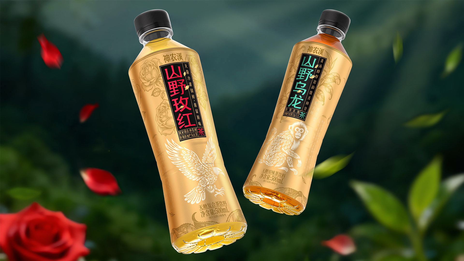
In the increasingly competitive market for Chinese-style tea drinks, "Shennongxi" has precisely positioned itself in the high-end sugar-free tea drink category. It not only enhances its high-end attributes through product formulas but also accurately reaches its target audience who pursue health and quality through differentiated packaging visual design. As the first new product launched in 2026, the bottle label design embodies three aspects: "ecology as the form, culture as the soul, and quality as the deity"
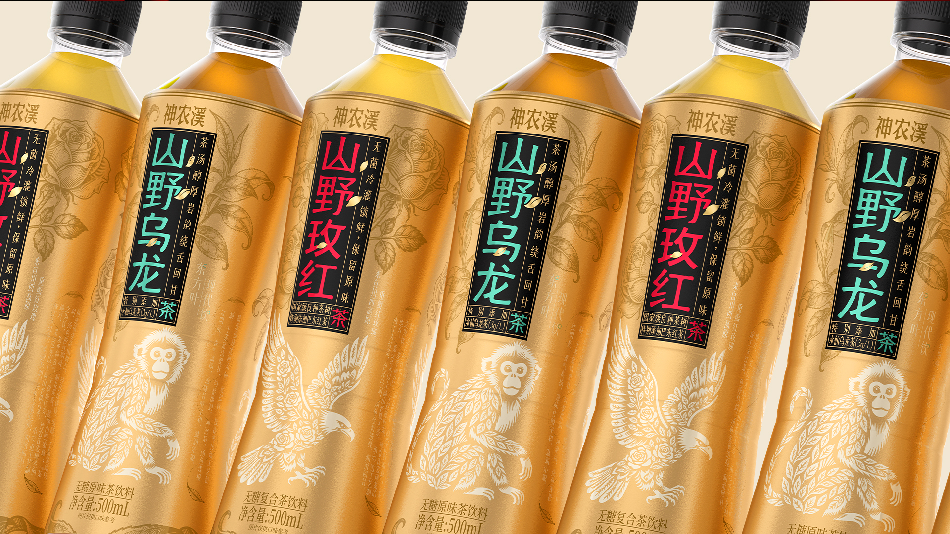
1. The text information regarding the product name and core selling points adopts the layout of ancient Chinese medical texts, featuring black paired with bright contrasting colors, which is very eye-catching and prominent. The clear hierarchy of information allows consumers to quickly identify and obtain key information while standing in front of the shelf.
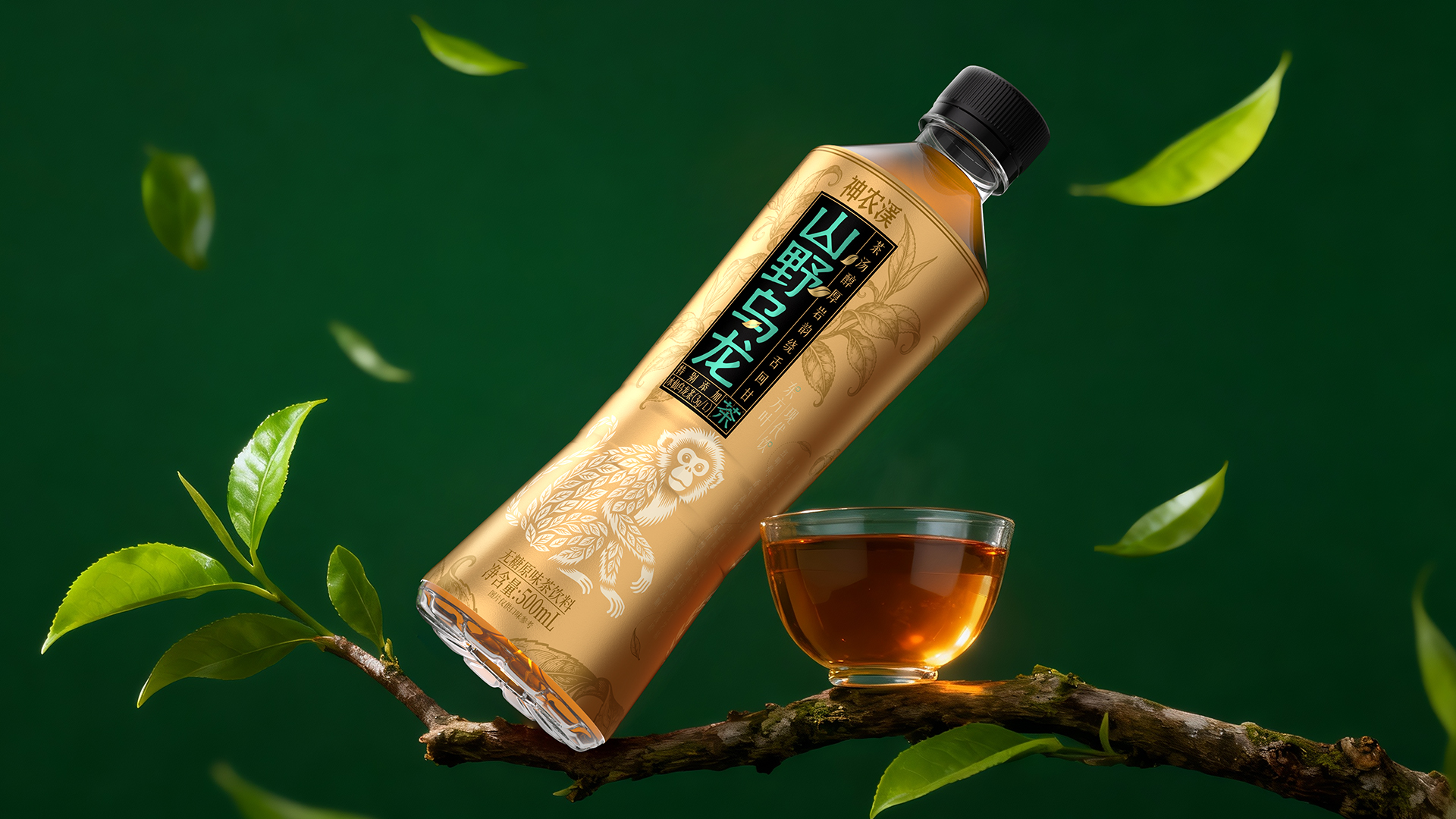
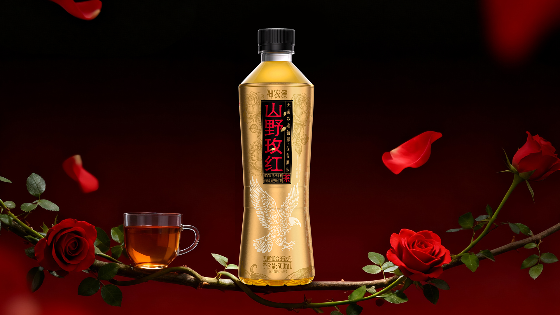
2. Using exquisite printmaking lines, the product's ingredients are depicted corresponding to different oolong tea and rose product flavors. The overall packaging adopts a special gold base color, directly enhancing the exquisite texture of the product;
3. Incorporating the local traditional intangible cultural heritage of Paper Cuttings art, tea leaves and roses are depicted as the most representative protected animals of the region, the golden monkey and golden eagle, vividly reflecting the product characteristics of natural ecology, making natural health a perceivable visual symbol.
Highlights
The packaging is named after "Shan Ye Mei Hong" and "Shan Ye Wu Long", embodying both the mountainous ecology and oriental charm. The red gold and green gold fonts on a black background enable quick recognition of information and clear differentiation of different flavors. The packaging incorporates the intangible cultural heritage of Paper Cuttings art, featuring rose gold carved Paper Cuttings and tea golden monkey Paper Cuttings, which not only showcases the local mountainous ecology but also inherits the intangible cultural heritage, presenting the product with both cultural and healthy natural attributes. The packaging adopts a special gold craftsmanship paired with a low-saturation brown gold color scheme, breaking away from the affordable visual appeal of mass tea drinks and establishing a high-end and exquisite quality. The overall packaging creates differentiation through ecology and culture, deepening the brand's perception of natural health through ecological imagery, satisfying the high-end users' demand for a sense of ritual in life, and enhancing users' emotional identification with the product's natural health.
Market Performance
none
Material(For concept works, please choose the material you plan to use)
PET塑料 PET material
Craft
Special gold, partial matt finish
Does the design solve the problems that are common across the product category? If so, please explain.
Compared to other products in the same category that tend to adopt a minimalist and affordable packaging approach, this design is named after the wilderness, utilizing intangible cultural heritage Paper Cuttings combined with wilderness ecology to create a high-end visual that combines unique ecology and culture, enhancing shelf recognition. The design is arranged with ancient calligraphy labels, balancing cultural texture and clear information recognition. The design integrates calligraphy and intangible cultural heritage Paper Cuttings, enhancing the oriental texture and helping the product form a differentiated barrier.
What functional designs of the work have enhanced the user experience?
The packaging adopts an ancient calligraphy label-style layout, presenting core selling points in distinct sections, allowing consumers to quickly grasp key information, adapting to the decision-making pace of instant tea consumption and enhancing purchasing efficiency. By pairing engravings with contrasting fonts in red gold and green gold, it intuitively corresponds to different flavors, reducing purchasing costs. The ecological imagery of intangible cultural heritage Paper Cuttings visualizes the health attributes, strengthening consumers' emotional identification with the product's natural health and cultural attributes, and enhancing the pleasure of drinking. Finally, the packaging, with its high-end texture achieved through special gold craftsmanship and a light brown background, meets the demand for a sense of ritual.
Did the design help increase the sales performance of the product? If so, please give related evidence.
Firstly, the packaging visualizes the health selling point, intuitively conveying the natural ecology and cultural value attributes of the product through the raw materials of printmaking and the ecological imagery of Paper Cuttings, accurately tapping into the health consumption demand and enhancing the added value of the product. At the same time, the texture of Eastern culture meets the consumers' demand for ritualistic feelings, increasing the premium price and willingness to repurchase of the product. It can not only attract new customers to try, but also cultivate loyal users, empowering sales growth. Finally, the packaging adopts special gold craftsmanship and brown-gold color matching to create a high-end texture, breaking away from the homogenization of visuals in the same category and quickly attracting the target customer group.
Does the work consider sustainability (environmentally or commercially, or both)? If so, please explain.
In a commercial sense, packaging that incorporates ecological and intangible cultural heritage elements to create unique visual symbols can be reused across the entire product line, reducing subsequent design costs. Differentiated packaging design and a high-end feel solidify the brand's premium positioning. At the same time, it precisely aligns with the growing market for health-focused, sugar-free tea drinks, meeting consumers' needs for health and a sense of ritual, thereby achieving sustained growth in the brand's commercial value.