
Type of applicant company
设计机构
Country
中国, 总部在美国
Company Website
https://makemarks.com/
Images
Brand of the Product
Starbucks
Designer Name
Project Lead: Danny Lye, Creative Director: Peter Lam, Structural Design Directors: Simon Newbegin, Mark Armstrong, Packaging Art Directors: Rhoda Chan, Jill Chan, Senior Strategist: Stella Tung, Account Manager: Celine Rao
Position of Designer
无
Target Consumer
Starbucks RTD Tea Coffee targets “healthy hedonists”—consumers who seek indulgence without compromise and view beverages as lifestyle expressions rather than mere refreshment. Instead of treating it as functional caffeine, they frame it as an experiential offering: a fusion that delivers both pleasure and wellness.
Distribution Channels
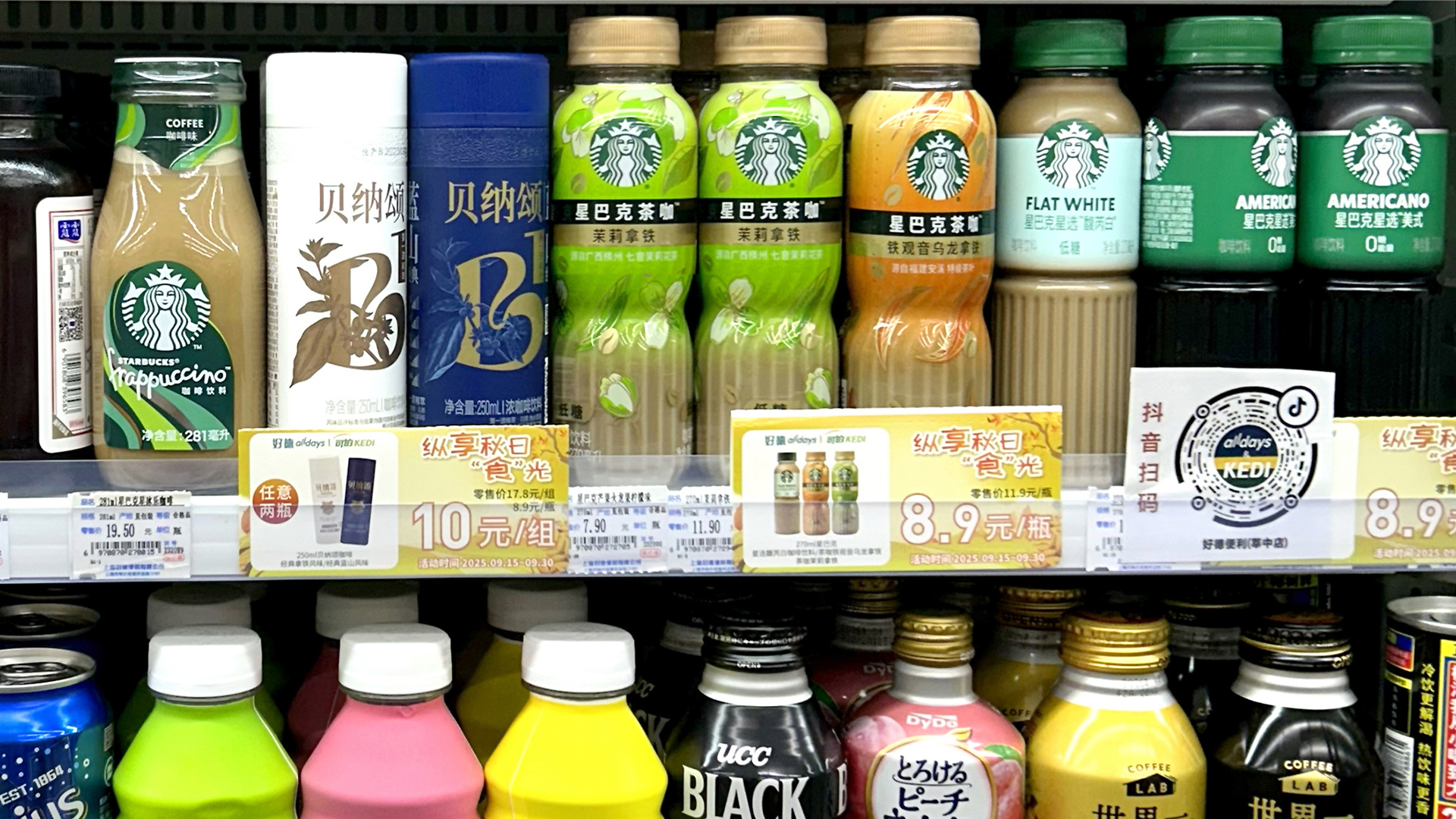
电商 E-commerce; 大型商场 Shopping Mall; 小型商超和便利店 Supermarket & CVS
Positioning
大货消费品 Mass Production
Design Story
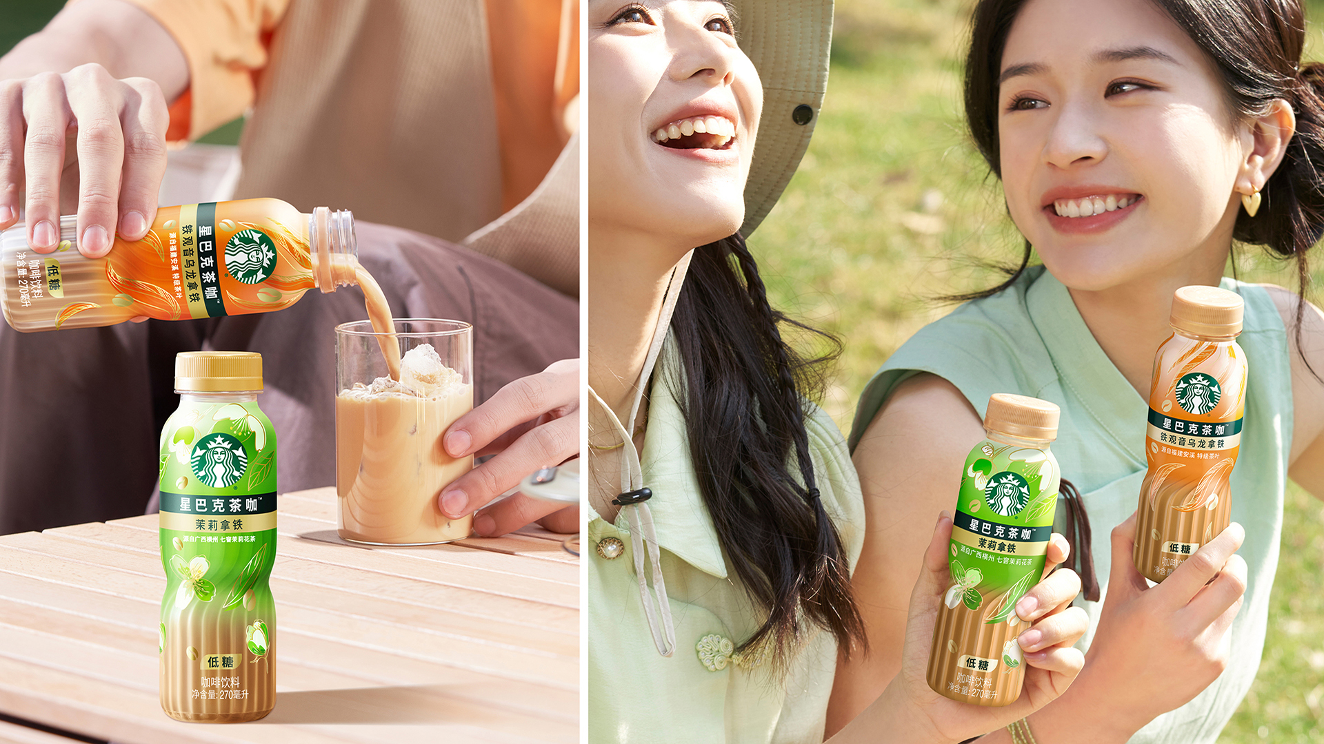
Starbucks needed to disrupt China’s hyper-competitive RTD market with a coffee-tea hybrid that appeals to Gen Z and young white-collar consumers aged 18-35. The new Tea Coffee range extends Starbucks RTD coffee portfolio by blending the richness of coffee with the lightness of tea, responding to young consumers’ demand for healthier ingredients, cleaner taste profiles, innovative flavors, and a sense of ritual.
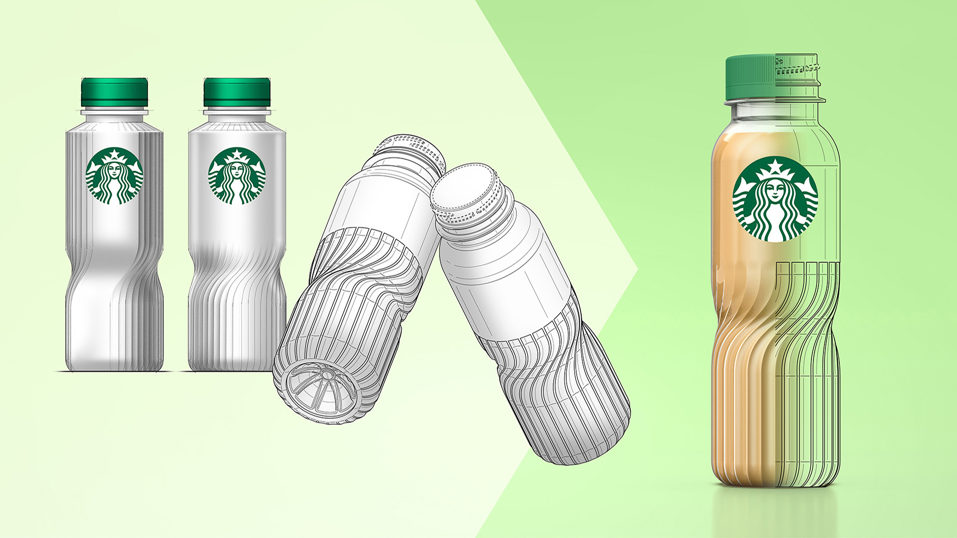
Marks designed the bottle structure and visual identity for Starbucks Tea Coffee in China, balancing aesthetic expression with production constraints. The design needed to work on existing high-speed filling lines with no control over label orientation and no custom caps, while still standing out in a visually saturated retail environment.
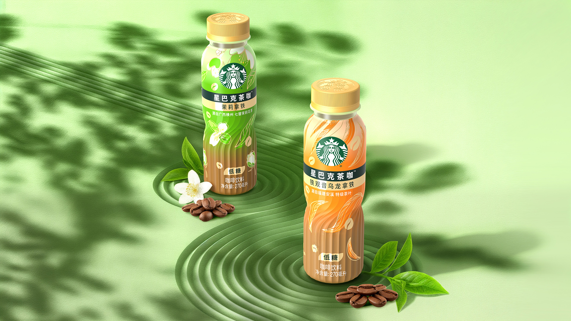
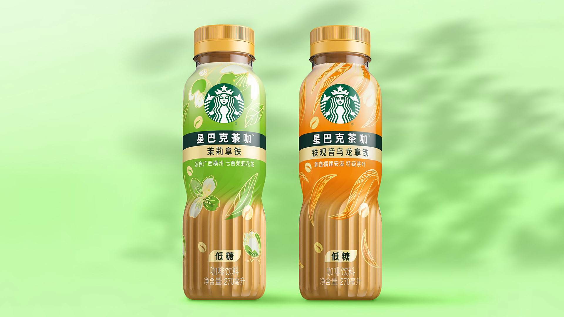
The bottle’s twist symbolizes the fusion of tea and coffee while functioning from any shelf orientation. A translucent gradient label reveals the product’s color, making the blend instantly legible. Structure and graphics unite to turn constraints into intentional design.
Highlights
The bottle's twist mimics the swirl of blending ingredients while functioning from any shelf orientation—a tactile metaphor that also creates a natural waist for comfortable grip. The textured base adds sophistication and stability. Graphically, modernized tea leaves wrap the bottle, bold variant colours drive differentiation, and a gold accent signals premium positioning. The translucent label is the hero: it reveals product colour dramatically, creating cut-through competitors can't match while maintaining cohesion with Starbucks' RTD portfolio. From structure to graphics, every element—from the cap to the texture—invites interaction and communicates fusion.
Market Performance
The launch delivered immediate impact. Within weeks, Coffee Tea generated 650 media mentions and 85 million impressions across trade and retail—strong evidence of shelf appeal and industry buzz. Consumer response validated the strategy: online feedback praised the balanced sweetness and aromatic quality, showing the design communicated taste credibly. Sales proved it: 1.5 million bottles sold monthly, capturing 8% of total Starbucks RTD sales and establishing Coffee Tea as a category disruptor, not just a line extension.
Material(For concept works, please choose the material you plan to use)
PET塑料 PET material
Craft
The designed transparent bottle with transparent label with graphic on the top reveals the product coffee color appropriately. The graphic design on the top use the modernized tea leaves to wrap the bottle, along with a gold accent signals premium positioning.